Description
Mailchimp is a platform that helps manage, create, distribute, and track analytics from newsletters. Newsletters are a commonly used marketing tool commonly used by organizations to promote products, circulate ideas or stay connected with an audience. Due to inconsistencies in the rendering of HTML and CSS code on different devices, platforms and operating systems Mailchimp is a useful tool that allows users to use visual templates to create letters with interactivity and analytics to track engagement.
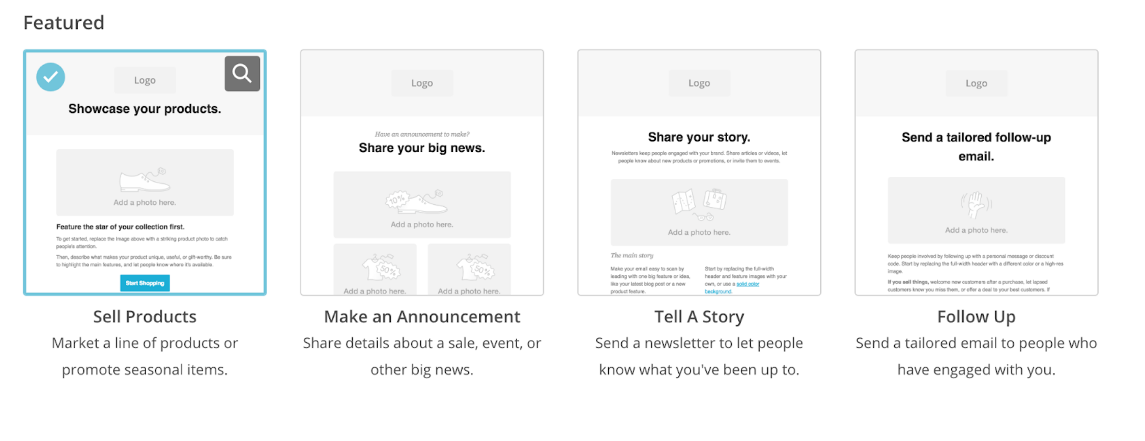
The product itself has a good representation of the seven stages of action-
Forming the goal/ Intention and Specifying the action: It presents goal oriented editable templates that build on established best practices that can be customized. This allows a user to declare intent and work towards a specific goal from the start.
Executing the action: It scaffolds different parts of the process with small cues that act as constraints. For example, you cannot begin a new draft without specifying an audience. As indicated by the greyed out options.
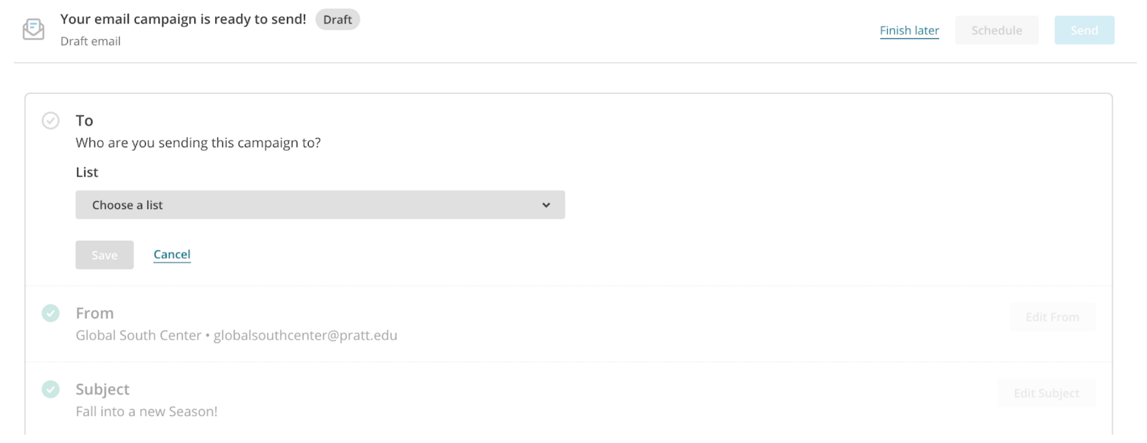
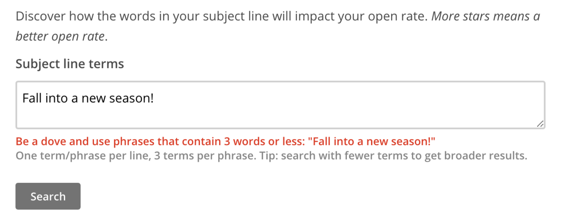
As seen in the image above, you cannot send an email without specifying a sender, or use a subject longer than 65 characters and the interface has built in suggestions that help optimize SEO and visibility.
In the example below, there appears to be a user error which is clearly indicated through the copy. The “resolve” button, which usually reads “edit design”, indicates a path of action for correcting the error.
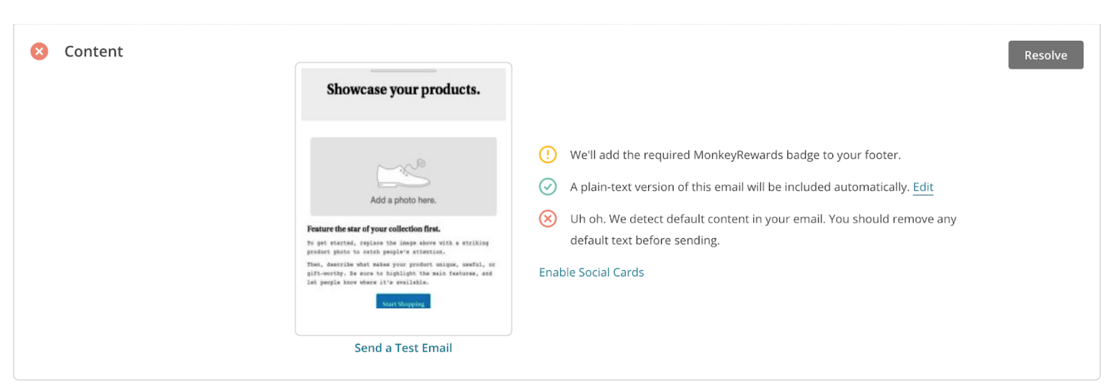
Such constraints guide the user towards creating an optimal product and create a more efficient experience. Instead of repeatedly testing emails a user is able to anticipate the best path of action and complete it before moving on to the next step.
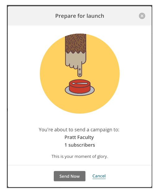
A notable Feedback feature is the “Send Mail” option which taps into the user’s emotional component. These Newsletters are often sent to large volumes of recipients and the interface correctly gauges the emotional response to such a moment. It bridges the gulfs of evaluation and execution very well by representing both functional information as well as conversational language catered to the state of mind of the user.
This particular interaction, executed through a gif, is particularly engaging and captures a behavioural level of design- it provides the user with a moment of anticipation and the feeling of success upon completing the task at hand.
Perceiving the state of the world/ Interpreting the state of the world/ Evaluating the outcome
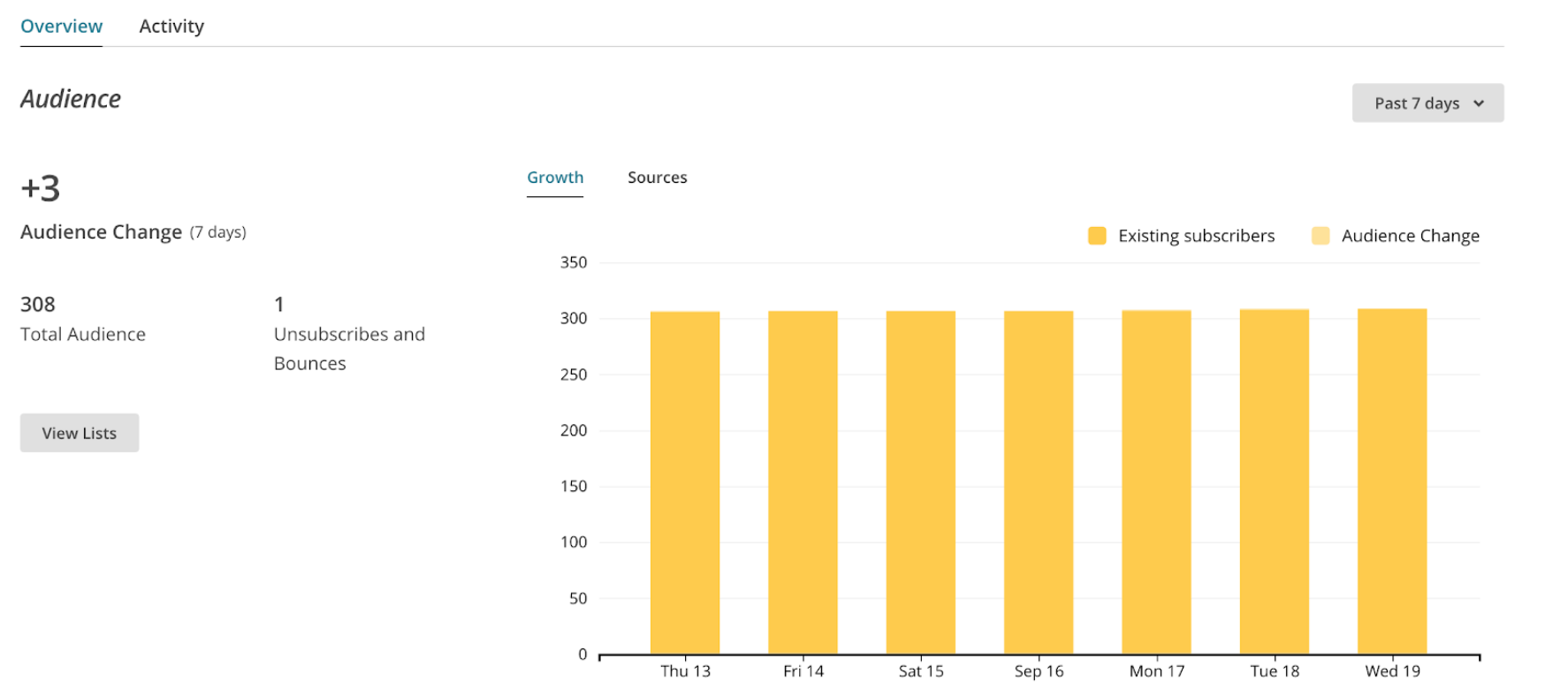
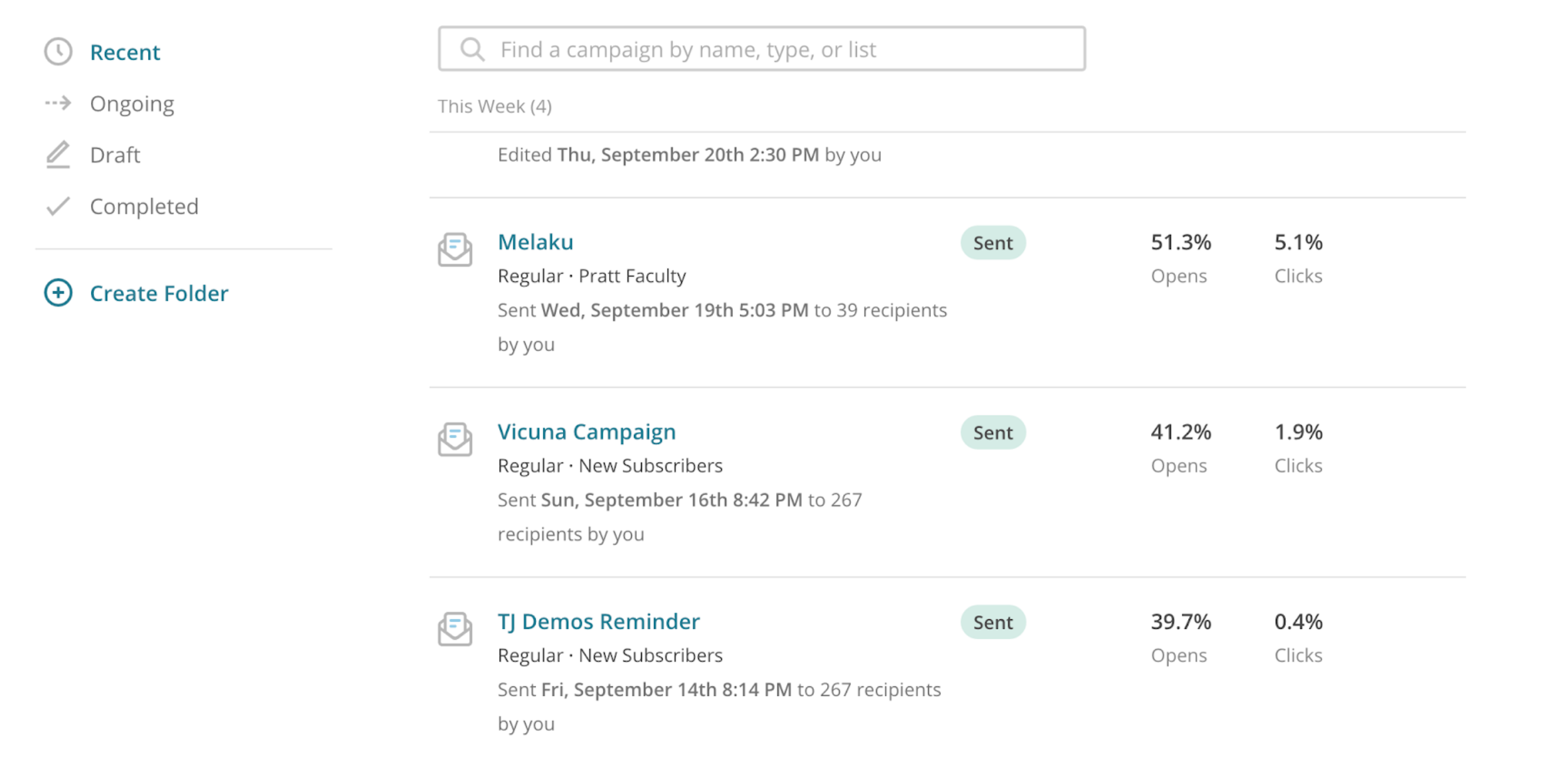
Returning users are immediately shown the analytics of past newsletters on the homepage.
In this way the interface anticipates the needs of the user, and allows for a seamless design cycle by then giving the users cues upon which they may return to the stage of forming a goal and intention.