About the project
UX-Women was tasked with optimizing the mobile experience for www.nypl.org to accommodate the growing desire for a robust mobile access. Based on our stakeholder interview, we interpreted mobile optimization to include a more seamless experience from desktop to mobile, and from physical libraries to the web.
Over the course of 12 weeks, we followed a process of design, plan and frame, create, and evolve. The stakeholder interview insights became guiding principles for the team informing each aspect of the process. I had two touchstones:
- UX design is “the practice of creating engaging efficient user experiences.” Jesse James Garret
- Information architecture is “helping people find and manage information more successfully.” Rosenfeld, Morville
Challenges
The Library is a venerated institution with a worldwide reputation for research and discovery and optimizing the mobile experience revealed the Library as a community center, research place, online resource, exhibition space, tourist destination, literacy center, place to cool off (or get warm) or collect one’s thoughts in peace. We ultimately targeted top level navigation.
My role
I was the chief copywriter and shared the creative strategist role with another UX-Women teammate. My strengths and my areas of interest throughout the project lay with information architecture and user experience. As a non-designer, I enjoyed sketching, especially the fast iterations in class. My mind was focused, generating fresh, inventive ideas fresh. Using Sketch software was a challenge, but I leapt in and discovered it allowed me to present and express my creative ideas vividly. Tools used: Adobe Photoshop, Google Drive, Invision, Keynote, Optimal Workshop, Sketch
Discover: Empathize with Users
The qualitative research, including the stakeholder interview, formed the foundation of our understanding of the NYPL user. The interview protocol we developed worked well for all of us and yielded useful insights:
- Desire for personalized navigation
- Avoid conventional navigation.
- Social media-like parsing might motivate users to try conventional navigation.
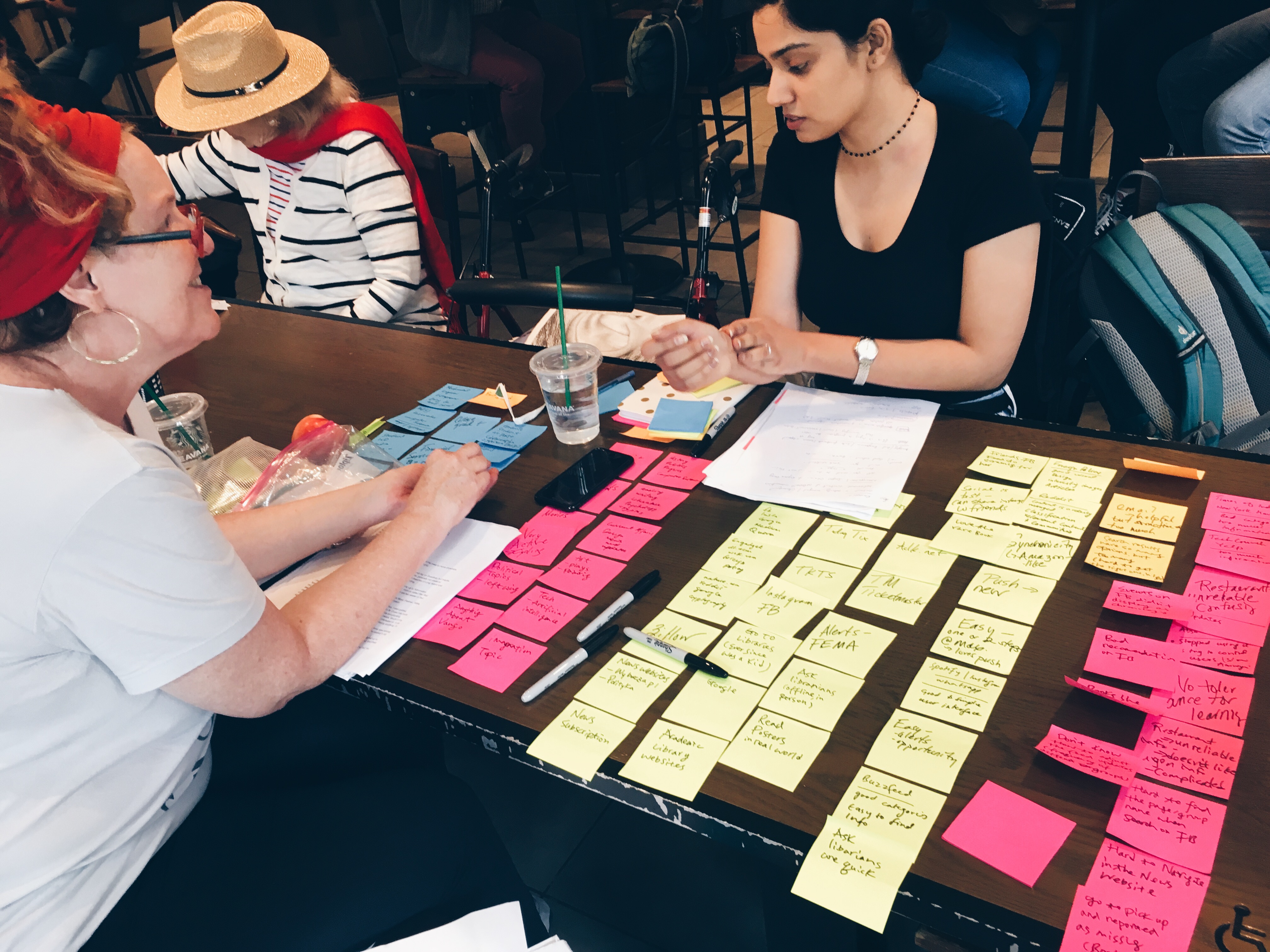
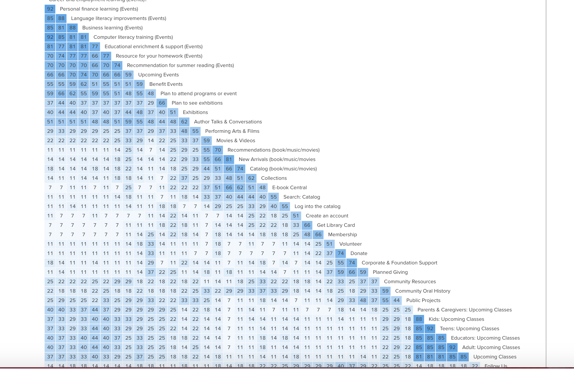
 The affinity mapping (sorting qualitative research) and card sorting illuminated the challenges users (as well as library staffers) experience in attempting to sort and access library tools, resources and services. Specifically, the card sorting revealed the depth of the redundancies in naming conventions and categorization.
Plan and Frame: A new information architecture
With research firmly in hand, we began brainstorming. We plotted four-stage user journeys: discovery, exploration, selection and action. The journeys and the questions we posed of our users informed our initial plans and sketches. The sketching process was brisk and exciting, allowing us to quickly express ideas regardless of actual functionality. Limited technical skills fueled my ability to ideate. More time with the user journeys may have resulted in more emotionally connected IA.
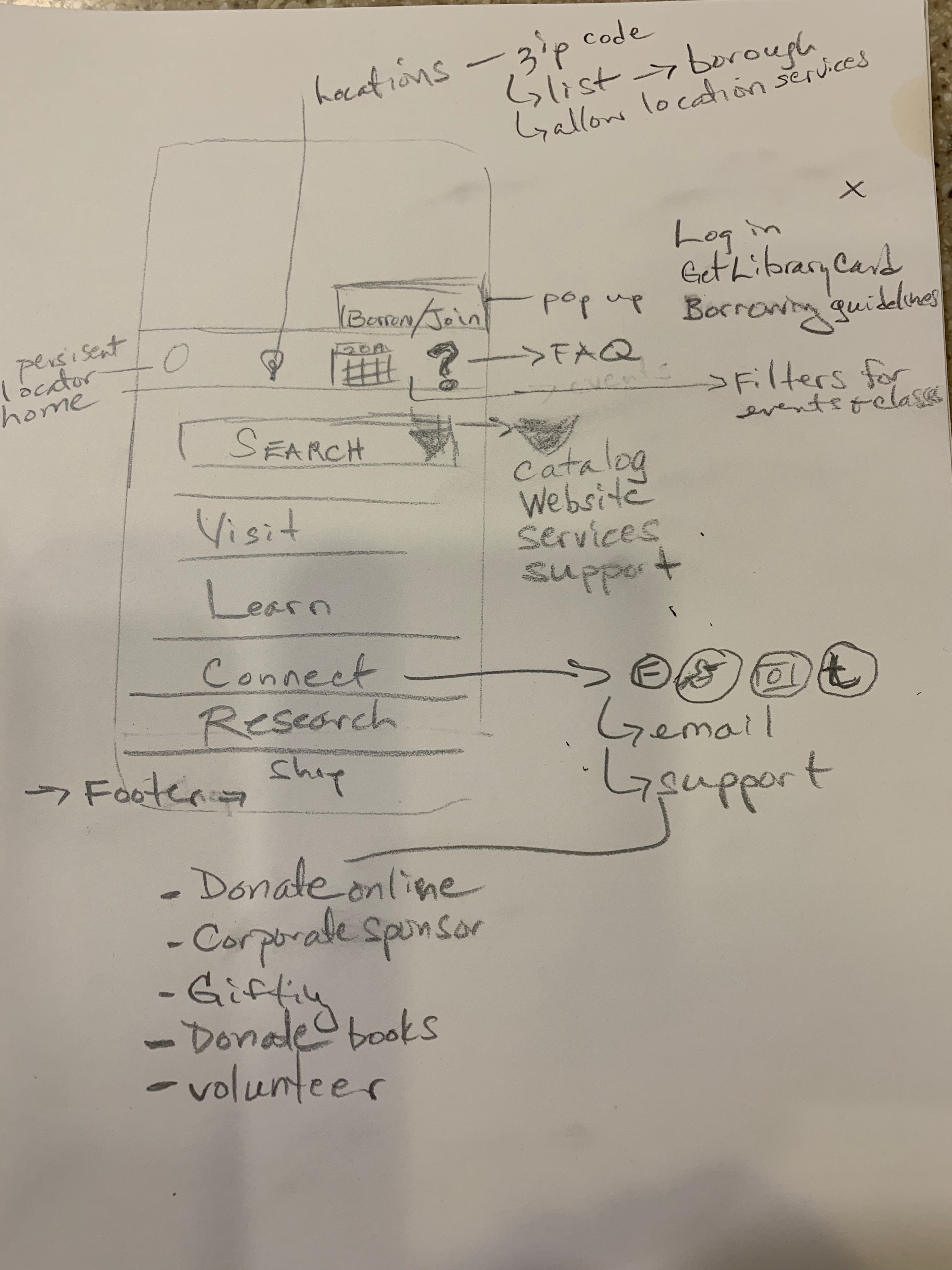
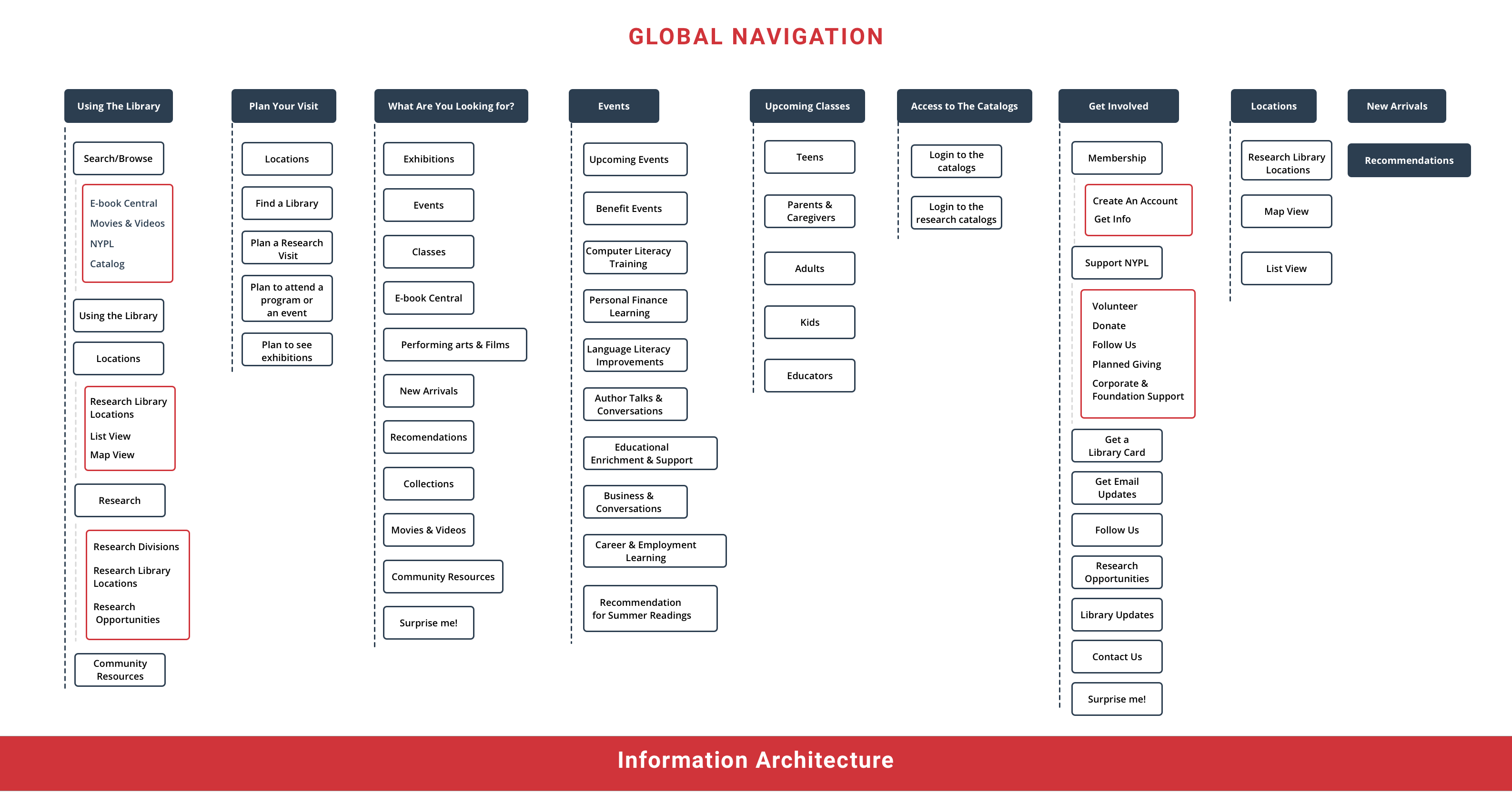
Proposed site map
The site map challenged us to make decisions. We reacted to our card sorting results. This was the right thing to do, but the speed of the process caused us to lose track of an important finding: some users created action-oriented categories. With feedback from the stakeholder we revised and simplified the site map.
Competitive review
Looking at how other libraries and institutions handle information architecture and experience design proved useful. In other contexts, competitive research was much earlier in the process. This was better. It would have stymied creativity and made it too easy to resort to copying ideas that appear successful.
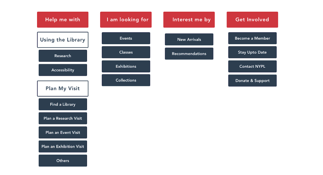
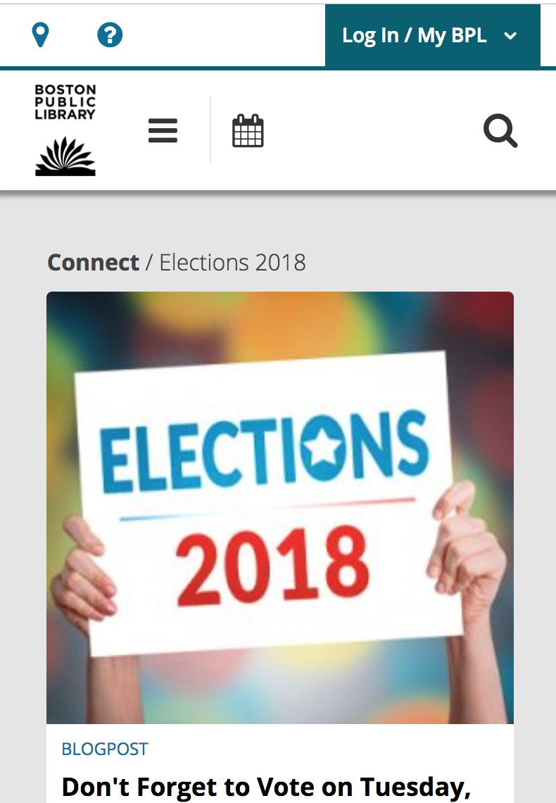
We saw much that we liked, including the task-oriented navigation at Boston Public Library. We ultimately included that in our prototype. It tested well, and was consistent with users’ desire for non-hierarchical navigation.
Design and Evolve
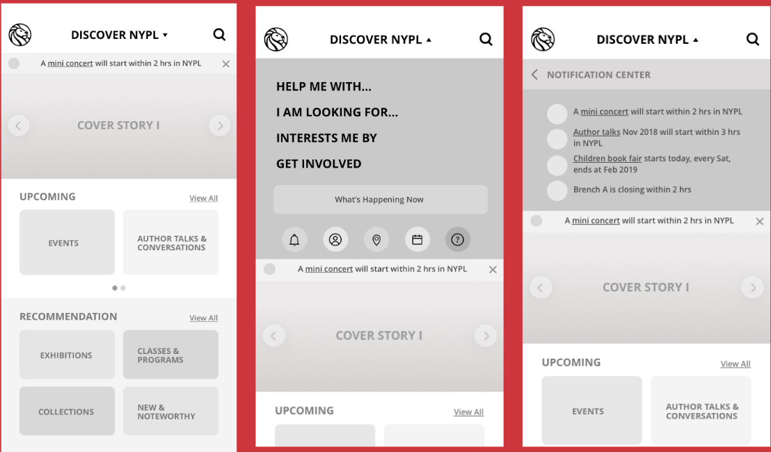
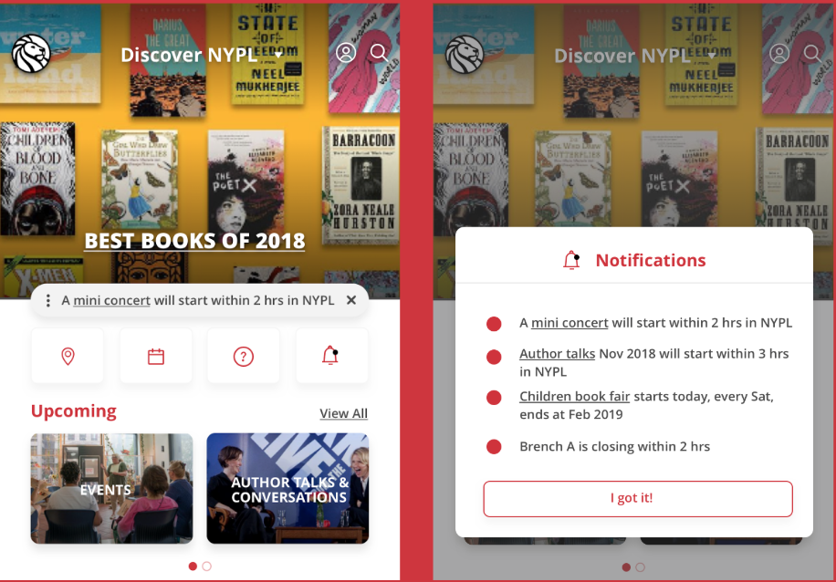
We moved rapidly from sketches to wireframes to prototype. It included the task-based navigation, strong labeling that encouraged exploration along with an animated calendar of events. Users reported universal dissatisfaction with the labeling, finding it redundant and ambiguous. They liked the task-oriented navigation, but wanted it located at the surface. Most reported that the animated “What’s Happening” was fun, but wanted it to move slower.
User-centered design delivered
We incorporated the feedback, creating simpler and fewer labels.
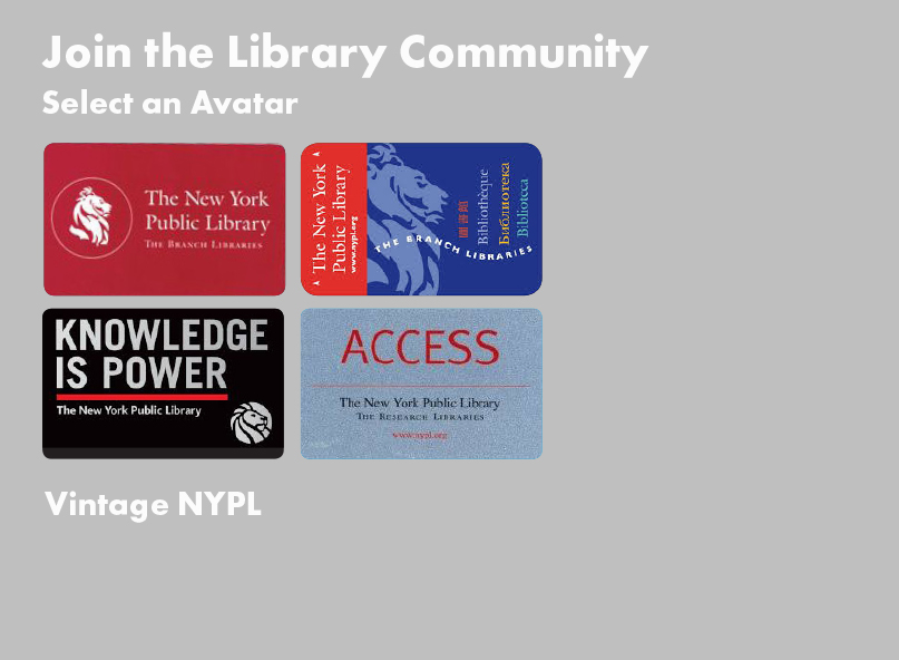
As we drew toward the end of the process, I became more adept and confident in my ideas and how they fit into IA/XD. For example, our qualitative research uncovered a desire for a social component and connection. I developed an avatar idea that would ultimately promote the acquisition of library cards, but also promote the idea of being a part of something big.
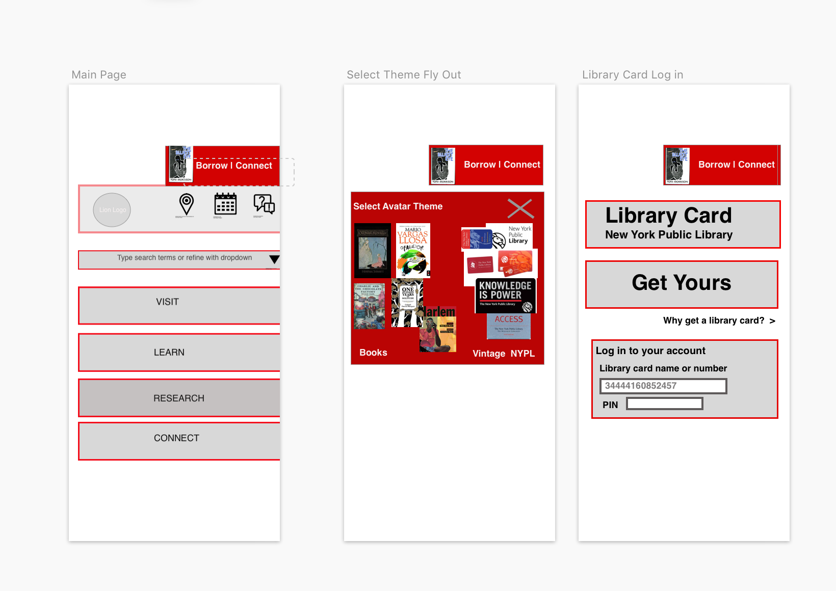
The flow was not fully developed, but after a few tries I created an idea that will work. And that was satisfying for me. It was at the end, but the idea came out of an accumulated understanding of what we had been doing.