With the Apple Books app, you can carry thousands of pages in the palm of your hand. No matter where you are, Apple Books allows you to pick up reading right where you left off. With just the tap of your finger, you can define, highlight, annotate, and share text as you please.
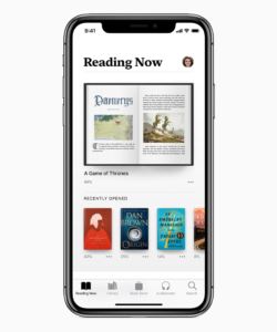
Apple Books provides five main controls to encourage discoverability from the home page.(a) These controls are mapped along the bottom of the screen for easy access with the thumb. Each one signifies an explicit action, such as “reading now” or “search.” Understandability of each control is enhanced by the accompanying icons. The open book icon, for instance, signifies what you are “reading now,” whereas the stack of books icon represents the collection inside your “library.”
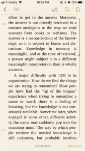
Although discoverability succeeds on the home screen, it falls short on the landing page. Apple Books always opens up on the last page read. Here, all possible actions are removed from view.(b) The five controls on the home page are not only gone, but also hard to find hidden behind an arrow.(c) The arrow is an ambiguous signifier. It can reveal a side-menu, turn back a page, or even undo an action. It is more understandable to use a house icon to signal the home page.
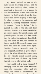
Despite the ambiguous signifier, the Gulf of Evaluation is bridged through the proper use of feedforward and feedback on the app. Feedforward signifiers help outline your next actions. When you highlight a word, for instance, you are presented with a series of explicit options, such as “copy,” “look up,” “highlight,” and “note.”(d) Feedback on the app is equally successful. When you tap “highlight,” the text is instantly overlaid with color.(e)
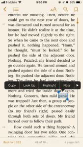
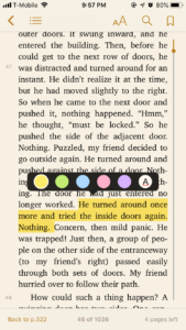
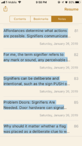
Apple Books also makes use of natural mappings and spatial analogies to make reading on your iPhone easy. An iPhone touch screen naturally affords swiping and tapping. To move the text up, you simply swipe up. You can also choose to swipe left to flip a page, mimicking the spatial analogies of a physical book. Nonetheless, certain actions are limited by the natural constraints of your iPhone – specifically its screen size. You cannot flip through pages on a phone like pages in a physical book. The main reason it is difficult to filter through your notes in Apple Books is because they all look exactly the same. Even though each note holds a unique message, they are all signaled by the same icon, a small box.(f) Moreover, all of the notes on the notes page are stacked arbitrarily without categorization.(g) Apple Books should differentiate each note by mapping them according to their chapters. This meaningful structure can help readers recall and locate notes seamlessly on their phones.

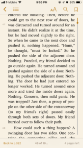
Unfortunately, it can be just as easy to lose your page as it is to lose track of your notes on Apple Books. A bookmark is both a deliberate and accidental signifier, in that it deliberately marks your place in the book and indeliberately indicates how much of the book remains. At the bottom of the screen, Apple Books provides your location within the book, and how many pages are left in the chapter.(h) This feedback is immediate and informative. But what happens when you accidentally scroll off? It can be hard to find your way back. Apple Books does not account for this common memory lapse among users. The most powerful tool to minimize the impact of errors is the Undo command. In case of a misstep, a “go back” option should appear at the bottom of the screen to help you trace your way back.
