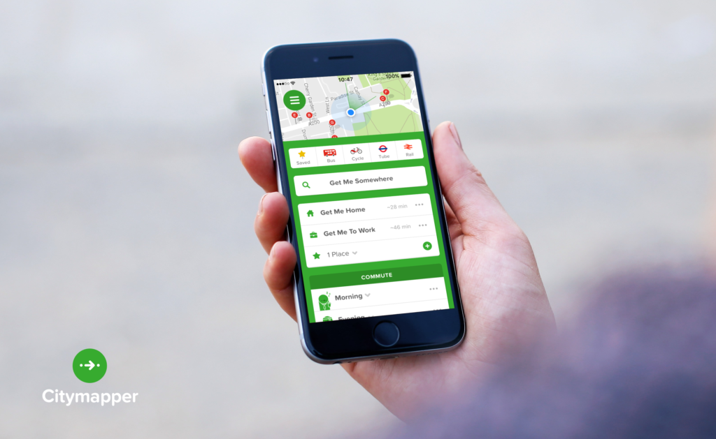
Citymapper for iPhone is a transportation app that finds the best possible routes between locations. It also provides transport maps and updates for your city. Given the scope of the app’s functionality, I will limit my critique to the home screen, based on a few of the principles found in Don Norman’s “Design of Everyday Things”.
Critique
One of the first principles Norman introduces is Discoverability: when a user can “determine what actions are possible and the current state of the device.” Already, some of the first visual elements we see on the homepage satisfy this principle:
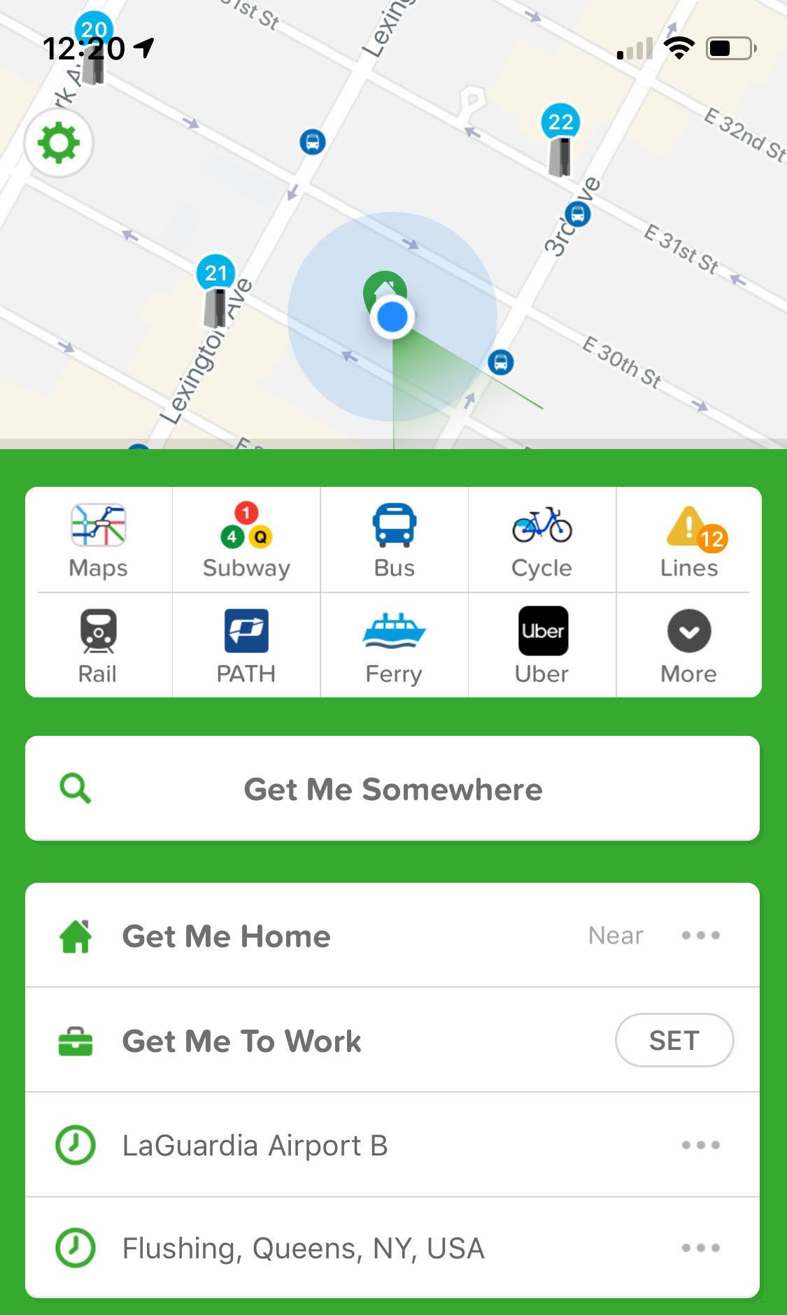
We can see from the picture above that the screen contains several buttons, each one indicating different possible actions with the interface. The discoverability of these interactions is supported by having buttons that look like buttons, that also contain visual clues to their purpose. In the example below the button includes visual clues that (correctly) imply you will find bus-related transport information there:

These clues are examples of Signifiers because they “ensure discoverability.” In other words, they indicate how or where the user needs to interact with the product to ensure a specific action happens (in this case, signifying where to touch the screen to find bus information). While signifiers are a large part of the success of the interface, they also rely heavily on knowledge in the head. For example, a user is expected to be familiar with the “PATH” train logo and where it goes if they are to understand the action associated with the button below because neither the name nor logo provide any indication that it relates to New Jersey. This may be especially frustrating for tourists or new residents:

A way around this would be to transfer some of the expected knowledge in the head into knowledge in the world (present in the app), such as including “New Jersey” or “NJ” in the button, like in the mock-up below:

One of my favorite DOET principles is Feedback – when there is “full and continuous information about the results of actions […]. After an action has been executed, it is easy to determine the new state.” All the buttons on the home screen provide excellent feedback by taking the user to a visually different place once the action is complete. For example, by selecting “Lines”, I am taken to a new page, in a new color, entitled “Lines,” where it is clear that this new state is a direct result of having clicked on that first button:
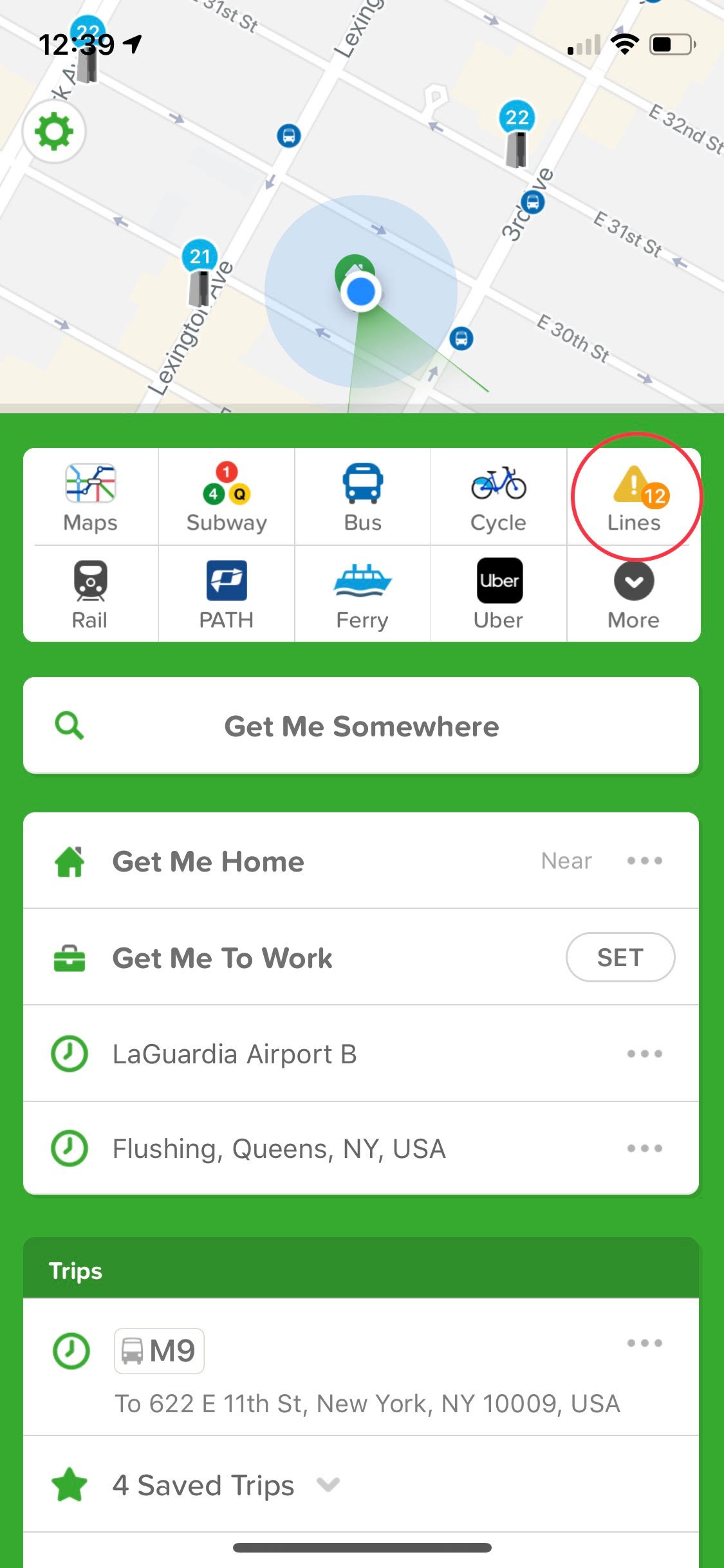
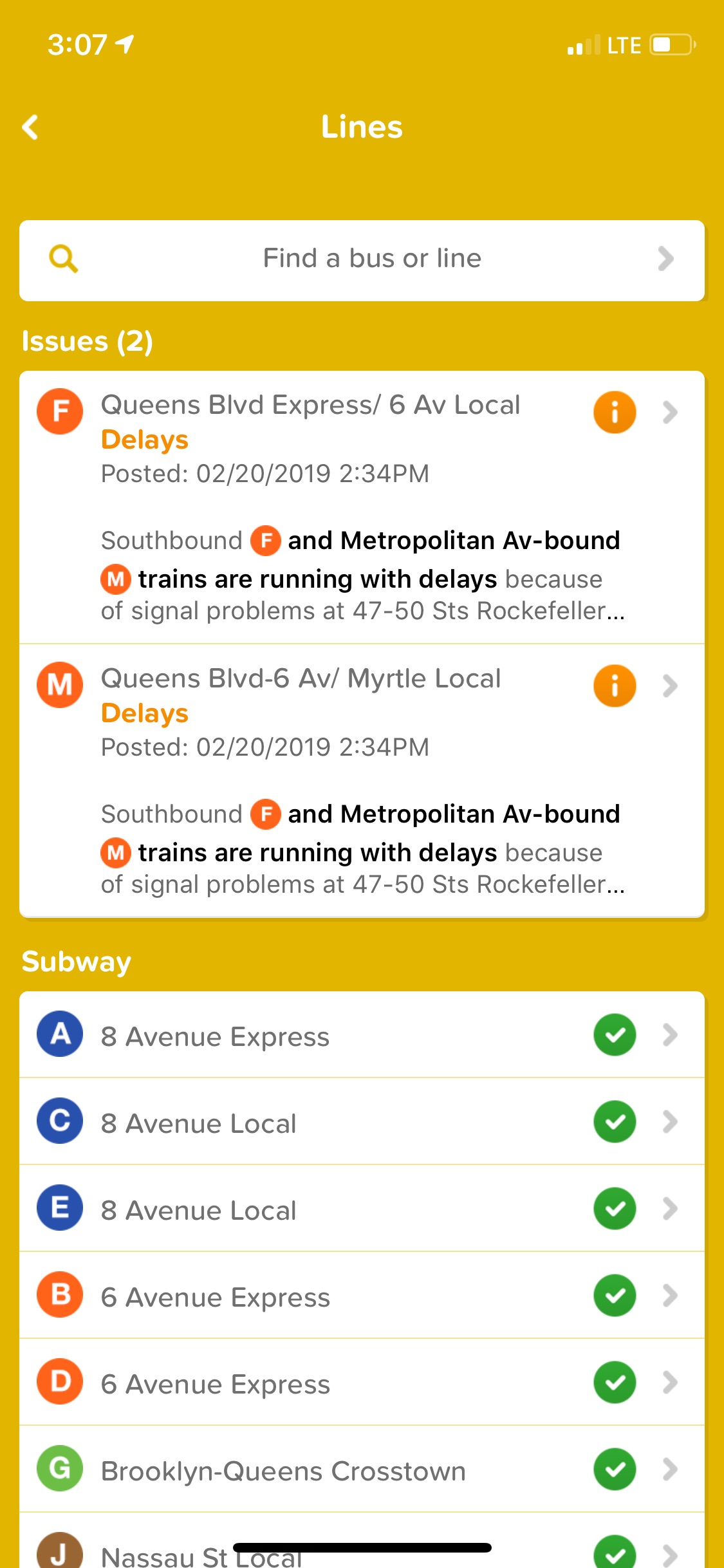
By ensuring users are taken to visually different places after taking action, the app indicates progression to a new state. This use of feedback fills the gap between the Gulf of Execution and the Gulf of Evaluation, by providing users with a result they can perceive, interpret and then compare to their original goal.
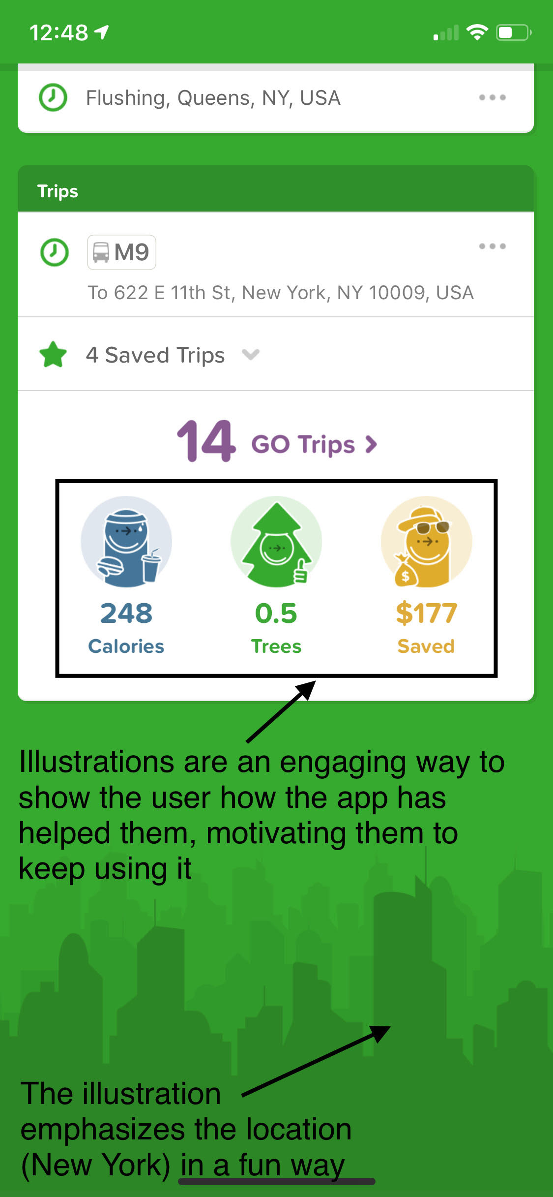
Another concept Norman discusses are the three levels of perception used to process human cognition and emotion. The Citymapper app is an excellent example of successful visceral level processing: it uses engaging aesthetics to drive a positive emotional response, by immediately making the app look and feel friendly and helpful. This response is largely driven by a combination of illustrations and colors that allude to the city you are in and to positively reinforce things the app has helped you do (in this case, save calories, trees, and money):
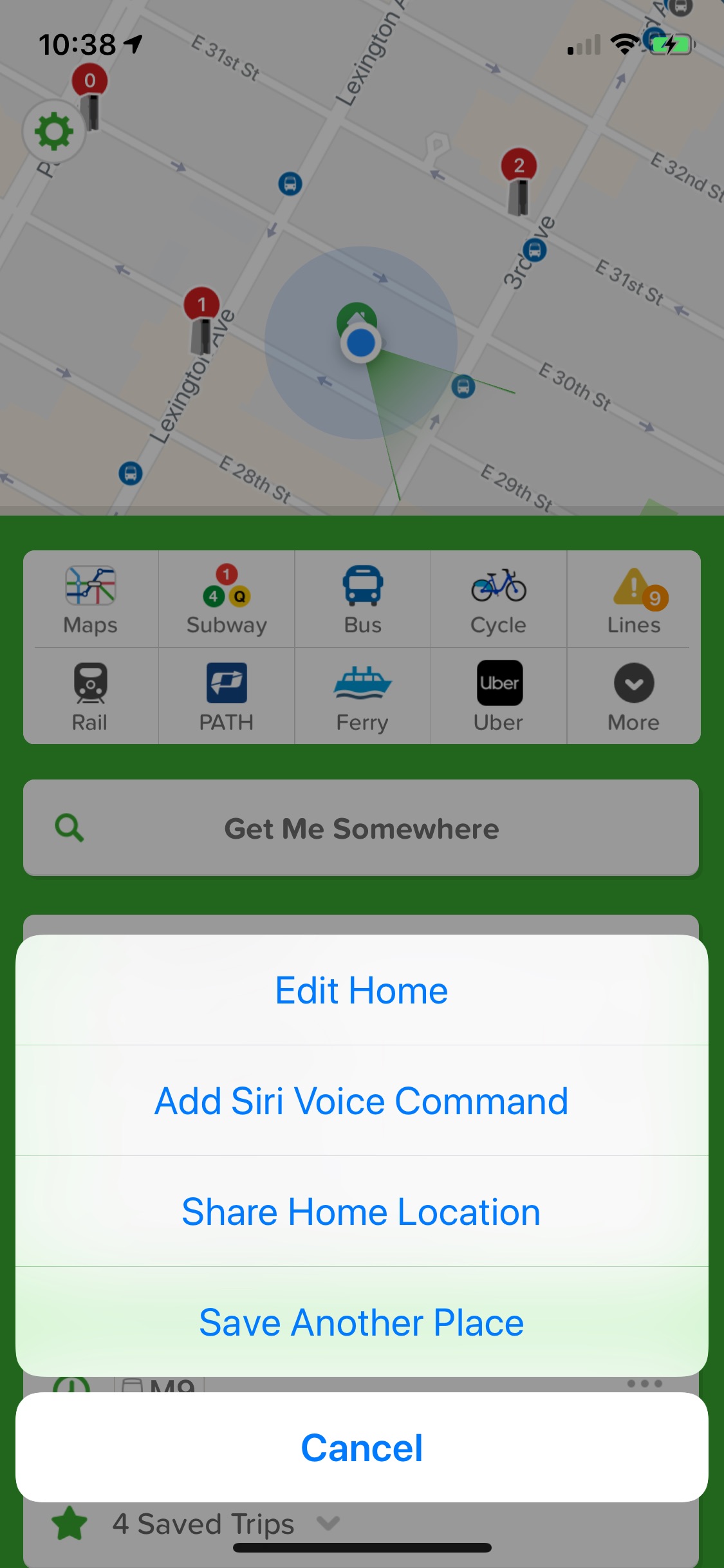
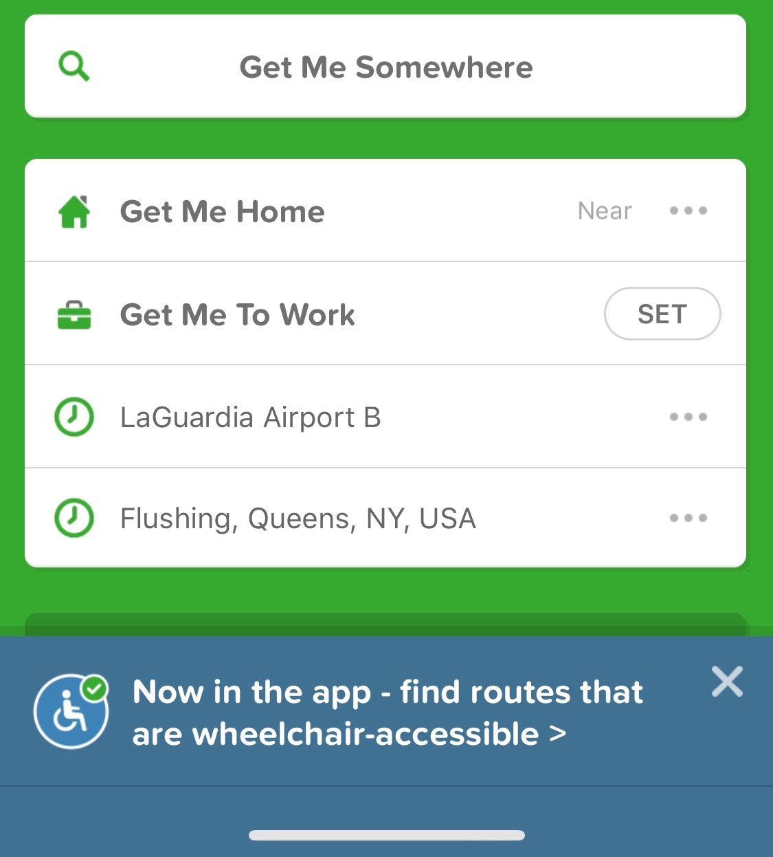
However, a positive emotional response to the app’s aesthetic appeal is only one of the visceral reactions I have had. Another, more negative response, is that I usually feel the app’s home screen is too cluttered when I open it. In an attempt to de-clutter my interface, I tried to delete the “Get Me To Work” button which I never use. Unfortunately, Constraints come into play here, as the only possible action for a first-time interaction with the button is actually to set a location:
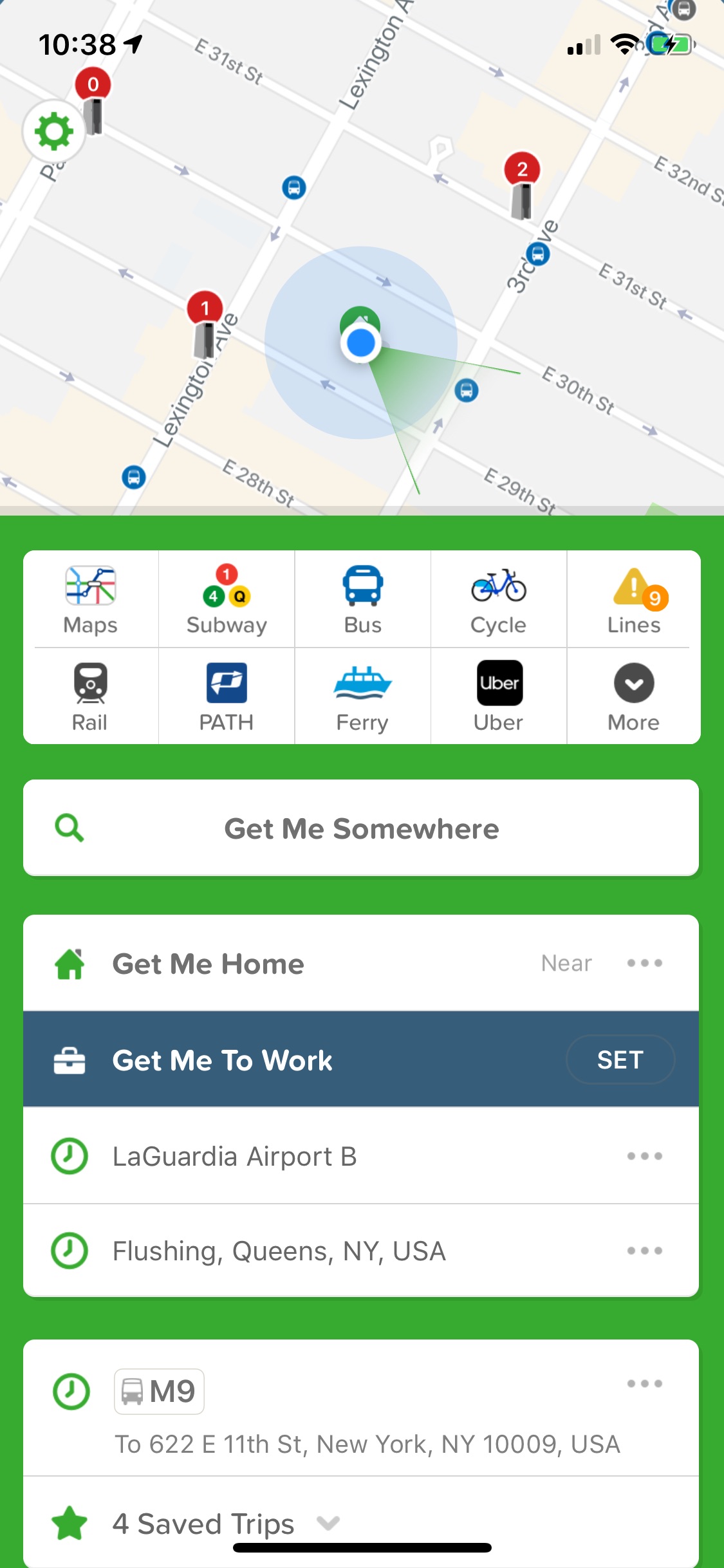
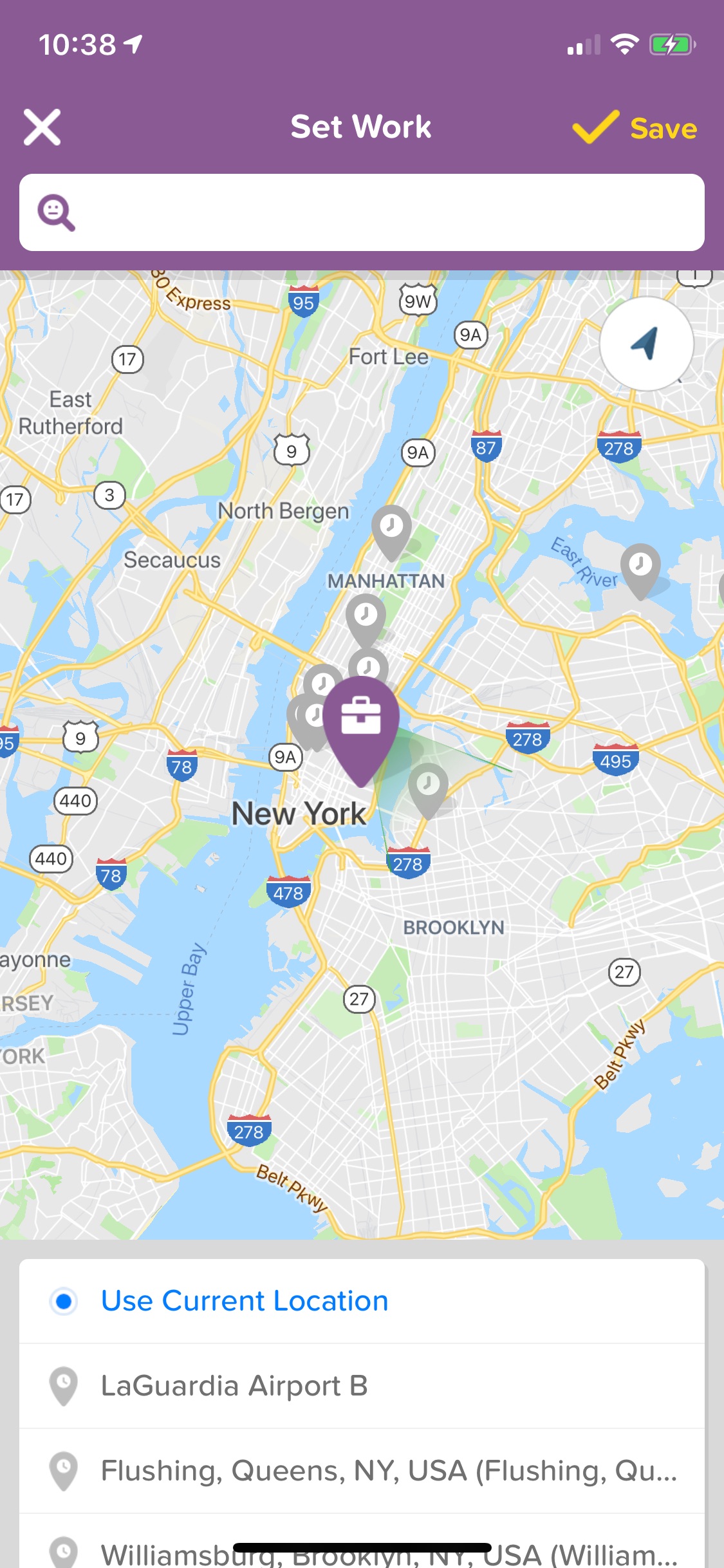
Not only am I not able to immediately delete the button, but I am also not able to delete it even after I have set a location, which I was able to test with the “Get Me Home” button, which I often use (none of the menu options allow for deletion):
The solution here might be to remove first-time interaction constraints and allow access to the full options menu on a user’s first try. Additionally, the options menu should be modified to include a “Delete” button. This would allow users to tailor the interface to match their preferences and usage, as well as contribute to a less cluttered interface and consequently, a more positive visceral response.
Conclusion
I have been using Citymapper for several years despite serious competition from similar apps, which is evidence of how user-friendly and effective I find it as a travel tool. This is also a good example of positive reflective level processing, as my memories of using the app are good and inform my decision to continue using it on a daily basis.
Bonus points ⭐
While writing this critique a notification for a new wheelchair accessibility feature popped up – it’s so encouraging to see inclusivity increasingly becoming part of mainstream design and it made me like the app even more:
References
Norman, D. (2013). The design of everyday things. New York: Basic Books.