
Perusing Depop: A peer-to-peer global marketplace for second-hand shopping
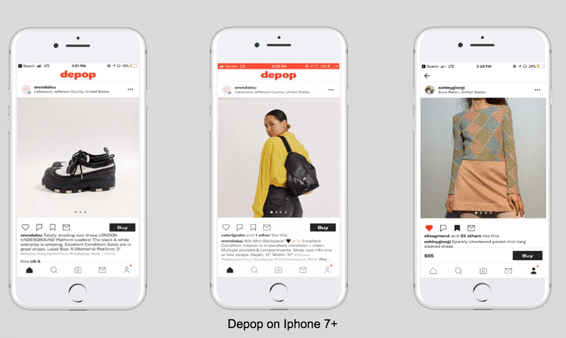
The UK-based Depop is a peer-to-peer iOS and Android application for the purpose of selling, browsing, and buying second-hand items from around the world. This critique follows a Depop user looking to browse items on their iPhone 7+. The 8-year-old app uses Instagram as a standard, or model, which boosts and limits the app’s usability.
Logging in on Depop
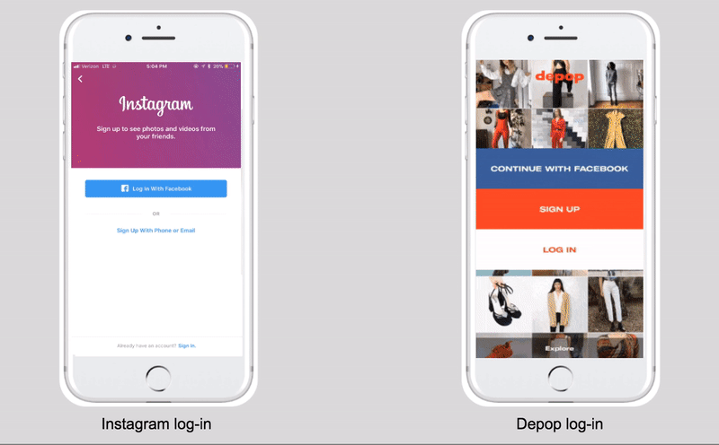
Depop’s initial encounter with the user, the log-in page, uses Instagam’s grid-structure to signify scrolling. The scroll feature uses mapping to engage users as they move their fingers down a page to view more items, or back up to return to previously viewed items. Mirroring Instagram enables such feedforward behavior. Yet, Depop’s log-in affords users more liberty than Instagam’s static design, allowing exploration of the application prior to sign-up, by hitting the aptly named explore button.
Depop product view
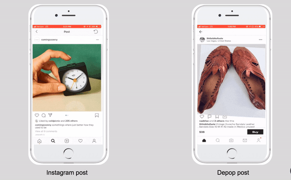
From the log-in page, it is clear Depop applies the ubiquitous design of Instagram as a standard, harnessing the user’s knowledge in the brain to create a pleasant, familiar experience. However, modeling after one of the most famous applications isn’t all smooth sailing. Detouring into independent design can confuse and frustrate users. When first looking at an individual product post on Depop, my visceral reaction is “something is not right.” My lizard brain longs for the cleanliness of Instagram’s spacing and less of the kerning headache of Depop’s typography and clutter of icons. Depop does succeed with using Instagram’s favorite signifiers, like the circles that encourage swiping a carousel of images. Depop even takes the image view a step further than it’s role model by applying a form of mapping. Once an image is dragged to a zoomed-in view, users can rotate the pop-up graphic in different directions by moving their fingers. When buying a product, especially one loved by a previous owner, zooming-in on details is essential to the e-commerce experience.
Liking items on Depop
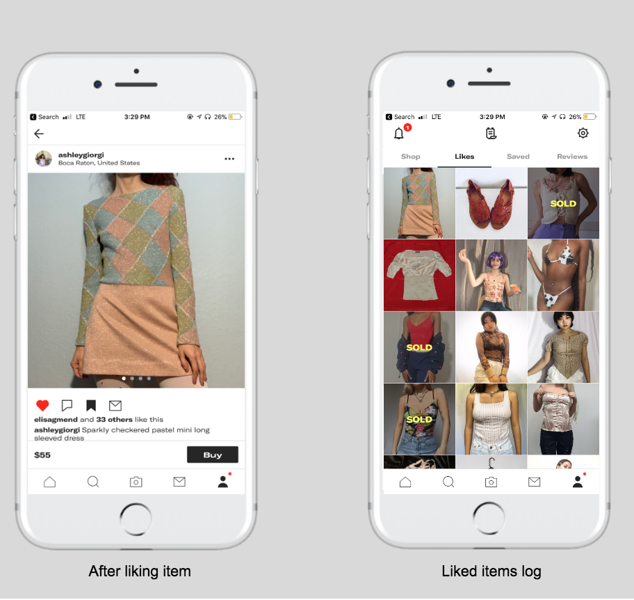
Depop’s design easily encourages users to fall in love with products, but can confuse those who want to save an item to admire later, and not immediately put it in their cart for check-out. As on Instagram, Depop users have the option to like or favorite a post by double-tapping or clicking on the heart icon underneath the image. Users understand they liked the post as the heart fills red, a form of feedback. What isn’t clear, however, is that Depop, unlike Instagram, holds an accessible record of the items liked in the profile section. Instagram also keeps an account of posts users save, but these posts are collected by pushing the bookmark icon, not by the act of liking.
Saving items on Depop
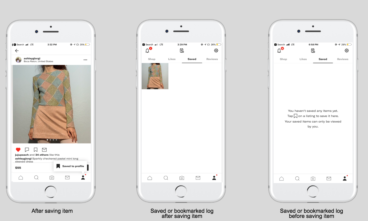
It seems smart for Depop to morph Instagram’s like and save feature together for e-commerce window browsing. However, the design has a flaw — Depop has a save feature, too. Once you tap the bookmark icon on a Depop product page, a pop-up directs you to visit the saved item in a log within the profile section, right next to the likes log. The pop-up, however, doesn’t indicate a difference between the likes and saved pages. The only way to learn that saved items are private, and liked items are public, is to visit the saved page without having bookmarked an item. This is problematic as most of users will visit the page for the first time after being directed by the pop-up that appears only after they’ve bookmarked an item.
Solving for visibility
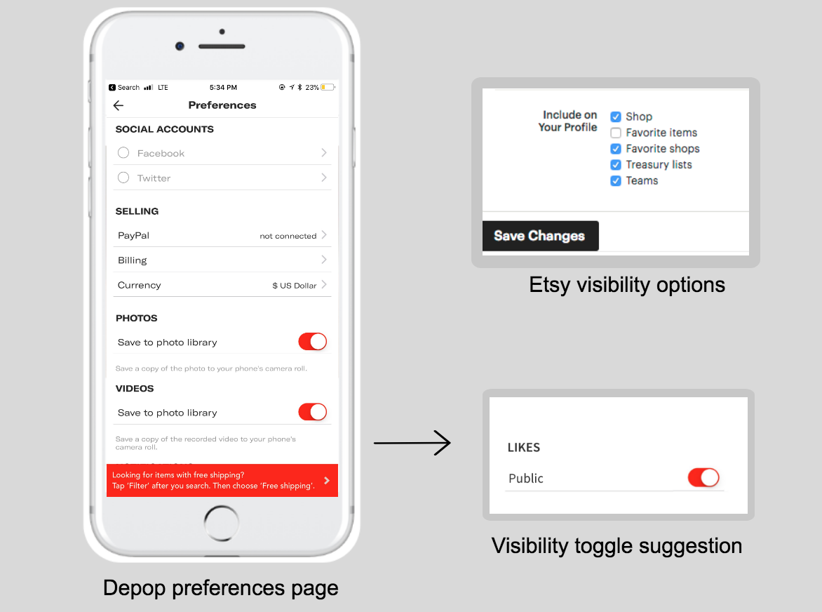
Having visibility options is a great privacy addition, especially for those who don’t want anyone else finding the vintage treasures they’ve spent hours hunting down. To solve for this need and eliminate the likes vs. saves confusion, Depop should apply a feature used by Etsy, another popular e-commerce app for thrifted goods. Etsy’s web browser has the option for users to change their privacy settings by checking off their preferred visibility of their liked items. Depop should enhance the liked items page with the addition of an on/off toggle for public/private view on their preferences page. Therefore, the unnecessary saved items page can be eliminated, which not only lessens confusion but helps declutter to soften the user’s visceral reaction.