Medium is an online publishing platform and regularly regarded as a blog host, where everyone can publish their stories from amateur writers to the professional experts. I have been a regular reader of medium and recently started to write on medium. I realized that writers can have a different experience than readers.
For this design critique, I will be focusing on the user, who is going to write for the first time on Medium. Before creating a new account on Medium, I draw my own conceptual model of the process see if the flow goes according to the expectations and it did. Fig 1.1 is the high-level diagram of the steps that new users follow.

I have divided the experience into two phases:
- Registration & Onboarding
- Publishing a story
Registration & Onboarding

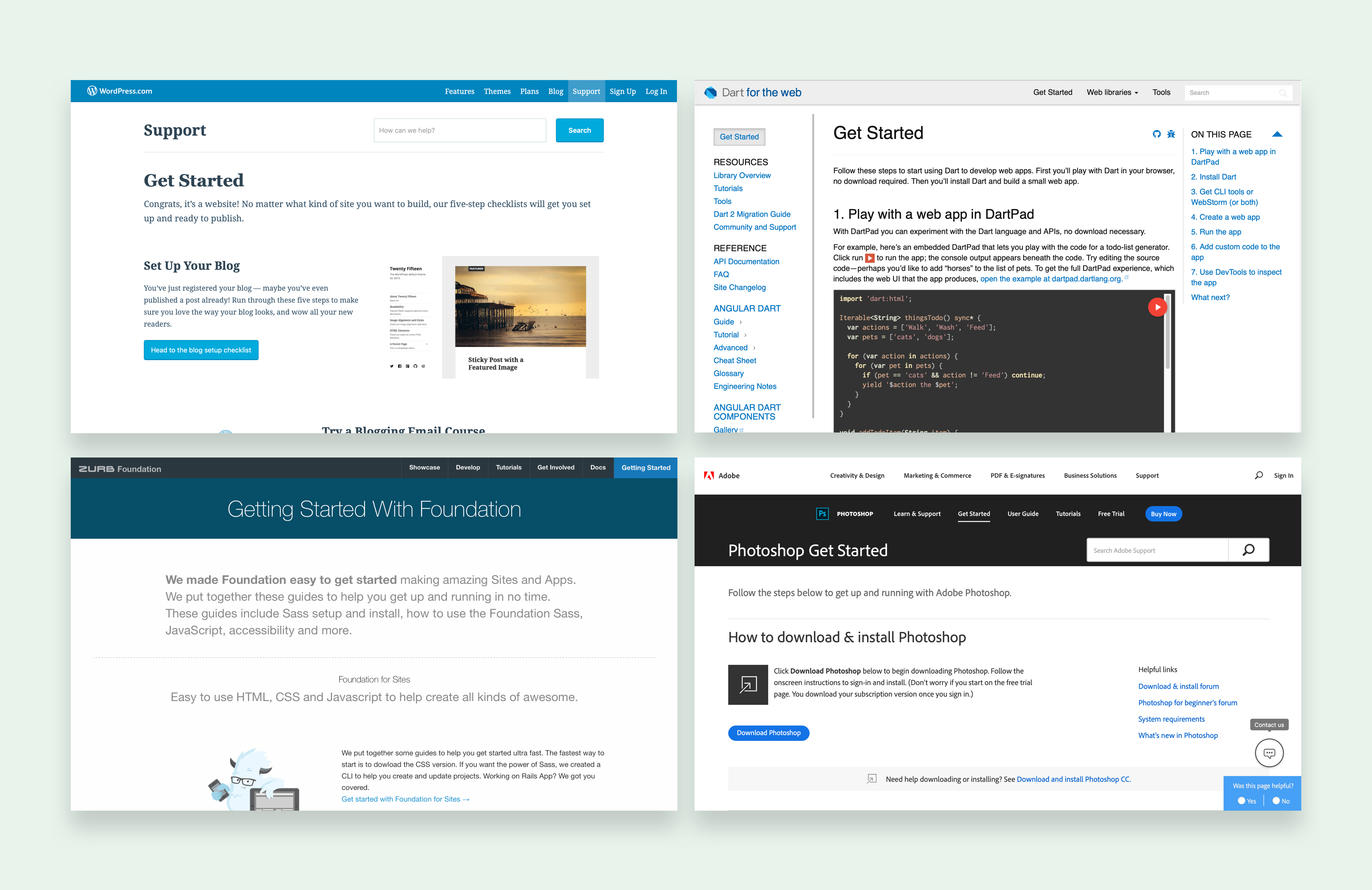
On the home page, four options are available on the top left corner of the website with good discoverability: Search, Become a member, Sign in and Get started. ‘Sign’ in and ‘Get Started’ has the same green color which can help user’s subconscious to determine that both actions are grouped. It is a good use of color to signify a connection. For the first time users, ‘Get started’ has good discoverability but it lacks right mapping and users can confuse it with ‘Become a member’. Most websites/applications use “Get started ” for a tutorial or guide [Fig 1.3 ] Using their knowledge in the head, users can assume it to be a tutorial. This confusion can get serious when the user doesn’t know how Medium’s membership module works.


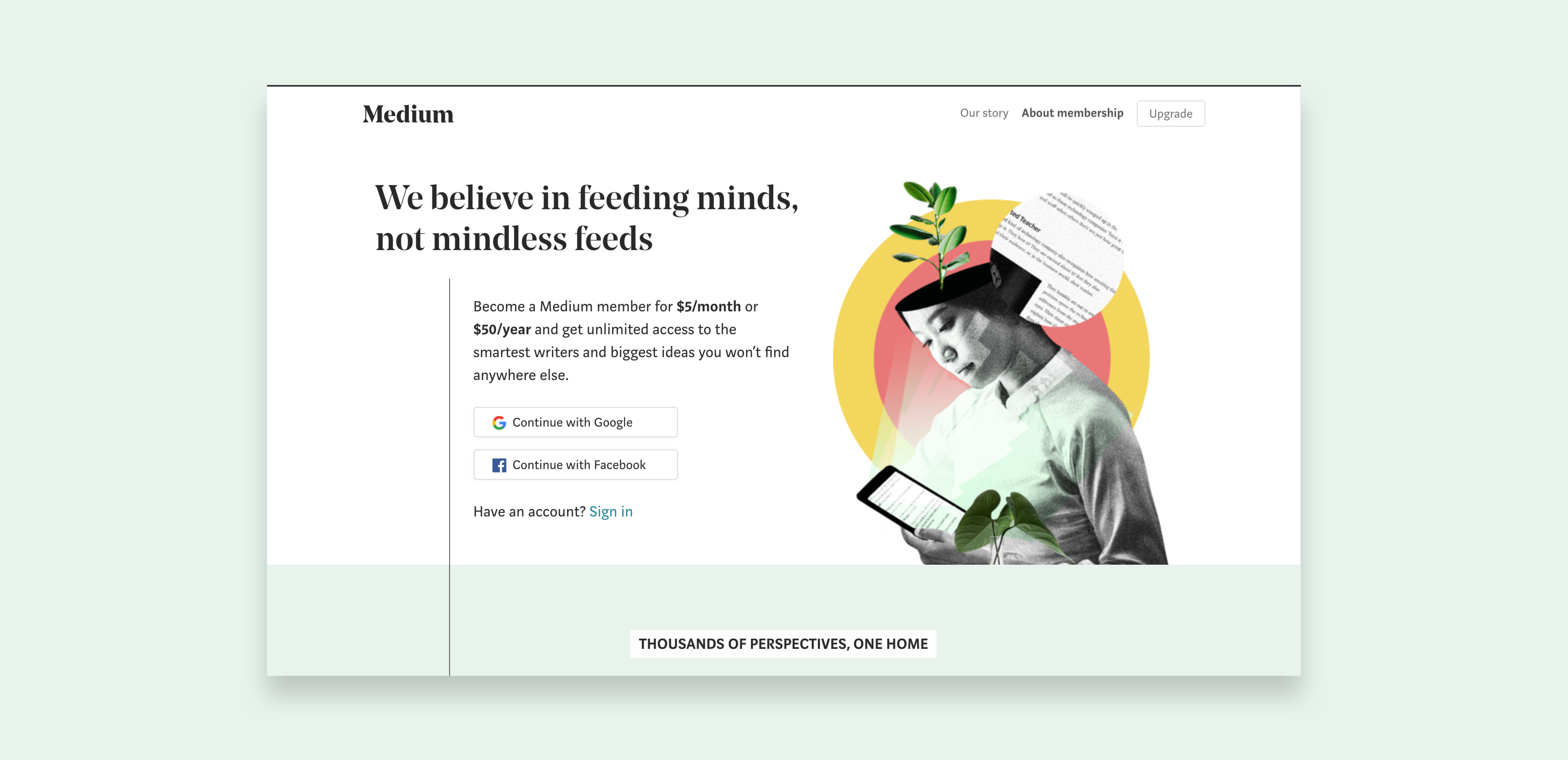
If the user clicks on ‘Become a member’ instead of ‘Get Started’, the only way to register there is by paying 5$. It can make the user leave the registration goal at “Execute an action” stage. If users confuse the two actions, there is no proper feedback to get them back to where they want to be. [fig 1.5]

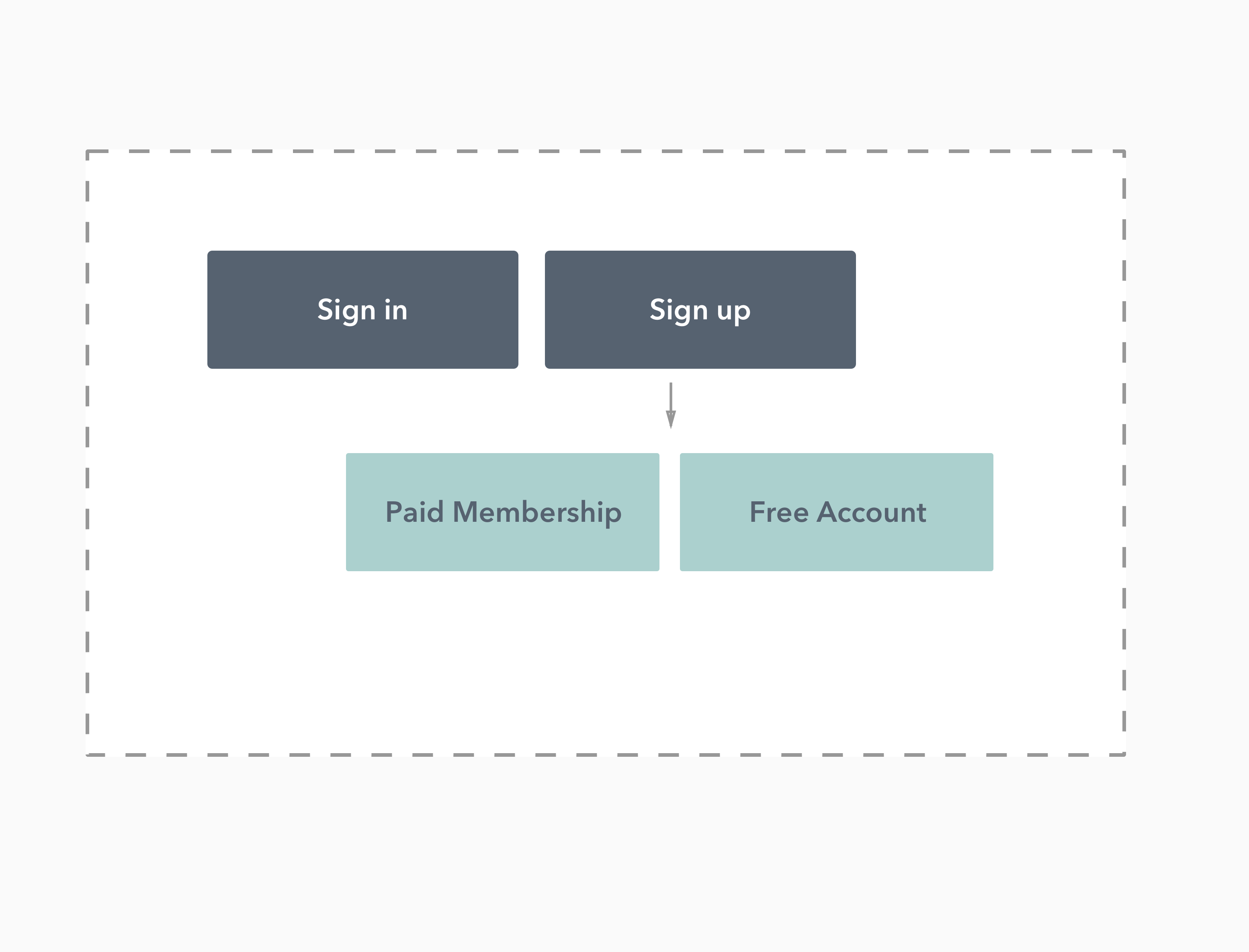
This experience can be improved by using proper signifiers, right mapping, feedbacks and probably by adding some constraints. Users expect registration from any website/app which requires a login. Instead of having three actions, there can be only two, 1- Sign in and 2- Sign up, constraining the user just having two options. When the user clicks on signup, giving feedback about what options are available for the user will improve the understandability. [Fig 1.6]

The user experience from signing up, onboarding to the home page is effortless and guided by the useful signifiers and constraints. Signup screen uses icons of Facebook, and Google to help the user quickly identify the actions however closing the window lack discoverability. A minimalistic welcome message with a button “Dive in”, helps the user in determining their next action.
Medium tailors users’ feeds according to their interest. There is a constraint of adding at least three interests. A signifier on the top of the screen makes this experience seamless.

Publishing a Story
For this section, I will be referring to the screen where the user can write stories as “the editor” [Fig 1.8]. The editor is a very important part of a writer’s experience on the website.


The editor is a significant part of the design. It is not using the top bar with actions which are commonly available in applications like google docs. Without putting pressure on the user’s memory to remember the location of tools, ‘Add button’ follows the cursor. By providing five essential elements needed for the blogs, the design is helping users to focus on the goal of writing a story. Excellent signifiers with correct mapping are used to communicate the elements.
The design follows the same pattern of providing limited options on the fonts. There is one font available with an ability to bold or italic the letters. [Fig 1.10]

Overall the editor is a good example of using constraints and signifiers to take decisions on the behalf of users and letting them focus on the actual goal.
WordPress is a rich tool for bloggers. It gives a lot of control and configuration options to them. On the other hand, Medium provides minimal control, mostly limited to editing tools, and hence puts less pressure on the conscious cognition of the user. This makes the platform easy to understand. I believe this is the main reason why Medium is so popular among writers.


