Nike Run Club is an app built to provide the runner with the community, guidance, and motivation they need to reach their running goals. The clean design and various features make it different from other running apps. By using Nike Run Club app, the runner can track their progress and get real-time feedback, get their run with coaching and workouts. What’s more, they can dig into the details with the record of every fun as well.
✔Strong discoverability and feedback
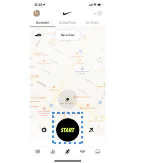
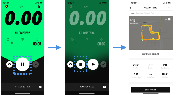
On the Quickstart page, the start button is clear and easy to find which inform the runner to start to record their running. During running, the pause button shows to the runner to stop recording as soon as they stop. This is especially convenient for the runner who wants to stop recording during running, and the big icon can be easy to find and click. By using the principle of feedback, there are three states after running. A stop button was shown to stop recording, running details and share page are here for the runner to review their running information and share their achievements.
✔Clear Signifiers
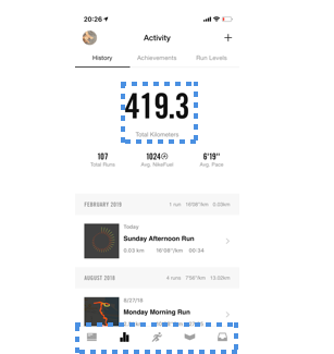
According to Don Norman’s theory, signifier, the Nike Run Club app uses clear labels and visual design to inform runner the different functions on the platform. For table bar, different icons inform runner the different features including Feed, Activity, Run, Club, and Inbox. For the Activity page, runner’s total kilometers is in the middle of the page. Clear and great details of previous running history have displayed in the following section: running date, running speed, and kilometers.
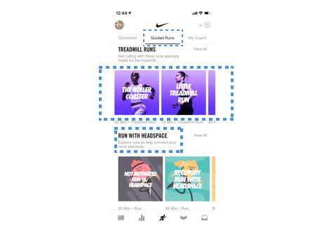
For the Guided Runs page, bold texts refer to the heading of each section. It has the same style images for each section as well. It also displays details including the duration of running time and the type of running.
✔Motivate Conceptual Model
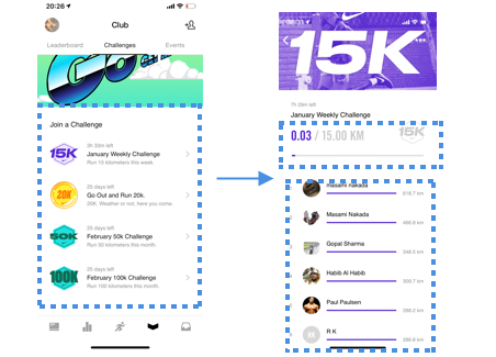
Nike Run Club has a Weekly Challenge page that will help encourage users to stay on their exercise schedule every week. Different Weekly Challenges can help runner “ stay motivated” The conceptual model of Weekly Challenge meets the runner’s needs to motivated themselves by Unlock Reward each week. Runners can join challenge base on their level and see other runners’ running achievement.
× Poor Visibility of Find a Friend Feature
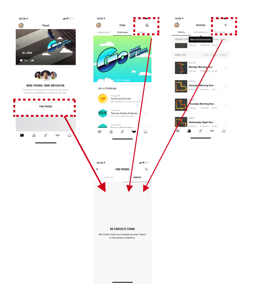
There are three access to the Find a friend page. From Activity page and Club page, on the right of the top bar both of them have access to the Find a friend feature. However, the icons are different which can be very confusing for the user. At the same time, when the user scrolls down on the Feed page there is a button to the Find a friend feature. This leads to the poor discoverability of this feature.
Recommendation
The icon on the top bar should be the same in different pages based on the principle of discoverability.
All in all, the design of Nike Run Club satisfies the design principle: clear
Medium platform satisfies the design principles by Don Norman: Strong discoverability and feedback, clear signifiers, motivate conceptual model. This IOS app is an excellent example of human center design and an effective running app as well.