
The travel guide book publisher Lonely Planet released its compact travel guide mobile application in 2016, packed with offline maps, must-see sights, neighborhood guides, audio phrase books, and top advice from on-the-ground editors of 243 cities (as of Version 1.14.0 updated on Jan. 30. 2019).
The conceptual model of Guide by Lonely Planet comes from the original printed Lonely Planet City Guidebooks. Hence the mobile app version is designed to be an interactive travel guide with similar design and functions.
Homepage
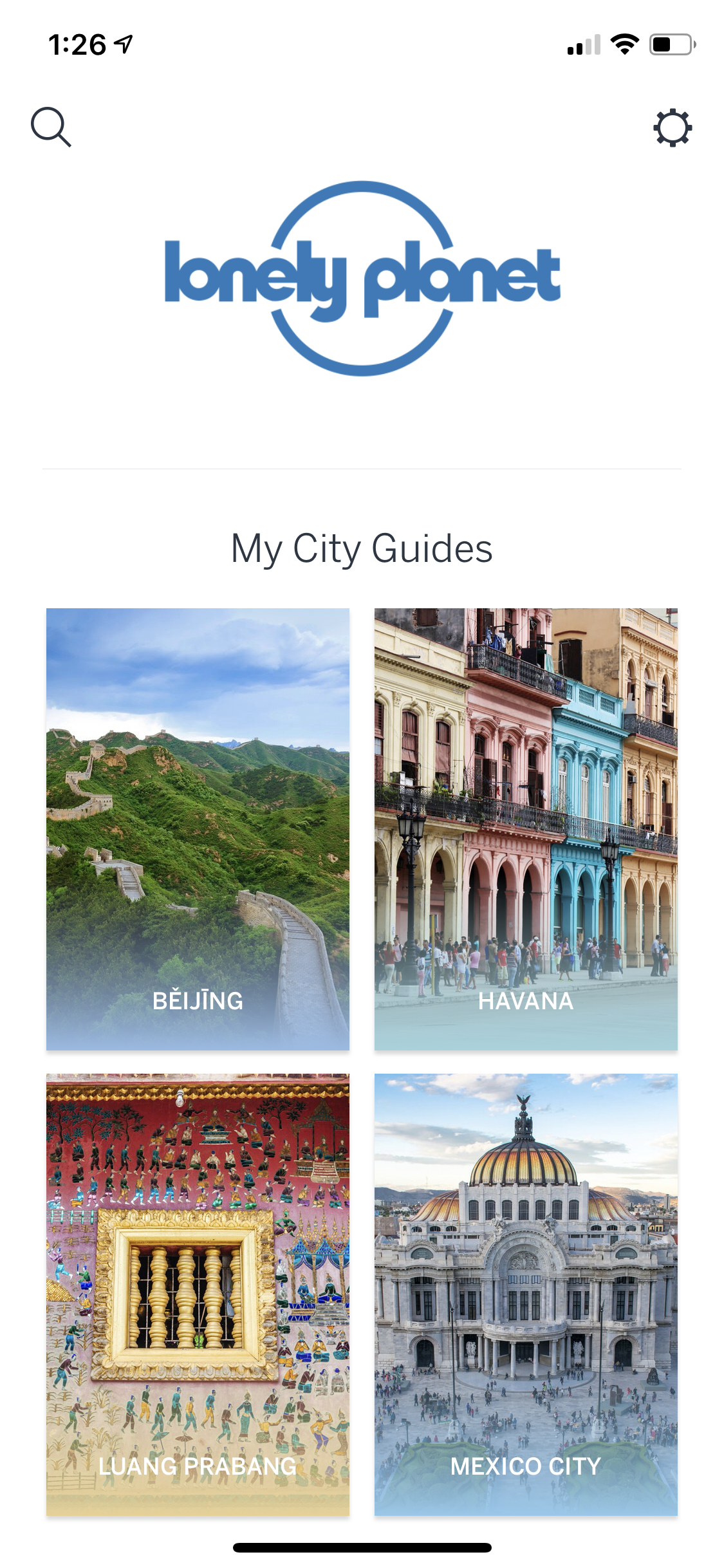

There are three sections on the homepage: [the top bar] with search and settings button, [my city guides] (if any city guide was previously saved), and [available city guides] with all the available city guides in alphabetical order. Note that there is no navigation bar of any sort on this homepage, meaning there is a constraint that limits users’ possible action only to search their desired city’s guide, go to settings, and browse available city guides. By doing so, the discoverability and affordance of the search function and available city guides are raised. To add a desired city guide to the homepage, simply tap the search icon on the top bar or browse through the city list. As shown on the screenshots, once the guide of Atlanta has been selected and downloaded, a new cover image of Atlanta will appear in the [My City Guides] section on the homepage, which also brings up the discoverability and affordance for users to access their favored city guide easily. This homepage design is simple and self-explanatory so that even first-time users are able to pick up without much confusion.
The City Guide
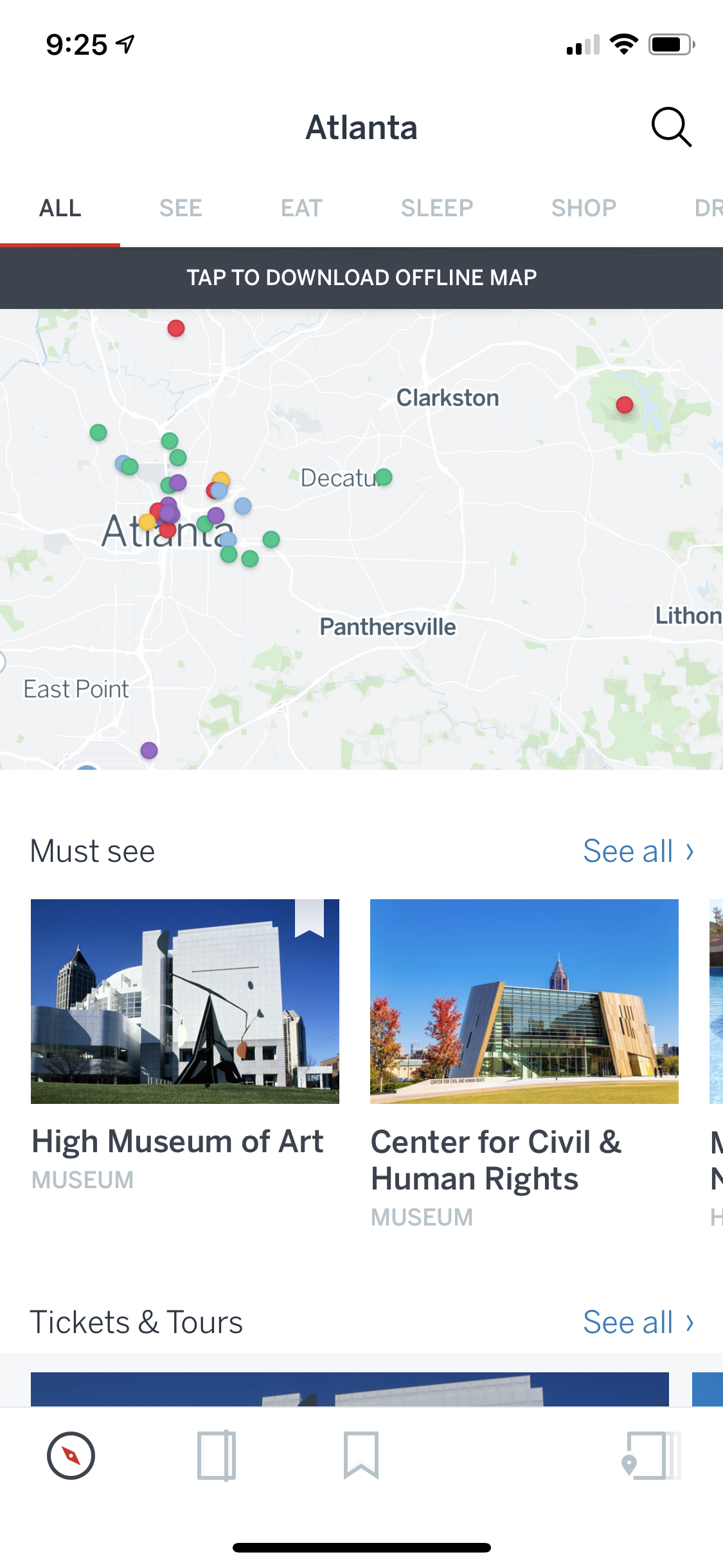
Once the guide of Atlanta is downloaded, the main page appears to show the overall top spots in the city with a labeled map and a list of places. Users are able to switch the category of places shown by selecting from the seven tabs at the top: all, see, eat, sleep, shop, drink, and play. The map and lists will then change accordingly to show recommendations in the selected category. This utilizes the natural mapping of sorting and filtering for more precise results.
There is also a prompt highlighted in a black background at the top saying ”Tap to download offline map”. Once the download started, this prompt changes into a progress bar indicating the downloading progress. When the download is completed, this prompt disappears. This series of signifiers suggested the users that this current city guide is not available offline yet, but you can download it here, and here is how much you have downloaded. By doing so, the gulfs of execution and evaluation are bridged, since users know exactly what to expect, what can they do and if they are doing it right.
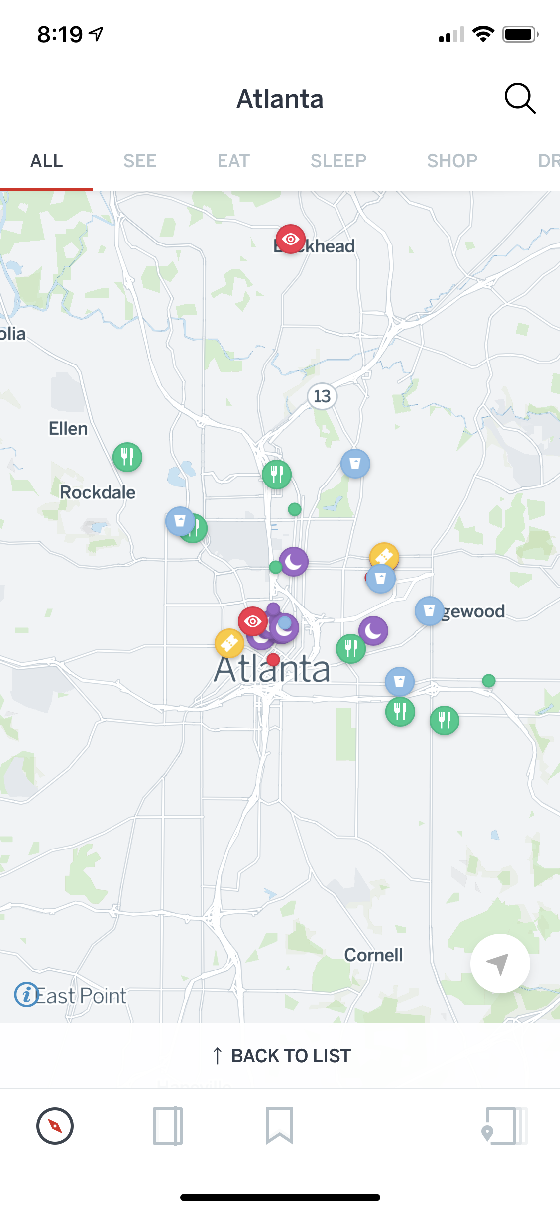

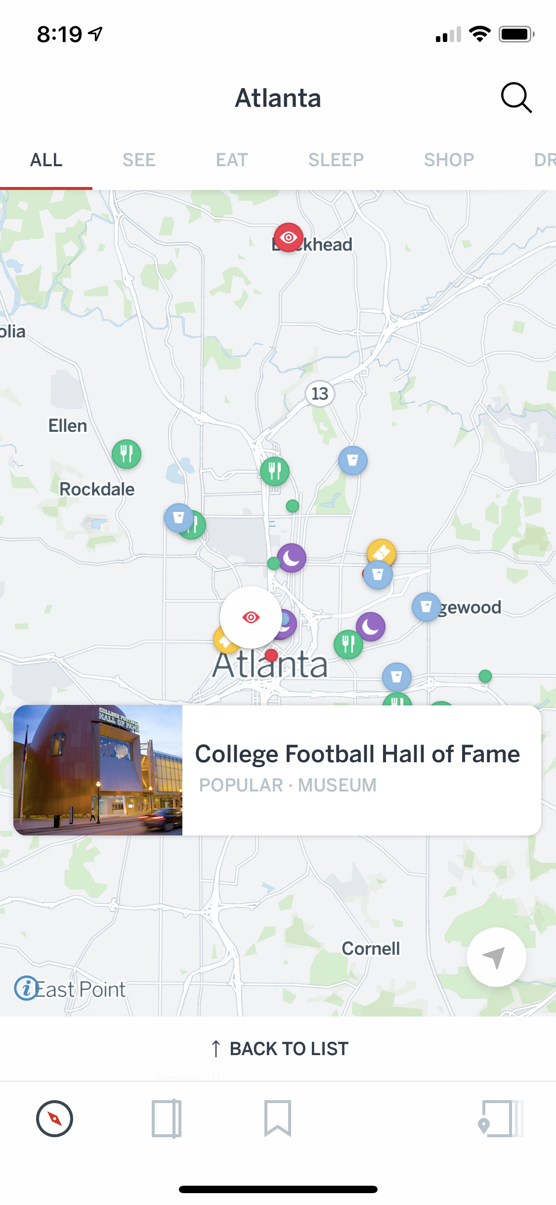
Users can view the map in full screen by tapping the map section or simply swiping down to expand the map section. With this natural mapping, although there is no verbal instruction, users can take a closer look at the map using actions they are already familiar with. Once the map is expanded into a full screen, top spots are labeled on the map with color-coded icons of different patterns to distinguish the seven categories. The design of these icons remain the same with those have been using in the books. However, for those that have never used the books, without any knowledge in the head, they can still figure them out with knowledge in the world thanks to the simple and clear icon signifiers. The dropped shadows on the icons signify the clickability of the icon. These signifiers indicate the affordance of the map functions. When one icon is clicked, it enlarges into a bigger icon with inverted colors, providing appropriate feedback. The corresponding entry of the attraction will also appear at the top of the page, allowing users to learn more about it by going to the particular attraction page. However, because the entry is placed at the top, attached to the category bar, without any color or font differentiation, the discoverability is fairly low. To enhance this, the entry can be an individual information box with both text and image (as shown below ).
The navigation bar
As mentioned beforehand, the bottom navigation bar does not appear on the homepage but when a city guide is opened. There are four icons each representing attractions, need to know, bookmarks, and homepage. The attractions, need to know, and bookmarks icons are grouped to the left while the homepage icon is on the right. The icons are designed obscurely that without any signifier of text, it is very hard to understand what each icon represents. The lacking of affordance and mapping can be avoided by adding text below each icon or changing the layout and order of the four icons so that they are not oddly grouped.
Overall, the Guides by Lonely Planet iOS App has a very clean and minimal design due to the relatively young audiences that are familiar with technology. Some of the design is minimal but straightforward enough like the homepage, and color-coded icons, while some are lacking in the discoverability and affordances like the entry bar and navigation bar, which may cause confusion for users without knowledge in the head.