As written language is taking up the majority space of a web or app interface, one of the most achievable ways of boosting the usability and accessibility of your digital product is to design your type thoroughly.
Legibility vs. Readability
Although the accessibility in typography is not an exact science, there are two elements designers should consider: legibility and readability. Legibility is a measure of how easy it is to distinguish each individual letters. While readability is the way in which words and blocks of type are arranged on a page. They are related aspects of typography, but one thing worth to keep in mind is that a high legible typeface is not always the most readable, depending on the situation. Examples can be found from types designed specifically for magazine mastheads and corporate logos. These typefaces might be highly legible but many will often make poor text faces. “Avant Garde” was designed based on the logo font used in the Avant Garde magazines. It is iconic and legible when used in headlines for the magazine, but when used for body copy or other situation, the readability is fairly low. Typefaces like this are called display faces.
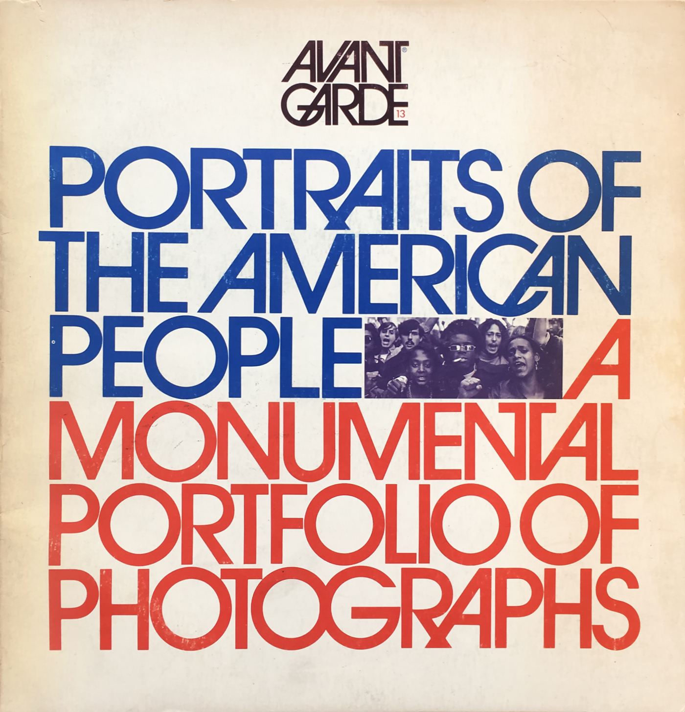 Figure 1. Avant Garde typeface
Some of the common examples of legibility problem within the same font family are the upper case I and lowercase l, uppercase O and 0, uppercase C and G in sans serif and etc. Therefore when it comes to choosing a font for your context, make sure that these letters are not causing confusion.
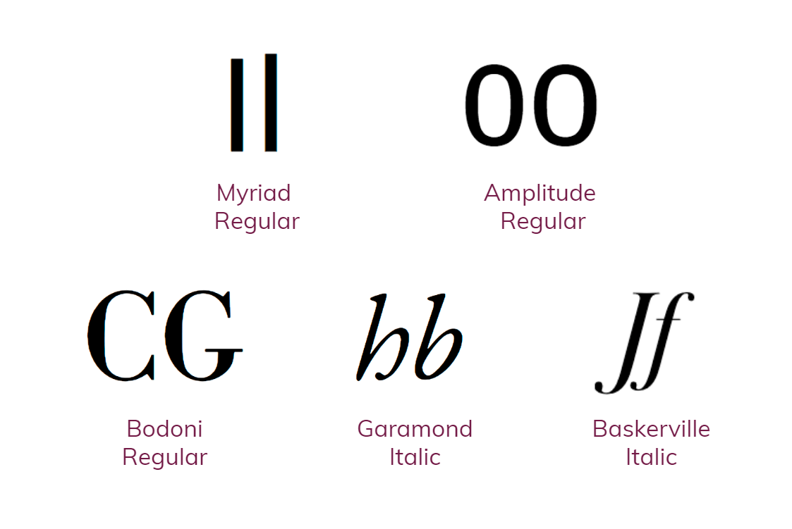
Figure 2. Common legibility examples
To design your type that provides the most legible presence of your content, here are some things we should consider:
Use typeface with a proper x-height
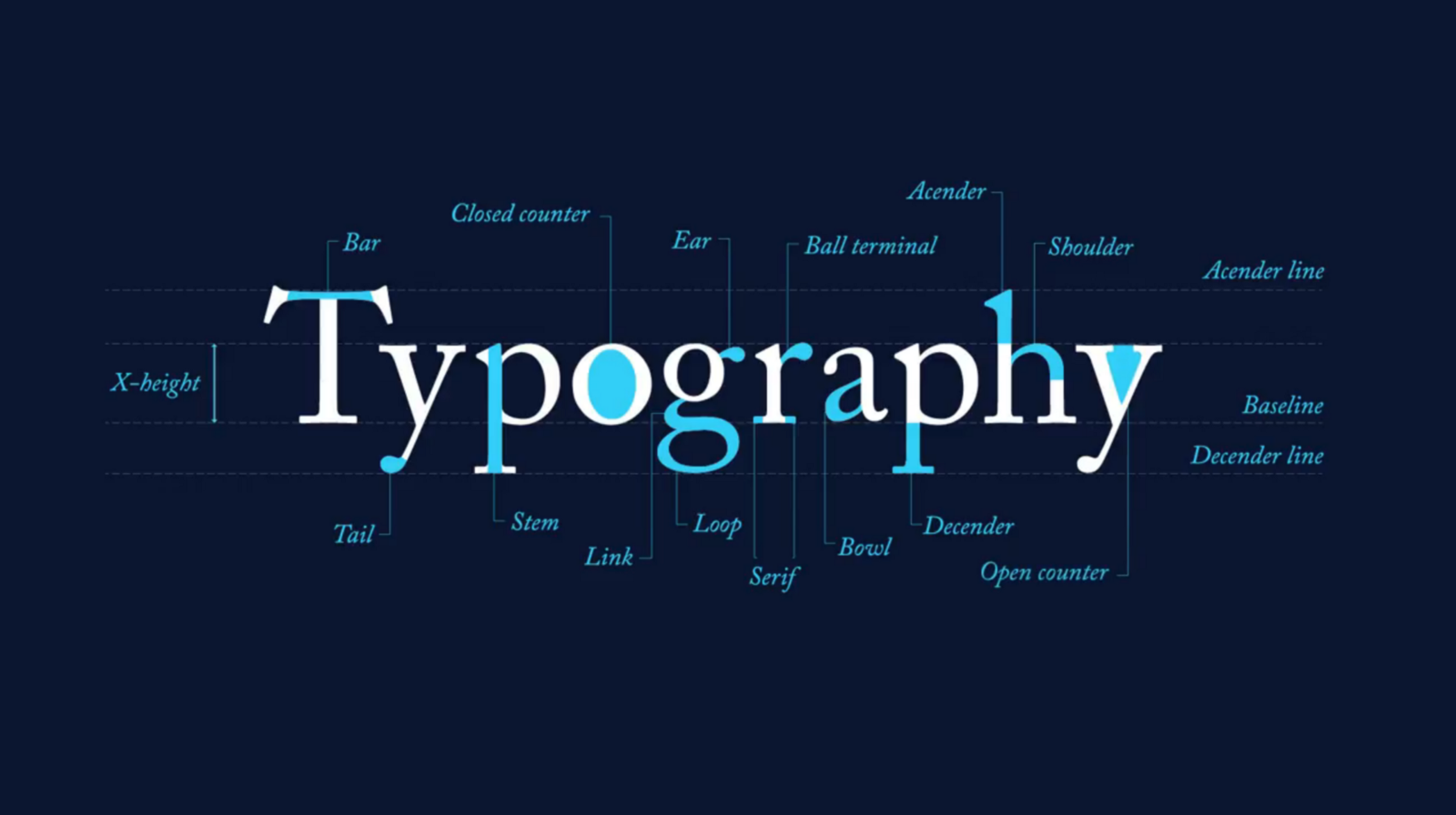
X-height is the height of a lowercase x character for a particular typeface, measured from its baseline. This height matters as it is a relative unit for measuring the proportion of the lowercase letters. Often times, when designers suffer from using multiple typefaces on a single page, mixing typefaces with similar x-height can actually create a sense of harmony. 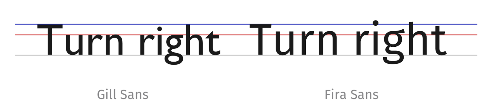 Figure 3. Gill Sans on the left, Fira Sans on the right, both set at 25px with 30px line height.
In general, a large x-height gives the appearance of having better legibility. The same phrase is written in the same font size but different typefaces with different x-heights. However, when there is a longer paragraph (Figure 3), a smaller x-height increases the perceived space, making the letters more distinguishable from the capitalized letters, providing better readability.
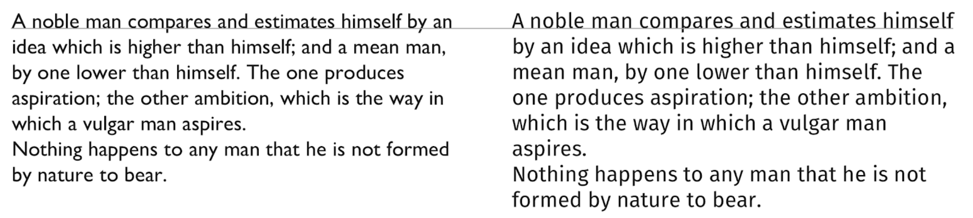
Figure 4. Gill Sans on the left, Fira Sans on the right, both set at 25px with 30px line height, in a paragraph.
Use all caps only when needed
As aforementioned, a typeface with a smaller x-height creates a more distinctive high-contrast shape versus a bigger x-height. The same rule also applies to text written in all caps. Words written in uppercase tend to be perceived letter by letter before recognized as the words. On the other hand, words set in lowercase are more easily recognized than the individual lowercase letter. Distinctive word-shapes contribute substantially to easier and faster recognition and these are more distinctive when setting in lowercase than in uppercase. 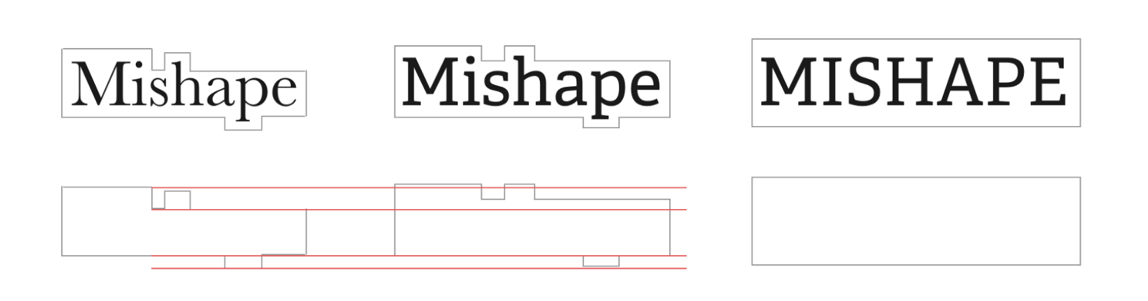
Figure 5. A typeface with a smaller x-height creates a more distinctive high-contrast shape versus a bigger x-height.
The thinner or thicker your type is, the larger it needs to be
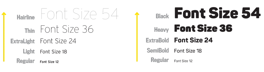 Figure 6. Font weight variation
Last but least, the proper weight of the typeface also makes a difference. The weight of a typeface affects legibility because additional weight inevitably encroaches into the counters, which is the negative spaces in a fully or partly closed area within a letter. Bold faces are usually used to increase visibility when emphasizing text or headlines. However, it can get tricky and affect the reading efficiency when the weight is not set correspondingly. When an extremely thick type is small, the counters will close in. When an extremely thin type is small, the strokes disappear against the page or the screen. However, Young children prefer thicker faces while mature readers dispute over dark pages of text. (Jury, 2004)
In conclusion, there are many factors to consider when it comes to choosing the most accessible typeface for a specific digital product. It is crucial to understand legibility and readability and how they can affect the ease of user’s access to the content.
References
Jury, D. (2004). About face: Reviving the rules of typography. RotoVision.
Magalhães, R. (2017, May 24). To choose the right typeface, look at its x-height. Retrieved from https://blog.prototypr.io/to-choose-the-right-typeface-look-at-its-x-height-instead-d5ef0967d09c
Farley, J. (2010, January 29). Typography: Readability & Legibility .Retrieved from https://www.sitepoint.com/typography-readability-legibility-part-2/
Rozario, S,D.(2018, February 07). How to choose an accessible typeface. Retrieved from https://www.webdesignerdepot.com/2016/03/how-to-choose-an-accessible-typeface/
Babich, N. (2017, June 23). 10 Tips On Typography in Web Design. Retrieved from https://uxplanet.org/10-tips-on-typography-in-web-design-13a378f4aa0d
Strizver, I. (2018, May 03). Legibility and Readability: What’s the Difference? Retrieved from https://creativepro.com/legibility-and-readability-whats-the-difference/
Loyd, J. (n.d.). Typographic Readability and Legibility. Retrieved from https://webdesign.tutsplus.com/articles/typographic-readability-and-legibility–webdesign-12211
Stinson, M. (2017, November 14). Font Size and Weight Matters. Retrieved from https://type-ed.com/resources/rag-right/2017/11/13/font-weight-si