About the Project
Overview: This project involved redesigning the information architecture and improving the user experience of Seton Hall University Libraries website. The Seton Hall University Libraries support excellence in academic and individual work, enable inquiry, foster intellectual and ethical integrity and respect for diverse points of view through user-focused services and robust collections as the intellectual and cultural heart of the University.
My Role: I was apart of a small team of four and I was responsible for conducting user research, restructuring the information architecture, conducting competitive reviews, and designing low and high fidelity prototypes.
Discipline: User Experience, User Research, Information Architecture, Wireframing and Prototyping
Design Tools: Sketch, Invision, Optimal Workshop, Lucid Chart
Research Methods: Observations, Questionnaire, Interviews, User Testing
Duration: Spring 2018, approx. 15 weeks
Brief Outline of the Problem
The Seton Hall Library website is an important resource for graduate and undergraduate students. It houses hundreds of thousands of print materials and electronic resources for its diverse student body. Students may communicate with a librarian through the live chat box feature for immediate assistance. They can also search through an array of databases and collections for books and articles. The library website is undoubtedly a vital resource for all segments of the student body. However, the site lacks discoverability due to inconsistency and organization of it’s Information Architecture and Visual Design.
Our Approach to Solve the Problem
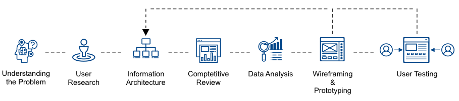
Understanding the Users
We started the redesign process with user research with the motive of gaining a deeper understanding of Seton Hall Library users. We divided our target audience into three different groups and used interviews, questionnaires, and observations to find out more about them.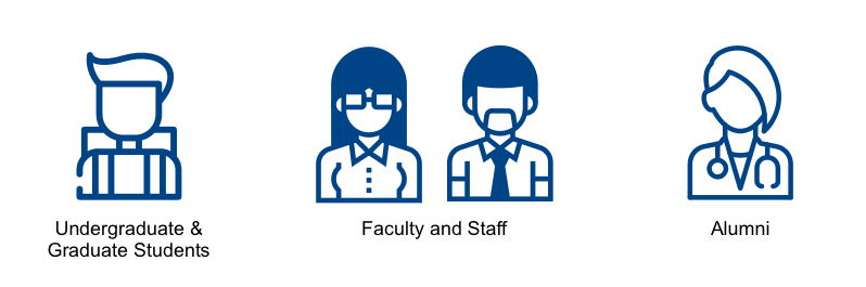
Methodology
Interviews – An in-person semi-structured interview was conducted with 4 graduate students from Pratt Institute. Each participant was asked questions related to their background, experience at school, research practice and interactions with libraries.
Questionnaires – The online questionnaire focused on the user’s interest, hobbies and technology/website preferences as well as basic information on their age and position. It consisted of 13 multiple choice questions with 1 fill in the blank and was emailed to a total of 14 users, male and female, between the ages of 18-40.
Observation – The observation focused on how a user interacts with a website through a task based approach. The one on one, in person observation included a total of 2 users and took about 45 minutes each.
Key Findings
The following insights were learned about the our user groups after evaluating the data collected from the observation, questionnaires and interviews.
- Navigation is a map – One of the first things you may do when you go to a new library is immediately look at the library floor map diagram to find where your favorite genres stacks are located. Similarly, on a website a user expects to be able to easily find what information is available to them and where to find it. Effectively making the site navigation organized and clear can overall improve the what is discoverable for the user.
- On the go accessibility – Users are on the go more then ever and no longer want to be tied down to a home computer for internet access. The collect data reflect both a strong user preference of mobile devices and laptops over desktops and accessibility on these platforms is extremely important to users.
- Organization leads to better consumption – Physical libraries are filled with information and opportunities to learn but it is organized in a way that it is accessible and easy to consume for users. The same principle should apply to a libraries digital website counterpart and keeping this principle in mind can make a fun and rewarding experience for the user.
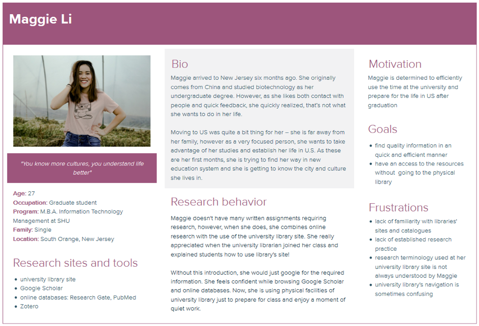
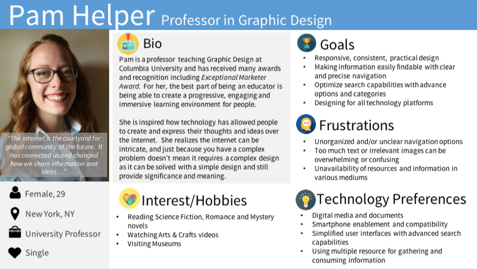
Personas
We developed the following personas based on the information collected during our user research. It includes their behaviors, interest, pain points, and needs.
Information Architecture
The next step of the redesigning process was to gather insights into our users mental model by organizing and structuring complex sets of information. To create a structure for the new site navigation we utilized the card sorting and tree testing methods to uncover how users logically organize information and assess discoverability within a hierarchical structure.
Both of these methods were invaluable as they not only tested a proposed site navigation structure but also helped us understand how our potential audience thinks and organizes information. We utilized Optimal Workshop User Research Platform to facilitate the card sorting test and tree testing to a total of 30 users.
Card Sorting
With the card sorting test, 8 users were given 52 cards to group and label as they see fit. The 52 cards were a representative collection of items of information that you would find on Seton Hall University Library website and navigation.
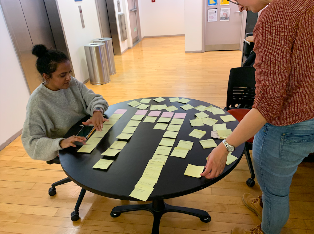
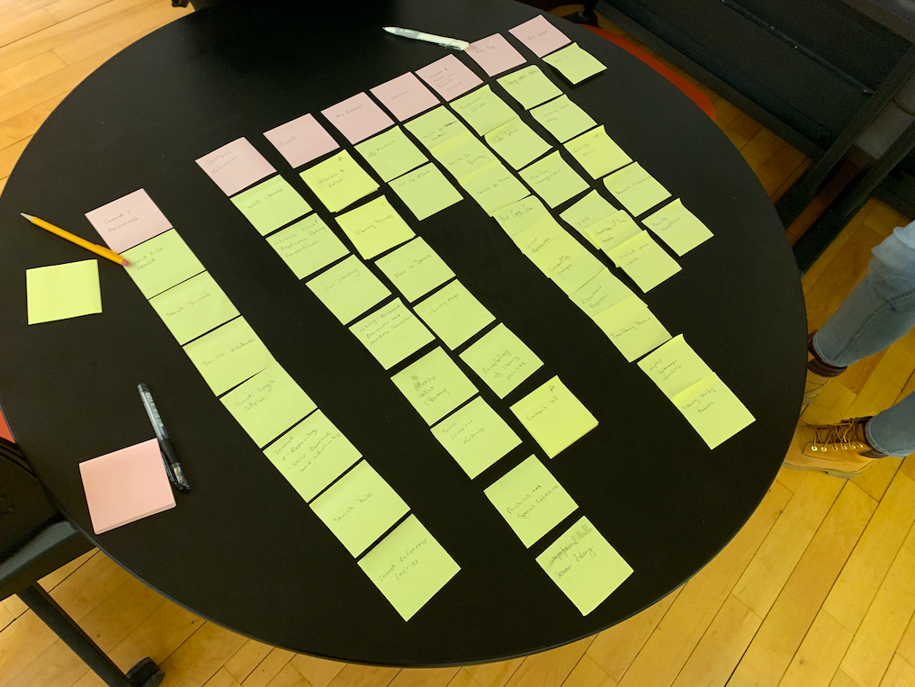
Team Curious Solomon using posted notes to create the site map
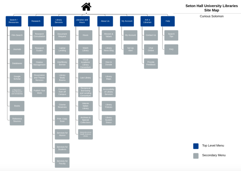
Site map created on Lucid Chart
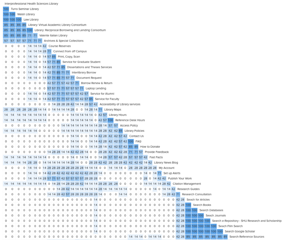
Upon completion of the card sort by the users, the results were analyzed by using Optimal Workshop’s Similarity Matrix tool (image below) which show the commonalities in the groupings of the cards by the users.
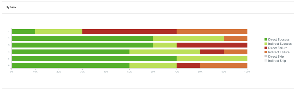
Tree Testing
With the tree testing activity, we evaluated the site navigation structure created from the card sort by having 22 users find the locations in the structure they best feel would complete specific tasks.
 A participant piloting the initial tree test we created based on our card sorting activity
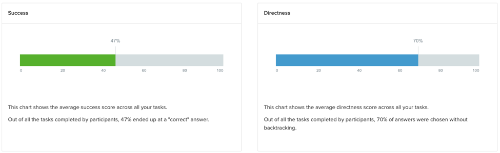
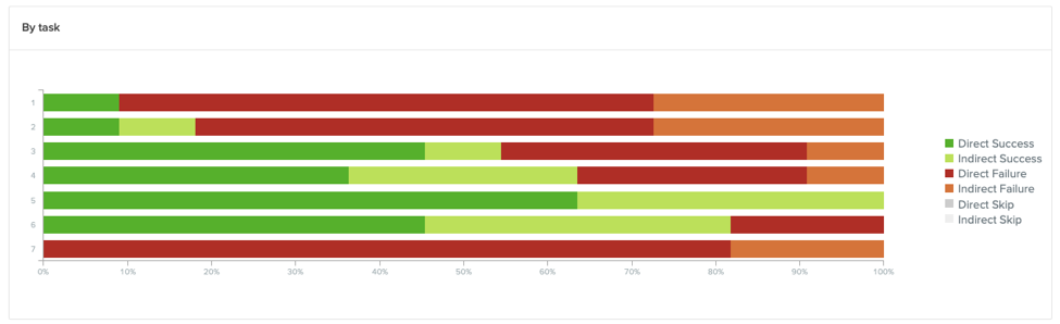
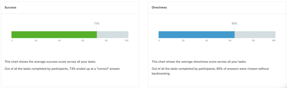
During this activity we had two rounds of testing with users, the first to test the initial draft of our navigation and a follow up round to test modifications we made to the navigation based on the results from the first round of test. Each round had 11 participants each. This is important to note as the initial site navigation structure was based on the analysis of the card sorting results and the second version, used during the follow up round, contained changes based the direct/indirect success and failures during the initial round. With the second round of testing, we saw our success rates jumped from 47% to 73% with our directness going from 70% to 65%.
Results from the first tree test
Results from the second tree test
Key Findings
The following insights were learned about the our user groups after evaluating the data collected from the card sorting and tree tests
- Clear and concise task during tree testing – We found some of the questions during the initial round of tree testing to be a little confusing and unclear and because of this it could’ve possibly lead to difficulty completing the task or lead to direct/indirect failures by the user. Therefore, in the follow up round, we not only modified the site navigation structure but also reworded or created new task to fit the new structure. We found that clear and concise tasks are extremely important to avoid failures that may not reflect bad navigation structure but instead highlight bad directions.
- It is important to provide context for the users – While performing both card sorting and tree testing, we noticed it was helpful to provide user with additional information regarding the purpose and context of the test. Users were informed prior to starting the test, via email and welcome message, that the cards or navigation was related to information you would find on a library website and navigation menu. By doing this it provided them with more clarity, understanding, and perspective as they worked through sorting activity or completed each tree testing task.
- Use simple and relevant terminology – As user worked through the card sort and tree test, we realized they were having a hard understanding the language we were using to label our cards or site navigation structure. Because of that, it was difficult for them to complete the given task, such as merge cards into groups or find information with the site navigation. Therefore, we renamed the labeling of the card from library terminologies to more globally understood terms. This helped the users a great deal as they completed the given tasks in card sorting and tree testing.
Competitive Review
In order to make the website effective and visually attractive, it was important for us to assess it’s current and potential competitor websites. It also helped us to see how they solve similar needs for their users. We selected 5 websites for our competitive review and compared them across 5 dimensions.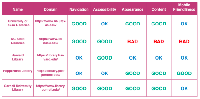
Prototype Evaluation
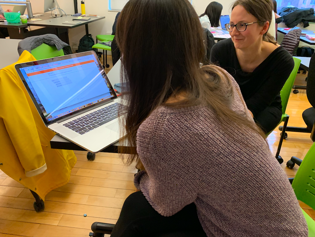
After working on the Information Architecture and analyzing the competitor sites we moved to the design stage. We started this process by creating three tasks or the user to work through. We then discussed how we were going to design a low fidelity digital prototype of the desktop version of the website. We first sketched the interfaces out and then utilized Sketch to create it and Invision to make them interactive. Finally We individually test the prototype with user who fit our user groups and profiles to get feedback.
Low Fidelity Prototype
During my user testing I had two user work through a set of tasks on two low-fidelity wireframes of the Seton Hall Library desktop and mobile. They were created as black and white illustration and focused on the “big picture”. While the UI elements were shown as boxes, circles, lines and other shapes with minimal text, they gave the users a chance to see and test the basic structure of the potential layout of the website
User Task
At the very beginning of this project we had a meeting with client stakeholders. They acknowledge there were flaws in their current design and identified areas of need/focus, for instance providing users a better way of contacting the librarian via chat or providing feedback and to find critical information quickly. We focused our task around these two issues. One for mobile and one for the desktop prototype.
- Mobile task – You are a teacher and you have a brilliant idea on how the library could help you in your course. You would like to suggest it to the librarian
- Desktop task – You found a bunch of books but you are not sure about the how many books you can borrow or for how long.
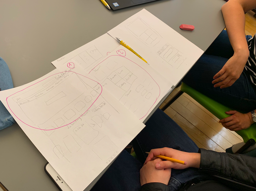

We then discussed how we were going to design a low fidelity digital prototype of the desktop version of the website. We first sketched the interfaces out and then utilized Sketch to create it and Invision to make them interactive.
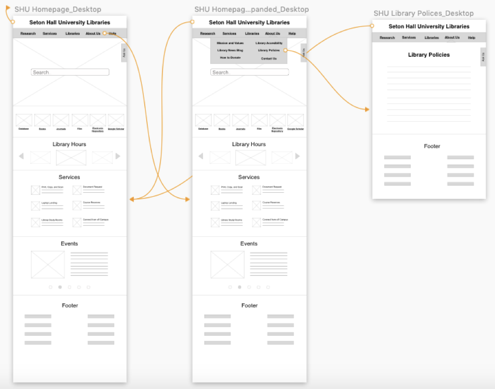 Artboard screenshots from Sketch of the Desktop wireframe.These artboards were later animated and tested with Invision.
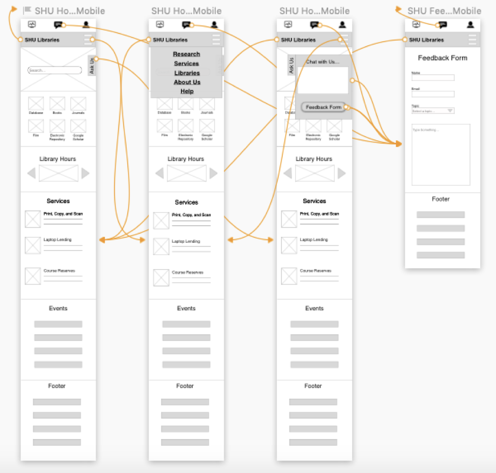 Artboard screenshot from Sketch of the Mobile wireframe. These artboards were later animated and tested with Invision.
User Feedback from Low Fidelity Evaluation
- Use descriptive and meaningful labels to encourage user interactioN
- Be mindful of how we group similar features together
- Provide pathways for users to navigate through the site via buttons and breadcrumbs
High Fidelity Prototype
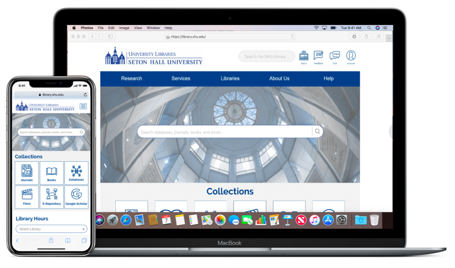
The final stage of the project was to design a high fidelity prototype of our redesign for the Seton Hall University Libraries website on both mobile and desktop platforms via Sketch and Invision. We also decided to use similar task as the ones used during low fidelity prototype evaluation.
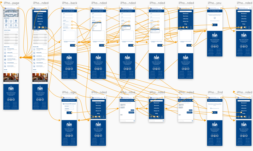 Artboard screenshot from Sketch. These artboards were later animated and tested with Invision.
To keep our two prototypes, Mobile and Desktop in sync we created a style guide, based on SHU style guide, for the user interface. The end product resulted in a consistent design, layout and workflow with a streamlined and understandable information architecture.
 Links to the Hi-Fidelity Desktop | Mobile
Conclusion
In conclusion, I learned a great deal over the course of this project. Ultimately I learned that we should design products with the user in mind. With user centered design, you can focus the users and their wants/needs in every design phase and by doing that you create a usable and sustainable product that is satisfying to both the user and the designer. I specifically like the way the assignments and the lectures were taught over the course of the semester. With each assignment and lecture building on one another and giving purpose and meaning to next activity, assignment, or discussion. Building this design story, especially, helped me see the full picture and after going through the process, it was easy to make the connection and understandings between all the assignments, briefs, testings, and activities.
As mentioned at the beginning of this design story I didn’t work alone. I worked alongside three great aspiring UX professionals. Working in a team can be challenging (if you let it) but can be a rewarding experience. Like the users we interviewed/observed, each team member brings their own perspective, style, way of doing things. There were plenty of times during the testing and design phase where a team member pointed out something that I didn’t think of myself. Such as using a dimension in our competitive review (i.e. accessibility) or giving me tips on their design techniques/esthetic. Through all the late days and nights, and frustrating moments I’m glad we were able to get to the “Performing” and “Adjorning” stages of Bruce Tuckman’s Group Development. I think we were able to come together with our own set of unique point of views/skills/experience and built a great prototype the client seemed to appreciate.
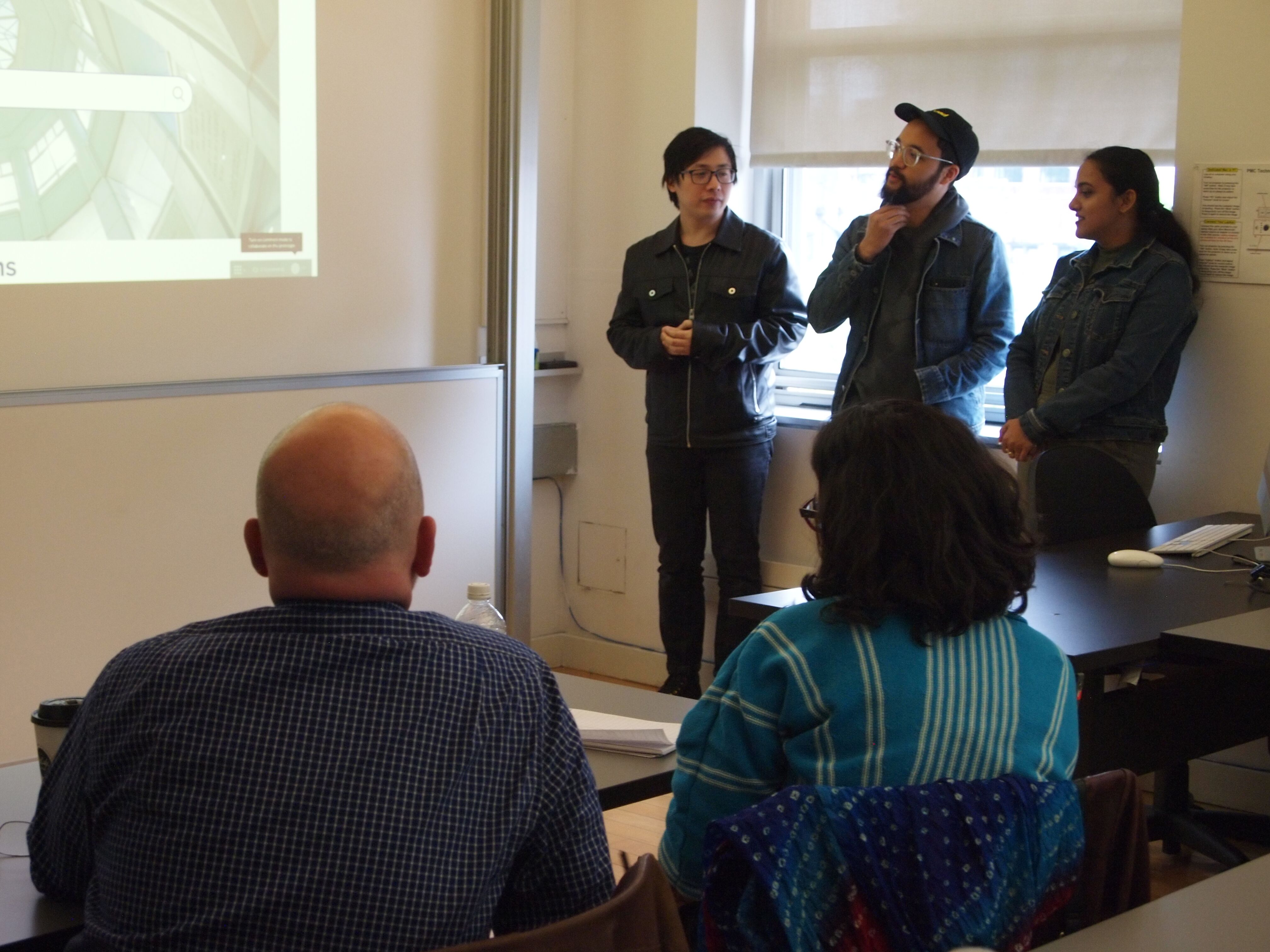
Speaking of the client, presenting our final high fidelity prototype was a bit nerve racking as we didn’t know what to expect. Nonetheless we made it through the presentation and the client and Professor provided great feedback and asked relevant questions, evening pointing out how they liked some of our ideas and gave pointers/ideas on things we could expand on. I also appreciate the candidness and format of the presentation i.e. not providing a deck/slides and just demo’ing and Q&A. It is representative of what may happen in the “real world” and points out that you should be prepared and confident in your design. Because if you aren’t, why should you expect the client to be.