Genius is a highly sought-after American media company, founded in 2009. It aims at spreading music knowledge, from song lyrics to the artist and the stories behind the creation. The company offers musicians, editors, contributors and, fans to explore, discuss, and understand the deeper meaning behind the music. Genius’s application is available on Playstore and Appstore.
THE FIRST LAUNCH
At the start of a user’s journey, there is a short introduction that combines storytelling and visualization to create a conceptual model that helps users grasp the core value and mission of Genius. (Figure: 1)

Sign Up / Sign In
The apps sign-up/sign-in page has been designed taking into consideration the knowledge of the world – uses the standard floating label login format which users are well-acclimatized to.
Twitter and Facebook’s logos act as signifiers and inform new users that the application affords to sign up using any of the 2 platforms. An email icon could be placed with the two logos for better clarification of the 3 possible sign up options. (Figure: 2)
If there is a human error or action slip, for instance, the password is too short, the app instantly provides feedback and prompts the individual with additional directions to make them aware of the constraint. (Figure: 2)

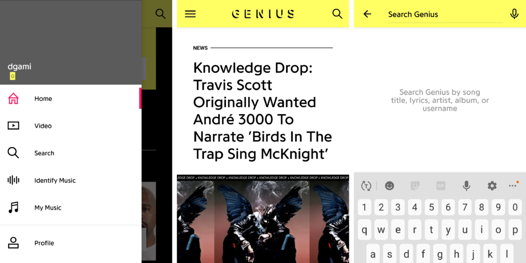
SEARCH AND NAVIGATION
The search tool has been signified by the universally accepted search icon that tells the user that it affords the action of searching. It is made discoverable and understandable. (Figure: 3)
The app uses a hamburger menu which seems to be a paradox of technology. The menu makes the design look visually cleaner but makes it more complex to use. Individuals who haven’t seen or used a hamburger menu might find it confusing. Having said that, in recent years, the burger menu has gained popularity and most of Genius’s user group is well adept with technological advancements and hence the menu used also demonstrates the knowledge of the world. (Figure:3)
For users who might have not used the hamburger menu, just adding the term ‘menu’ below the icon would reinforce the meaning and help solve the problem.
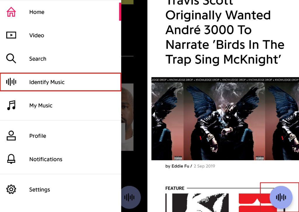
Once the user clicks on the menu, a slide-in navigation menu opens with a list of items. The menu showcases natural mapping. There is clear division and spacing between all the items on the list (Spatial similarity) and icons have been used as signifiers to help achieve better understanding (Conceptual or metaphorical similarity).
The icon (signifier) used for ‘identify music’ in the menu is confusing and has also been placed as a floating button on the homepage. This imperceptible icon causes confusion at the visceral level that could lead to users experiencing a gulf of execution due to the disconnect between the user’s conceptual model and the designer’s conceptual model. (Figure: 4) Adding the text ‘identify music’ to the icon would help solve the above problem. This would create an ideal system image and beat the gulf of execution.
CONCLUSION
Overall, the application is easy to use and most of the content is understandable. The experience is almost hassle-free. Most interactions and affordances are perceivable. A few signifiers could be improved upon by adding a label or using icons that are common and more universal. The application has been designed keeping Don Norman’s 3 levels of design appeal in mind – Visceral, Behavioural and Reflective.
- Visceral: The layout is clean and the content has been arranged in a logical manner for easy flow. The application uses the same visual language all throughout.
- Behavioural: Performing most actions on the application is effortless. Actions are well associated with the user’s expectations. Actions are followed with instant feedback.
- Reflective: The application allows ease of use. There is a sense of satisfaction and enjoyment due to the effective use of the visceral and behavioral levels.
Even though Genius uses quite a few theories from The design of everyday things – Donald A Norman, it is a perfect example of how no design is perfect and there is always a scope of improvement.