A Canadian mobile app developed to aggregate and navigate the public transit scheme of city with precise real-time projections, easy journey planning, step-by-step navigation, notifications of service interruption, and records of departure and reminder for stop, shown in a clear, precise and bold interface. It is functional in more than 200 cities of Australia, Canada, Europe, USA and NZ.
For this design critique, we are going to focus on the users who are using the application for the first time. Firstly, we are going for the positive and negative aspects of the design in page/options and then discuss the recommended solution for the negative ones.
1. Home Page
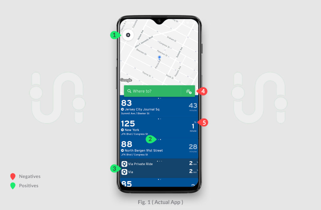
The first impression of the app i.e. home page (Fig. 1) is quite optimistic. Its simple, soothing and gives the looks of modern style application. The designer have tried to use few colors possible but at the same time succeeds in providing proper distinction between different transportation services. This results into the good discoverability of different modes of transportation as pointed by (3) also the settings options shown by (1). App provides great affordance as we can see half number 85 which gives the hint that we have to drag down for more options. Also doted signifier darted by (2) signs that other options are also on left side which is also good application of system image that user have to swipe right.
The Problem
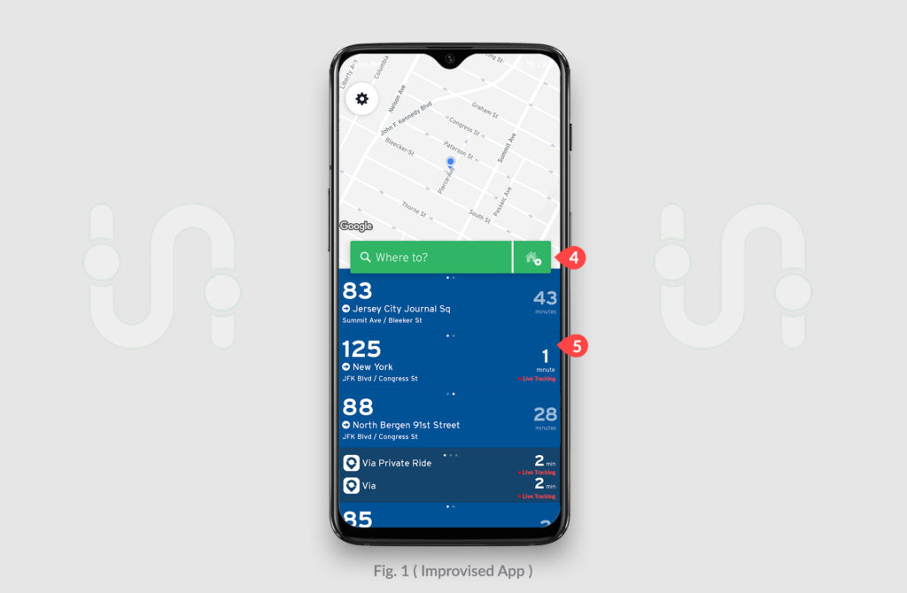
Major options on the page are properly aligned, well signified and discoverable but the “Add Home” icon marked by (4) is quite lost as focus is diverted much towards transportation services and its content and the setting highlighted on the top.
Secondly, the signifier pointed out by (5) is not constraint to give the proper idea of the live tracking, it can give multiple interpretation like if transportation service is having the wifi facility in it.
Recommendation
(4). To enhance the discoverability of “Add Home”, we can make it as separate button which also hints its distinction with the search bar and increase its visibility.
(5). To get the true idea of this signifier, we can replace it with red “Live Tracking” text tagged below time and the blinking red dot which signifies the actual meaning if something is broadcasted “Live”.
2. Navigation Page
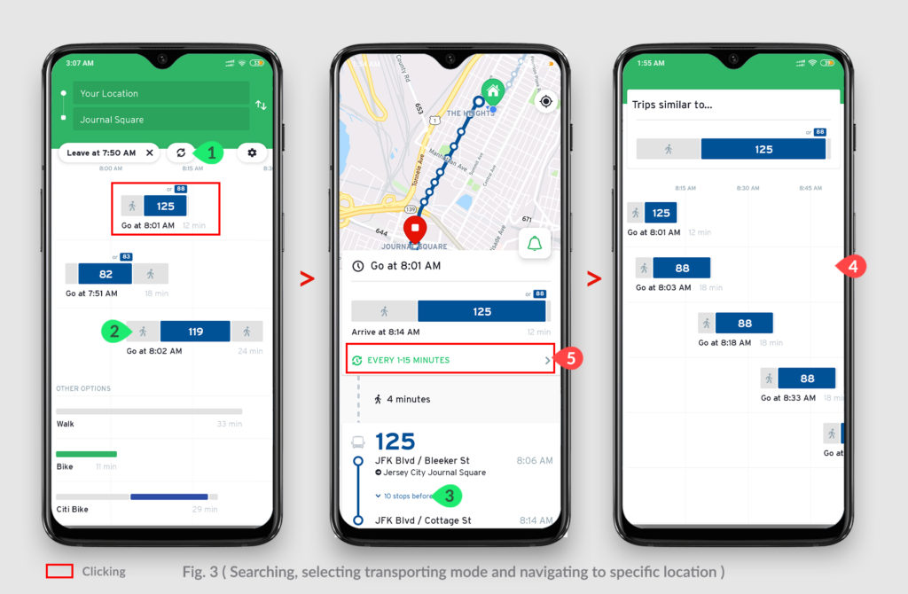
The Figure 3 shows the process of searching and selecting a mode of transportation and finding its schedule. Overall the designer have made consistency throughout the app. (1) is the example of feedback as manual refresh options helps to update the system if app. unable to do automatically. (2) and (3) are the fine examples of signifiers, mapping and discoverability, as we easily understand what hints are trying to denote and offer clear concept of what happens when you click, hence employing knowledge in the world.
The Problem
The issues lies when new users want to find out whole schedule of the specific transport mode(if they want to plan their commute) and won’t able to reach its goal as only limited amount of time slots are seen pointed by (4) This lead to gulf of evaluation in the feedback of the system. Also full schedule option is not available in the page pointed out by (5) which leads to gulf of execution.
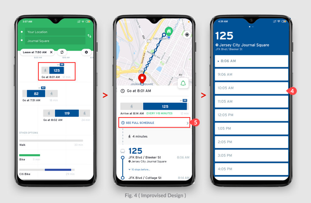
Recommendation
(5). It can be solved by providing “full schedule” option instead of frequency of the bus shown which can moved in the upper bar, thus this will bridge the gulf of execution.
(4). Now with this changes in (5), will lead to proper mapping of the “full schedule” by providing the whole bus schedule in (4) which in turn will bridge gulf of evaluation.
Conclusion
Transit is a great initiative to keep the work of several apps into one single app and thereby easing users life. It has maintained its design theme throughout the app with great affordances, feedback, discoverability, mapping and as said by Donald Norman “Communication is key to design and to communicate, signifier is the key” and this app managed to do so in greater extend but as again Norman suggests, “To Err is human” and there are some issues in different areas which can be simplified with the help of recommendation and thereby increasing the overall experience of this wonderful application.