
Yelp is an application with the mission “to connect people with great local businesses”. It is a platform where users are able to locate restaurants, dentist, hair stylist, mechanics, local businesses and other services nearby. Almost 80% of the searches on Yelp are done through its mobile app with restaurants being the most reviewed business category followed by local services and shopping (source: https://www.yelp.com/factsheet).
Following the principles of the Design of Everyday Things by Don Norman below is a critique of the mobile application of Yelp with possible recommendations to improve the design.
1. Strong discoverability but conceptual model has scope for improvement
Placing the search bar in between icons and an eye catching image gives (see fig. 1[1]) strong discoverability and affords user to explore the diverse categories that yelp offers. First-time users do not have knowledge in the head for various categories therefore providing hints such as “search for burgers, delivery, barbers” prove to be good signifiers. On the other hand, the two search bars on a single screen (see fig. 1[2]) creates confusion and accounts to be a capture slip weakening the conceptual model.
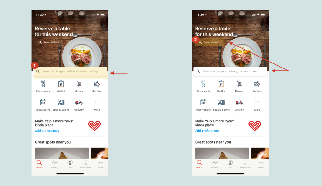
Recommendation: Per the principle of avoiding procedures that have identical openings, the conceptual model can be improved and simplified by providing only one search bar to ensure that sequences differ from the very start.
2. Clean display of categories but needs improvement to avoid slips
Categories displayed below the search bar have clear titles and attractive icons (see fig. 2[3]) which are good signifiers. The “more icon” is correctly grouped (see fig. 2[4]) with other categories thus giving affordance to the users. Tapping on this icon brings up a new screen that has categories like “hot and new”, “deals”, etcetera; icons on this screen are clear and visible with the exception of nightlife and bars (see fig. 2[6]). They both have the same icon leading to a description-similarity slip.
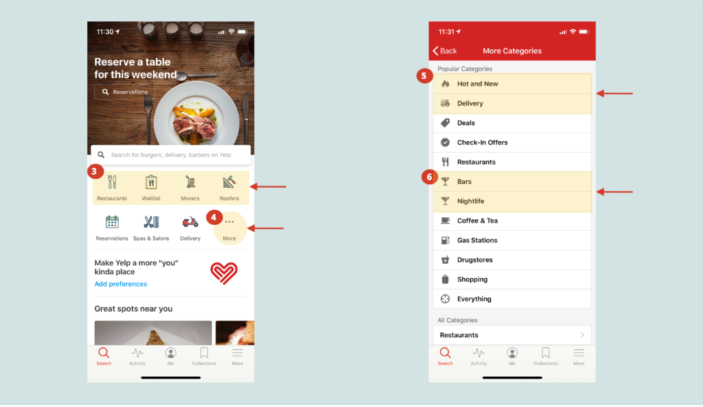
Recommendation: Bars can be removed from the “more” category and displayed as a sub-section when users tap on nightlife icon. Alternatively, the icon for nightlife can be substituted.
3. Headings are used thoughtfully but errors can be minimized
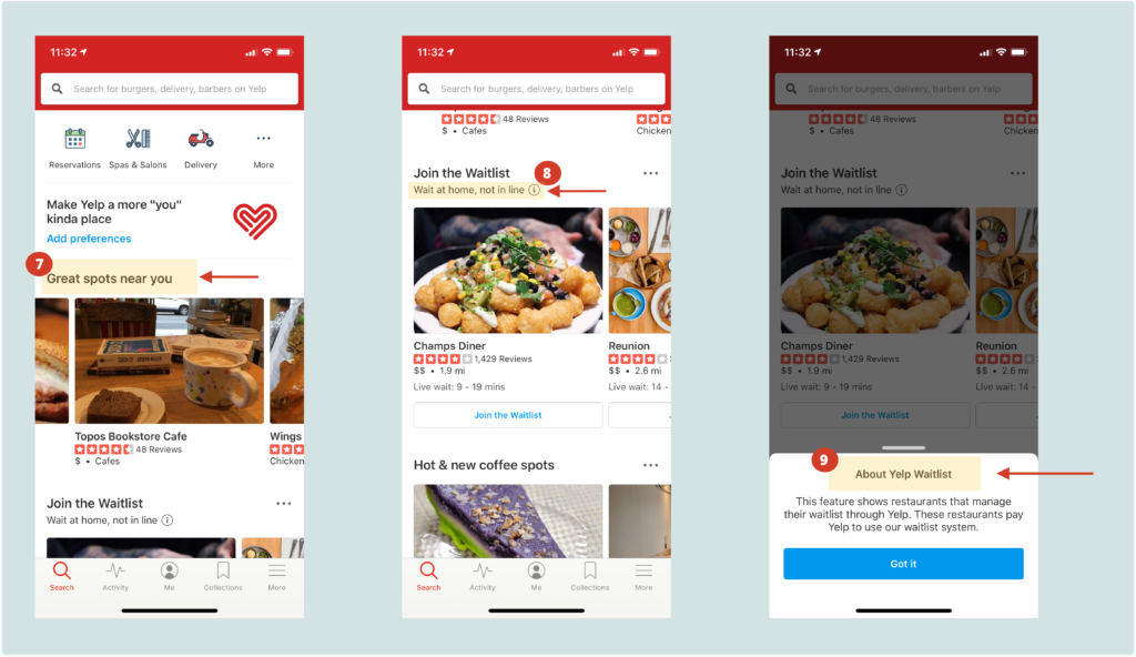
Headings like “great spot near you”, “Hot and new” etc.(see fig. 3[7]) are easy to understand since users have knowledge in the head for these titles.
Unclear headings like “join the waitlist” (see fig. 3[8]) is accompanied with an icon which signifies and affords users to get more information. Tapping on this icon (see fig. 3[9]) gives an immediate feedback with a pop up describing the particular heading.
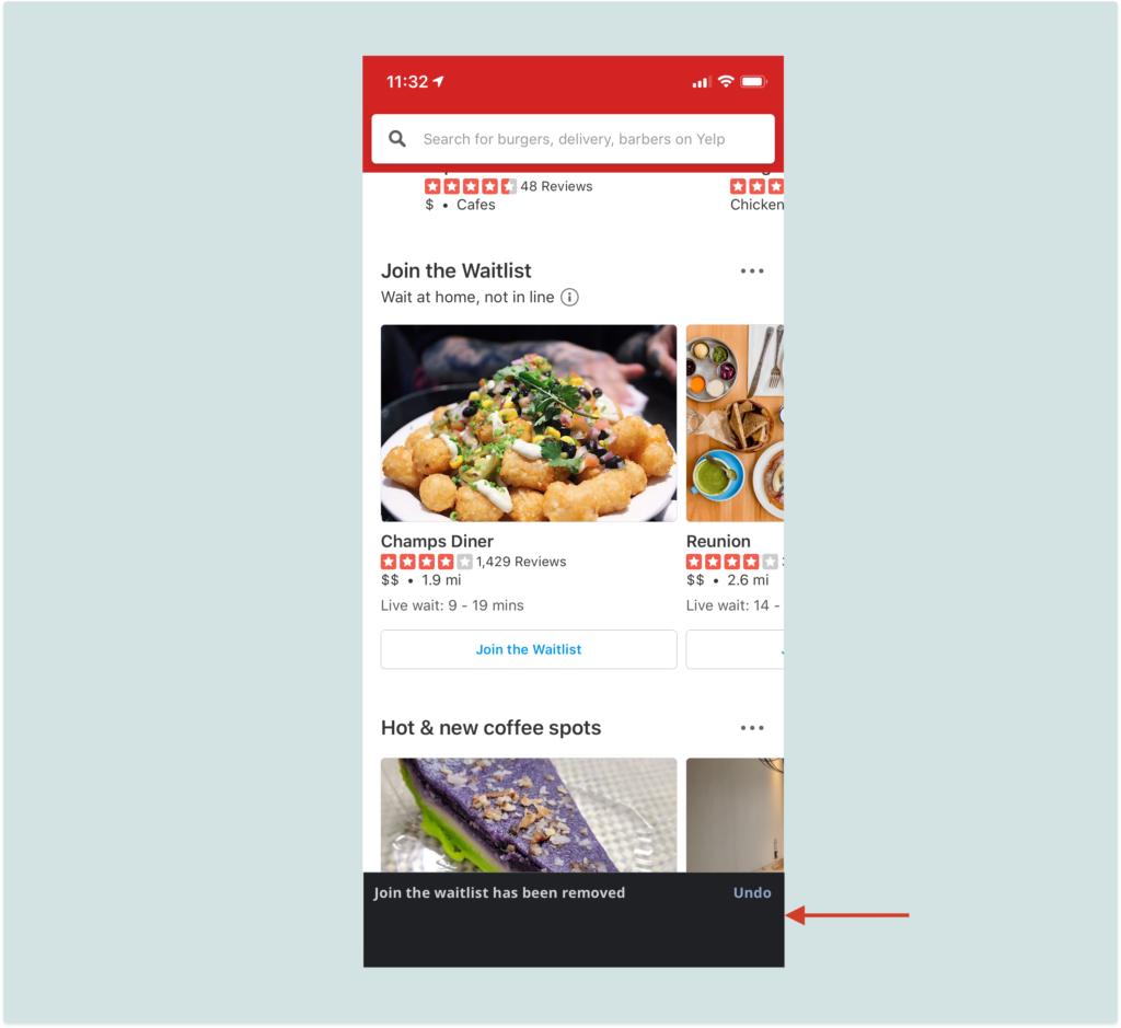
The three dots on the right of each heading like “hot and new lunch spots” , “hot and new coffee spots” (see fig. 4[10]) give consistency to the conceptual model. The three vertical dots (see fig. 4[11]) has an option to hide the content which leads to constraint of information simplifying the experience. However, this action lacks feedback as users are unaware of where the hidden information is. Also, there is no option to get this information back. What if we tapped on “hide this content” accidentally and want the content back?
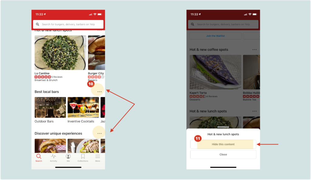
Recommendation: When the user taps (or accidentally taps) on “hide this content” there should be confirmation in the form of a message informing “join the waitlist has been removed” and an undo button on the right (see fig. 5). This will be an immediate feedback in the form of a message which will disappear shortly.
4. Good Natural Mapping and consistency of color on the home screen
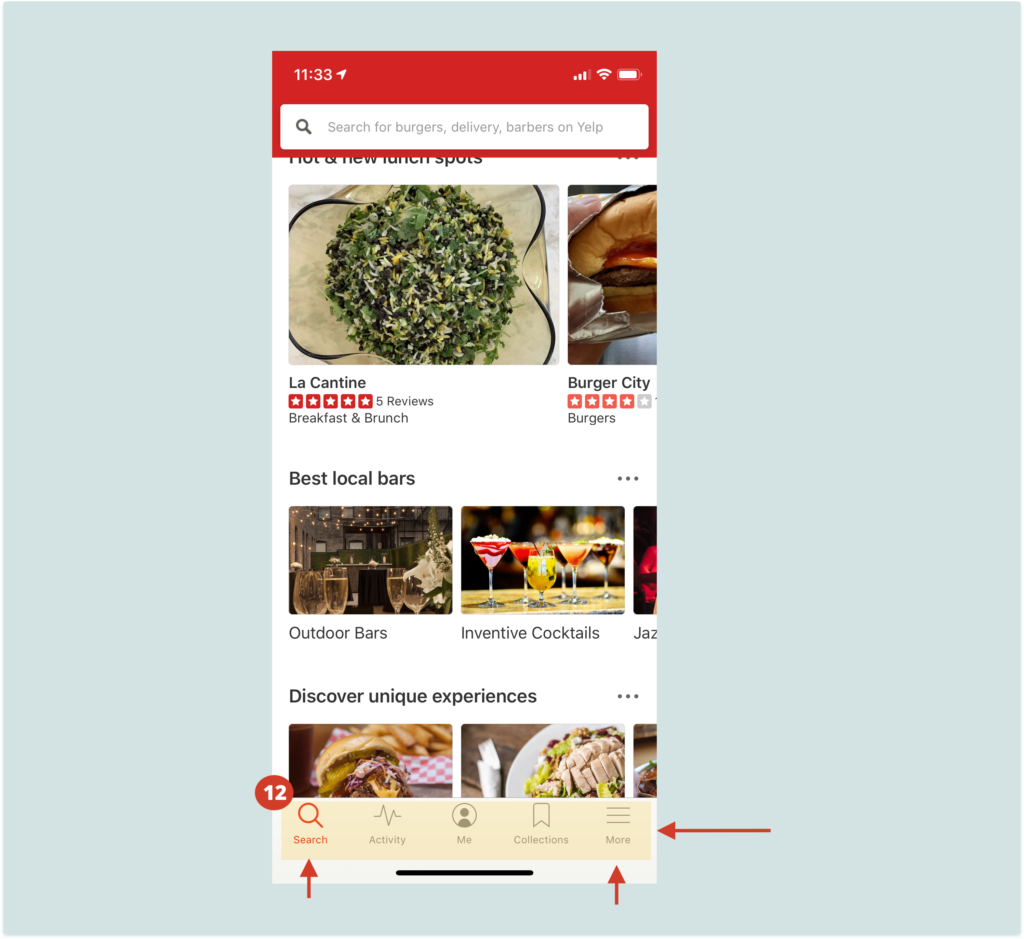
The bottom tab has good natural mapping with all functions such as search, delivery, profile and collections grouped together (see fig. 6[12]). The icons used to display information are signified well. The principle of feedback is also applied effectively as the color of the icon changes immediately when you tap on it. The red color on one icon signifies selection of that screen.The hamburger icon is easily understood because of the title “more”. Color red in the app is used in a consistent manner.
5. Great feedback and mapping principle on the restaurant page
The restaurant search opens a new screen affording the user to view the information both in the form of a map and list.The pins on the map (see fig. 7[13]) are laid nicely signifying the various options which can be explored.The principle of mapping and feedback is used in a thoughtful way for example when you tap on option 1, the pop-up for that particular option (see fig. 7[14]) is displayed on the screen. The pop up also affords the user to place an order from that particular restaurant using the “order now” button (see fig. 7[14]) which is signified in blue color. This helps to bridge the gulf of execution. The overall flow from finding a restaurant and ordering is simple and easy to follow.
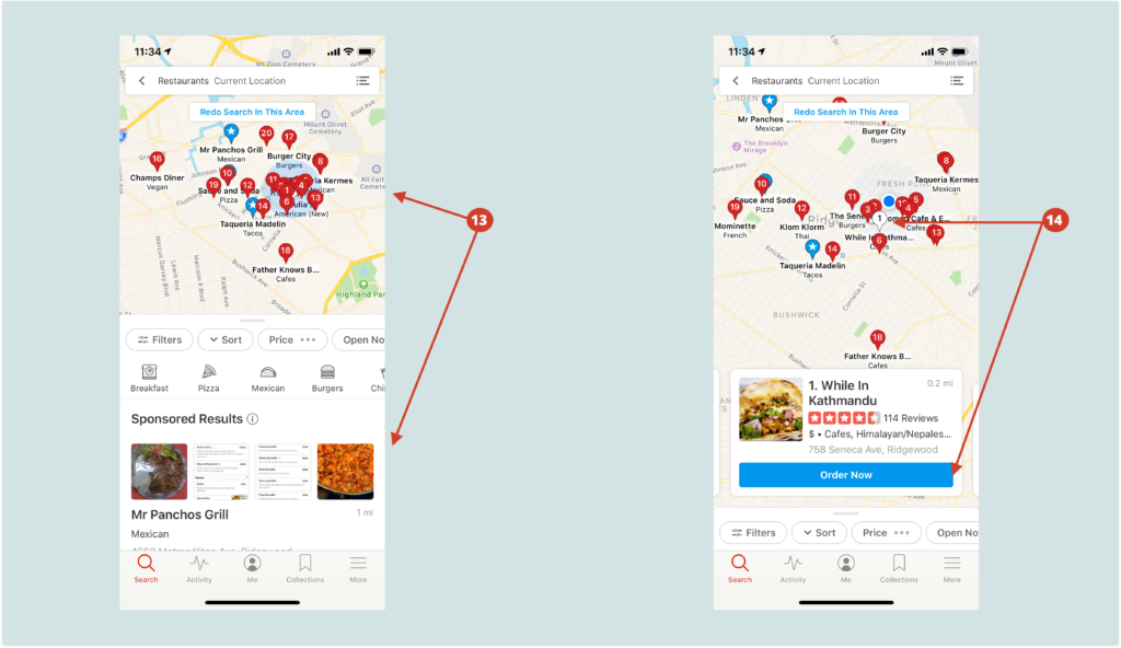
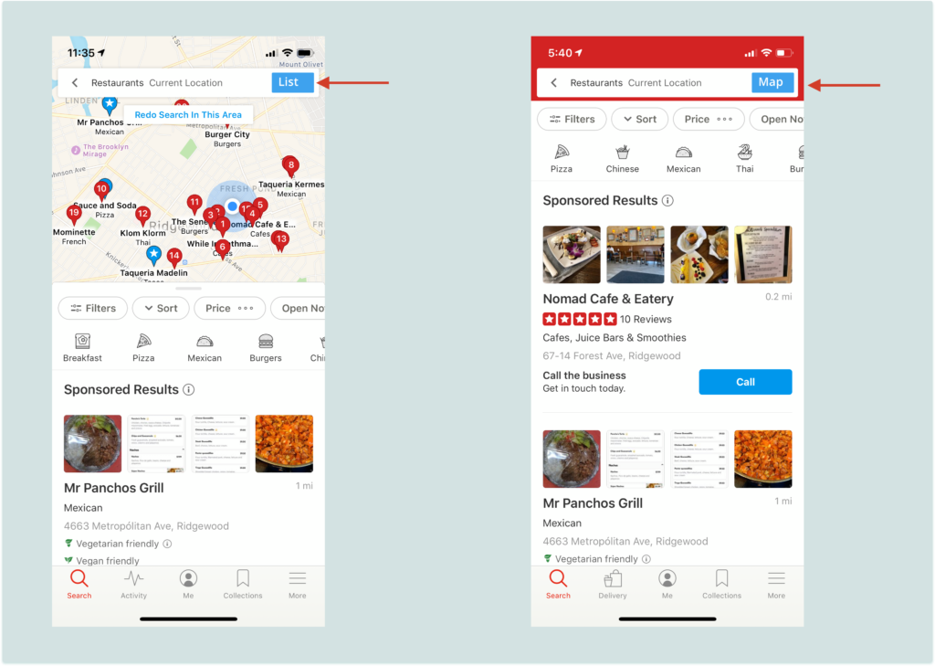
An icon on the right of the search tab affords to toggle between the list-view and map-view (see fig. 8[15]) of restaurants which acts as a constraint. However, it is difficult to understand the function of this icon because it is not descriptive and requires knowledge in the head.
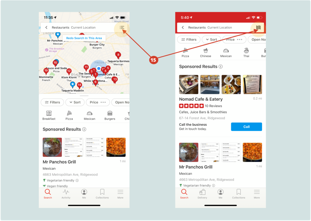
Options like “filters”, “sort”, “price”, etc. just below the map (see fig. 9[16]) is a constraint to avoid unnecessary clutter on the screen. The pinch gesture on the map, which the user already has the knowledge, helps to explore the map. On changing the map-view, the “redo search in this area” button (see fig. 9[17]) immediately pops up providing feedback and affords the user to refresh the search results with new pins being displayed. Signifiers on the map, like numbered red pins, blue dot (see fig. 9[18]) showing the location of the user are used correctly.
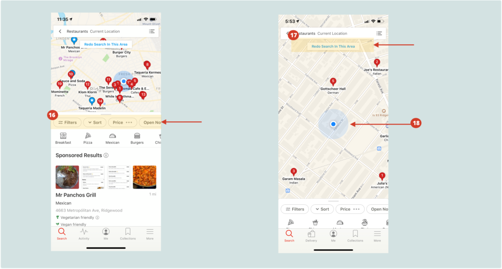
The principle of feedforward and feedback have been used carefully by providing appropriate constraints and good mapping.
Recommendation: In order to make the functionality of toggle between map-view and list-view visible (see fig. 10) the icon can be replaced with a button to switch to the other view leading to feedback and discoverability.
Conclusion
Yelp is able to display a lot of information which is both easily visible and understandable to its users. However, there is a scope of improvement in the manner information is displayed. When it comes to finding restaurants it gets the job done. It provides good recommendation and has been a go-to app for exploring restaurants.