Spotify is a popular music-streaming service that provides its users with access to millions of songs from a multitude of creators. With a Spotify account, a user can save their preferred music and access it from any device that supports Spotify—including mobile phones, computers, and web browsers. This design critique focuses on Spotify’s app for iOS devices.
Searching and sorting music
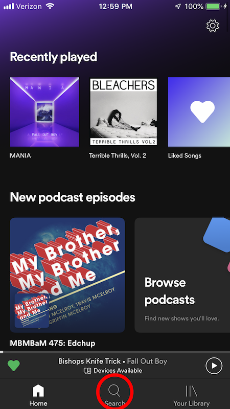
New music is easy to find on Spotify. The bottom navigation bar of the app has a clear signifier (Figure 1): the magnifying glass icon, accompanied by the word “Search.”
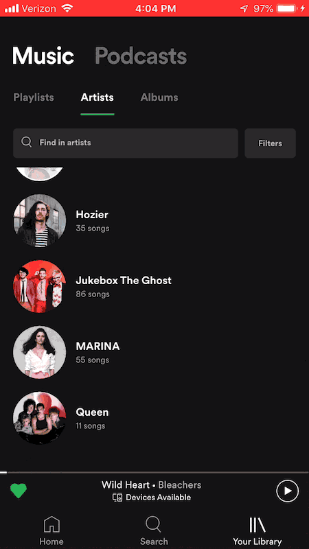
However, searching and sorting the user’s saved music is different. In the “Your Library” section (also found through the navigation bar), the music is separated into “Playlists,” “Artists,” and “Albums” (Figure 2A). When these screens are viewed, the search function has no immediate discoverability.
Scrolling up beyond the top of the list in each section reveals a search bar and “Filters” button (Figure 2B). This is how the user can search for a specific title, or choose the order in which their media is displayed. But new users might not be able to find these functions, creating a gulf of execution when they want to search or sort their music.
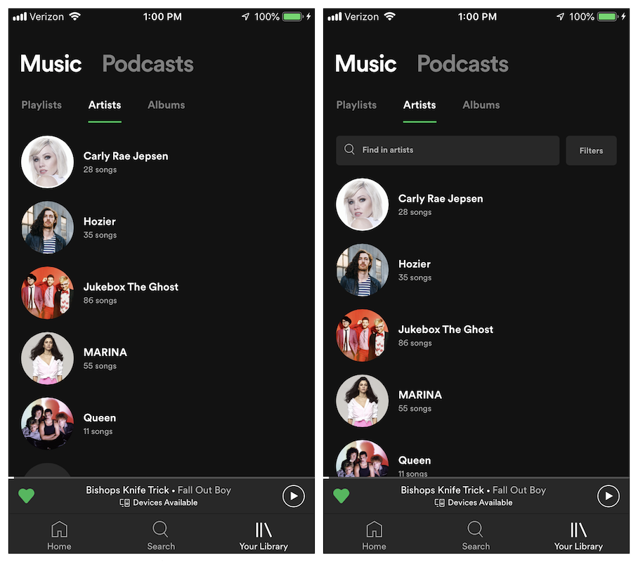
Figure 2B (right): Once the user scrolls up, the search and filter features are revealed.
SOLUTION:
Keep the search bar visible at the top of the screen at all times (Figure 3). This solution adds discoverability to the search and sort features, helping the user cross the gulf of execution.
Liking music
Spotify affords two methods for “liking” a song and saving it to the user’s library. The first method is to tap the “…” button next to the song title and then tap the “Like” option in the menu (Figure 4A). The second method is to swipe left (Figure 4B). The same methods can be used to “unlike” a song.
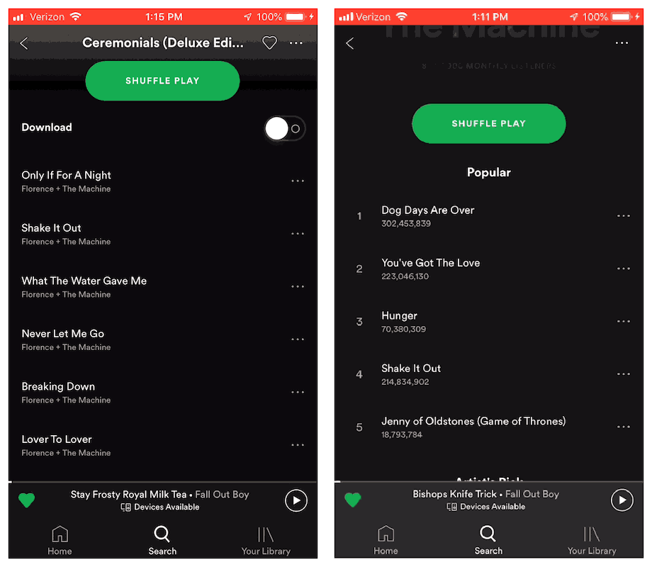
Figure 4B (right): Users can also swipe left on a song to “like” and “unlike.”
The first method is more obvious, since there is a visible button; the second method lacks discoverability. However, in both cases, the user receives immediate feedback, saying that the song was “Added to Liked Songs” or “Removed from Liked Songs.”
This feedback makes it easy for new users to learn the function of swiping left. An extra signifier to indicate the function of swiping would provide knowledge in the world, but it could clutter the screen with too many buttons. Instead, the feedback ingrains the meaning of swiping left as knowledge in the head.
Queueing music
Similar to the “like” function, Spotify also affords two methods for adding songs to the “queue” of what will play next. Users either use the “…” button (Figure 5A) or swipe right (Figure 5B). The feedback is also similar.
Figure 5B (right): Users can also swipe right to add the song to their queue.
However, repeating the action will not cancel the queue function, as it does with liking. In order to remove a song from the queue, the user must navigate to the queue and edit it from that screen (Figure 6).
The similarity of the “like” and “queue” processes may lead to a rule-based mistake. With liking, the rule is: swipe once to like, then again to unlike. With queueing, users may conclude that swiping once will add to the queue, and swiping again will remove it.
While the feedback shows the user’s incorrect result, the user still needs to take extra steps to correct the mistake.
Solution:
Change the “queue” rule to match the “like” rule. Swiping once adds a song to the queue, and swiping again removes it (Figure 7). This minimizes rule-based mistakes.
Downloading music
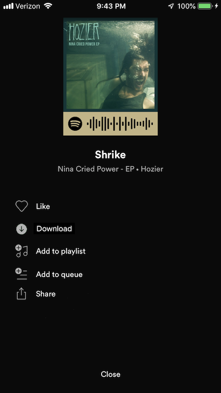
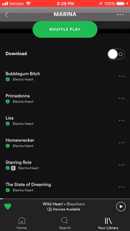
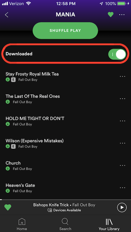
In order to be able to listen to music offline, the Spotify app allows users to download music to save locally to their device. For an album or playlist, the “Download” button can be toggled on or off (Figure 8).
However, the Spotify app does not afford downloading a single song without its album or playlist. Users who want to download individual songs must use long or complex workarounds (liking the song and then downloading the “liked songs” playlist, or using Spotify’s desktop app to set download settings). These extra steps can cause the user to feel frustrated on the visceral level.
SOLUTION:
Add a “Download” option to the “…” menu next to the song (Figure 9). This adds an extra function, removing the need to use workarounds. This could lessen the user’s frustration, and thus improve their experience with the app.