Felicia, Nitya, Siddharth and I were assigned the client: The School of Visual Arts (SVA) Library. Phoebe Stein, the Digital Services Librarian, was our contact for the assignment. SVA has not done a major update to their website since 2015, so they were eager to test all corners of the website from many different perspectives. While doing a massive test was not within the scope of the small-scale user test, as a group we were able to focus on the components that the library suggested might be high pain points for the students at SVA. We focused our research on appointments, hours, Inter-Library Loan and meeting rooms. Personally my task was focused on the ease of making appointments with librarians and the process revolved around contacting them.
The overall method and evaluation was very simple. Every choice made was done because they were the simplest solutions to the problems. SVA doesn’t have plans to create an entirely new website just yet but were looking to see if there are serious sections of concern and small ways to ease the pain point. We all met with Phoebe Stein, then narrowed the scope of the test, created the test, administered eight tests and analyzed the research. Having all sat in on different tests, we each decided what we deemed as the most important problems, picked the ones that overlapped with the most users and then each decided how to fix each issue. Some of the eight users were received via an email blast, however we had more success asking people in person to partake in our study. Each user was given ten dollars to Amazon for participating. SVA has two libraries so we were limited to people choosing to hang out at the Main Library. We had a high sampling of Photography and Design majors, which might reflect on the school, class locations, or projects due the week of our testing. There was one graduate student, however there was a mix of ages and library use.
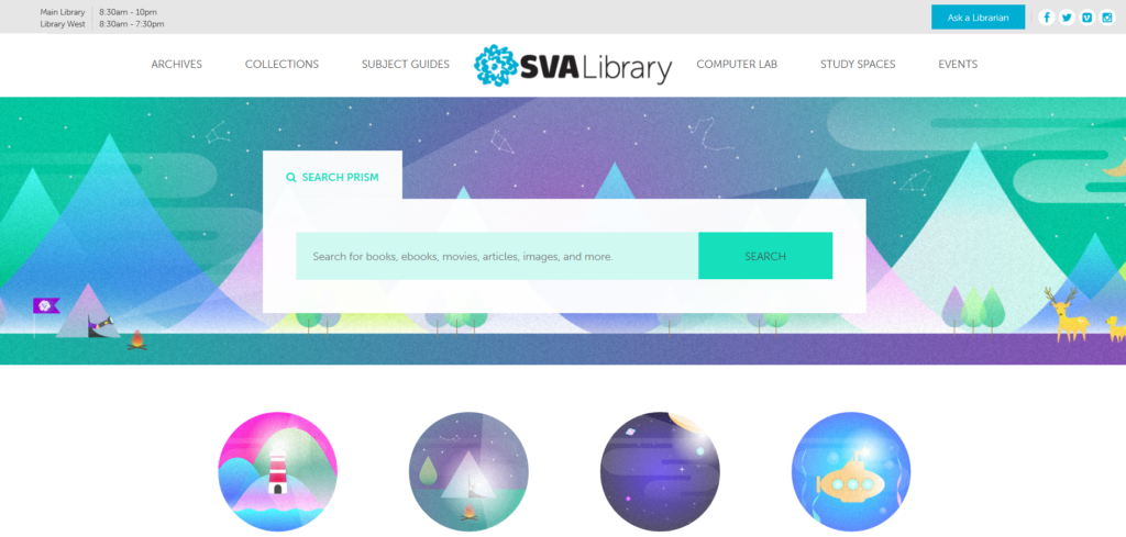
Overall, the website is well executed. The little changes they have made recently are good and the site itself is relatively useable as it is. However, the most important fixes would be making the hours clickable and cleaning up the ‘Ask a Librarian’ page. Explaining Inter-Library Loan is another thing that would greatly benefit the space.
I think our client was pleased. I noticed SVA has already made at least one change that I recommended for the website, by removing one of the ask boxes on the “Ask a Librarian” page, so that was a cool accomplishment to already have made a very minor difference on the SVA campus within 24 hours of handing in the assignment. Some other changes might take longer because they require more people to put them in place. If I could continue to evaluate this website I would do a few different things, especially if I had the ability to use a variety of user testing tools. Possibly A/B testing different colors for the top bar because I have a hunch that the gray is making the top bar disappear visually. I would look to see what wording and sections work the best for pages like ‘Ask a Librarian’. Using heat maps to see how far people are scrolling for the bottom menu. Additionally, seeing the metrics for what people click and what routes they take to get to their desired content to see if some other parts of the user journey can be eliminated. There are a lot of things that can be tested on this website, which is good because there is always room for improvement. Making some of the changes our group has suggested and then going back and continuing to test and make more changes is how user testing works effectively., SVA partaking in their first test of this website is a good step forward for their future in increasing their usability and is a positive step forward for the users journey.