Chewy.com is an online retailer of pet food and products I use to order things for my cat Ram. I focused on the seven fundamental principles of design from Don Norman’s book The Design of Everyday Things to show where this site displayed the application of good design. His book provides guidelines for designing understandable, usable and enjoyable products.
Discoverability
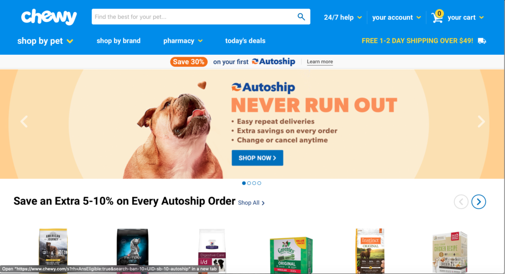
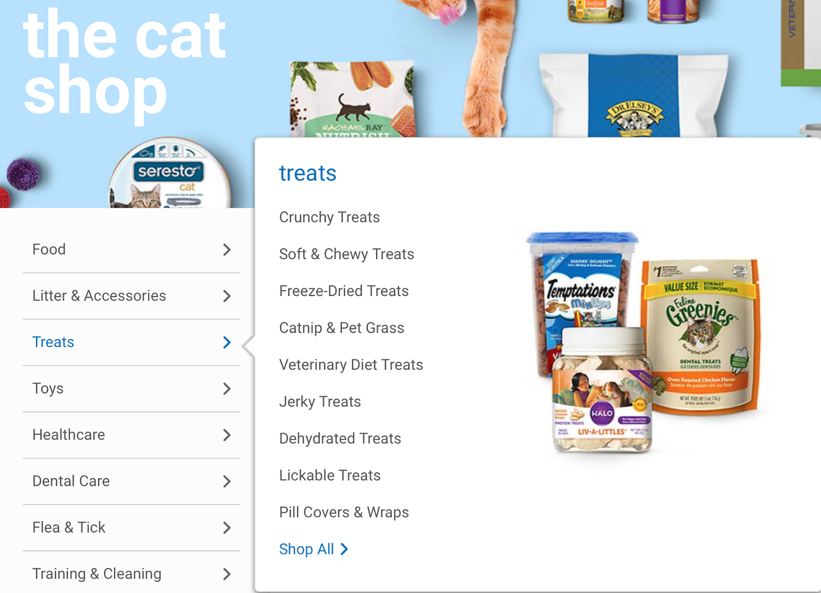
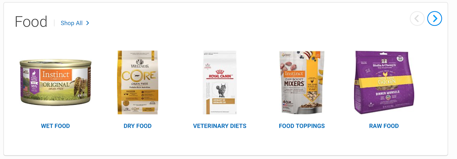
Chewy.com makes it easy to find what you are looking for and to discover what actions you can take. The use of prominently featured elements and easily categorized items creates high discoverability. In this example, I wanted to buy cat treats. On the Home page, there is an option in the top navigation bar to shop by pet. After selecting “Cat,” I was able to find my selection easily in the Cat Shop. I thought having Treats separated out into its own category from Food was a smart choice which helped make the shopping process even faster.
I discovered several options to buy different types of treats like “Crunchy” or “Soft & Chewy,” which was useful in case I wanted a specific type or wanted to try something new.
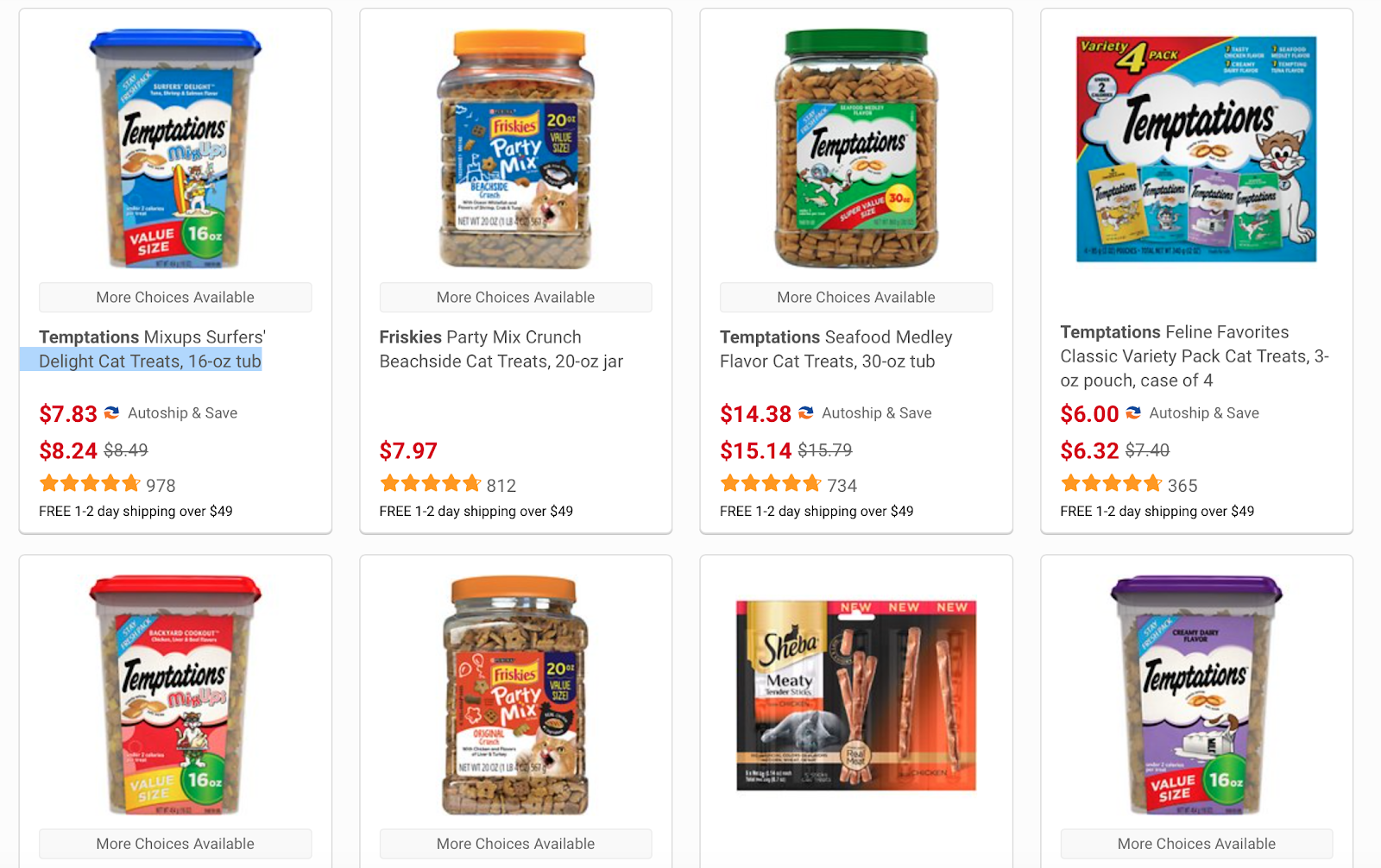
The product shots were vivid and showed off the packaging well and also indicated the various brands and flavors available.
Although the hamburger menu is a common interaction element that lets users know where to go to find more content, it wasn’t necessary. I would opt to get rid of it and just rely on the other navigational cues. It initially did not even appear until I started to scroll down the page so I thought it wasn’t a good design element.
Signifiers
Norman discussed the difference between the two design principles, affordances and signifiers, and how they are both important but updated this edition of DOET to focus more on signifiers, which are more relevant to designers. Signifiers are signs that indicate where an action should take place, which helps ensure discoverability. They have to be perceivable or they fail to function as signifiers.
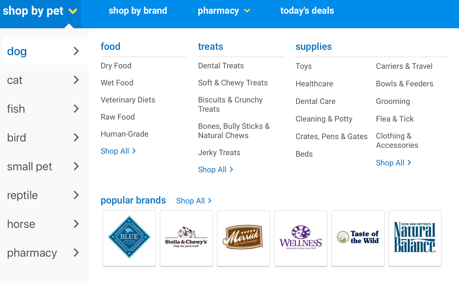
On the top navigation bar, Shop by Pet is more prominent than the other three options (Shop by Brand, Pharmacy, and Today’s Deals). This shows importance. The large yellow arrow to the right lets you know there is a dropdown menu to make your selection. However, a minor issue I had was the Pharmacy category. I think Pharmacy could be confusing so would rename it Vet Supplies or Pet Meds instead.
More of these signifiers showing the other options on the far right navigation bar.

The carousel of products, with arrows on the left and right, signify that there are more items available. Arrows are one of the more simple, easy to understand signifiers.
Feedback
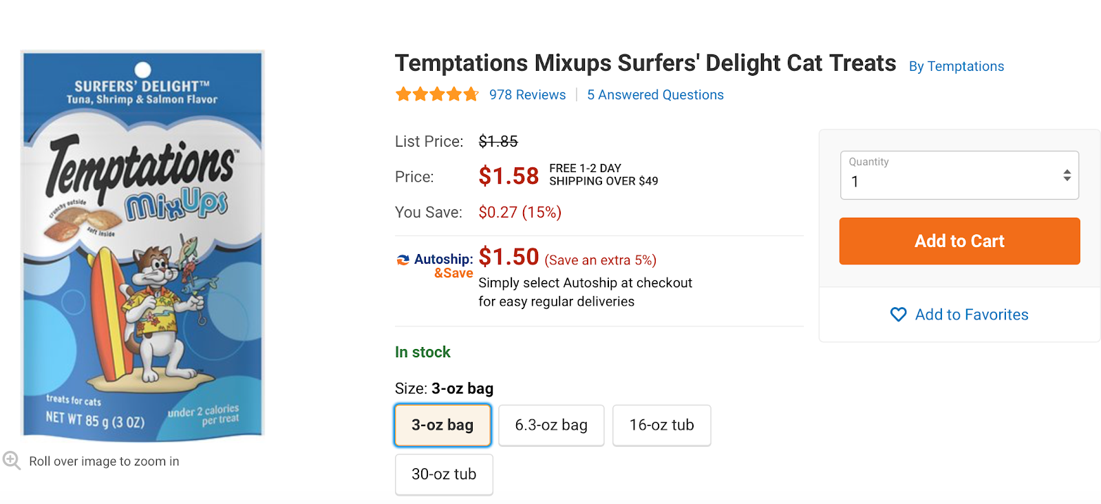
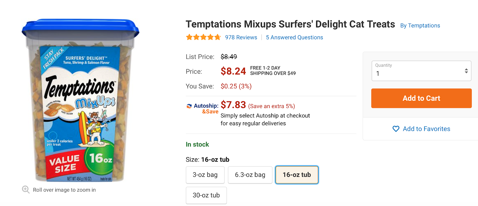
Receiving feedback is crucial so users know their desired action was successful and their current state. After finding Treats, I was taken to a page displaying several options. You are able to click on the photo to get to the product page. To see all of the different available sizes, I hovered over the various sizes and the photo changed accordingly. But only after actually clicking on the size did the price update on the screen. That important feedback let me know the price for purchasing the item one time and also if I added it to an Autoship order, for an additional savings.
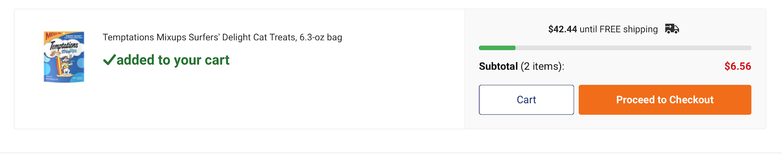
The next page featured a confirmation message that says “added to your cart” with a checkmark in green.
During my analysis, I also kept in mind the main principles that are most important for interaction designers, understandability and usability. I think the Chewy.com website does a successful job at both because the designers were careful in making sure the website was well thought out with the user in mind, resulting in a positive experience.
I also see a strong correlation to their branding and marketing, which is happy and upbeat, creating a fun and enjoyable shopping experience from visiting the website to receiving your order.
In conclusion, applying Don Norman’s design principles to the Chewy.com website helped me examine how to create a good user experience.