Meetup.com is a site for themed groups and corresponding events. It aims to give the impression of fast-tracking a user to meeting people at such events and tangibly advancing their lives.
I became a member on meetup.com by connecting to it from an email sent to Pratt’s google group. You can become a member of it quickly ‘through Google,’ so your existing professional or school email is preferred, add a profile picture, which is required at least for some groups, and start exploring.
There is a lot of both emotional and conscious, or reflective, thought processes that quickly come into play with a site like this, in my opinion. In other words—by naming both emotional and conscious up front, I mean big gulfs of execution. The site comes off like a less explicitly professional and more real-world version of LinkedIn. And this status has its refreshing qualities. The site successfully gives the impression that it’s about connecting with groups via interests and events. As the name suggests, it is event-centric, so that is a strong signifier.
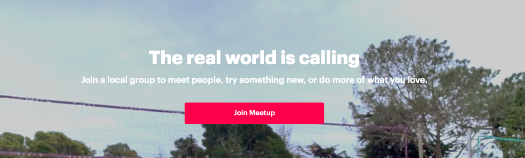
Since I was curious for the most general version of this signifier, I needed to see the site’s homepage when I wasn’t even logged in. Not logged-in, meetup.com’s homepage declares over a video, “The real world is calling,” and subheading that “Join a local group to meet new people, try something new, or do more of what you love.” And the content of this video—a montage—is stock footage-like scenes, including people making pasta, walking through Shinto shrines, at a restaurant, playing volleyball, in a dance class, among a couple others. The signifiers of the site want to be as general as possible, but at the same time, I think context or discoverability-wise, slants toward professional or at least professional interests. I say that because the group I connecting point to it was professional interest-based: An NYC UX/UI group, and when I see that there are many active similar groups, suspect that such veins of interest are also how people connect to the site.
In that sense, meetup.com gives me the impression it’s a more grassroots version of LinkedIn, and I don’t know if it is with or against their wishes to seem similar to LinkedIn, or remind users of LinkedIn when interacting with meetup.com, but that was my general experience with it. And with remembrances of LinkedIn comes some baggage. I realize LinkedIn is basically a “what you make of it” type of site, but its relative sleekness and non-specificity always bothered me a little. In the past I’ve thought career choices and progressions should be treated as ‘serious stuff,’ and so over streamlining or sleeking it out frequently results in begrudging wastes of time for all involved.
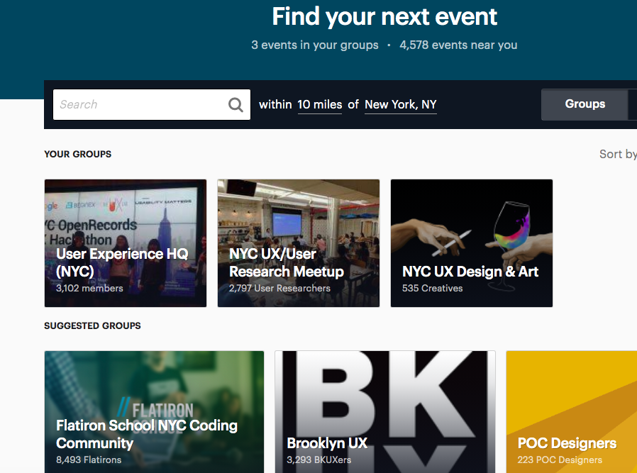
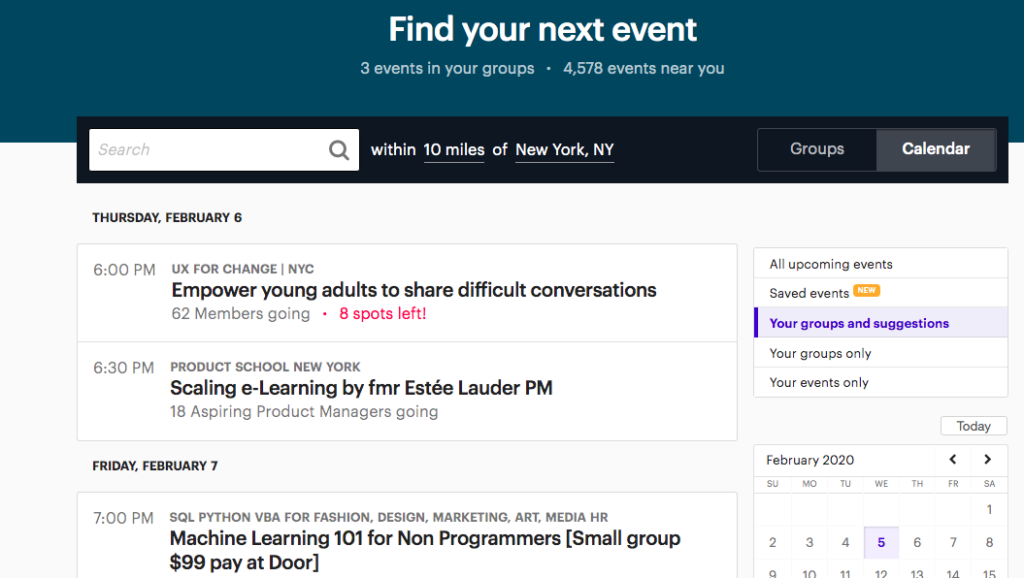
As an example of the connection between the two sites, meetup.com’s homepage—once logged in, which is a feed, says “Find your next event” followed by “3 events in your groups,” then a wider-funneling feed of upcoming events. It is divided between two categories: “Groups” and “Calendar.” Both share the “Find your next event” banner.
I find my impression of this to be similar to LinkedIn, or even a listserv—anything funneling the user a stream of tangible or possibly-tangible material. And that impression is that I’m at once piqued with aspirations to advance my interests and connect with people in at least semi-special settings, but it also surfaces an immediate, conscious cageyness. Especially when being presented with large amounts of tangible material (events I could ostensibly attend), I reflect right away on such presentations not leading to satisfying circumstances in the past. Among other reasons I suppose this is because brand groupings or ideas of one’s interests are powerful, but I also think design should reflect that there is no fast-forward button for figuring this out. In other words, if there was a conceptual model for one’s professional interests, it should perhaps be more careful and less imperative.
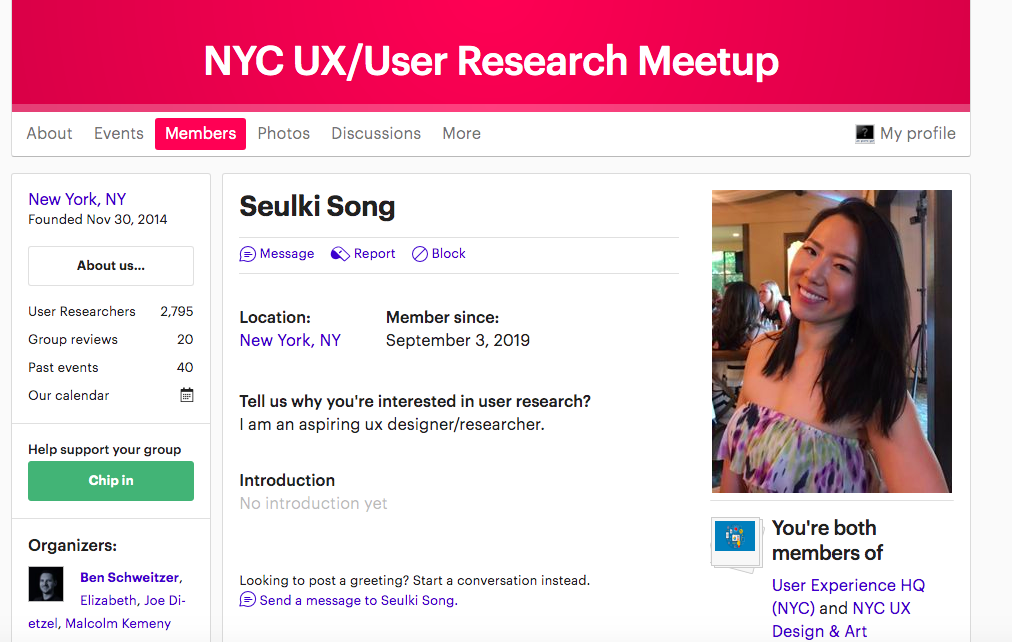
The site has its intimidating moments. When clicking on a user’s profile you must sometimes click past a “See my full member profile” popup clear in terms of credentials to do so or if you are sending a “friend request” type of command.

And when I do reach a member’s full profile I am greeted with this block-red banner at top, which, as far as reactions to the color red are regarded design-wise, makes me wonder if it is necessary or helping me connect to the group. At the same time, when joining at least some groups a user must enter short-answer responses. Short-answer responses on a digital interface virtually always put a user on the spot, and unless that user specifically enjoys the challenge of coming up with something pithy or “to the point” in this case (and are those even most advantageous as opposed to conversational or exploratory information architecture?).
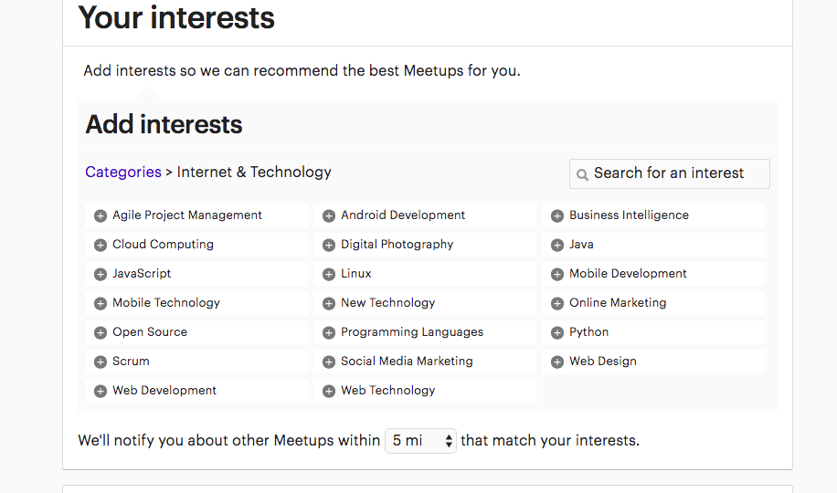
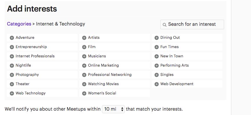
I think that Norman would agree, as a lot of brand-driven groupings cause the user to perform lots of ‘interpreting,’ or doing. There’s not a flow state where cognition matches emotion with a site like meetup.com. Take for example how quickly the site’s interest tagging becomes intimidating. First the user is given broad categories within which to tag interests. I selected ‘Internet & Technology,’ as that’s more or less the theme that brought me to the site. The first round of tag options within this category is fairly straightforward, but I as I started choosing them the tag options auto-refresh and shuffle in new options that do not totally sound like “internet & technology.” And if the user is bold enough to try clicking on “Communities & Lifestyle,” I’d like to meet the person who isn’t intimidated by the options there. Since these are far from what would be said routinely in the average professional environment, they would seem to send meetup.com to an altogether different sphere, albeit still with at least my general impression seeing it as a professionally-focused site.
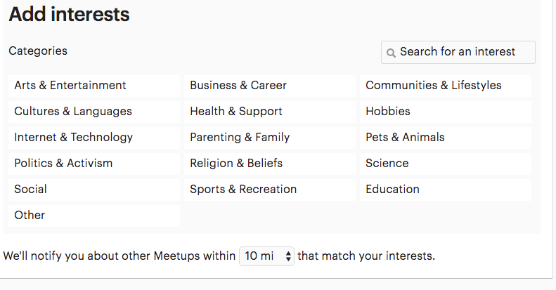
The first panel of interest tags
The first panel of Internet and Tech tags
An auto-repopulated panel of internet and tech tags
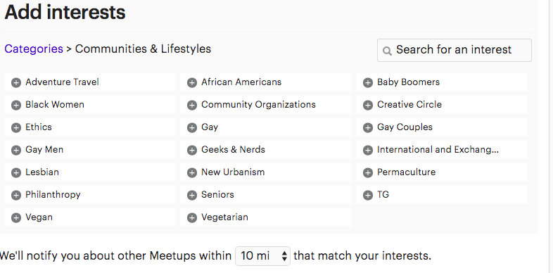
The community and lifestyle tags
In all, it makes me think how perhaps I am appealed by bite-size designing. When design presents as imperatives, meaning a large amount of tangible opportunities super-packaged and offered at once, I think that can lead to too much interpretation, and not much of a conceptual model. The last thing a user should want to do is fuse that same excess to upcoming time and events.