Background
The NJ Transit App is transportation application meant to aid commuters and tourists traveling
between New Jersey and New York via NJ Transit’s buses, Path Train, or Light Rail.
It allows users to buy tickets, look up arrival and departure times, as well as create travel plan.
The application’s objective is to make commuting easy and it is continually updated,
with the most recent release being its 2019.3.1a version.
HomePage
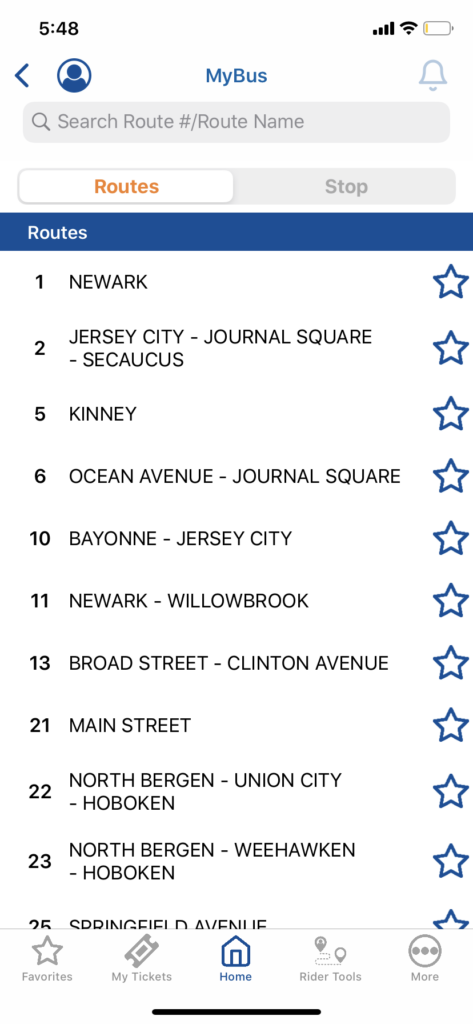
Home is the starting point for users on their journey. A simple, but block heavy home screen directs users to what main actions are possible: Buy Tickets, Departure Vision, My Bus, and Schedules.
Discoverability and understandability is emphasized in the home layout through color, sizing, icons, and labels. Large, blue boxes affords visibility and clickability against a white background. Whereas signifiers such as a bus icon indicate a relationship to their bus system, which is clarified more by labels like: “view real-time bus status and departures.” Feedback is also immediate with buttons leading users directly to their respective follow-up pages with labeled headers.
negatives:
Having explored the app, the easily navigable home screen is a great example of Don Norman’s understandable design. However, these traits failed to translate throughout the app’s other pages. Overlapping designs make things not so user friendly and the app favored internal knowledge or familiarity with the bus system making it difficult for first-time users. Overall, the app has many great functions, but there are too many steps making them tedious to execute. The app would benefit from being less roundabout and perhaps be amplified by combining features. To illustrate these and provide possible solutions, I will focus on MyBus and Trip Planner.
MYBUS
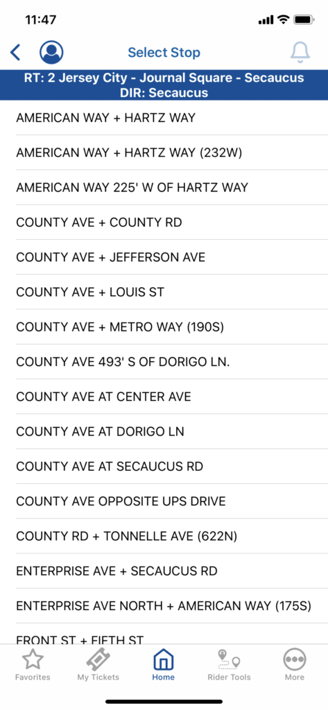
The MyBus function allows the user to track the real-time status of their bus by entering their route number or stop. The user flow is as follows:
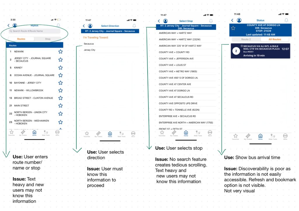
The user flow is good, but fails to cater to needs of those unfamiliar with bus routes or those pressed for time.
Their is a need to conduct further user studies to aid the app’s ease of use. The use of interviews, questionnaires, and observations would lead to a stronger design.
Useful questions to ask participants includes:
1) What are their demographics? eg. Age, Occupation, Gender
2) Have they used NJ Transit before?
4) Are they familiar with transit routes? Do they need to lookup them up?
3) When do they use the app? What situations? e.g commuting to work
4) What is their current opinion of the NJ Transit App?
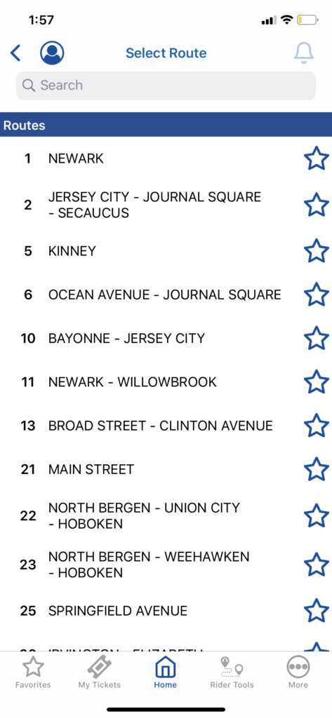
An additional issue, is the app being riddled with opportunities for description similarity-slips. Apparent in the flows above as well as when comparing “MyBus” and “Schedules”. The Schedules’ route search is near identical with MyBus, but it results in different outcomes. As the user navigates the function, the main label is not present and existing labels are very small making users likely to miss them when rushed. Their design becomes frustrating and far less practical as insufficient descriptions and signifiers do not allow a user to discriminate the information presented.
MYBUS REDESIGN CONCEPTUAL MODEL
The redesign provides the following abilities:
– Real-Time Bus Arrival Times
– GPS Bus Tracking System
– Real-Time Map
– Transition Between Transport Schedules (Bus, PATH, or Light Rail)
– Search Bus # or Stop
– Favorite Bus Route Schedules
The redesign helps eliminate description-similarity slips by using unique controls and displays to differentiate functions. By using a map instead of a list of routes or stops, the content is more palpable and provides a sense of familiarity at a visceral level. Resembling popular apps like Uber or Lyft, signifiers such as a vehicle pin show incoming buses to a stop and location icon shows the user’s location in relation to the stop. At a behavioral level, this familiar design gives users a feeling of control and the ability to apply learned skills from similar transportation apps. On the reflective level, users are applying conscious cognition as they engage with the design and evaluate what decisions to make on their journey i.e. whether to rush breakfast or take a later bus.
Additional features to consider adding is “Buy a Ticket” option beside bus times and consider merging Trip Planner and MyBus to make the map more accessible to new users.
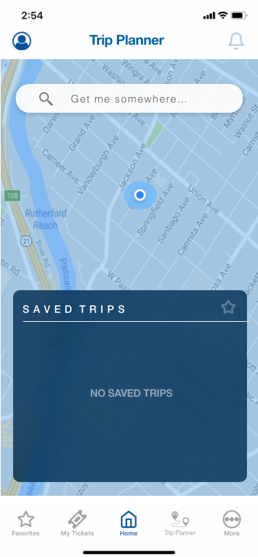
Trip planner
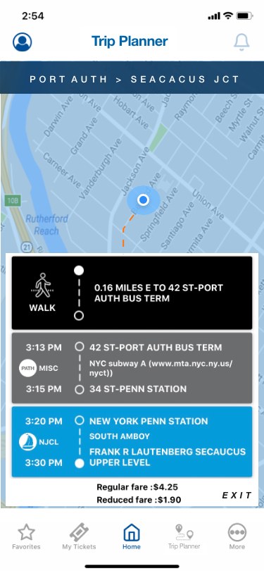
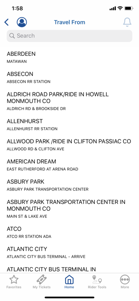
The Trip Planner function allows to search for the optimal plan to travel between two locations. Users can select their origin, destination, travel method, as well as the departure time and date. The user flow is as follows:
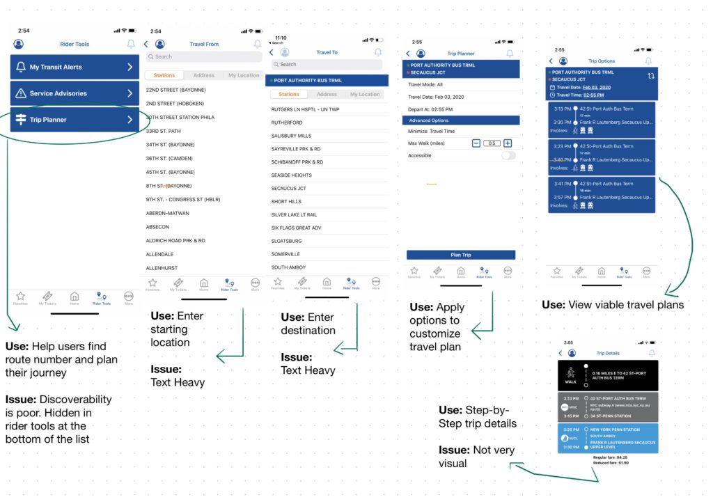
Excluding the first page, this flow is my favorite as it is very easy to follow and is pretty efficient. For instance, trip planner allows users to search for their origin and destination either by station, address, or tracing their location unlike “MYBUS’s” rigid scrolling, Unfortunately, this useful tool is easily missed as it is not prioritized on the homepage or at the start of the Rider Tools Tab. Ironically, this tool is very valuable to new users who are unfamiliar with NJ Transit routes or those who would like to use “MYBUS,” but are unaware of their route # or stop name.
TRIP PLANNER CONCEPTUAL MODEL
Trip Planner biggest issue is discoverability. It is an essential function to the success of the users, but is rather difficult to find. To remedy this, the redesign would first revise the navigation menu from “Rider Tools” to “Trip Planner.” The tab would be solely for the Trip Planner function. Whereas the service advisories and my transit alerts functions could easily be moved to a new page activated by the alert bell icon on the header.
The final revisions I made were to the main Trip Planner page and trip details page. A map on the main page signifies a relationship to navigation and is a well-used design. A visual map aside the step-by-step instructions also aids in overcoming memory lapses. Users can use the model to visualize the next steps to take making retaining and understanding directions easier. Lastly, I would include the ability to save trips to help new travelers save their route information, which would likely be forgotten using short-term memory. The details on these bookmarked routes can be applied by users later for their MyBus schedules.