Sleep Cycle is an alarm-like mobile application that helps users have a better sleep by relaxing them at bedtime, tracking their sleep and waking them up at the light sleep phase. This post reviews this application according to Norman’s Design Principles with the following tasks: play a sleep aid, set up an alarm and close it and review the statistics.
Why did I use it?
A clear conceptual model starts from the logo
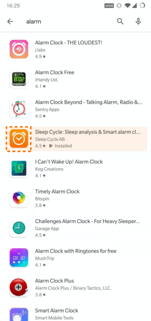
I chose to download Sleep Cycle among those alarm applications not only because of the precision of the alarm-like logo but also because of the visceral feeling I had at that moment. I perceived that this application was well designed and would not wake me up in other fancy ways as I felt from other competitors.
The task “Play a Sleep Aid” is well-designed
The video above records how I select a sleep aid and play it. As shown above, this application has a good mapping that user can clearly understand that the top section is for “sleep aid”, the middle section for “set up an alarm” and the bottom section for navigation. The “play” button on the top region builds users’ conceptual model indicating it plays sound. The color difference between the whole “Sleep Aid” button and the background helps to strengthen the signifier to make it looks more like a clickable button. Also, I appreciate the feedback after clicking on the “play button” where sound wave-like animation shows up.
However, the interface for the sleep aid list needs to improve its discoverability since users can see all types of sleep aids at first glance, hindering users’ gulf of execution when they cannot specify to take which action. My suggestion is to add a card banner with each available sleep aids type to filter those scrolling down options.
The task “Set up an alarm” is satisfying
The video above records how I set up an alarm clock. The little distortion of the timer along with the thin white frame around the time is a good example of affordance that suggests it is scrollable. The big orange button of “start” is also a good example of the signifier communicating where the action should be taken place. After activating the alarm clock, the fluctuating wave on the bottom gives users strong feedback that it was working.
However, for a long time, I did not find out the alarm clock can actually switch its mode because the sliding indicator is not obvious especially sitting below the big “start” button. My suggestion would be adding some subtle text guide next to the sliding indicator or adding “<>” on the edge of the interface to indicate the page is slidable.
Why did I delete it?
This application does not appeal to me at the reflective level
The video above records statistics related functions for this application. It utilizes graphs and histograms to tell you how you sleep statistically but it does not give you any recommendation. Sleep Cycle does well in the Visceral Level and the Behavioural Level by providing us an intuitive and associating most of the actions with the user’s expectation. In my cognition, this application shares the same nature with the default alarm and plays exactly like a machine. I cannot form an emotional bond with this application because I would not be willing to analyze the sleep data every time. I would expect Sleep Cycle to give evidence-based recommendations like adjusting bedtime or sleeping environments such as sleep aids, temperature. Otherwise, it would be hard to keep using it every night. My suggestion would be adding a “recommendation” function in form of sliding text on the home page.