I’ve been using Netflix since my senior year in high school. I’ve also tried HBO and Hulu from time to time, but I always go back to Netflix. Netflix has a way of hooking its users and making watching it into a habit, by delivering a very “chill” experience. User-centered design employs empathy and in turn increases satisfaction of the end-users. This design critique will be using Norman theories from “The Design of Everyday Things” to analyze the good and bad designs Netflix utilizes.
“Good design is actually a lot harder to notice than poor design, in part because good designs fit our needs so well that the design is invisible, serving us without drawing attention to itself. Bad design, on the other hand, screams out its inadequacies, making itself very noticeable.”— Don Norman
What is Netflix?
For those who are not familiar with Netflix—Netflix is an American media-services provider and production company which focuses on subscription-based online streaming services offering a library of films and television programs, including those produced in-house.
Landing Page
If you’re a returning user, subscribed and logged in, this is the first thing you see after directed to netflix.com. It’s highly discoverable, and has a very clear conceptual model for Netflix users. There is almost no “space” for errors and confusions. 99% of returning users click on their profile to log in to their main page, as shown in the next section.
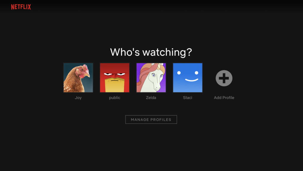
NEGATIVE: DOES NOT REMEMBER USER’S PROFILE PREFERENCES 😤
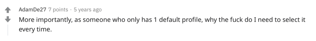
However, as a longtime user, this page is a complete waste of time. Logging in with the mobile app or a laptop, I’d go to the same profile each time. It’s just an undesired additional yet inevitable step for me. Maybe this is useful for someone with multiple-personalities or a youth who shares the same computer with his siblings (computers come with multiple user profiles too though). Furthermore, a lack of constraints often lead to unwanted user behavior, such as someone (accidentally) clicking into another profile and (accidentally) seeing his or her view history and saved list. The good news is this additional action drive visceral responses since the user would likely click through their profile image (the one they are most familiar with and pleases them the most) without thinking at all.
RECOMMENDATION: ALLOW USERS TO STAY LOGGED IN TO THEIR PROFILES ✌️
…Or at least add the option to set a default profile for their device, and not be logged out each time.
Main Page
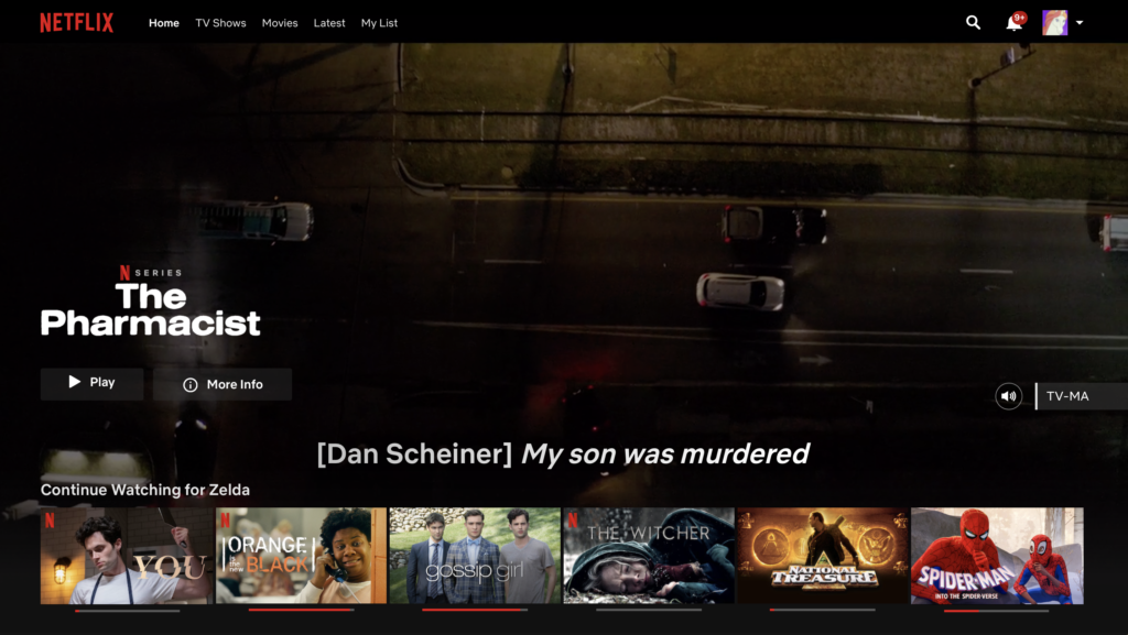
After clicking on your profile image or name, the main page opens. A trailer automatically plays in the background, and the user can choose whether to play it or look into it more. They also have the freedom to mute the trailer, and move on down.
POSITIVE: ONLY DISPLAYS WHAT’S NECESSARY AND USEFUL ✅
Netflix is like a library of movies, so it focuses on functionality rather than aesthetics . Minimal design always wins. Netflix consistently sticks to its main colors–black and red— making the movie images stand out through visual hierarchy.
RECOMMENDATION: CREATE A “LIGHT” MODE FOR BETTER ACCESSIBILITY 👀
Netflix’s black background and white text displayed strong contrast, but the contrast ratio would be higher if it was black text on white background. A “light” mode would improve Netflix’s accessibility for visually impaired users.
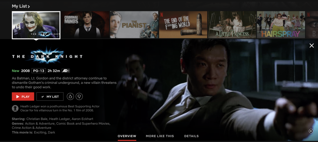
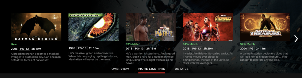
Underneath the trailer is the “continue watching” playlist, and a “watch later” list added by the user. Upon hovering on any of the movie images, an enlarged preview appears. If you wanted to see similar movies to “The Dark Knight”, you would look for signifiers with the labels “similar films”, “you might also like” or “more like this”. You most likely would spot and click on the text that says “More Like This”. The red underline moves under “More Like This” immediately, indicating now you’re seeing similar movies.
POSITIVE: SMALL GULF OF EXECUTION AND EVALUATION ✅
This gulf of execution is small since there are only a few obstacles, such as someone missing the text under the trailer because it is not very noticeable. The gulf of evaluation is also small since immediate and highly visible feedback is immediately given by the system.
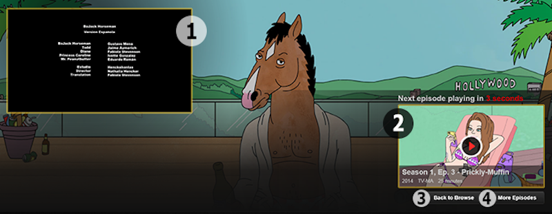
AUTOPLAY
The function of jumping from ending episode (1) to the next episode (2) is made discoverable. Even if the user sits afar, they would be able to see the next episode in 15 seconds. The play button which follows an established conceptual model (in 2) informs the user that it affords starting the next episode immediately. Although extremely tiny compared to the autoplay option, there is a return to home page option (3) and a button to select another episode to watch (4). Some might say Netflix is applying a dark pattern to the autoplay design to lure users into making endlessly binge-watching Netflix a habit.
POSITIVE/NEGATIVE: (UNNOTICEABLE) OPTION TO ELIMINATE AUTOPLAY 🤷🏽♂️
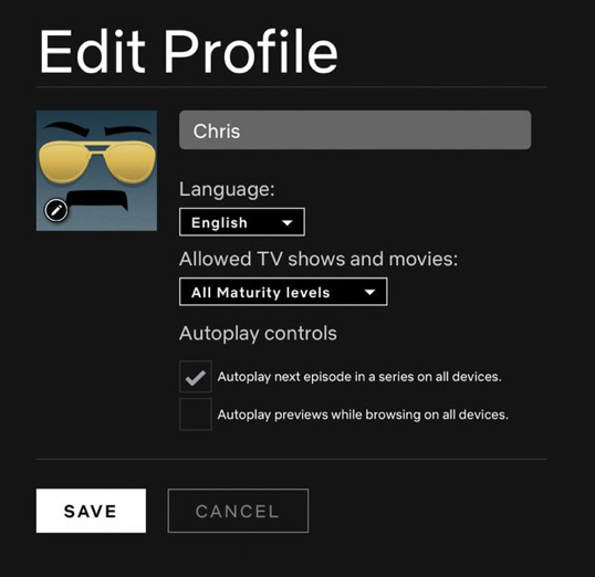
Users are able to turn off autoplay in their profile settings, which gives them the freedom to stop “forcibly” watching Netflix episode after episode. However, the location accounts for a poor mental model of the users, as the mapping between where the user expects this setting to be found (probably in view settings, not profile settings) and where it is put is problematic and illogical .
CONCLUSION
Netflix is very popular among users of all ages, but it has room for improvement on the usability front and user empathy settings.