Uber is an American transportation network company that offers services of matching passengers to vehicles, founded over a decade ago. The company currently operates in 60+ countries and 700+ metropolitan areas. Over the past few years, Uber has established itself as one of the leading ride-hailing companies across the globe, making itself synonymous with the word ‘cab’.
Initial Landing Page
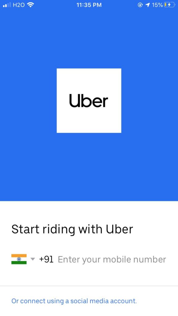
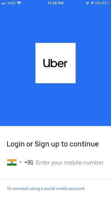
The application features a minimalistic layout for the landing page. A single text field is seen that affords to enter phone numbers. As the application is available in several countries, it allows one to select a dialing code for a specific country, mapping the international dialing code of the country with its flag. The login page also features a hyperlink, ‘Or connect using a social media account’ that affords logging into the application using common social media platforms. However, there is no apparent signifier (Login label or button) to indicate the process of logging in.
Logging in
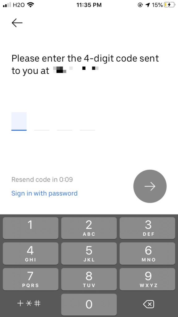
After entering the phone number, the application allows logging in using two mechanisms, either by entering a One Time Password or by the traditional method of entering a password set by the user. Using the OTP can reduce the load on Knowledge in the head, by having an OTP sent to the registered mobile number at the time of login itself, for authentication.
However, if the user is unable to access his/her phone, he/she can also be authenticated by entering a password.
Homepage
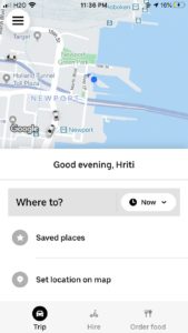
After logging in, the homepage of the application features a map powered by Google maps, for the user to understand his current location and the proximity of the cars with respect to his location. This, however, requires a certain knowledge of the world.
The homepage also features a field to enter the destination which is easily discoverable and signified by the phrase ‘Where to?’. The application lets you select the destination by typing it out, choosing from a list of saved places or set a location on the map. This again makes use of knowledge of the world.
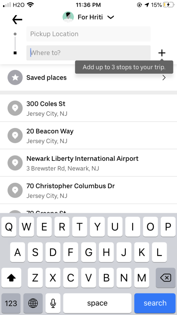
The user can add up to 3 stops for a trip. These stops can be added using the ‘+’ button that clearly signifies adding. A new user, however, wouldn’t know as to how many stops can be added. Thus, when the user logs into the application for the first time, this information is made available to him (Shown in figure 5), which on a usability front is a good feature, especially for new users. The application also lets you book a cab for someone else, by selecting a rider from a list of riders, signified by the ‘dropdown’ icon. This, however, the user to be aware of the common icons or in other words, have some knowledge of the world.
Once the destination is selected, the user receives immediate feedback (Shown in the video below), where the path to the destination is traced, estimated waiting time and fare for different options are shown.
Booking a cab
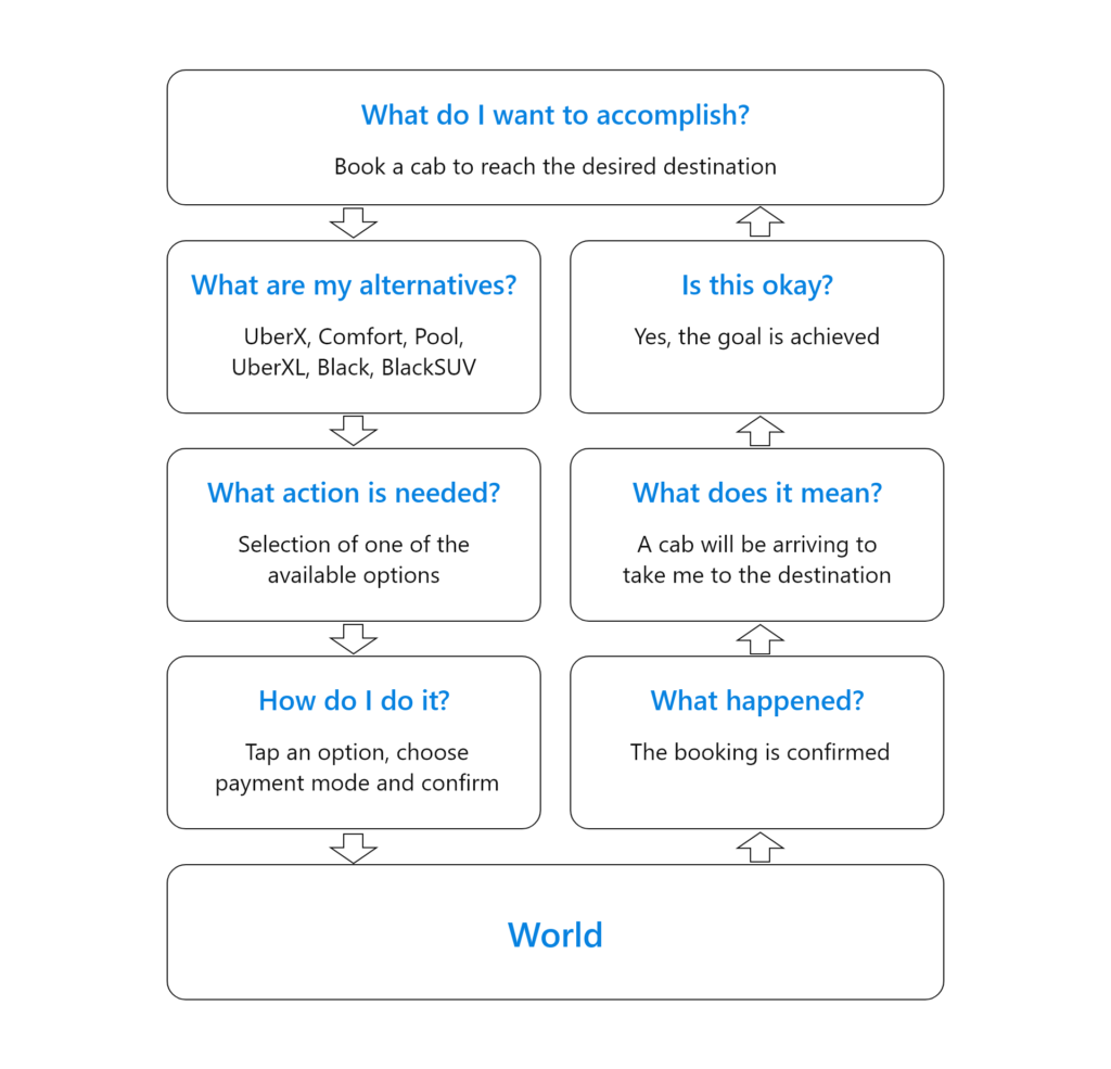
The seven stages of action (namely, Goal, Plan, Specify, Perceive, Interpret and Compare) are applicable to the process of booking a cab to reach your desired destination.
Side panel
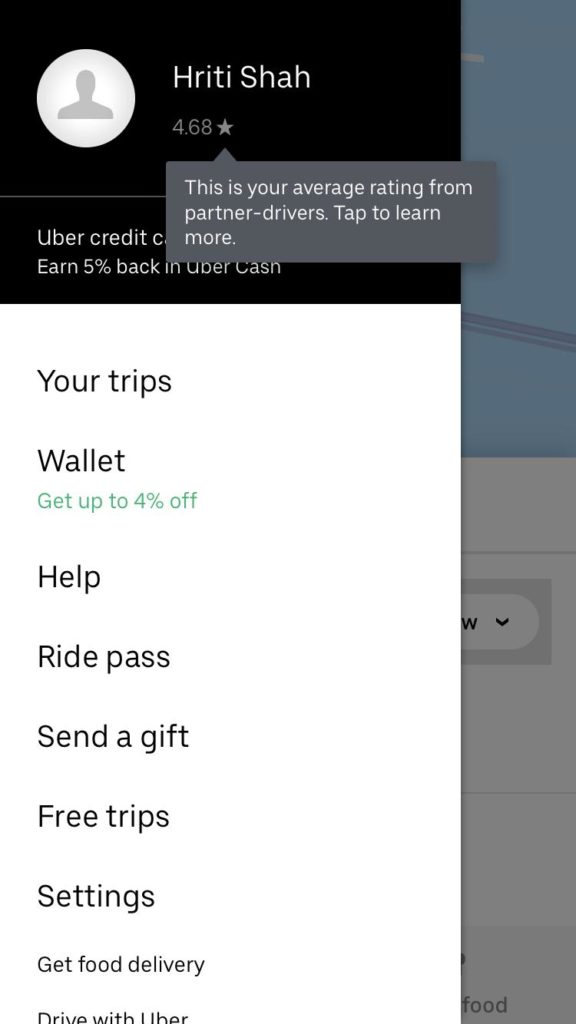
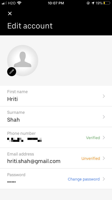
The side panel is easily discoverable, making use of the hamburger icon on the top-left corner. This requires certain knowledge about the icons or in other words, knowledge of the world. However, the side panel does not have a clear signifier to access one’s profile to edit details, which can be done by tapping on the name.
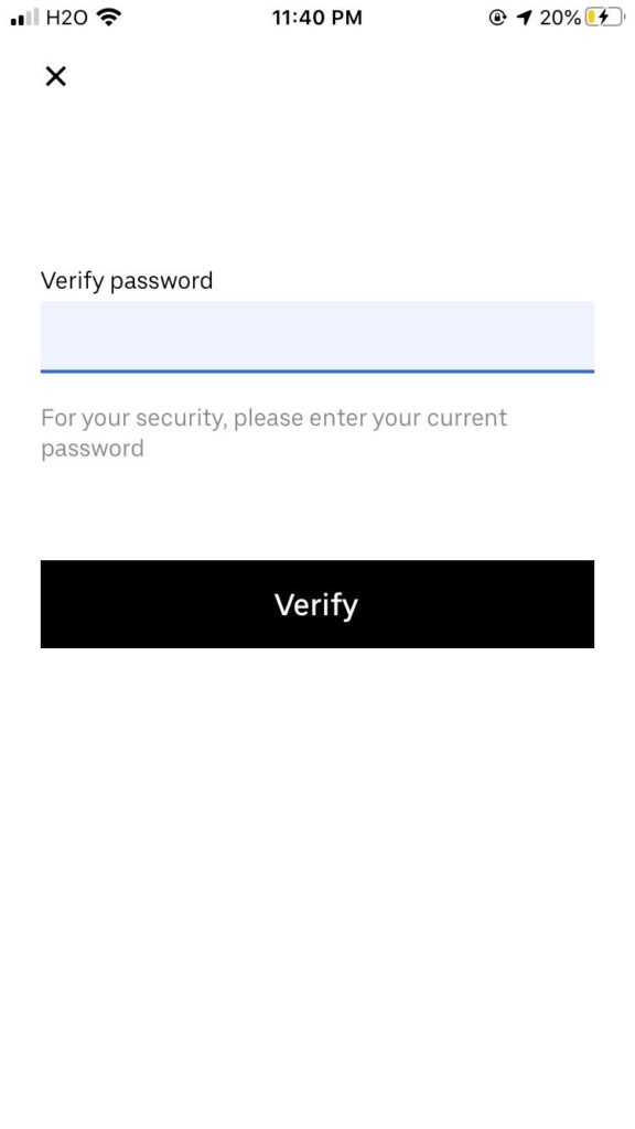
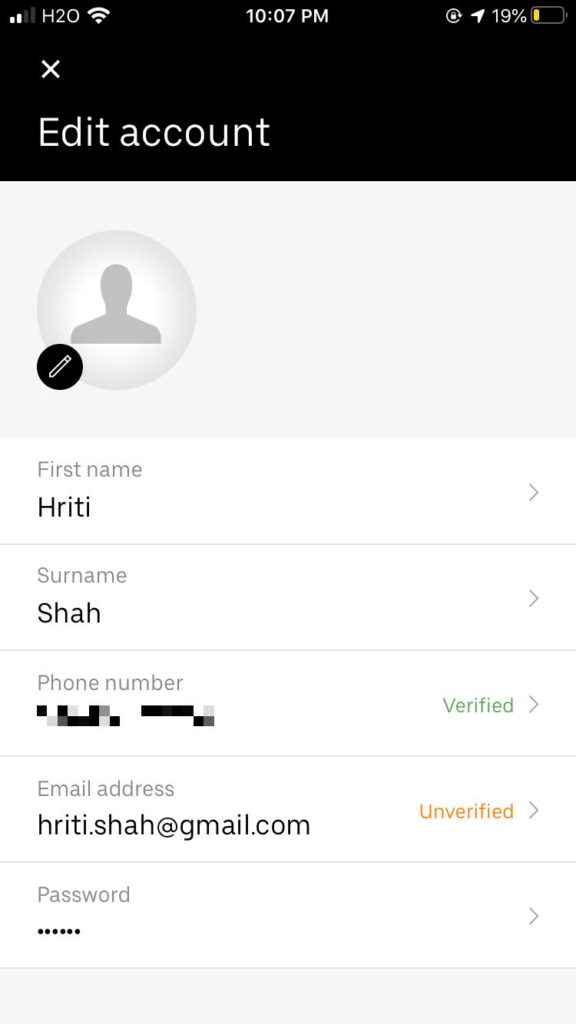
Once you visit your own profile, the action for changing the password is not easily discoverable. This can be done by tapping on the password and verifying the current password. This, however, is not clear due to a lack of relevant signifiers like ‘Change password’.
Final Thoughts and suggested improvements.
Overall, the application features a minimalistic UI that is easy to learn. In most instances, the application makes use of relevant signifiers, mapping and provides appropriate feedback. Apart from a few exceptions, most of the actions are discoverable. Here are the following improvements in order to make the user experience seamless.
For the initial landing page, adding the phrase ‘Login or Sign up to continue’ (Shown in Figure 8) can serve as better signifiers to indicate the process of logging into the application.
The password change action in the ‘Edit Profile’ section Is not easily discoverable. This can be improved by providing a hyperlink for the action (Shown in figure 9).