THE CHALLENGE
I was part of an ambitious project to evaluate the desktop version of the Barnard Digital Collections website (based on user research), address critical issues, and provide recommendations to solve them.
THE CLIENT – A POOL OF ARCHIVAL MATERIALS
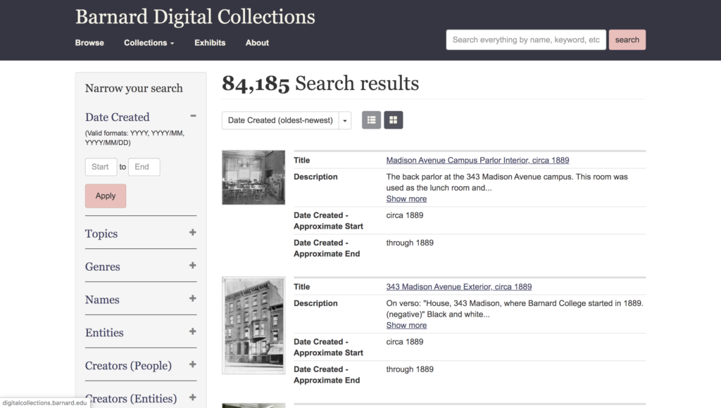
Created in 2014, the Barnard Digital Collections features materials from the Barnard Archives and Special Collections, offering students and researchers access to about 85,000 resources including but not limited to digitized photographs, yearbooks, and newspapers, with more added to the site every day.
THE GOAL
Our goal for the project was to make the website usability easy and efficient to attract more users and revive the old ones. Our ambitions were to create a strong foundation that embraced simple navigation and efficient researching, be it for Barnard student researchers, staff members, or external researchers.
TEAM MEMBERS
Lillian Gooden
Mayank Gupta
Mohammed Hosen
MY ROLE
I collaborated with the team members in brainstorming, ideating, user research, user interview, and eventually creating the user testing report and presentation.
I was part of 6 user interviews – I moderated 2 and assisted in note-taking for 4 of them. I was responsible for working on Recommendation #2, designing the report, and was the contact person for the clients via email.
DURATION
7 weeks
MENTORS
Prof. Elena Villaespesa
Prof. Madhav Tankha
KICKOFF – THE CLIENT MEETING
At the outset of the project, we didn’t have a clear mission or specific goals for improving usability. At first glimpse, the website looked pretty decent in terms of browsing. However, the client meeting shed some light on the fact that 85% of the users use the desktop version of the website. They have been planning a major update to the site and would like recommendations from usability experts at this point in time.
THE PROBLEM
The major problem was surrounding the discoverability and use of filters and categorization of the website. This also included some of the client’s concerns:
- How often do users make use of the filters? Do they find the filters useful or confusing?
- Are users aware of the different categories the website has to offer?
- How long does it take the users to find what they are looking for?
- Are users being able to effectively utilize the Exhibits section?
- Do users realize that the task has been completed?
PROCESS
- Defining the Goal
- Designing a Plan of Action (Screening Questions, User Tasks, Interview Script, Checklist)
- Remote User Testing (User Interviews, Post-Test Questionnaire)
- Analyzing Data
- Making Recommendations
- Creating the Usability Report
DEFINING THE GOAL
Our goal for the project was to make the website discoverability and usability easy and efficient to attract more users and revive the old ones. Our ambitions were to understand the challenges that the users faced and the workarounds they employed and to make strong recommendations that embraced simple navigation and efficient researching, be it for Barnard student researchers, staff members, or external researchers.
Designing a Plan of Action (Screening Questions, SCENARIO AND User Tasks)
We started by creating a Google Form Survey to target the right users for the study. The potential users were Barnard student researchers, staff members using the website, and also external researchers.
Screening Questions
The Barnard team was very helpful in passing on the survey to their existing users. Our major success criteria were users who:
- are researchers
- have used a digital archive portal before
- are pursuing or achieved a Bachelor’s Degree
- can dedicate up to 50 minutes for the study
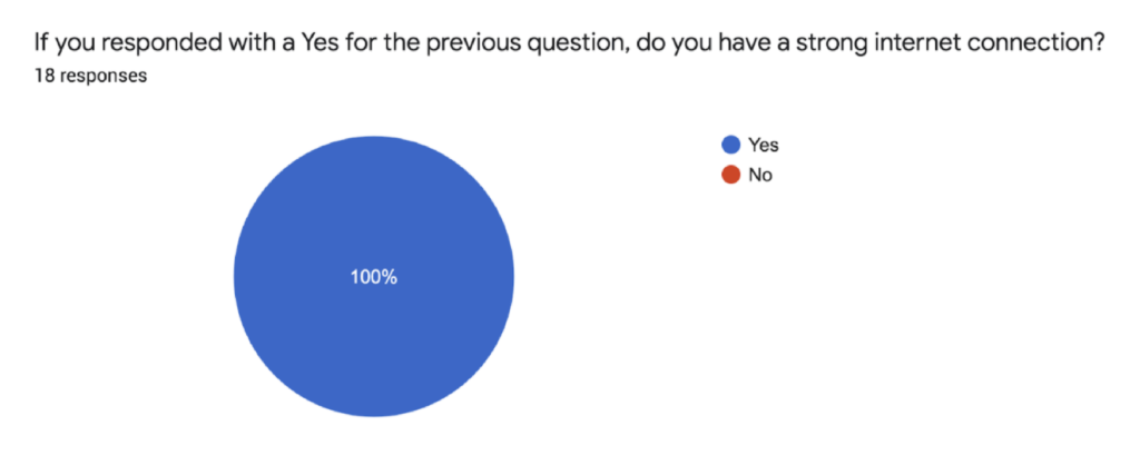
- have a laptop with a strong internet connection for a Zoom interview


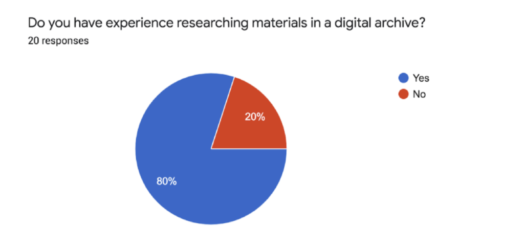

Based on the success criteria, 8 prospective candidates were shortlisted for the study; 1 was an external researcher and 7 were part of the Barnard College community.
Scenario and User Tasks
We brainstormed and shortlisted 4 main tasks based on a given scenario to test the client’s concerns regarding the different features of the website. Our tasks were designed to mimic actual website usage.
We presented the users with the following scenario for the tasks:
Imagine you are an independent researcher looking for information on student life at Barnard College in the 1960s and ’70s. You have come to the Barnard Digital Collections portal to source materials from their archive.
Task 1:
Find the digital exhibit on Student Publishing.
a. Describe your first impressions and think aloud as you browse through the exhibit.
b. Do you have any suggestions or observations based on your experience with this task?
Task 2:
Martha Stewart is a notable alumnus from the class of 1964. Locate an article in the Barnard Alumnae magazine about her.
a. Describe your first impressions and think aloud as you browse through the exhibit.
b. Do you have any suggestions or observations based on your experience with this task?
Task 3:
Your research involves second-wave feminists’ concerns for women in higher education. Search for proposals on this subject matter in the digital collection.
a. Describe your first impressions and think aloud as you browse through the exhibit.
b. Do you have any suggestions or observations based on your experience with this task?
Task 4:
You are a historical researcher looking for images of Greek games held at Barnard in 1966. Try finding the photos using Barnard’s digital collection.
a. Describe your first impressions and think aloud as you browse through the exhibit.
b. Do you have any suggestions or observations based on your experience with this task?
We also had an interview script and checklist designed to carry-out the interviews.
REMOTE USER TESTING (User Interviews, POST-TEST QUESTIONNAIRE)
We reached out to the participants via email to fix a meeting day and time and also sent them consent forms to sign before the interview. Since this study was being carried out during the COVID-19 pandemic, we found it best to conduct the interviews remotely on Zoom instead of in-person.
User Interviews
The goal of these interviews was to study:
- the background of the user
- user patterns in terms of task difficulties or task completion
- website discoverability and navigation

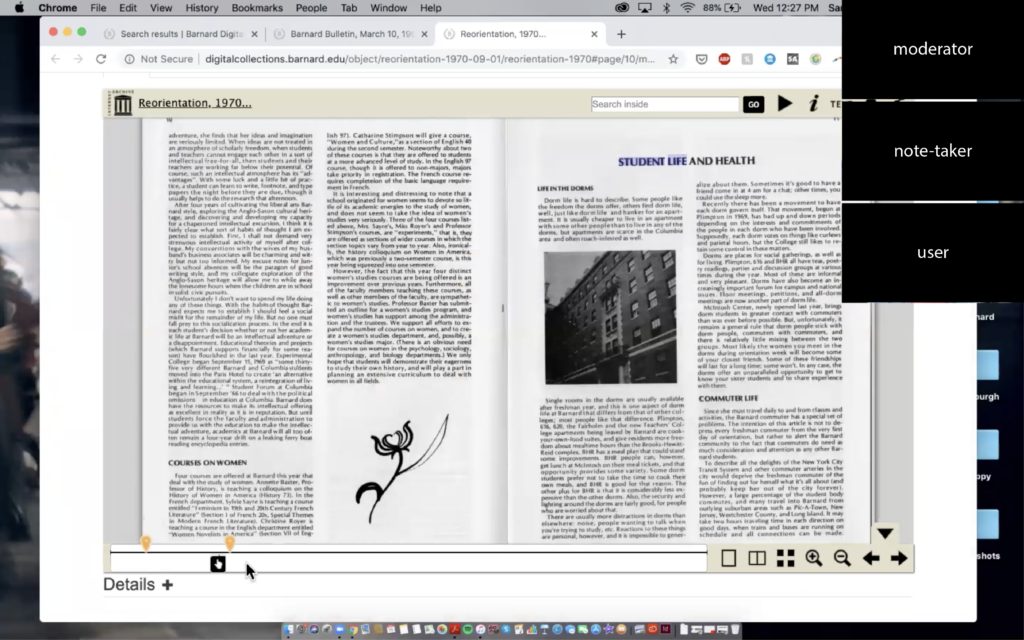
The participants were asked to share their screens on Zoom and browse the website based on the above-mentioned scenario and tasks. The interviews were recorded and lasted for an average of 45 minutes and were followed by post-test questions. Each interview had a moderator who would introduce the tasks and run the interview. Each moderator was assisted by a note-taker who was responsible for taking digital notes during the interview and ask any follow-up questions to the participant if need be.
Post-Test Questionnaire
The interview ended with an online post-test questionnaire to record the participants’ experience with the website and ask for any recommendations they would have.


ANALYZING DATA
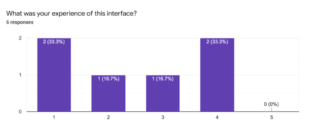
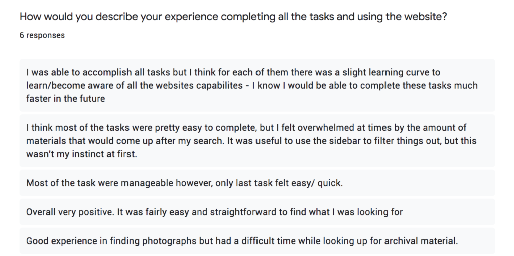
The user interviews and post-test questionnaires resulted in some common usability issues among the users. Below is a summary of the overall interview experience:
- Most users found the website to be aesthetically pleasing, particularly the color scheme, and were impressed by the quantity of data the website offered.
- The number of metadata (filter) categories was overwhelming for some.
- The functioning of the filters was confusing.
- Inexperienced users had a hard time finding relevant results for the first task as they were not aware of the advanced search operators.
- Navigating the Exhibits section was confusing and not organized well.
- The ‘View Object’ button in the exhibits section could look more clickable.
- Zooming in and out of photographs was difficult.
MAKING RECOMMENDATIONS
The team decided to focus on 4 usability issues that required priority. Each member worked on a recommendation each. Below are the 4 findings (based on user interviews and feedback) along with 4 recommendations that fall into the areas of searching, metadata, digital exhibits, and archived photographs:
Finding#1
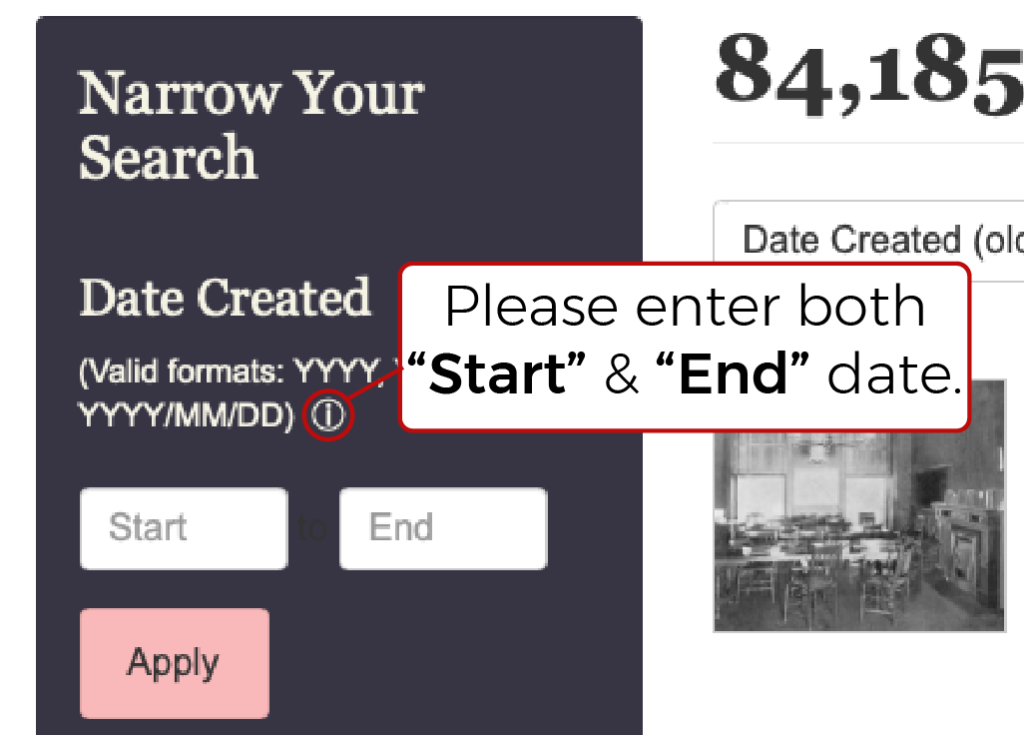
37.5% of the users missed the “Narrow Your Search” panel on the left (Fig. 1), which rather helped the 62.5% users who used it to streamline their search results. Since 62.5% of users actually found filters to be helpful during their tasks, it was concluded that making the filter section more prominent would help significantly improve the user experience.
It was also noted that 75% of the users struggled with the date filter, as not entering the ‘End Date’ gave them a vague error with no feedback on how to correct that.
Recommendation#1a
Adding more contrast to the ‘Narrow Your Search’ panel would make it more visually appealing and draw the user’s attention, helping them find information more efficiently (Fig. 1Ra).

Also, adding an “i” (information) button to provide details about how to use the date filter would improve the usability of the filter panel (Fig. 1Rb).
Finding#2
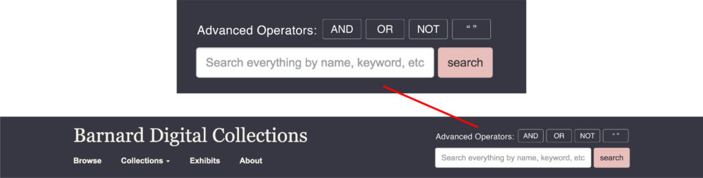
The global search bar (Fig. 2) was the first instinct for 75% of users for an average of 75% tasks. 37.5% of users who were also Barnard students/alum made use of “ ” and ‘AND’ for advanced searching to find the results of the tasks.

You have to know what you’re looking for to find what you need.
– Barnard Staff Member
Barnard students are taught early on how to use advanced searching methods.
– Barnard Student
Using the logical operators “ ”, AND, NOT, and OR while searching the database helps in finding exact keywords. It came to the team’s attention that Barnard academics and external researchers are taught to use the advanced tools as part of their education.
However, since the options “ ”, AND, NOT, and OR are not quickly visible (they are located in the narrow search bar on expanding the keyword section) while searching keywords, some researchers think that this feature is not applicable. In contrast, some others are not aware of this way of advanced searching and end up spending more time finding accurate results. There is a need to highlight these options.
Recommendation#2
Adding the options “ ”, AND, NOT, and OR in the form of buttons (Fig. 2R), above the global search bar to highlight it and increase the efficiency of research and reduce the task time. All that the users have to do is click on these buttons to add them automatically in the global search bar.
Finding#3
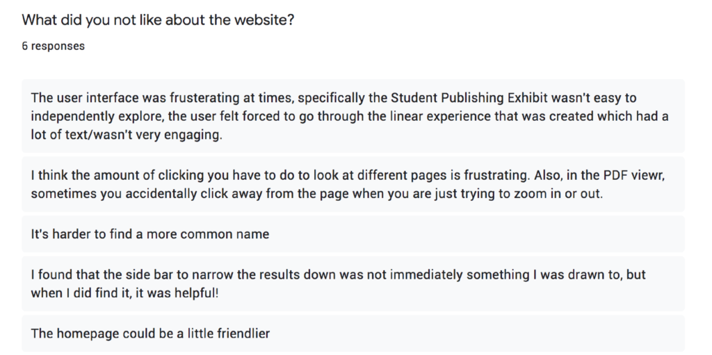
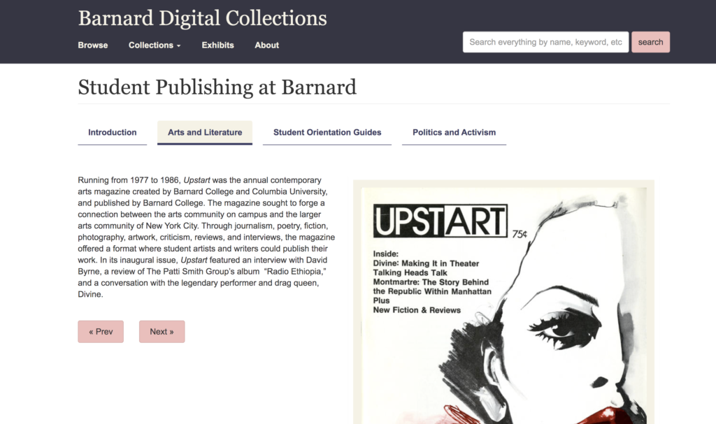
Users found the Exhibits section “interesting and dynamic” and appreciated the readability of accompanying text on each page. While they had no problem locating the exhibits section, they did express frustration with the limited navigation options there. Because the section only has the Previous and Next buttons (Fig. 3) and the section tabs at the top to guide them, it was challenging to gain a sense of their progress within each section and the exhibit as a whole. One user, a Barnard student, pointed out that they “felt forced to go through the linear experience” of the exhibit.
Recommendation#3
To enhance the user’s sense of place and progress within the digital exhibits, it is recommended to add a progress bar to the interface. This progress bar displays a row of buttons with titles pertaining to each slide in the exhibit. It echoes the style of the existing navigation bar, subtle changes in the format and font size indicates that the entries in this bar fall below the sections above in the exhibit hierarchy (Fig. 3R).
As users navigate through the exhibit, the highlighted titles serve the purpose of showing where in the exhibit users are and also provide an escape from the “linear experience” described in user feedback. By clicking on the buttons, users have a way of jumping to entries of interest outside of relying on the Previous and Next buttons to flip through each page in sequence.

Finding#4
The photo gallery within the Barnard Digital Collections is vast and contains photographs collected since the founding of Barnard College. Many users noted that it was easy to search for photographs and were pleased with the filtering options.
During the interview, 37.5% of the users had either issues with or suggestions for improving the interface and how it displays photographs within the digital collection. The zoom features embedded within confused some users as they tried and failed to view the entire image successfully. While some weren’t expecting a zoom feature, others did not notice it. Fig. 4 below shows how most images appear once clicked.
Pretty straightforward. Noticed the + – and option on the search this collection tab. Maybe it was there before, [but I] noticed now.
– Barnard Student

Recommendation#4
Making the zoom buttons more visible will allow users to quickly and easily find the location of the feature and its uses. It is also suggested that photographs appear in full view when opened. Users can then decide whether to zoom in to see the finer details of the image (Fig. 4R).

POST-TEST CLIENT MEETING
Our recommendations were well-received by the client. They were surprised that since they had been using the website for so long, that even though they had come across these usability issues, they did not see them as an issue for the users. They liked the fact that some of the recommendations were easy fixes like the date filters and photograph view and could be implemented quickly.
We discussed some alternative options to increase the efficiency of the ‘Narrow Your Search’ panel and if there is a way that its use can be improvised. They suggested a horizontal panel instead of the current vertical one. We did give that recommendation a try but it turns out it looks crowded and the vertical dropdown menu takes over most of the viewing screen. We realized this was not the best option and did not include it in the final report.
TAKEAWAYS
The entire evaluation process was very well planned and executed by the team. It was a great experience working with such a well-coordinated team. The best part of the process was to moderate the interviews and observe user behaviors.
Since the tests were conducted in a remote setting (because of the COVID-19 pandemic), I missed out on the experience of conducting an in-person interview. However, this remote user testing helps me realize what preparation is required in the back-end for conducting an interview under such circumstances.
The next step would be to conduct further testing when the recommended changes have been implemented.