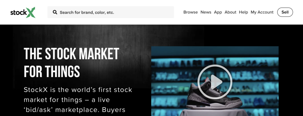
StockX has had what seems like a meteoric rise to success over the past several years, as it has combined two unique concepts that haven’t really been seen together before: consignment shop & stock market. In this design critique, I’ll be evaluating the StockX website against Jesse James Garrett’s book ‘The Elements of User Experience’. Garrett asserts that the framework for user experience is made up of five planes: Strategy, Scope, Structure, Skeleton, and Surface. I’ll be breaking down each plane in that order, as we move from the abstract Strategy plane towards the concrete Surface plane of this website.
Strategy: User Needs & Product Objectives
I’ll start by defining the strategy of this website by answering the following two key questions:
- What is the product’s objective(s)? To amass a large and reputable collection of in-demand collectible sneakers, clothing, accessories and art, generating a profit off of the transaction fees of sellers. It also serves as an informational tool for broadcasting resale prices.
- What are its user’s needs? To find, purchase and sell collectable items, and monitor resale prices and trends.
I can attest that the website meets, at the very least, the basic needs of the user, and based on its reputation for being one of the market leaders in its industry, I can imagine it is also meeting its product objectives. Therefore, checking off the two main boxes in its Strategy plane.
Scope: Functional Specifications & Content Requirements
On the functional side, this product is concerned with creating a one-stop site for users to browse, save and purchase items, post their items for sale, and bid prices on items. On the content side, this website includes information on item descriptions: brand, sizes, colors, styles, etc., trends and history of item prices for resale predictions and monitoring, FAQ for users of the site, and feature articles related to fashion. The fashion editorial section of the site I think distracts slightly from its strategy, but it doesn’t impede the user from fulfilling their needs.
Structure: Interaction Design & Information Architecture
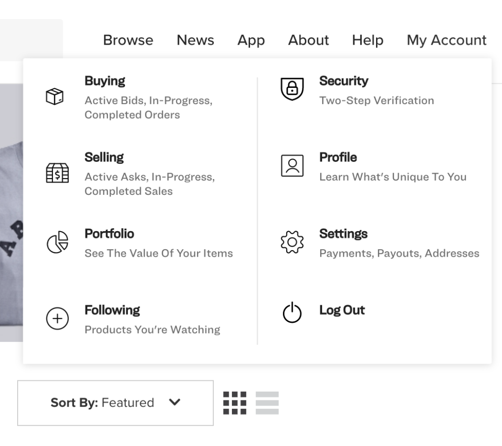
This website sticks to some tried-and-true conceptual models when it comes to interaction design, like the logo being used as a global ‘home’ button and a magnifying glass being used for the search feature. However, one of the most widely recognized conceptual models when online shopping (the ‘shopping bag’ or ‘online cart’) is excluded. When a user clicks on an item that they’re interested in, they have the option to either buy the item now at its lowest asking price or bid another price. If the user decides not to buy now and continue browsing, they are redirected back to their previous page and cannot save the item into a cart. They have the option to ‘follow’ an item, which acts as a saving feature, but this is not as intuitive as an ‘online cart’ feature. The area where a user’s ‘followed’ items are stored is hidden under a drop-down sub-category on the global navigation bar and not very readily accessible (see below).
The information architecture seems to follow a matrix structure in its browsing feature which allows the user one of the websites greatest functionalities: to filter their search results based on a multitude of options including price range, gender, season, size, which can then be filtered even further by popularity, lowest price, release date, volatility and more.
Skeleton Plane: Interface Design, Navigation Design & Information Design
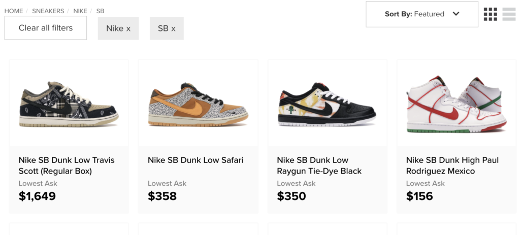
From a navigation standpoint, the user is easily able to navigate to the sites main areas by using the global navigation bar along the top of the page. The navigation bar includes a standard search function and 7 categories: ‘Browse’, ‘News’, ‘App’, ‘About’, ‘Help’, ‘My Account’ and ‘Sell’, that the user can always locate no matter where they are within the site. The website also makes smart use of a breadcrumb trail to allow the user to find their way back to the previous page (see below).
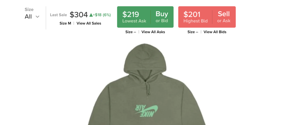
The interface design compliments the sites matrix architecture by including boxes that the user can close out (see above) to clear a filter(s) without losing the rest of their meticulously selected filters. Some of the interface’s elements include multiple checkbox lists (when allowing for multiple filter selection criteria), and radio buttons (when only one filter selection can be made) giving the user a seemingly endless search scenario. The interface design works in tandem with the sites interaction design by using strong visual cues in its use of a large green ‘Buy’ button and a red ‘Sell’ button, highlighting two of the main functions of the site. It also cleverly employs the use of a green ‘trending up’ arrow and a red ‘trending down’ arrow to effectively convey price trends (see below).
A weaker point of the site would be in some of its information design. When browsing a clothing brand, the user is given a list of categories that aren’t consistent or intuitive. For instance, the user has the option to choose from ‘Shirts’, ‘T-Shirts’ and ‘Tops/Sweatshirts’, with little indication of what sets these three categories apart.
Surface Plane: Sensory Design
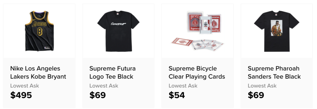
The site is visually appealing and allows the user’s eyes to follow a clear path. The photographs displaying the items for purchase are all uniform allowing the user to easily digest the page. Because the website is so graphic-heavy, it was a smart choice to keep the color palette black and white, with subtle pops of red and green. The typography is minimal and there are small, but effective contrasts between the typography used to display the price and product description, to allow the price to catch the user’s eyes first (see below).
Overall, I think the site does a great job conveying its purpose and meeting the needs of the user. Its navigation is uncomplicated and a visual emphasis is placed on highlighting the photographs and prices of its items, putting front and center exactly what the user is looking for when browsing this site. While there are some areas for improvement, I think this site strikes a good balance between looking and operating like an e-commerce site, while also displaying price trends like a stock market would.