Bookshop.org is a website dedicated to selling books while promoting and supporting local bookstores around the U.S. It’s a service I use frequently, so I wanted to examine the website under the lens of the five planes of user experience design, as described by Jesse James Garrett in The Elements of User Experience.
The five planes are defined by Garrett as follows:
- Strategy: the underlying purpose for a product, intended to meet a user’s need
- Scope: the requirements and limits of the product in order to fulfill this need
- Structure: the way information is organized and ordered in the product
- Skeleton: the basic layout of the product’s user interface
- Surface: the final visual that the user actually sees when using the product
STRATEGY
According to Bookshop.org’s “About” page, their mission is “to financially support local, independent bookstores,” while providing users a way to purchase books online. Since most people buy things online, Bookshop.org is an alternative to large companies like Barnes & Noble or Amazon.
As a user, I go to Bookshop.org to find specific books I’m looking for. Bookshop.org definitely fulfills this need, as well as providing for users who aren’t looking for specific books, but just to browse for their next read. They offer recommendations based around various themes in addition to a search function that allows me to find the exact book I want to read.
This suggests that they’ve taken into account the needs of multiple types of users of their service, which demonstrates a good underlying strategy.
SCOPE
Bookshop.org has quite a wide scope, despite being based on a simple concept. In addition to purchasing books through the website, it also allows you to search for a local bookstore in your area, so that you can visit them in person or choose for your purchase’s proceeds to go to that specific store.
They also allow people to become “affiliates,” which is a function that lets you recommend books and make a small profit when people follow your recommendations. This is available to individuals, authors, or publications looking to recommend books.
Finally, Bookshop.org has an email newsletter, which allows them to recommend books and bring other information to their customers.
These different parts of the service, while adding a lot of functionality to the website, are all reasonable and relate to the overall theme and mission of the website.
STRUCTURE
The structure of this website is constructed in a sensible manner. The search bar and book recommendations are located on the homepage, which makes sense because those are the two functions that people are most likely to want to use when they visit the website.
Following that, additional information like locating a local bookstore, learning more about the company, and the affiliate program are on separate pages, which would allow the user to navigate to them if they wanted to learn more about those less-used features.
SKELETON
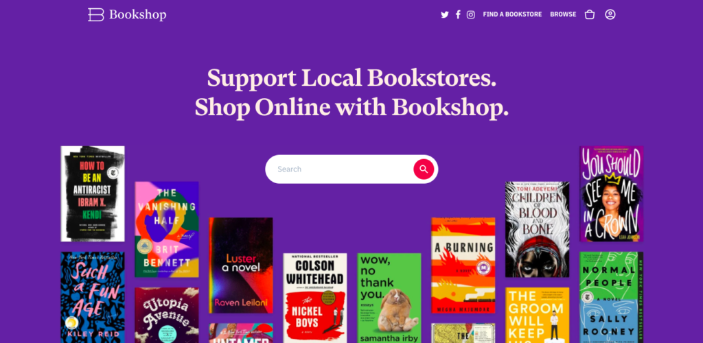
The site layout, while different from many websites that are primarily used for shopping, is nonetheless sensibly approached. The search bar is featured prominently at the top of the page, highlighted in a bright purple color so that users can easily search for a specific book. As the user scrolls down, various themed recommendations are revealed on the page, for users who want to browse a certain category.
There are some “courtesy navigation” options offered at the top of the page, including the link to find a local bookstore, another search bar, and the shopping cart, so users can see what they’ve added to their cart.
The only slightly annoying thing about the website’s homepage is that the bottom navigation bar, which includes the link to the “About” page and some other useful information, is only accessible after scrolling a long way down. Several recommendation lists must be loaded and bypassed before the user can get to the information they might be seeking; the first time I visited Bookshop.org, I wondered if this was even an infinitely scrolling website that would never reach the bottom.
However, the other pages of the site, including search results, individual lists of recommended books, and the shopping cart, avoid this issue by not having too much content to scroll through.
SURFACE
The final visual layer of Bookshop.org has a strong, appealing design. A bright purple color is used to highlight notable items, with accents of red for certain important buttons (like “Add to Cart” or “View List”). Beyond the homepage, the site looks and functions a lot like many other shopping websites, displaying search results and shopping cart contents in a way that follows “convention” for such a website.
Overall, Bookshop.org is attractive and relatively easy to use; aside from some minor concerns, it demonstrates a skillful example of Garrett’s five planes of user experience design.