
Snapseed is a photo-editing app for android and iOS users. It is a perfect application for every novice and professional photographer/editor as it provides various detailed and powerful tools.
Initial screen
As the users open the Snapseed, the application always greets them with this screen(figure 1). It starts simple for users, as here they are having a logical constraint of just being able to add an image(no other task than that). There is no issue with discoverability on this screen, as there is no secondary information here. The big icon and copy make an informative signifier for users to understand.
As we tap on the screen, we immediately get feedback to add an image either through the image gallery, camera, or open the latest image.
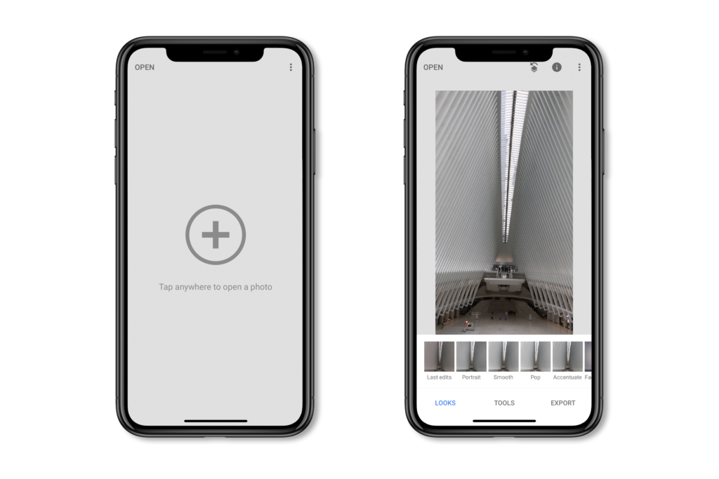
figure 1
Looks
As the users try to edit an image, Snapseed provides them with various pre-loaded looks. This application uses knowledge in the world to inform their users about the tasks(figure 2). For example – how do the users want to edit their picture and what effect to apply over an image. However, the lack of discoverability makes it hard for users to understand the secondary tasks. As seen here(figure 2), we can’t tell what does this icon stand for, and we only get to know the details once we tap on it.
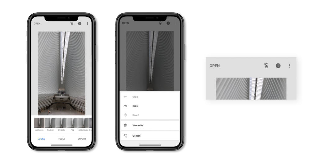
figure 2
This issue can be improved if we try to label the icons and not use the icons at all(figure 3). Labels can be a good signifier for users to help them achieve their tasks, and also they go with the consistency of the whole application.
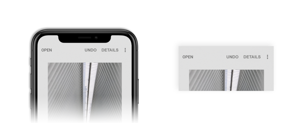
figure 3
Tools section
When users click on the Tools section, they see a grid of available options(figure 4). This viewing affects the discoverability of all the tools. Not only with the grid view, it is tough to discover the tools, but it also takes up the majority of the space. Clicking on any one of the tools provides immediate feedback and takes the user to the selected option.
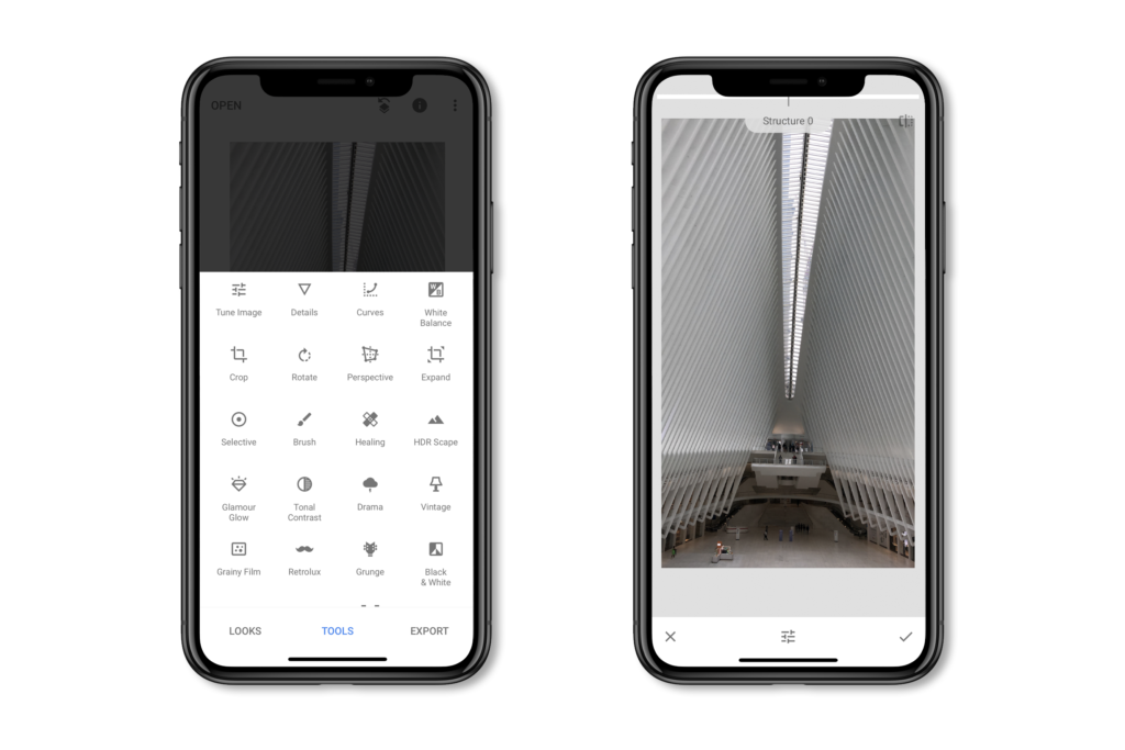
figure 4
When users select an option from the tools section, there is no discoverability of what tool is selected. This screen has a faulty conceptual model as it wants the user to use knowledge in the head to remember the current tool. It gets hard for users to remember which option they selected from numerous lists of tools(figure 4).
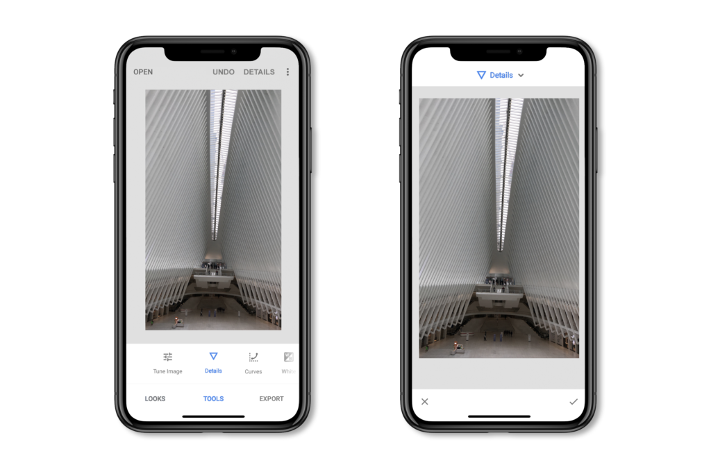
figure 5
For better discoverability of tools in the tools section, a horizontal list view can replace the grid view(figure 5). This new view not only takes less space, but it is also a better signifier to select a tool. Once an option is selected, Snapseed can provide users with information about it on the top of the screen, as seen here(figure 5). With this information, users have to use knowledge in the world rather than using their memory.
Editing an image
As the users try to edit an image, this application affords two ways to view the list of edits.
1 – Either by tapping anywhere on the screen
2 – By tapping on the edit option on the bottom of the screen.
This method makes the discoverability tough to find the list of edits. See(figure 6) to understand the user interface for the Snapseed application. This screen provides good mapping, as you can see here(figure 6) – as users scroll right or left with their fingers, they can see the changes happening. Feedback is also immediate with this function, as users can see real-time changes on the screen. However, there is no signifier for these functions. Users have to use knowledge in their heads to get through these interactions.
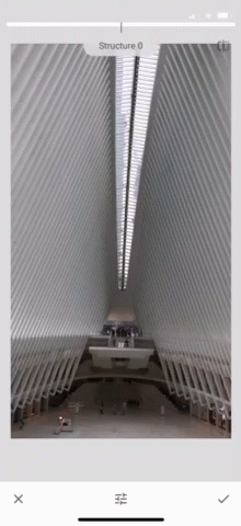
figure 6
Snapseed can achieve more discoverability with this screen by presenting a drop-down to view the list of edits(figure 7). This new design can be easily discovered and is also a better signifier as users know what tool to select. By showing a description on the top about the interaction of the edit tool can help users to understand this function better. Users here will acquire knowledge in the world rather than knowledge in their head(figure 7). There can also be a progress bar to show users the changes done. This progress bar adds to the discoverability of the screen.
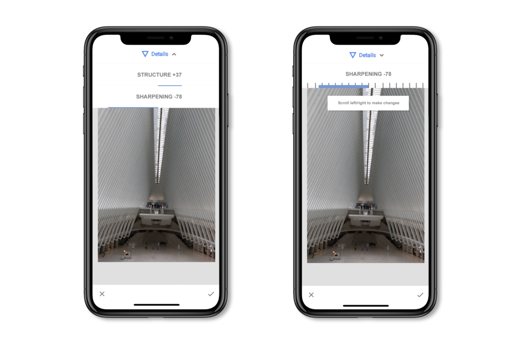
figure 7
Conclusion
Overall the Snapseed application has a clean and minimal user interface. They are trying to provide professional tools without intimidating users. It is a crucial application for amateurs to get into professional editing. However, I believe this application can provide more details and information about the interface to the users. First times users may get lost in the application and may also feel confused. The correct knowledge and interactions can be helpful for the users of this application.