Back Story
As a first time user, I was launched to the Pratt Institute Library unwittingly, via a copy and paste link from a course syllabus. With no prior introduction to this website, I thought to put it to the test against Jesse James Garret’s five elements from his book, The Elements of User Experience, to the test. These elements consist of five planes as he describes: Surface, Skeleton, Structure, Scope, and Strategy. I’ll use these elements to facilitate this critique.
I’ve only had to use the Pratt Institute Library to identify and download required reading for a class thus far. So, I’m going to scope this 5 element lensed critique to just that experience as to critique the website in it’s entirety would be quite a lengthy endeavor. So with that, let’s review the element: Strategy
Strategy: User Needs & Product Objectives
As a user, I’m making an assumption based on my own needs to be, “I want to be able to easily find and download my required reading for my class”.
From a business perspective, the Library’s website could be used as a business to customer or business to business entity to drive revenue. However, it’s worth noting that not all of the books come with a fee for the students. Based on this, I can assume that library’s revenue stream based on providing other businesses, or rather publishing companies, which have proprietary ownership of the books required for class, are charged a fee to offer dedicated webpages for books, which are then linked to the publisher’s database.
Why does this matter? And how does this affect those decisions at later points? The next plane shows a little more insight: Scope
Scope: Functional Specifications and Content Requirements
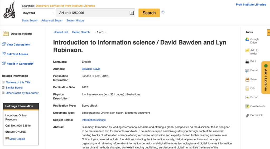
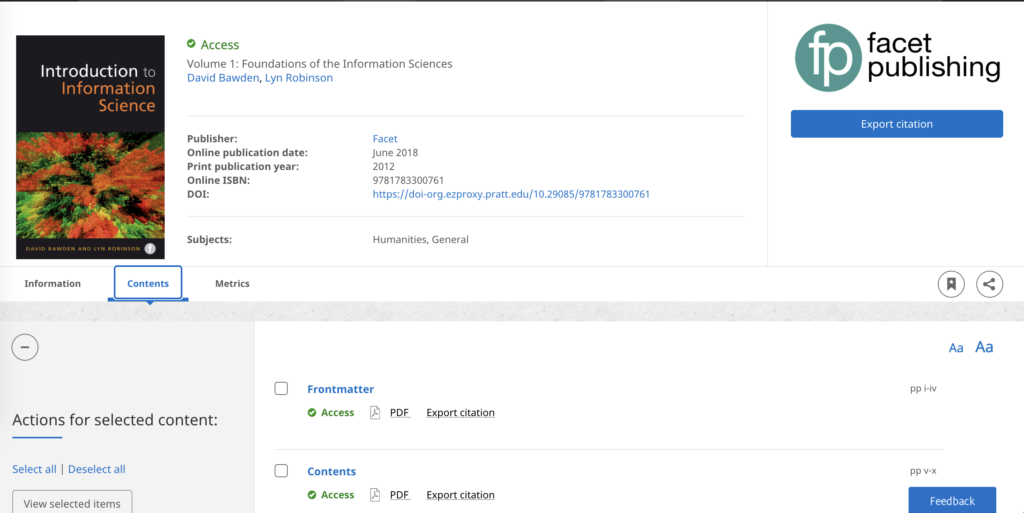
From the initial context of my needs, to just get to the book, this feature set is a small request in the larger scheme of things. Each detailed record of a book is present on a webpage like the one below, which offers a number of options that a user can do in order to extract forms of information from the page. Such as being able to create a physical copy of the product description by printing, or sending this page to myself or a friend via email if needed, copying a link to the page for later reference, or just exporting the citations altogether. It also provides a good amount of information to ensure that I’ve identified the right book that I need for my class. For that, it’s great. However, for the one purpose that I need it for, to download the book, it is extremely difficult to determine the action that I need to take to download the book. Exporting doesn’t do it, and there’s no clear indicators above the fold, to tell me where to go to download this ebook. This feeds into the next plane: Structure
Structure: Interaction Design and Information Architecture
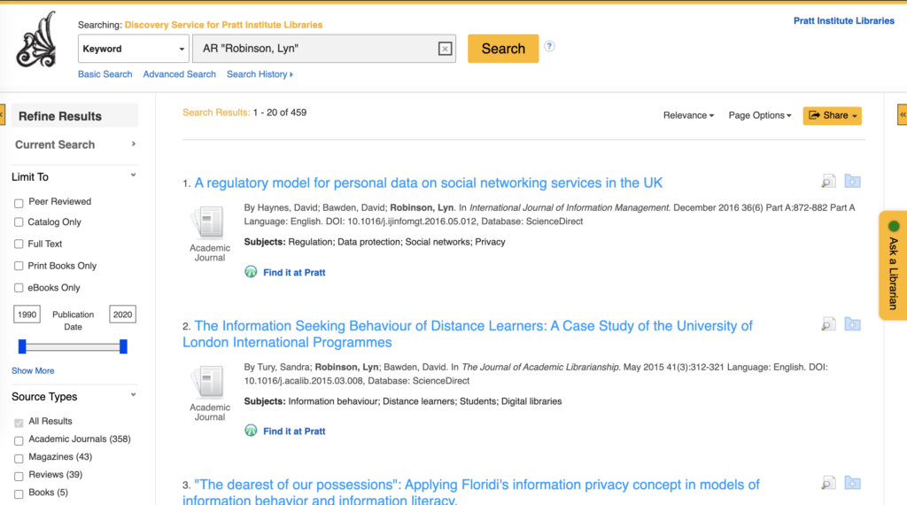
The page, indicated above, shows a number of options to select to get to addition information so you are aware of where you’re going based on the title of the buttons. Even within the text provided. As noted in the image below when clicking on the hyperlinked name of the other authors, it takes you to a new search within the library to see additional texts that they’ve written or contributed to:
So overall, from a structure perspective, it is a very helpful page with a lot of great information organized in a way for a good user flow to understand the book that I need to access. However, once we get down to the skeletal layer is where I see the breakdown of user experience.
Skeleton Plane: Interface/Navigation Design and Information Design
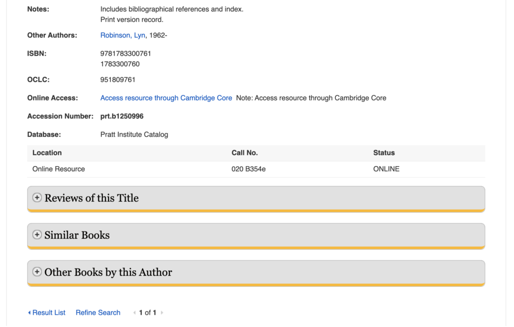
The issue with the detailed record for the book as shown below, is that it lacks the visual queues, to access the text, apart from appearing within the “Online Access” section, below the fold. There are two issues that I take away from this from the perspective of the Skeleton Plane. Number one, it’s below the fold, and if I am looking for quick and easy access to get my required reading, its not intuitive if I can’t see how to access it when I immediately land on the page. Secondly, its not included in the action buttons like “Export”, “Print”…etc which one would expect to find since downloading is an action. Additionally, it shoots you to another page to actually perform the download, which may have been setup as part of the skeleton design due to limitations when working with 3rd parties or publishers. I still found this rather frustrating and required the help of another student to figure this out.
Lastly, we’ll touch on the text and imagery of this page, or rather, the Surface Plane.
Surface Plane: Sensory Design
From a requirements standpoint, the page has all of the items that you’d expect to see. It has the logo in the top left so you know you’re in the right place. It tells you that you’re in the Library at the top as indicated below:
It also provides text that helps the user confirm the book they need to find, which is helpful. However, the overall layout has a lot of information that I did not need as a first time user, along with a lot of features outside of downloading and accessing the text. Not to mention that the download capability, is not easily identifiable. For comparison purposes, I’ve included the page accessed once I clicked on the hyperlink to download the book:
Comparatively, from a sensory lens, this detailed record of the book is cleaner in use of space and text, the buttons used to take action, and includes an image of the book. This page also has updated icons in contrast for key actions such as bookmarking and sharing features and clearly defines the actions that I can take on the left side of the page. While I understand the scope of functionality may be limited by the objective of the page, it makes my user experience a lot less painful in searching for the information needed because it is designed for the primary function of downloading.
As a result, I prefer the user interface of the Cambridge Core website. While I now understand how to use the Pratt Institute Library’s detailed book records, I think there is room for improvement for the Skeleton and Surface Planes of their pages.