
Here is my critique of Zara mobile app. I have analyzed many aspects of the design errors or misinformation and design delights. For this critique, I focus on four attributes to talk about here.
#1. Con: fail to signify the affordance
There is a hidden feature specifically for pages after clicking a subcategory underneath ‘COLLECTION’, which you can minimize the image size in order to see more products in the screen. The affordance is that users are able to see type types of layout of products. One is large image with details such as name and price. Another one is over 10 pieces of images purely on the same screen. This is a good feature comparing to only having one type of layout from those two, but it’s not the best solution for user experience. There are more problems behind the layouts and I am not going to further talk about this for now. In terms of the affordance that is invisible, which is acceptable, however, missing signifier of the gesture by moving two fingers on the screen to minimize and maximize the images, is a failure of design. It can be simply solved by having a small icon on the right corner on the top with 50% transparency, which will remind users of the possible interaction that triggers the affordance.
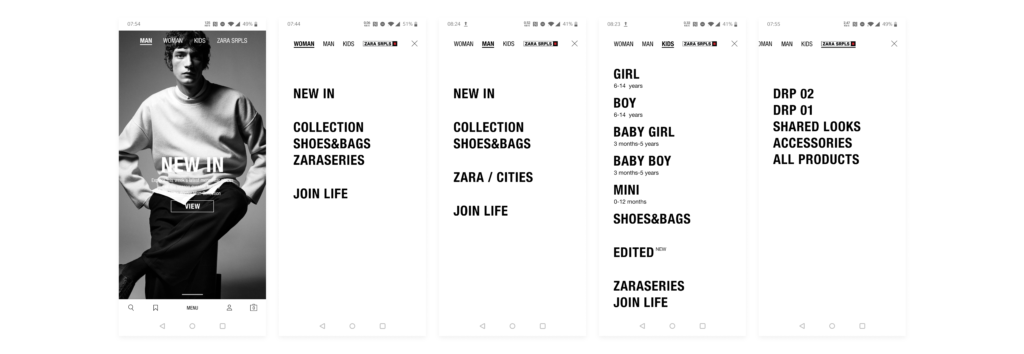
#2. Con: wrong mapping of category information
There are several places of incorrect mapping information. Firstly, wrong order of category between the landing page and menu page. On the landing page, the shop category is ‘MAN, WOMEN, KIDS, ZARA SRPLS’, while on the menu page, it becomes ‘WOMEN, MEN, KIDS, ZARA SRPLS’. This gives an inconsistency of understand information group. The possible way to solve this problem is just simply making them look the same, following the same order. Second, on the menu page, categories that share similar characteristic are gathered together by using space to separate the difference. However, For categories that sit together, the relationship between each other doesn’t make sense to me. To simplify, for example, I don’t understand why ‘COLLECTION’, ‘SHOES&BAGS’ and ‘ZARASERIES’ are together. The mapping is telling me that they have parallel relationship while I don’t get it. Therefore, this is a failure of mapping. The way to fix it depends on their content strategy which I could not fully understand how to solve this problem.
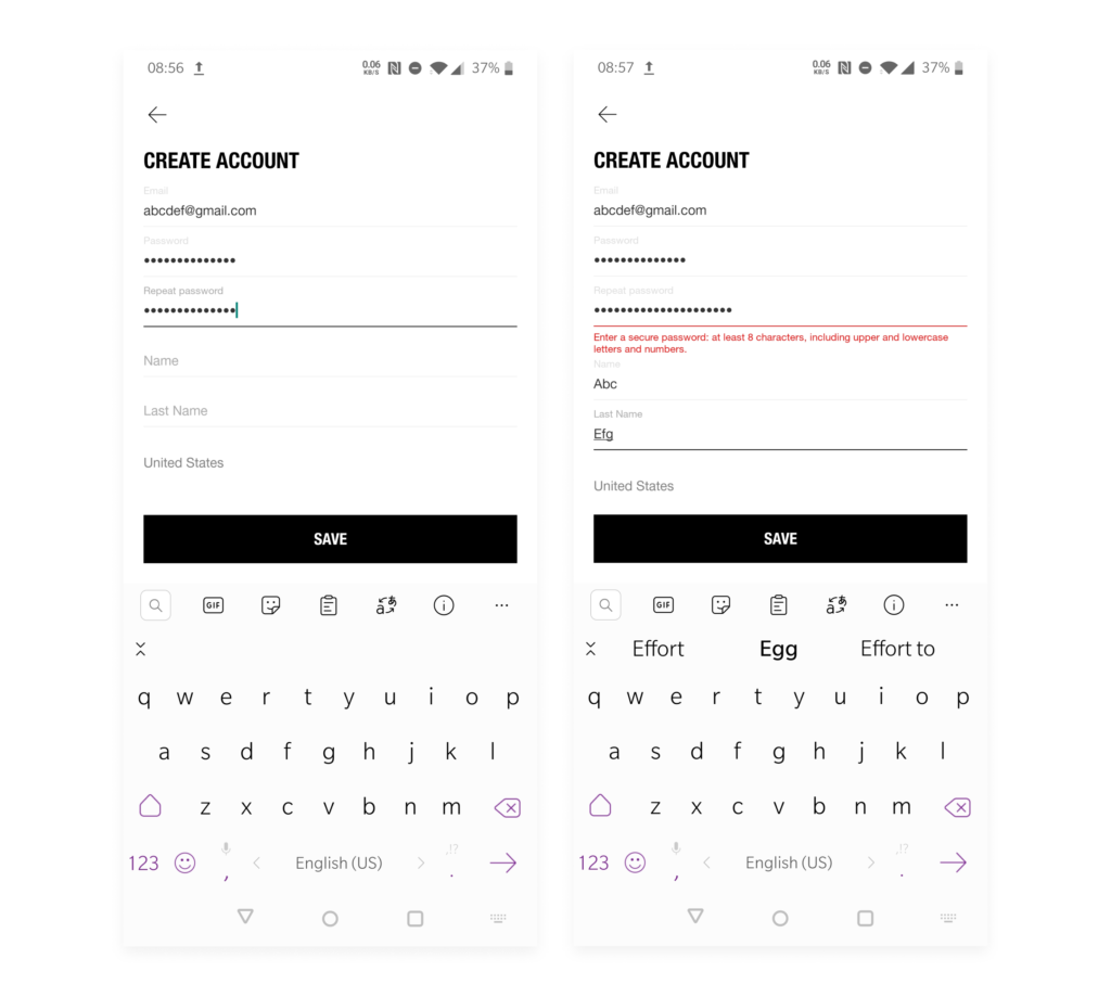
#3. Con: wrong feedback
There are a few very subtle details that will get users frustrated in ‘CREATE ACCOUNT’ page. Firstly, when typing password and while repeating password, we will not able to see what letter we input. There is not even 0.5s showing the typed letter/number/symbol. Moreover, you will not be able to see what you typed, because there is no such affordance. Therefore, there is no way to if you mistype your password and also mistype the repeated password. To solve this problem, it’s very easy that you just need to add ‘an eye icon’ next to the password input places and provides the affordance of viewing the input. Of course, showing what you just type for one second before you type the next letter is also helpful but cannot replace ‘the eye icon’. Secondly, one huge mistake of the feedback is that when we type the repeated password wrong in a very obvious way. The alert message indicates in a totally wrong meaning and direction. It is supposed to say that the repeated password is not matching the original password. It’s simple, but Zara team did it wrong.
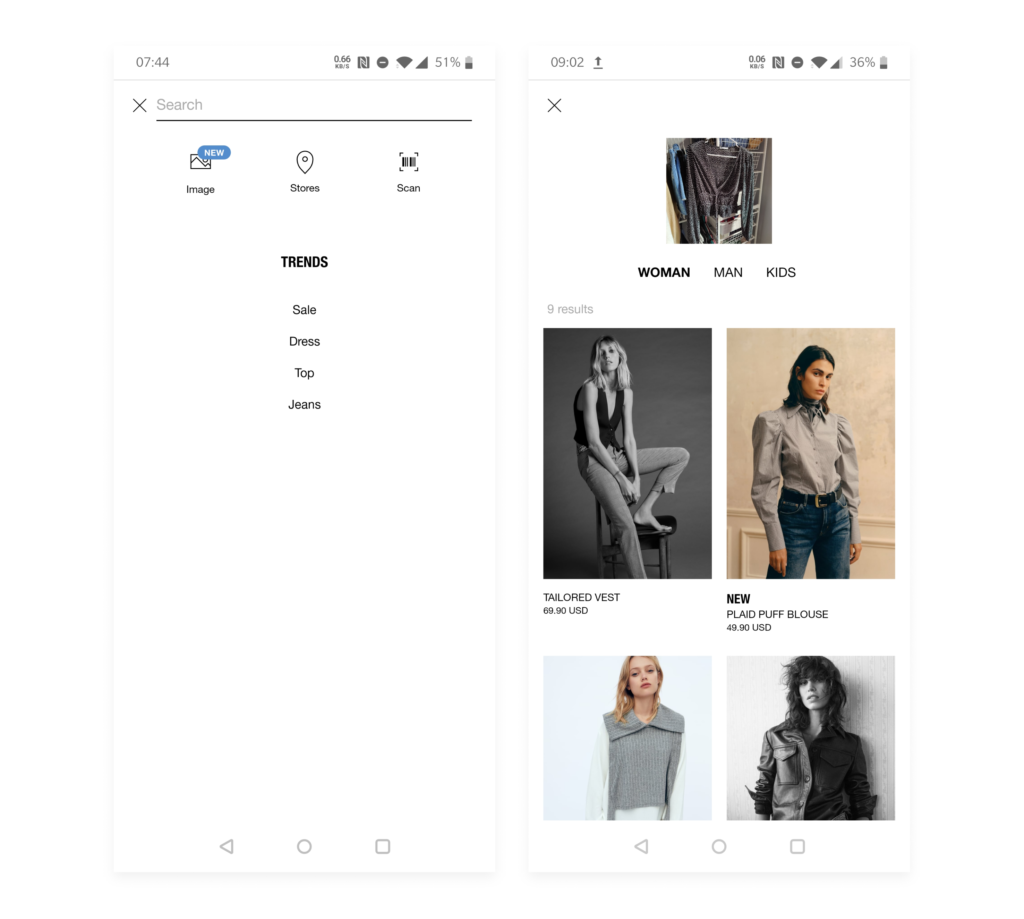
#4: Pro: good feedback and mapping
It is impossible to say that there is not good design in an app unless you don’t examine it carefully. There is a good feature right after you click ‘Search Icon’ on the landing page. It allows you to find products through images you take or upload. Despite the accuracy for the result of this type of search, the feature itself is impressive. It gives a good feedback after inputing an image, because it keeps the image I upload in the middle of the top part and I can see results underneath. Why is it a good mapping? There is a subcategory underneath my image just to give a filter of products, which is clean and straight forward.