Google Maps is a representative application for geographic information. The app has been helping users to find a place and get more information about the place since 2005. It offers various views of the map such as satellite imagery, aerial photography, street maps, 360° interactive panoramic views of streets. Especially, it gives users information on not only geographical information but also real-time traffic and route planning for traveling by foot, car, and other public transportation.
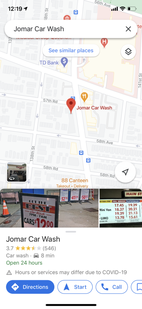
Initial screen (Map view)
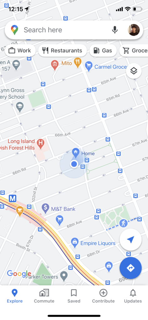
The image on the left side is the first screen of the application, where users can start to navigate. All buttons with clear icons and graphics give users clues of the correct operation(Signifier).
However, almost ten tappable objects are on the screen against Don Norman’s principle of discoverability. There are two of the most emphasized icons – A Long Search Bar, A Blue Navigation Floating Button – and it makes users’ responding time longer.
Search page
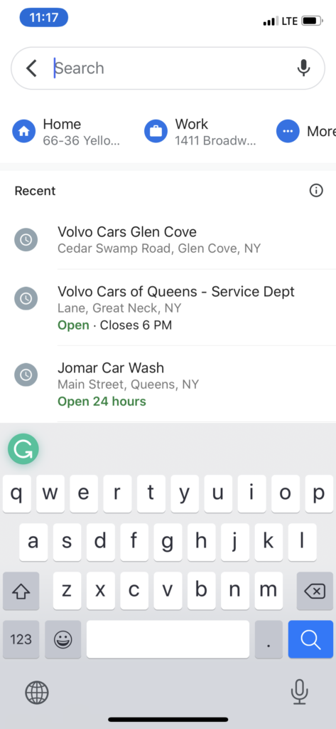
The entire screen is blocked as the image on the left when users tap the search bar in the initial screen is good feedback. It makes users focus on what users have to do next and constraints other actions on the map in the initial screen. There are suggestions with icons for home, work, and more places where users saved. Icons are an excellent mapping to indicate as buttons. The cut ‘More’ text on the right side indicates more items to navigate for users.
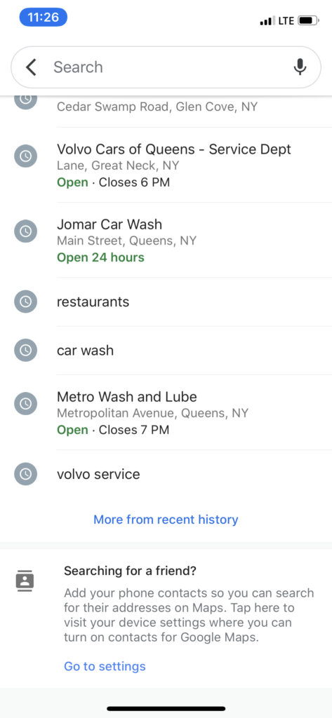
When users swipe down, there are all of the histories of searching below the search area. Icons on the left of the history list indicate it like buttons, which is a good signifier. Moreover, the shortcuts disappeared when users try to find history as the primary action was changed.
However, history shows only seven items, and it requires one more tap to see ‘More from recent history.’ Users may expect to see more items when they scroll down.
Information page of the place
The card at the bottom shows up when users select a place. It contains necessary information about the place. And it gives more information when users swipe up or tap the card. The animation of the card gives users great feedback. Also, the buttons at the bottom have consistency with the icons gives a clear signifier to users.
Route page
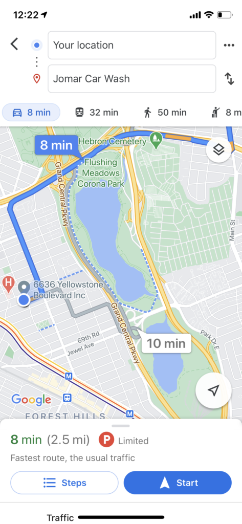
This page shows when users tap the ‘Directions’ button on the previous page. The two text boxes of location with icons help users check confirmed locations, and the text boxes designed like input boxes give users more freedom to modify the locations.
The icons with ETA below the boxes indicate what it means.
Lastly, the ‘Start’ button at the bottom has changed to blue, looking like a primary button, indicating what users have to do.
Navigation page
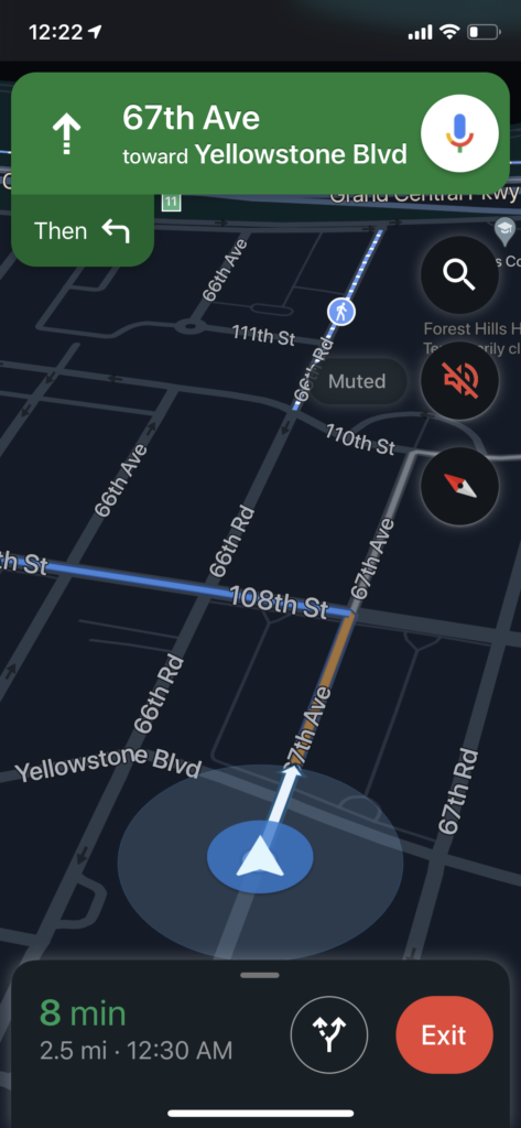
The 2D map on the previous page was rotating to 3D smoothly for the navigation mode. Furthermore, the theme was changed to the dark at night. It reduces the fatigue of users’ eyes at night and gives essential information, including the direction and time.
However, there is a microphone icon at the top of the screen. It does not give users the right signification what action they can do with it as it is a navigation mode.
Conclusion
Most of the visual objects and animations give users pretty good signification and clear feedback. More importantly, the interactions worked quite intuitive to get more comfortable using the app over time.
The only thing the app needs to improve is discoverability. There are a lot of items on each page, especially the initial screen. From Don Norman’s principle of design, the design has to be easy to figure out what to do. I suggest streamlining the objects on the screen, removing items that complicate users.