What does PACKLANE.COM do?
Packlane is a website for creating and ordering custom boxes and packaging. Its platform allows users to adding their designs on their choice of packaging types. Besides providing a designing dashboard for customers, packlane also includes many inspirations and works to showcase product from previous customers. The unique and creative website visual style makes it stand out from other e-commerce site.
Visual Interface Design (About Face 3: The Essentials of Interaction Design)
As UX designers, we tend to emphasize the importance of UX design in the product development; however, we have to admit that in design a product, everything matters, including UI designs. Often, visual design plays a very important role of helping users achieve their goal easily with a good communication designed.
After reading the chapter :Visual Interface Design from Cooper et al. (2007)’s book about the essentials of interaction design, I had a better understanding about visual interface design in many different aspects. And based on what I learned from the chapter, I could actually found out the reasons why I like a particular website so much which I’m gonna give a critique about here.
Before getting into the website, it will be good to understand some basic content Cooper talked about in the chapter. I enjoy reading the difference between visual interface design, visual art and graphic design. To be honest, it is not easy to differentiate in the real life and most of people blend their concepts and functionality together.
Besides giving a background of understanding what visual interface design does, Cooper et al. (2007) also listed 7 fundamental elements of making the visual composition of interfaces, which are shape, size, value, hue, orientation, texture, and position. Each element has it own property but must be applied carefully with each others together to create a useful and engaging user interface. And then the authors provided a series of visual interface design principles with detailed explanation. The principles are the following:
- Use visual prosperities to group elements and create a clear hierarchy
- Provide visual structure and flow at each level of organization
- Use cohesive, consistent, and contextually appropriate imagery
- Integrate style and function comprehensively and purposely
- Avoid visual noise and clutter
“cohesive, consistent, and contextually appropriate imagery”
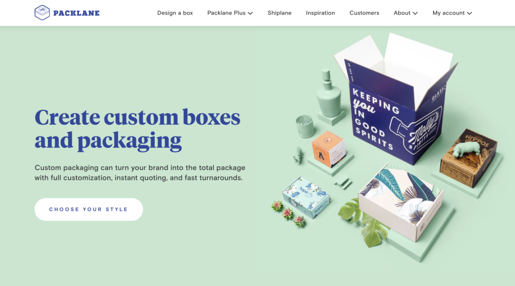
By having these background information, I am going to dissect one of my favorite e-commerce website, www.packlane.com. First of all, this website has a strong visual identity that stands out from many websites including competitive websites. The most prominent feature is the use of unique icons throughout the whole website. In another word from the visual design principles I have mentioned above, it uses cohesive consistent, and contextually appropriate imagery.
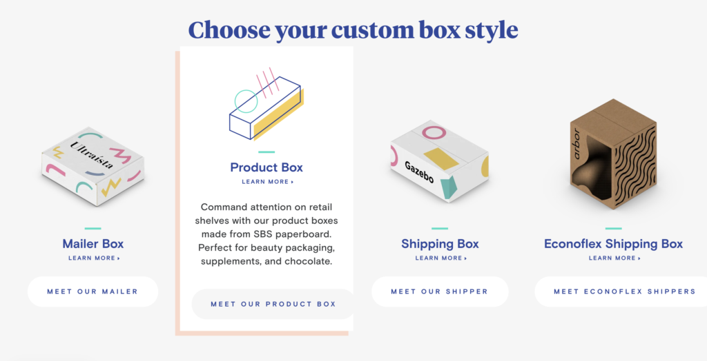
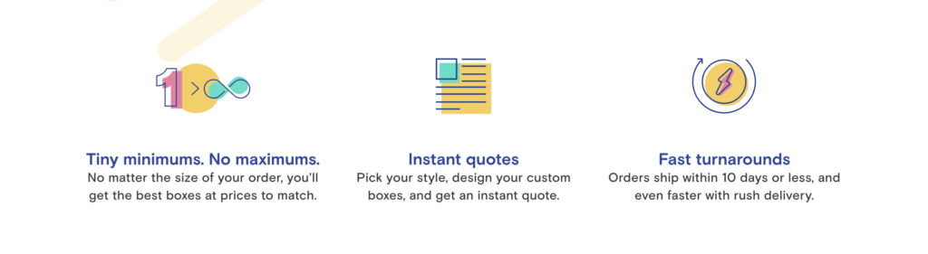
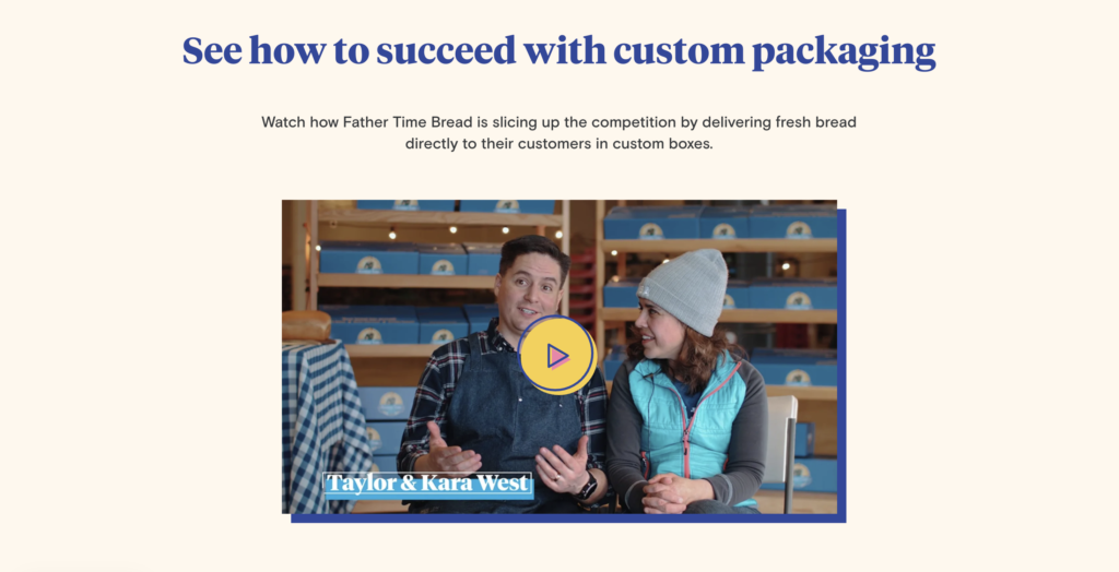
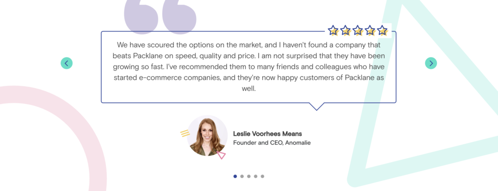
For example, the rough sketching style of icons appear in every section of the websites, such as product options hover stage, how it works description, and even the video play button on the founders’ story. They share the same color hue throughout all imagery design to create a recognizable and consistent branding identity. The icons are funny and creative without making the information noisy and distracting. As a creative packaging manufacturing service website, the colorful imagery design helps build the connection between users’ design and the quality they ensure.
Some might argue that icons are supposed to be simple, avoiding excessive visual details, and just to convey information as global signifiers. However, in this website, those icons can be considered as a type of illustrations as well as icons. There is no set rules indicating that you have to apply certain features in certain ways. In this case, the icons are being used consistently and extremely so that there is no a sense of incompleteness that requires further explanation of the meanings.
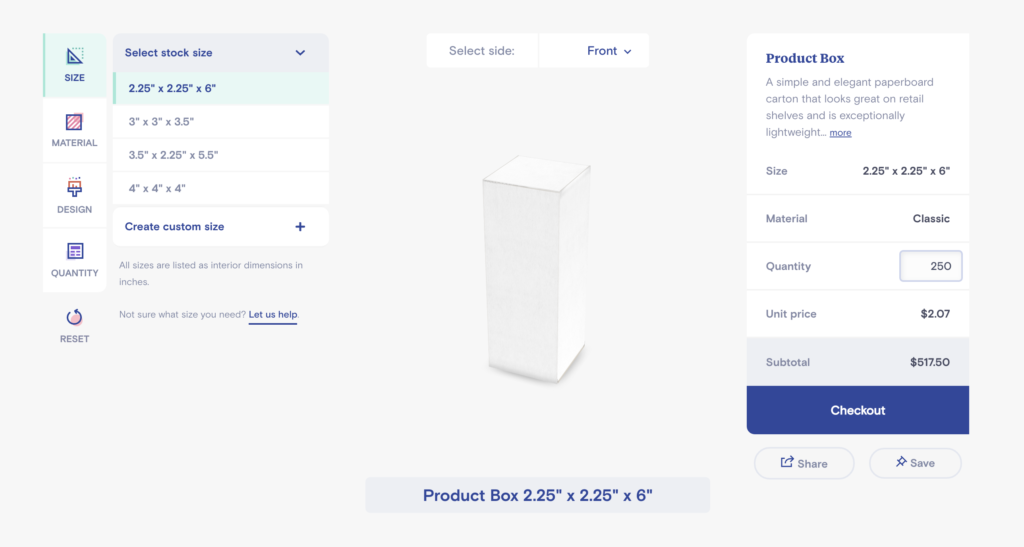
In terms of visual information organization and hierarchy, Packlane did a great job creating a clear hierarchy using their own iconographies, grouping things in different levels and adding color contrast.
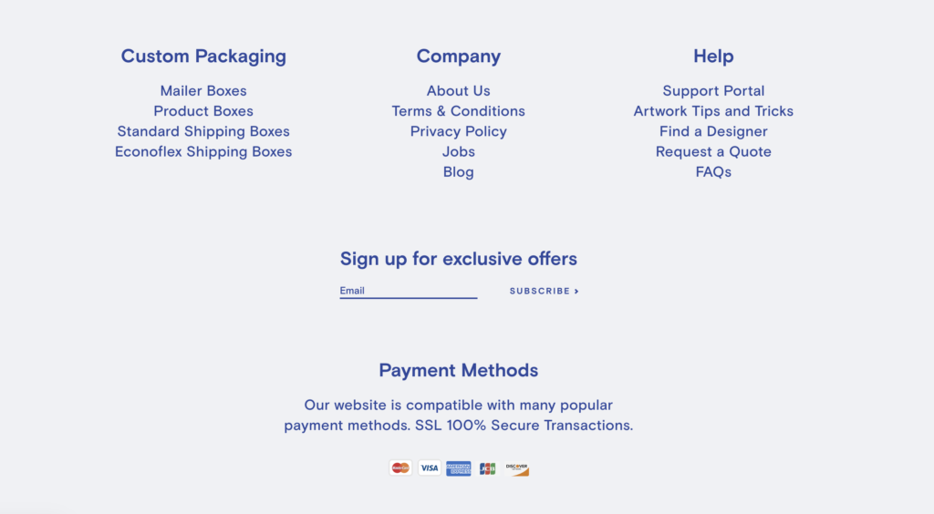
One thing to mention for improving the website will be the footer which is simple with two main colors(light background and Navy font color), but missing enough hierarchy comparing to other sections. Although the font size and weight of headers and sub headers are quite different, with the background of very similar hue, the contrast between headers and sub headers is subtle. And it seems plain comparing to other sections as well, which breaks its brand consistency in a way slightly. Overall, this website is very creative, interesting and powerful on expressing itself as well as the capability of works.
Reference
Cooper, A., Cronin, D., & Reimann, R. (2007). About Face 3: The Essentials of Interaction Design. Indianapolis, IN: Wiley Pub.