About This Project
As a part of the Information Architecture and Interaction Design class at Pratt Institute, a research team of three students worked on a 16-week project to design a new feature for the NYC Parks department website, nycparks.org. This project was undertaken with two clients in mind: the NYC Parks and Recreation Department, as well as the Department of Internet Technology and Telecommunications.
PROJECT GOALS
The main focus of this project was to launch a new feature allowing users to reserve spaces within a park for personal use. Keeping in mind the goals of both of the clients, this project worked on this focus with three major considerations:
- Optimizing the website layout for the growing number of mobile users
- Acknowledging the financial challenges the Parks Department faces
- Accommodating visitors’ changing relationship to the parks during the COVID-19 era
The team committed to employing an iterative design process based on user testing, in order to ensure that the new feature would be comprehensible and intuitive for the NYC Parks site’s target users.
THE TEAM
This project was undertaken by three students: Viola Li, Stephanie Meltzer, and myself. Working under the constraints of COVID-19 and only meeting virtually, our roles were malleable and shifted frequently over the course of our work, but generally, I functioned as the team’s copywriter, as well as assuming supporting roles as a designer and researcher.
Where We Started
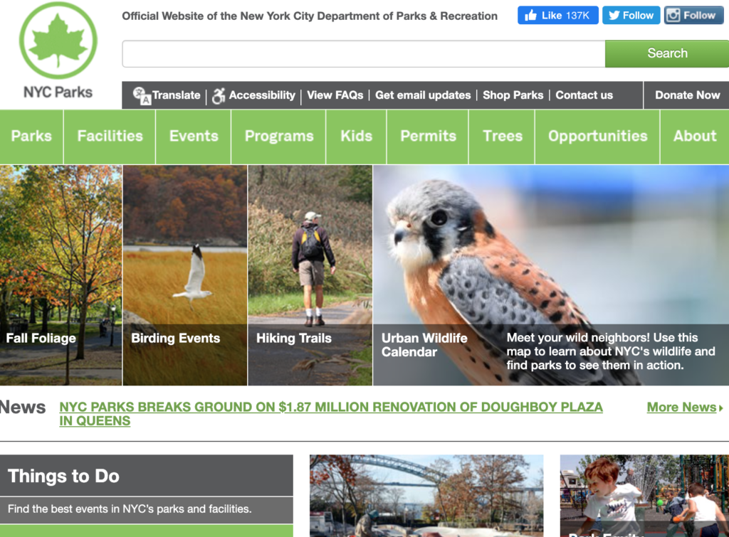
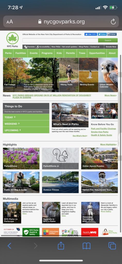
At the beginning of the project, an analysis of the current layout of the NYC Parks website was conducted, in order to identify its strengths as well as the areas that could be most improved.
In addition to the researchers’ analysis of the website, it was also important to understand the behaviors, habits, and mentalities of visitors to NYC parks, as well as visitors to the NYC Parks website.
USER RESEARCH CONCLUSIONS
In order to get a better understanding of the target users of the NYC Parks website, ethnographic interviews and contextual inquiries were both undertaken; for my portion of the research, three participants were chosen for each type of interview.
Questions were focused on how people expect to use technology in relation to parks — an important consideration not just for the NYC Parks website, but also for the Reserve A Spot feature our research team was in the process of designing.
After all three researchers consolidated our data, three main insights emerged:
- Park-goers prefer to be unplugged at the park, wanting to immerse themselves in the outdoors environment rather than focusing on technology.
- Typically, park-goers prefer secluded spots, rather than high-traffic areas, especially due to COVID-19 concerns.
- Most people prefer to access park-related information quickly on their mobile phones, meaning a mobile-friendly layout is crucial to improving engagement.
Creating a New Feature
In order to create the Reserve A Spot feature, the researchers focused on blending the physical and digital worlds. Reserving a spot requires some infrastructure in the actual parks, as well as the support of a website-based reservation system. Therefore it was important to our team that both sides of this feature were thought out carefully and with consideration for what would be convenient, sensible, and easy for park-goers.
THE PHYSICAL WORLD
We started by brainstorming what the spots would look like when approached in person. We took inspiration from many places, including parking lots, restaurants, and hotels. We finally arrived at some guidelines as to how the physical spots would work:
- Each reservable space is surrounded by a rope to mark its boundaries.
- Each space comes with a sign with a unique QR code, to identify which spot has been reserved.
- The reservable spaces should not take up the entirety of the park in question.
the digital world
From there, the research team focused on how the physical aspects of the park reservation system would interact with the website feature. In order to discover which features and capabilities were important to include, the research team conducted a comparative analysis on a total of nine online reservation systems that work well and easily for their users. My research was conducted on Airbnb, OpenTable, and TicketMaster — three well-known reservation systems that I have used in the past and whose use has left me generally satisfied.
From an in-depth analysis of these three platforms, as well as the other researchers’ analyses, we came up with the following features to be prioritized in the Reserve A Spot design:
- A customized search to allow users to identify spots that meet their exact needs without browsing a large number of search results
- An interactive map that allows users to browse search results by location
- Point-of-view images to allow users to view the spot they’re reserving
- Eliminating unavailable spots to minimize confusion during the reservation process
- Allowing users to invite friends and share details about a reservation
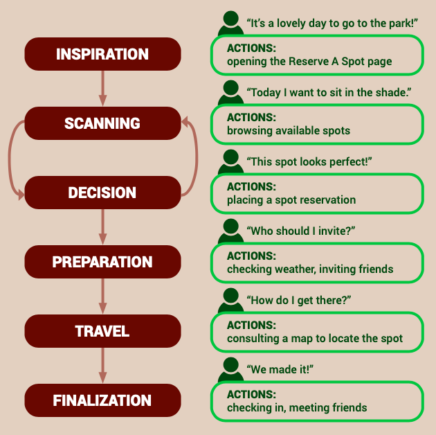
THE USER JOURNEY
Based on our user research, as well as the prioritized features selected from the comparative analysis, we next collaborated to discover a universal flow of steps that a user follows in order to choose a spot at the park. Then, we modified this user journey to imagine how the Reserve A Spot feature might fit into that flow.
Testing Our Hypothesis
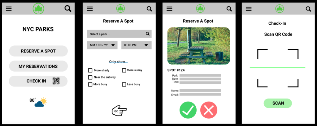
Once the user journey and prioritized features were decided on, the team created a low-fidelity prototype in order to test out the effectiveness of these ideas. The prototype supported two tasks, and allowed users to interact with 10 distinct screens to mimic the abilities of the Reserve A Spot feature once it was finalized.
Because we wanted to prioritize people who use mobile devices and want to access information quickly, we set up our prototype to use the proportions and screen size of a smart phone.
Prototype Evaluation Conclusions
After testing the prototype with a total of six participants, we noted the responses and behaviors of those participants and developed the following insights:
- Clarity in labelling: Users want more specific labels for the buttons on the initial screen.
- Flexibility: Not all users are able to use QR codes, so there needs to be another way to check into a reservable space.
- Date ranges: Since users are mostly interested in reserving park spaces for the near future, including dates past a month from the current date is extraneous.
- Specificity in searches: Users want to be able to control their search filters with granularity, in order to only see search results that meet their specific criteria.
Revising Our Ideas
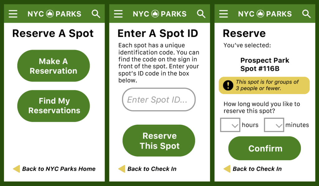
With the results of our prototype evaluation in hand, the research team returned to our prototype in order to refine the Reserve A Spot feature. In particular, I was interested in reimagining the “check-in” function, which would allow users to claim a reservable space from within the park. This aspect is, in my view, where the physical and digital worlds of the Reserve A Spot feature intersect the most. I decided to apply my efforts to making the transition between the park and the website as smooth as possible.
Merging two worlds
I focused on a number of issues that would make the check-in process easy and intuitive for users:
- Small and large spots: In the physical world, the reservable spaces should be available in various sizes, to allow both small and large parties to reserve a spot. In the digital world, the check-in process should provide notification as to the suggested occupancy of the spot.
- Check-in method: Since not all users are familiar or comfortable with QR codes, there should be an alternate way to identify a spot. In the physical world, the sign identifying the space should come with both a QR code and a short, unique identification code (Spot ID). In the digital world, the check-in process should support both scanning a QR code and manual entry of the Spot ID.
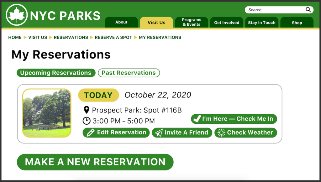
- Clear labels: The check-in process was the task that participants in our prototype evaluation had the most trouble completing. In the physical world, users will understand checking in to a spot as part of a reservation process; therefore, in the digital world, the website should reflect this by nesting the check-in option under the broader “Make A Reservation” category.
Putting It all Together
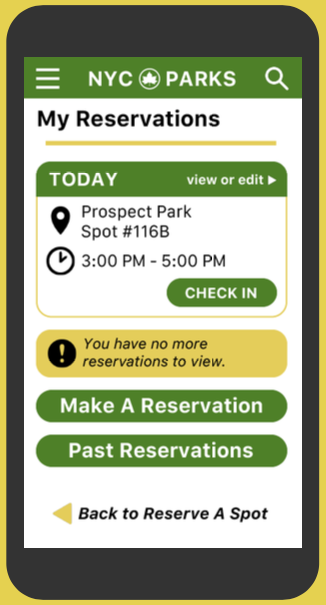
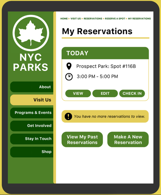
Given these areas of focus, I worked on iterating upon our previous design, focusing on the check-in process.
In addition to these wireframes, I also created high-fidelity mockups of the My Reservations page, to highlight the site layout in three separate breakpoints (mobile, tablet, and desktop).

The Next Evolutions
The new iterations of the Reserve A Spot design are the latest step in the process of creating this feature. In future work regarding this feature, I would recommend the following steps be taken next:
- Create a new interactive prototype to be tested with more participants. This prototype should take into account feedback given after a presentation of the current design.
- Refine the design for the physical infrastructure that supports the Reserve A Spot feature, including designs for the signs that would identify reservable spaces within parks. These designs should also be tested to ensure they’re easily understood by users.
- Include the clients in the ongoing process in order to take into account their abilities to support the feature. This would include the budget allowances to support both physical infrastructure and website design for the new feature.
- Continue to iterate in both the physical and digital worlds to create a product that is intuitive, understandable, and navigable for park-goers of all types.