
Website Home Page
The home page(Figure 1) consists of trending videos from each section. The navigation is well labeled and it is easy to find and access the video that the viewer might be interested in. As you login in, the recommendation video will automatically update based on the viewing history and follows
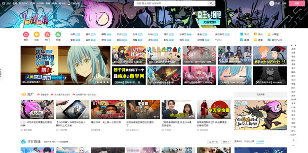
Figure 1
On the right side of the page, it has a floating catalog(Figure 2) indicating the current viewing sections. And it quickly navigates viewers to their needed sections. This design does a pretty good job of helping the user locate themselves on the page and get quick access to the section if they know what they are looking for. This design feature is a good mapping strategy and helps improve the discoverability of its massive contents. However, I will argue that it is still too overwhelming for the first glance on the home page.
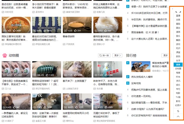
Figure 2
Indidviual Video Page
When you click into its video page, you can see useful information such as the number of views, bullet comments, likes, and coins (Figure 3)(Figure 4)(when the viewer likes the video, they can give 1 to 2 coins, coins can be earned by the number of videos the viewer watched). It also provides a button to turn on and off the bullet comments and control the amount of the comments floating on the screen. The coin feature encourages the viewer to help promote their favorite videos.
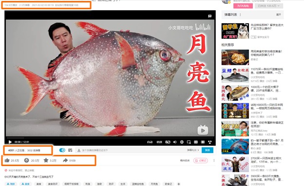
Figure 3
When the viewer hovers the mouse over the icon, it will pop up a small window explain each icon’s feature and function. It gives the viewer a good signifier of each icon.


Figure 4
When the viewer hovers over the timeline, It shows the thumbnail of a frame(Figure 5). This provides great feedback of the action and clear affordances of achievement of this action.
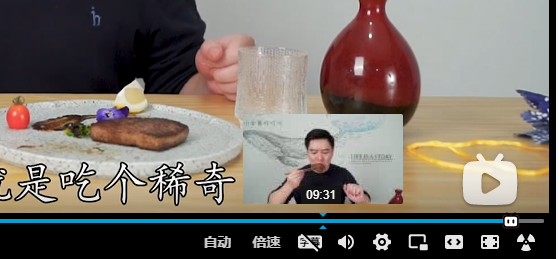
Figure 5
Catalog
At the bottom of the video, it lists hashtag links(Figure 6) to some categories that are identified by the uploader, the viewer can easily find another video that has similar topics. This function creates an opportunity for other non-famous videos to be seen.
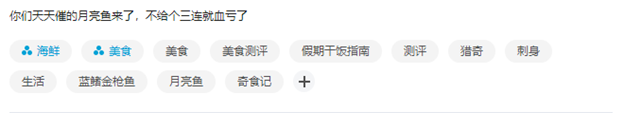
Figure 6
Comments
As the viewer scrolls down to the comment section, the video will appear at the bottom as a small re-scale window. (Figure 7) With this feature, the viewer is able to navigate to other parts of the page or read comments while watching the video. The viewer also has a control to list the comments chronometrically or trendily. (Figure 8)
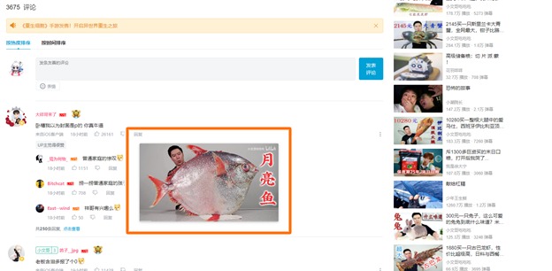
Figure 7
Figure 8
Bullet Comment
The image shows an example of bullet comments(Figure 9), This feature gives a sense of a conversation and community culture while watching the video. This feature is a good fit for the Chinese characters since it is cubical as the result of easy reading.
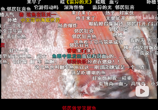
Figure 9
The suggestion for this website is to have an auto-translate subscription feature to translate Chinese to other languages so that it can be a more international platform. It has so many great videos however if the user does not know Chinese, then they cannot use this app at all.