Leke Fitness is a chain gym brand in China. Its business includes gym operation and professional trainer service. I started using their service last summer and the overall experience is good. To experience their whole services, the user has to be either a member of a gym, or the user can book a trainer service and use the gym for free with limited-time access. Many different types of human-computer interactions occur in the process but I will focus on their mobile application.
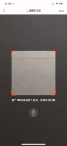
I used the mobile app to accomplish three major tasks. The first task is to enter the gym space. Every Leke gym uses an electronic lock because they allow its members to use it 24/7. Therefore, to save both the human cost and card key cost, they chose to use randomly generated QR code on the mobile app for its members. Meanwhile, for users who only take training classes there, Leke makes an additional rule, which limited the using time before and after an hour of the user’s class.

Good Design:
In the book “The Design of Everything”, Norman introduces the concept of affordances and signifiers. In our case, the affordance is the QR scanner beside the real door, Which suggests an action could be taken here. While the icon on the application is the signifier. I didn’t mark which icon is the QR code on the picture. However, I believe that most of us can identify the icon instantly. In the meantime, the designer of this app also put a scanner icon next to the code icon. In this way, the user may have a better understand because the two icons share connections.
Bad Design:
The designer uses a relatively small icon on the homepage and uses large are for advertising. However, just by observation, most people use this app only for the code and scanner function. Thus, I think these two icons deserve more space.
The second task is to scan the QR code on some training equipment, such as the treadmill. When I scan the QR code, the treadmill will also record my data and share it with me on the mobile app too.
Good design:
The whole process could be seen as a really great example of a conceptual model, which Norman believes is the most important psychological concept of good design.
The first thing that should be noticed is the signifier. It’s clear to any user that this is a camera aperture. However, In order to indicate the concept of a scanner, this app adds a line in the frame and makes it move as a scanner. In this way, this line also mapping the connection between this interface to a real scanner. Finally, when you successfully scan the code, instead of a camera capture sound, the feedback sound effect is a scanner beeping. I’m not sure if all the users of this app ever used a scanner, but as a person who does, I think the designer did a great job on build the scanner concept here and also ensure all the details.
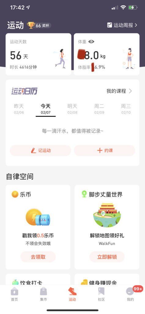
The third task is to check my fitness data in this app.
Bad Design:
As users view the main entrance page for the personal data record, they may believe that they can only see the top 2 blocks, which represents their working out days and current weights. There is no signifier to indicate that these two blocks can be clicked. Moreover, it took me months to realize that the eye icon could click too.
Good Design:
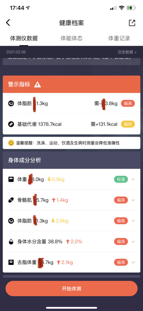
We record the data because we want to analyze and understand the data. Therefore, a good data visualization design would make the process easy. On the data detail page, we don’t need to even think to understand the red number means severe warning. The yellow means moderate and the green means fine.
Conclusion
Generally speaking, the Leke fitness app works well in many aspects. The user can understand the basic function of this app easily. However, the app has too many functions that I’m not interested in at all and there is no way for me to make personal adjustments based on my needs. Therefore, I think the designer of the app should think about redesign the interface.