Now that classes are back in session, I’m using Microsoft OneNote on a regular basis to keep my course notes organized throughout the semester. OneNote is a note taking management software designed by Microsoft – it lets users take notes through text, drawings, screenshots, audio recordings and more, while keeping their notes organized in one place.
This critique will examine design aspects of OneNote while relating it to concepts in Don Norman’s book The Design of Everyday Things. We’ll be taking a look at 3 key features of OneNote:
- Organizing a Notebook
- Taking Notes (Text & Drawings)
- Adding To-Do Tags
Organizing a Notebook
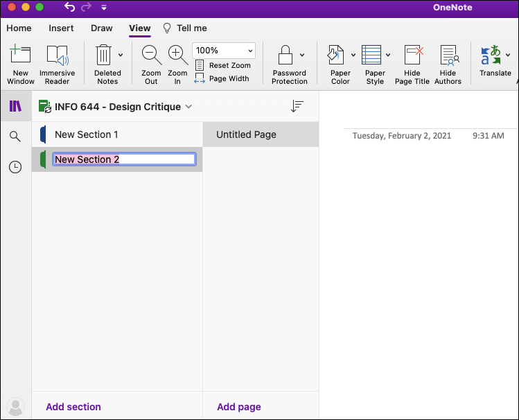
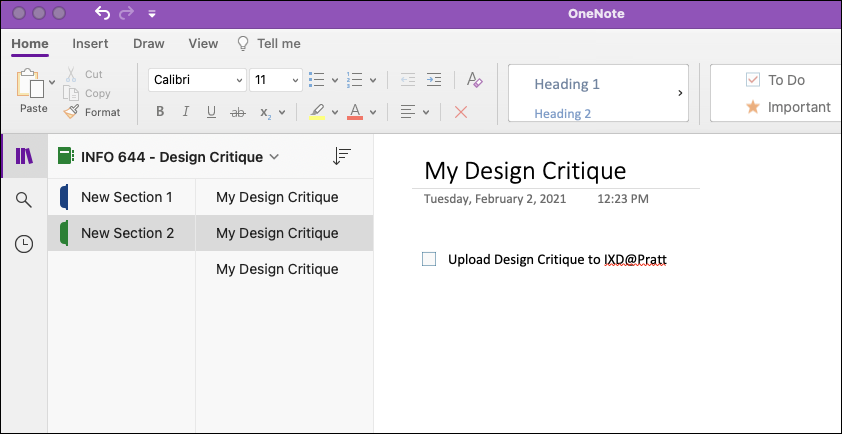
OneNote has a good conceptual model that closely follows that of a physical notebook. In OneNote, notebooks are divided into a hierarchy of Notebook > Sections > Pages. A notebook icon is included next to the title of the user’s notebook, and a tab icon is included next to each created section (see Figure 1).
These icons help signify that sections in OneNote are to resemble tabbed sections in a physical notebook, and pages are what falls within those sections. There are clear labels listed at the bottom of the screen that both signify and bridge the gulf of execution on how a user adds a new section or page. Shown below in Figure 2, once ‘Add Section’ is clicked, the user will immediately receive feedback that a new section (tab) has been added thus bridging the gulf of evaluation.
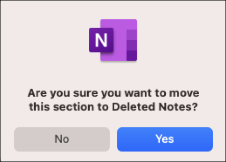
Constraints have been used to only allow users to add pages to sections that have already been created, forcing the user to organize their notebook into sections (after all, this is an organizational tool). Additionally, if a user wants to delete a section (whether intentionally or unintentionally) an error message pops up to confirm this is the intended action – an example of good error prevention of a potential action-based slip (see Figure 3).
Taking Notes (Text & Drawings)
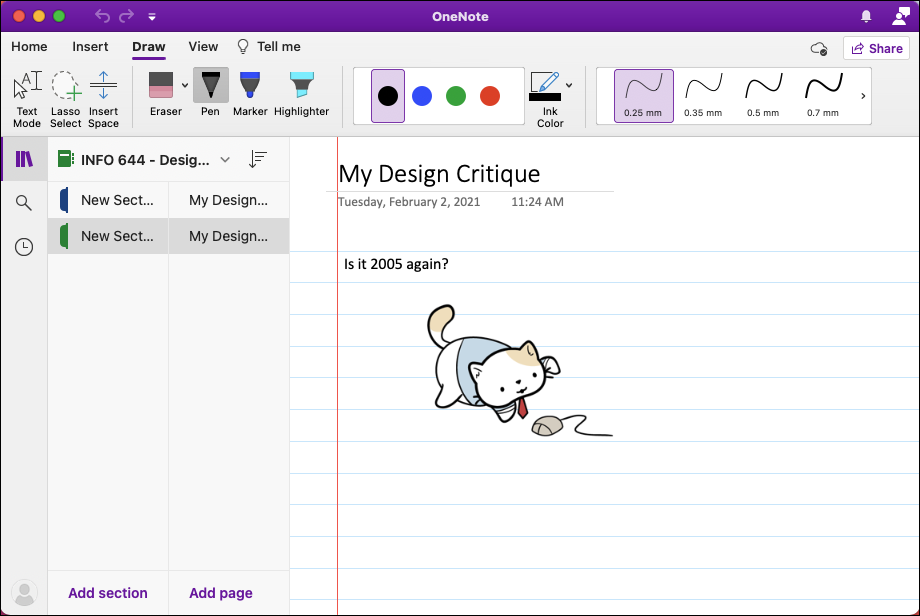
Once the user has set up a section with a page, they can take notes seemingly anywhere on the page. As earlier noted, OneNote is intended to mimic a physical notebook where free flowing ideas aren’t bound to the usual digital formatting constraints. The user can also easily switch from text to drawing and back again.
While the lack of constraints allows for greater freedom of note taking expression, they also leave the user open to having memory-lapse slips. I’m usually taking notes while reading or listening to lectures, so I’m constantly switching between two or more applications while using OneNote. I often forget whether I’m in drawing or text mode once I return to my notes and have been prone to draw when I mean to type. In my opinion, text mode should be the default and more feedback should be given when users are in drawing mode, as well as a clear ‘exit drawing mode’ button. See Figure 4 for an example of this redesign.
Adding To-Do Tags
OneNote has a tagging feature that lets users call attention to a specific note with tags like ‘To Do’ or ‘Important’. When tagging a note as ‘To-do’, the user receives immediate feedback through the appearance of a new icon – a check box that is left unchecked (see Figure 5). This effectively combines knowledge in head with knowledge in the world (most users know that blank boxes afford checking) and signifies that this box should be checked once they’ve completed their ‘To-do’.
This ‘To-Do’ tag supports the user’s memory for the future as they can plan for something that needs to be remembered, but it doesn’t help with their prospective memory of remembering to do that something. A workaround for this could be the addition of reminder dates when adding a new ‘To-do’ tag. Since this is a Microsoft application, most users are connected via an email account and can set up email notifications to receive these reminders.
Conclusion
Overall, I think OneNote does a good job at tapping into the reflective level, as users can reflect back to a pre-digital era where physical notebooks reigned superior. Some of the old fun of physical notebooks like freeform note taking, drawings, and stickers are present in this digital notebook – they’ve even included a view option which adds college-ruled lines to the background (see Figure 6). While appealing to nostalgia, the designers have also added a modern digital touch by including features that allow users to take screenshots and audio recordings directly through the application. OneNote effectively merges the physical into the digital, while maintaining usability.