This project was created and graded for INFO-643 Information Architecture & Interaction Design at Pratt Institute School of Information.
Platform
Mobile/Web
Role
Researcher and Co-Designer w/ Sarah Tsao, Jing Peng, and Chris Ferrera
Key Project Framework: Research and Development, Information Architecture, Interaction, User Testing, Wireframing and Prototyping
Software
Figma
InVision
User-Testing.com
Optimal Workshop
Zoom
Project Summary
Music is a universal language. Most individuals have a favorite song or artist, and many may even have an account on a streaming service. Aquarius Records started as a Rock/Indie music label but incorporated selling records via their website over time. In order for visitors to remain engaged and incentivized to visit this website more than once, the website needs a remodel to focus more on its core features.
This study aims to find the best approach to redesign the current website to be the most relevant and accessible for our target groups. Using several different testing methods like:
User Interviews
Usability Testing
Tree Testing
Card Sorting
we understood what our target group’s interest in music was. We used that information to add the necessary features. As a result, we are expecting to create a website that is user-friendly and succinct.
The Challenge/Problem
The major problems and needs are listed as follows:
Users end up leaving the website due to its lack of validity and interactivity.
Users want to be able to hear and download music from the website to their streaming sites.
Users want to visit a music website that has a relevant and unique design.
Users are looking for uniformity in the website’s visual optics and a design that honors each band’s genres.
The Solution
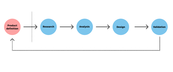
Process
Using five critical phases of the UX design process consisting of product definition, research, analysis, design, and validation, we created a prototype that addressed these problems.
Product Definition & Research
User Interviews
We conducted semi-structured exploratory user interviews with questions that allowed us to study user’s attitudes, beliefs, desires, and experiences to get an in-depth snapshot of their user need’s concerning visiting our website. In our preliminary user interviews, we were provided feedback and insight into how and why users would potentially visit Aquarius Records. As information seekers, our users wanted to discover new artists, look for upcoming events, and listen to music in-browser. Throughout our observation of the site, some common critiques included a design overhaul, populate pages with relevant information, and domain validity.
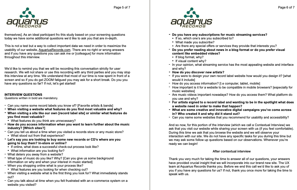
User Interview and Contextual Interview Script 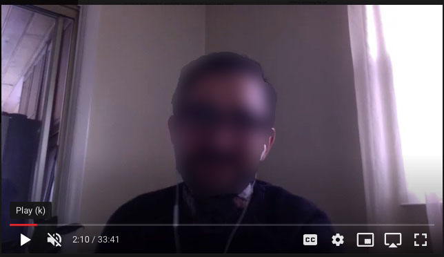
Screenshot of User & Contextual Interview with Participant
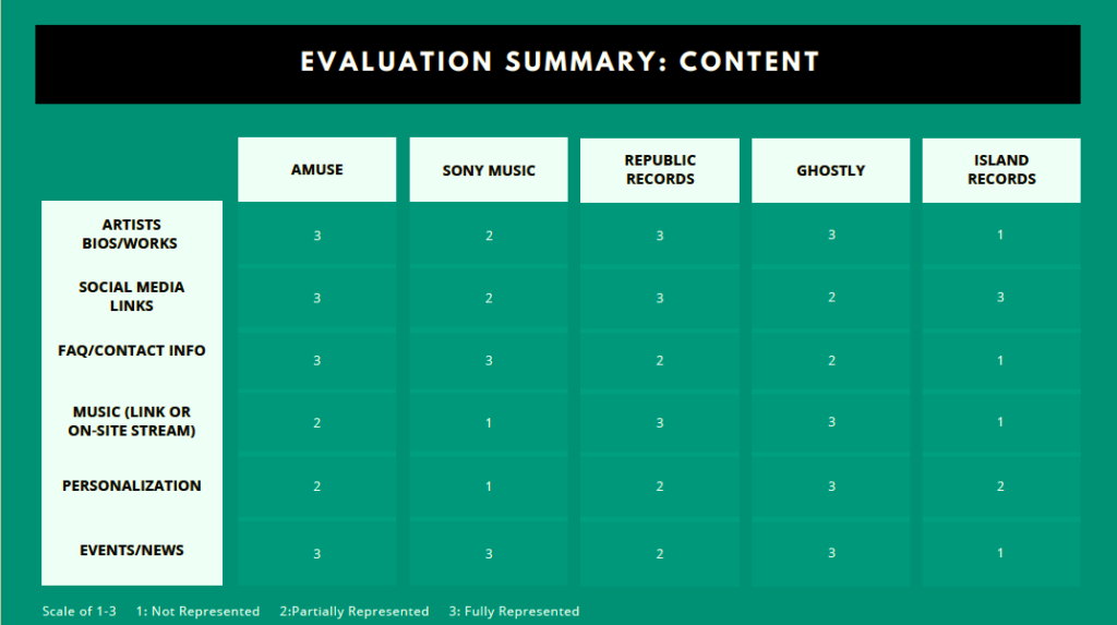
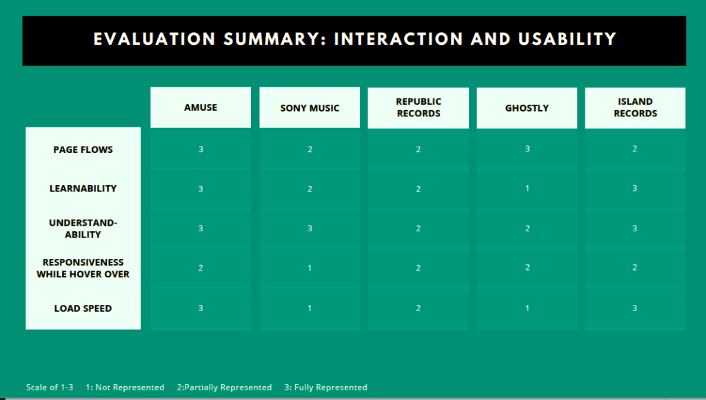
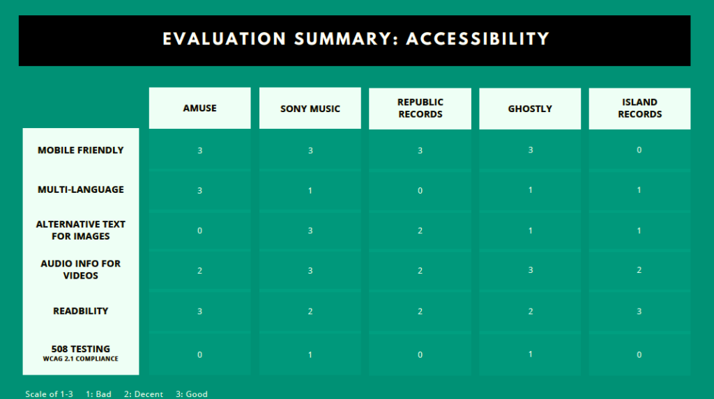
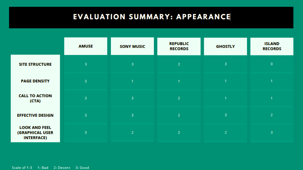
Competitive Reviews
Research led to analyzing five different record label websites:

using the following standard set of criteria to synthesize excellent and bad practices that should be integrated into/avoided for our Aquarius Records prototypes:
C O N T E N T
I N T E R A C T I O N A N D U S A B I L I T Y
A C C E S S I B I L I T Y
A P P E A R A N C E
Analysis
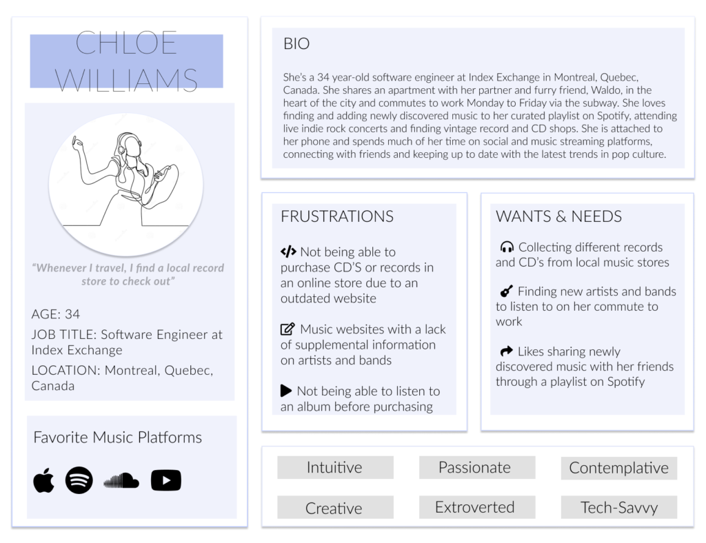
Persona
This persona was created based on the understanding of existing users through research, user interviews, and competitors’ knowledge. Her name is Chloe Williams, a 34-year old software engineer from Canada and a music lover, a compilation of several different target and potential users.
Card Sorting
We created fixed content categories and hosted a Card Sort on Optimal Workshop to obtain data to help us redesign the information architecture of AquariusRecords.com. The data provided helped us improve the organization, uniformity, readability, and ease of use of the current interface. We identified patterns in the way target users and potential users interpret and sort the information within the record label exploring experience in order to create a new site map.
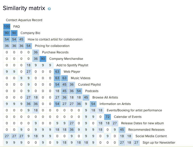
Similarity Matrix Graph from Optimal Workshop
We each sent a link to different participants through Optimal Workshop, inviting users to complete a quick card sorting activity. Some of the findings we gathered were:
Creating tabs based on what our target user’s information needs are
Incorporate direct links to other sub-pages on our site map upgrading our current IA.
Create detailed sub-browsing information pages.
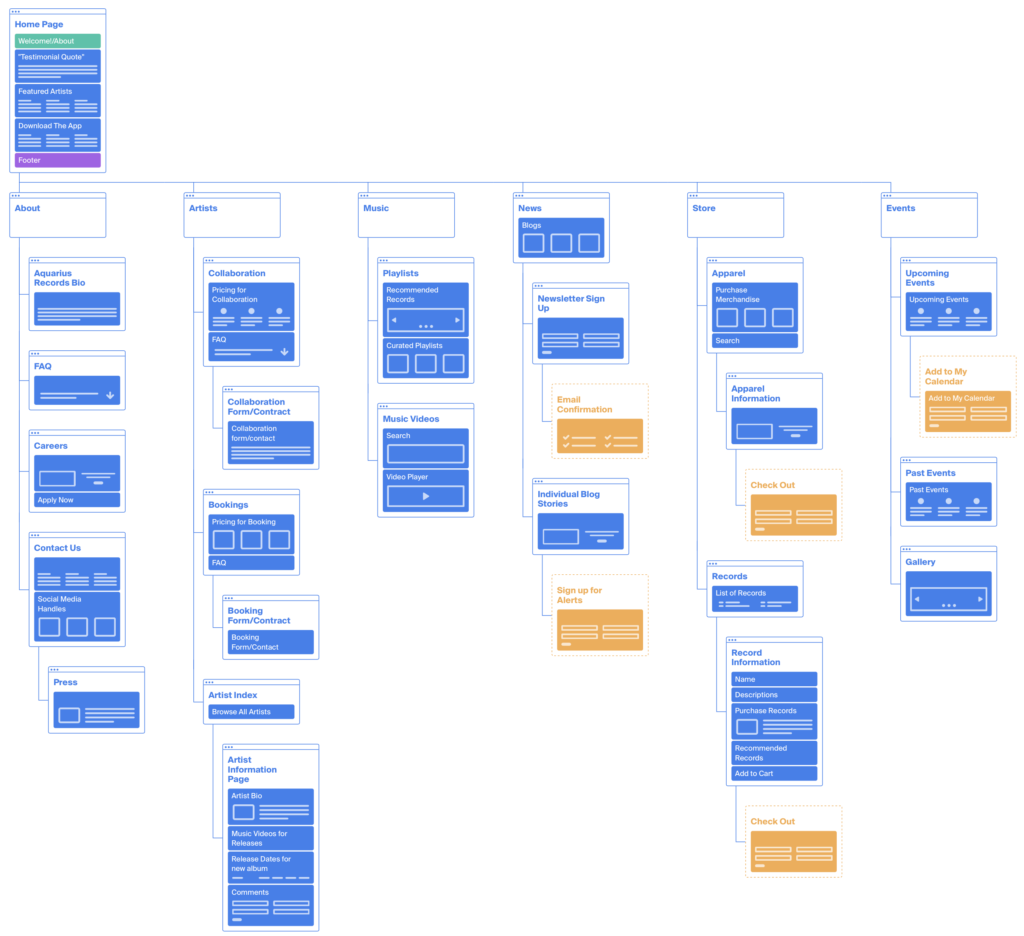
Site Map
Based on the initial findings of the card sorting study, we created a new sitemap on Octopus.do, a visual sitemap builder, that included additional key terms and indicators.
Design
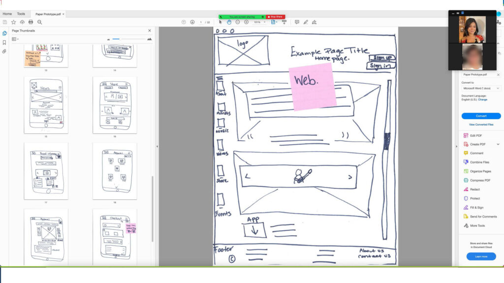
Paper Prototypes: Mobile and Desktop
Once we analyzed all of the data provided, it was time to create a paper prototype for mobile and web. When approaching design, it is much easier to design from mobile to web than vice versa. This part of the group project was done individually and discussed with the larger group later. Although the usability testing focused on improvements, there were areas where the prototype succeeded.
Participant 1 Remote Usability Interview, 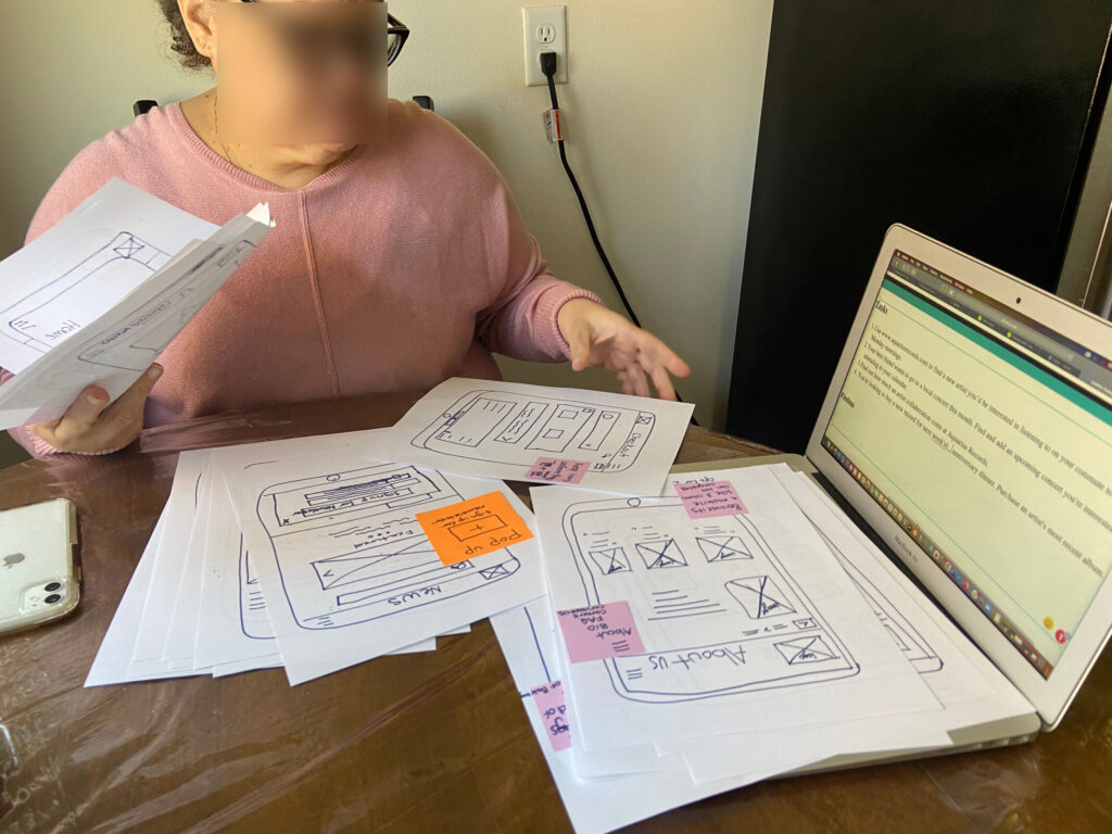
Particpant 2 In-Person Usability Interview
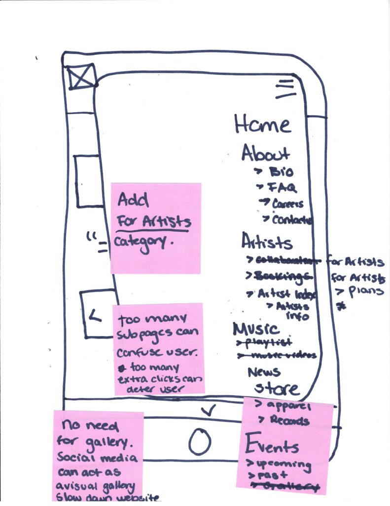
Mobile Navigation 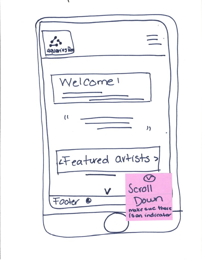
Mobile Home Page 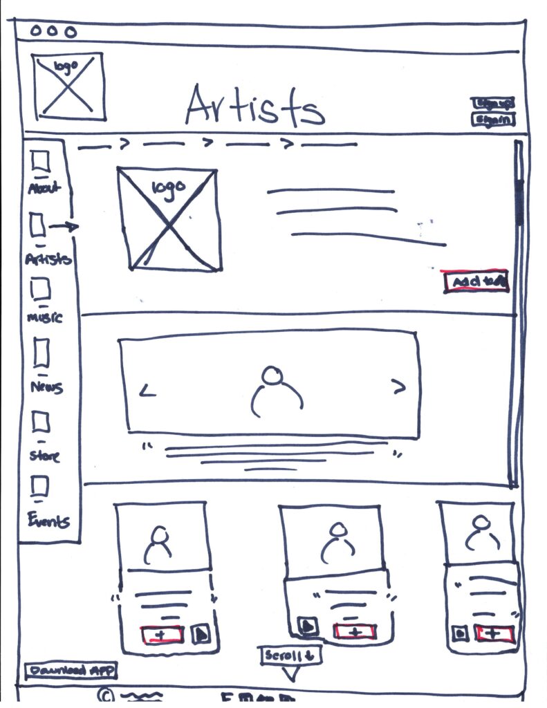
Web Artists Page 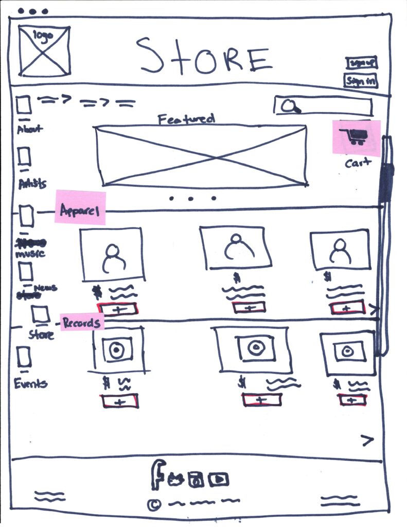
Web Store Page
Medium Fidelity Prototype – Mobile & Desktop
Based on our usability testing for our paper prototypes, we applied the critical feedback provided by our participants to our medium-fidelity prototypes. Some feedback included adding proper indicators to scroll down or swipe and functions like share and add to calendar. We used Figma to create wireframes with limited functionality but clickable areas representing the website interactions and navigation possibilities.
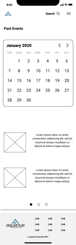
Past Events Page 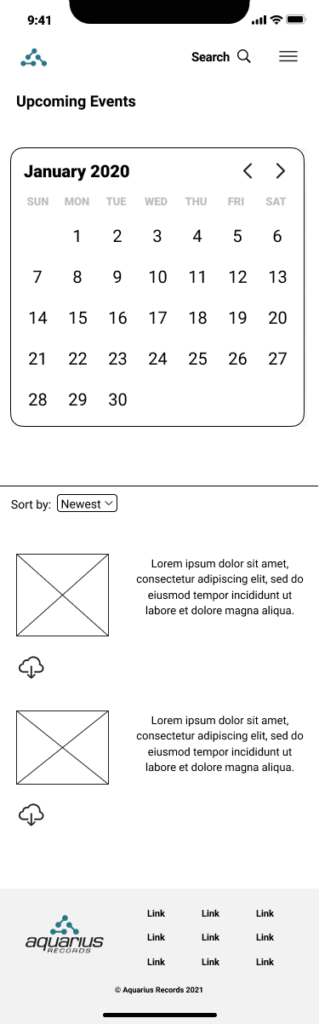
Upcoming Events Page 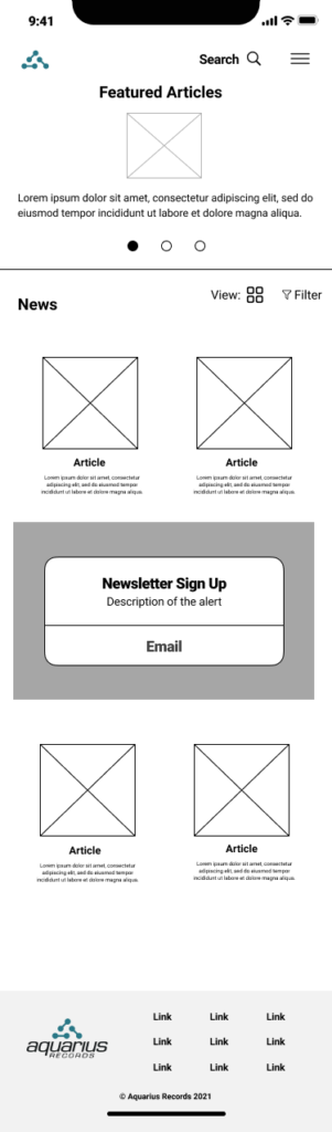
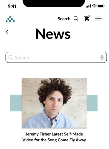
News Page 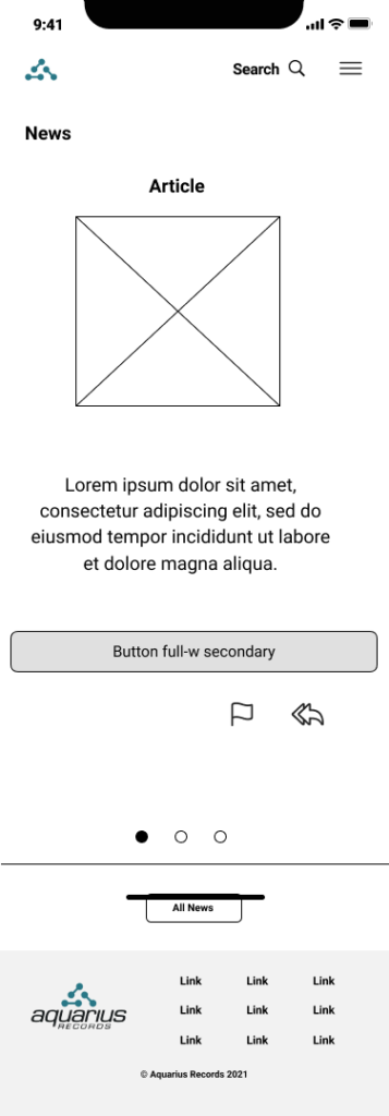
News Article
Testing and Adjusting Medium-Fidelity Prototypes
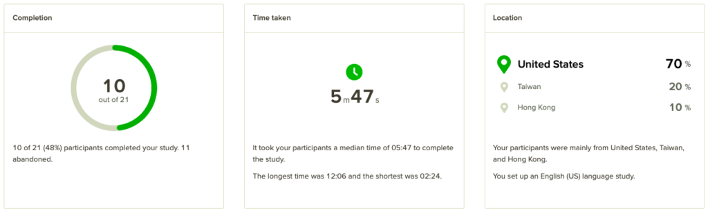
We uploaded and hot-spotted each screen to InVision and created an unmoderated usability test with specific tasks through User-Testing.com. Based on the data collected from each user test, we implemented site improvements to each screen. Users had concerns with navigation and uniformed labeling throughout the prototypes. In order to solve these problems, we incorporated confirmation, share, “add to” overlay pages, optimized navigational indicators, created uniformity in the icons throughout the site.
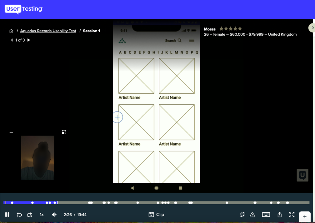
Medium Fidelity Usability Testing via User-Testing.com 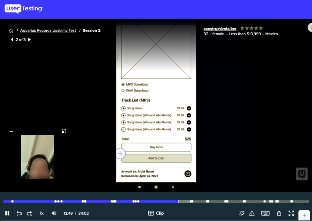
Medium Fidelity Usability Testing via User-Testing.com
Adjustments to Medium Fidelity Prototypes
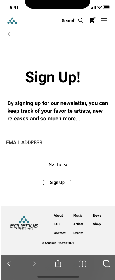
Additional Screen- Sign Up for Newsletter 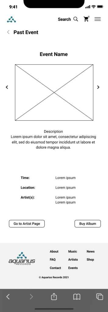
Adjustment to Past Event Page 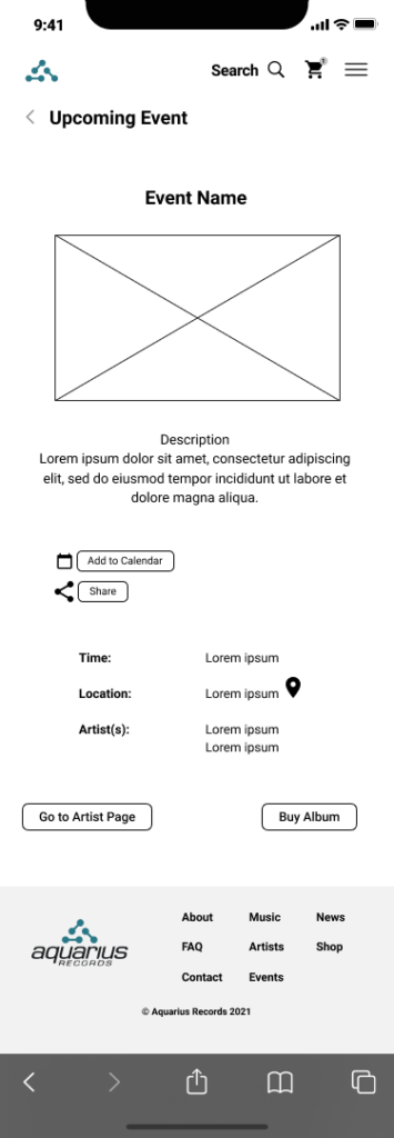
Adjustment to Upcoming Event Page 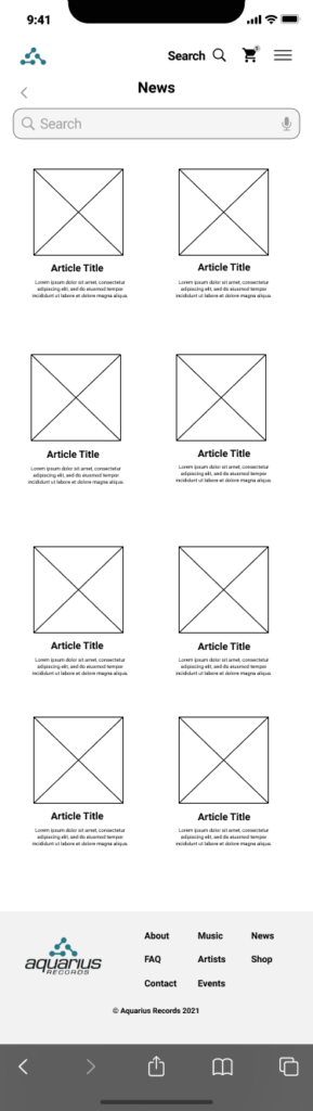
Adjustment to News Page
Design System & Style Guide
After we adjusted our medium-fidelity prototypes, we created a design system of components, patterns, and styles for our high-fidelity prototypes mobile and web screens. Each team member was tasked with creating their style guide for both mobile and web, and we collectively presented and discussed each design with each other. Using colors that were already integrated into the original logo, like teal and black, there was a need for a pop of color, and yellow was perfect. Aquarius Records is a Rock/Punk label, and these funky colors honored their history and mission.
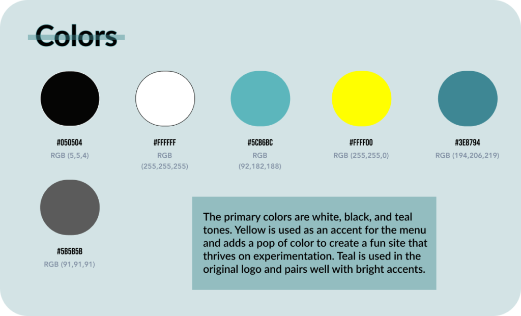
Colors 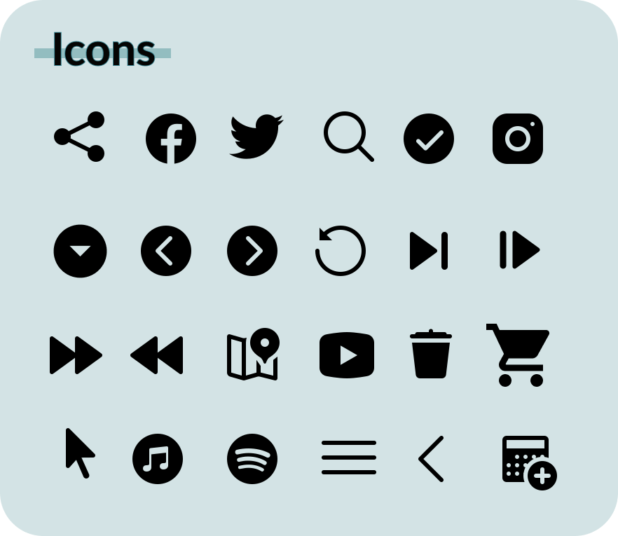
Icons from Icons8 Free Icons 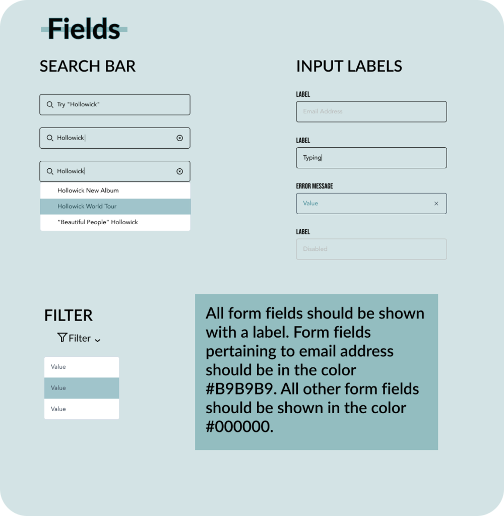
Fields 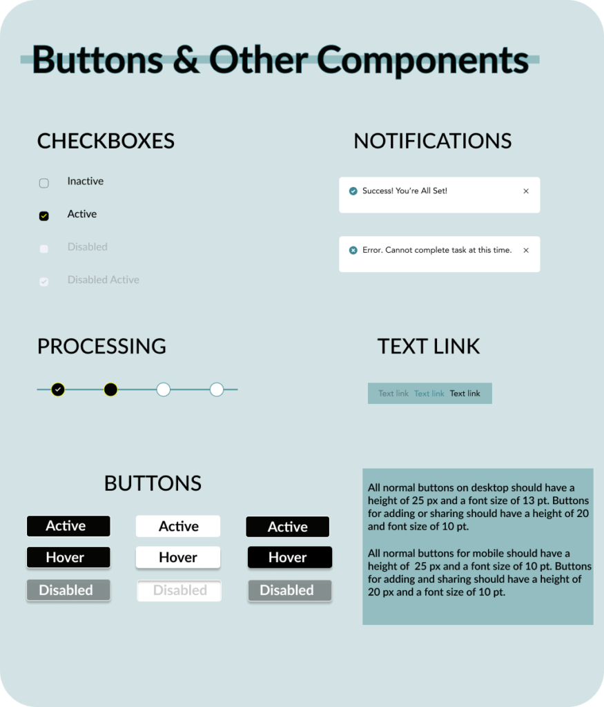
Buttons & Other Components
High Fidelity Prototypes
Using the design process, we each created a high-fidelity prototype that incorporated all of the research, analysis, testing, and adjustments over a semester. Keeping in mind all of the data collected, I incorporated “quicklinks”, breadcrumbs and a pop of color throughout my screens. Although our high-fidelity prototypes have been created, there is one final step: Validation. We are continuing to test out our prototypes to perfect the result.
Mobile
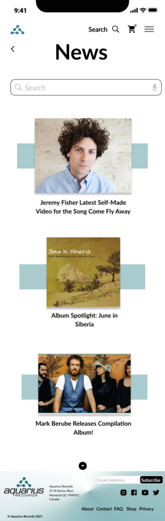
Mobile News Page 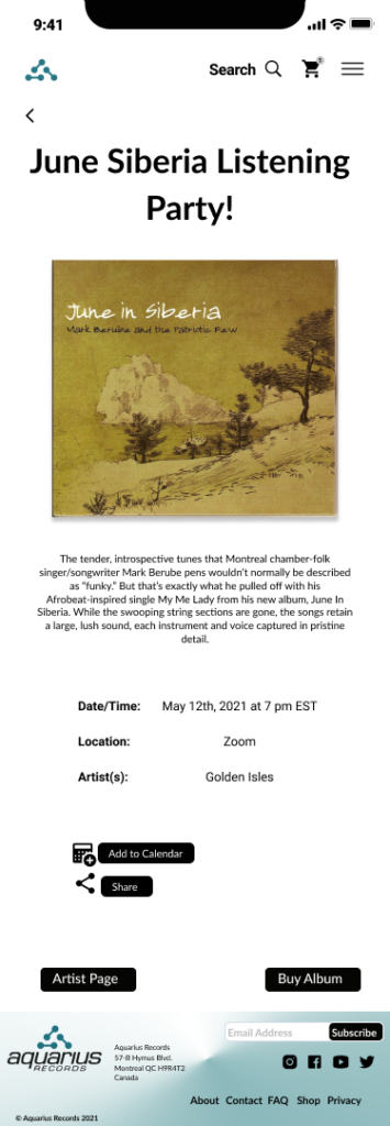
Mobile-Upcoming Event Page 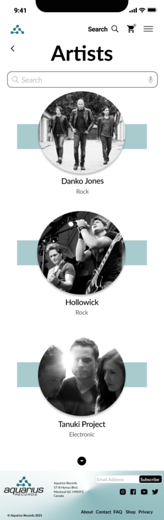
Mobile Artists Page
Web
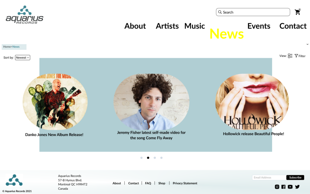
Web News Page 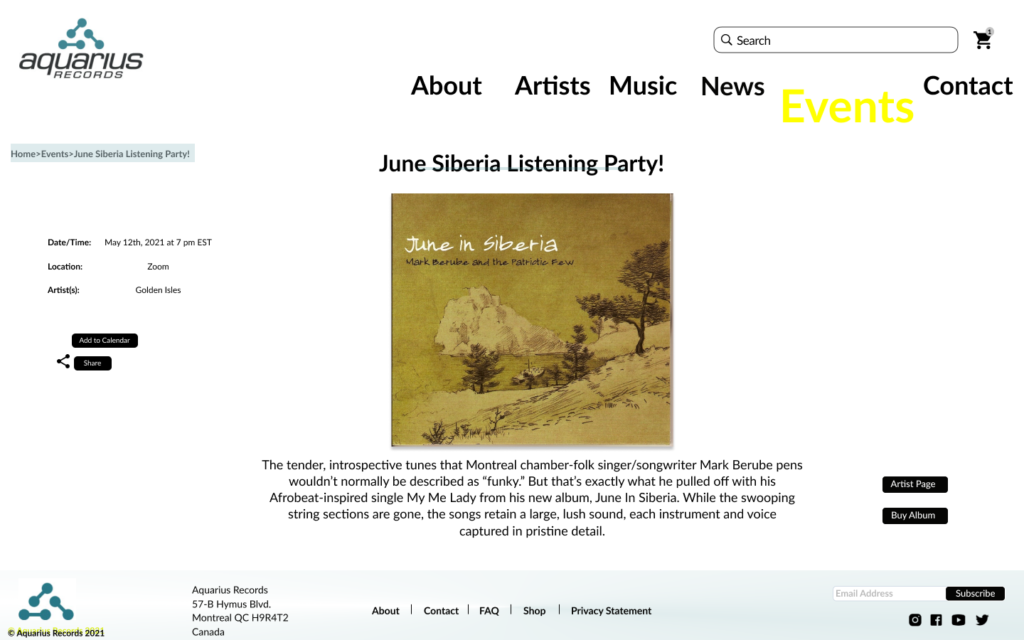
Web-Upcoming Event Page 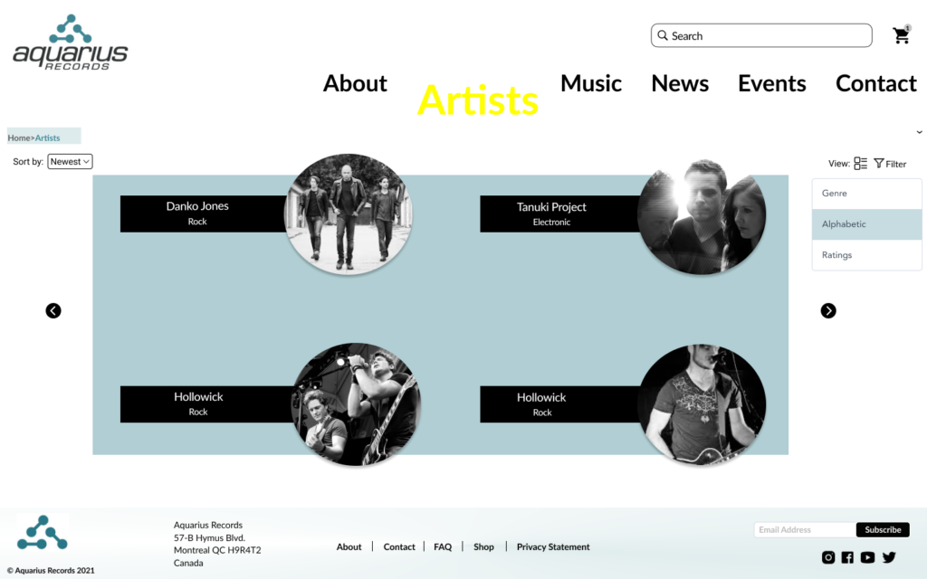
Web Artists Page
Next Steps & Take-Aways
Our next step in the design process is Validation which is an essential step because it helps our team understand whether our final design works for our target and potential users. Since our high-fidelity design is ready, we are looking forward to testing it with users to gather valuable feedback. We will validate the proposed Aquarius Records website with both stakeholders and target users during these testing sessions.
As someone who did not have any experience with UX design and Information Architecture, this project was both rewarding and challenging in ways I could not have foreseen. I can see and understand all of the necessary work in order to get to a finished product.