Introduction
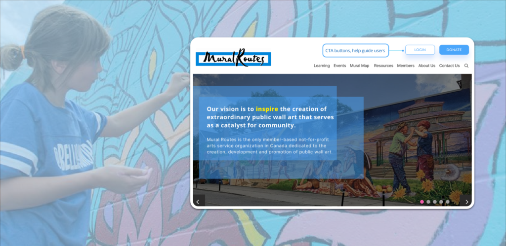
Mural Routes is the only member-based not-for-profit arts service organization in Canada dedicated to the creation, development and promotion of public wall art. The website promotes public wall art in partnership with artists that serve as a catalyst for community building.
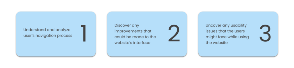
Scope and goals
Mural Routes updated their website in 2016 and approached the Center for Digital Experiences to analyze the website again. They have worked with Pratt students in the past semester to evaluate the Mural Map of Canada which lives on the Mural Routes website. Since that part of the website has already been evaluated, the main focus of this study was to learn more about the homepage, menus, arrangement of the content, discoverability and accessibility. The scope of this study was to determine the following:
The team
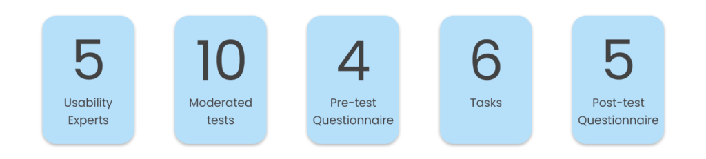
I worked in collaboration with 4 other UX researchers: Katherin Aristizabal, Jessica Drozd, Olivia Turpin, and Elisabeth Pefanis from the Pratt Center for Digital Experiences to conduct a Moderated Remote User Test and to create a report that outlines the major usability issues that were identified during the usability study and propose some actionable recommendations as solutions. My role in this study was to create the test along with my team, recruit users and conduct the study, data collection and analysis, identifying the usability issues and proposing recommendations and designing the mockups for the findings and recommendations along with the final report.
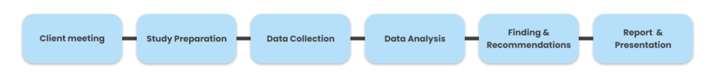
The process
Project timeline
Duration: March 17-May 5, 2021
Recruiting Participants
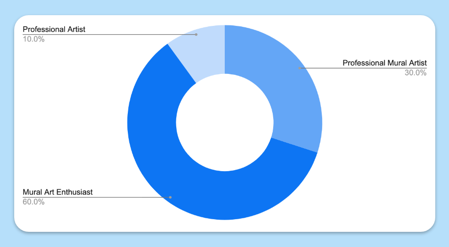
After understanding the target user group of the website based on the discussion with Mural Routes, the team targeted Mural Art Enthusiasts & Professional Mural Artists/ Artists for the study.
A screening questionnaire helped in selecting and recruiting 10 participants. Participants were recruited via the following channels:
- Social media
- Recruitment of known artists
- Pratt School of Information mailing list
Study Design
My team and I inspected the usability of the current website by conducting moderated remote user tests through an online platform, UserZoom Go. UserZoom Go records both the screen and faces of the participants while they navigate through the website and perform tasks while thinking out-loud as they narrate their thoughts while completing each task on the website.
Tasks:
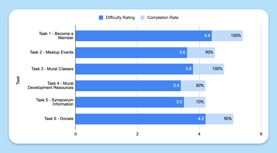
The following six tasks were given to the participants to complete while using the website. After completing each task, participants were asked about their general thoughts about the page, and measurements on completion rate and task difficulty scores.
- Task 1: Find information about becoming a member
- Task 2: Find the last time a monthly member meetup happened.
- Task 3: You are interested in taking a mural art class. Find a mural art class that has recently been offered by Mural Routes.
- Task 4: You’re interested in creating a mural project on a building in your community, how would you find relevant information for this project?
- Task 5: You want to read about the Keynote speakers from the latest National Mural Symposium. Find the report from the last Mural Symposium.
- Task 6: You are concerned with how murals are being maintained in your community and want to make a donation. How would you do this?
Analysis Process
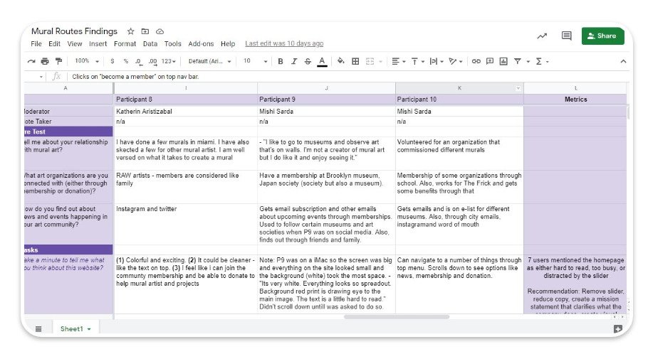
Once the sessions were complete, my team and I re-watched the recordings of the usability tests and created a combined list of notable findings on Google Sheets.
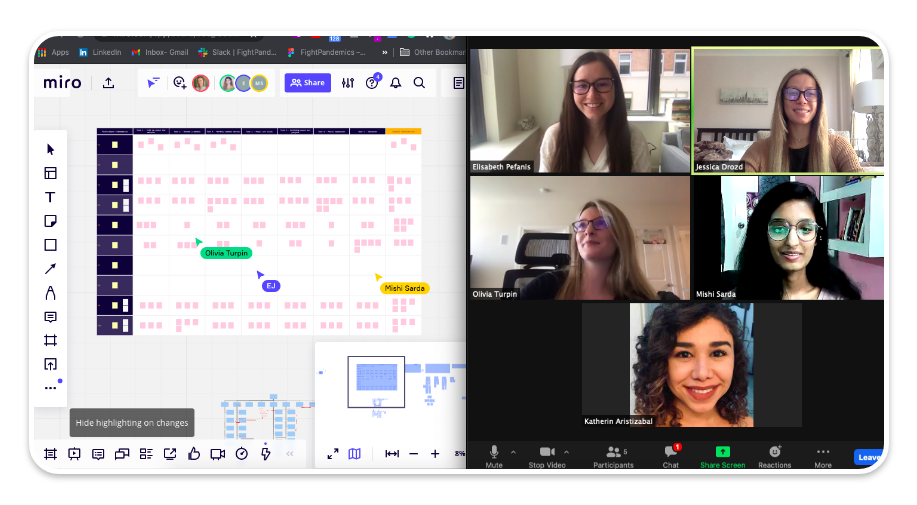
We then grouped together themes that emerged from the user testing data on Miro to help shape the findings and recommendations.
Results
Analysis helped us understand that all ten of our participants reacted positively towards the website and 80% of them said they would use the site again.
“Yes [I would use this website again]. I think the member directory was cool and I would want to be a part of that so that I can connect with other artists and get my name and art out there.”
When asked, “How would you rate your experience with navigating this website (1 being difficult and 5 being easy)? ”, participants on average rated the site a 3.7.
Post-session thought – “I liked what the organization stands for and the site does a good job highlighting that”
Moderated Remote User Testing of muralroutes.ca produced some usability problems. After a thorough analysis of the testing sessions, my team and I were able to propose some alteration to the website’s interface that are intended to create a more meaningful and understandable user experience . The recommendations are as following:
Recommendations
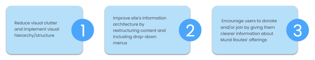
Recommendation 1: Reduce visual clutter and implement visual hierarchy/structure
Finding:
Although users could accomplish the tasks on the website, their interaction was not error free. Description of some of the findings are:
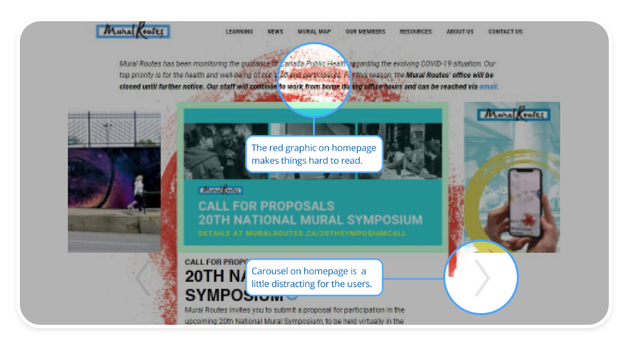
- Users found it difficult to read the COVID-19 safety protocols because of the red graphic in the background on the Home page.
- The carousel of the Home page creates an accessibility issue as it takes away user’s control while moving freely and acts as a distraction.
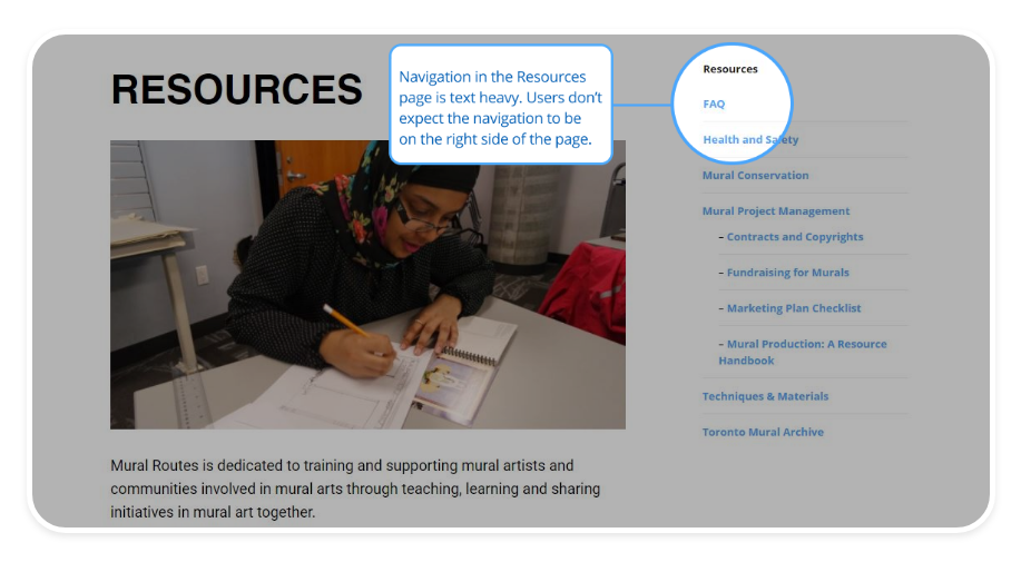
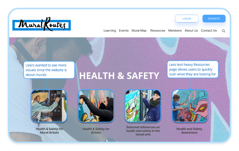
- The busy layout and text-heavy pages made it difficult for users to navigate. The Resources page, in particular, had a submenu hidden within the page, being difficult to find unless the user was on that page.
Recommendation:
To bring a greater clarity to the users and increase the user-friendliness, we proposed the following recommendations:
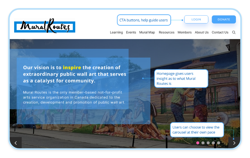
- Create CTA buttons of what we want to lead our users to. Members should be able to log in and most importantly, people should be able to donate right from the top navigation menu.
- Add a mission statement to help users gather a better understanding of who Mural Routes is.
- Allow users to view the carousel at their own pace, a carousel that moves on its own can be an accessibility issue.
- Add more visuals to represent the content.
- Make the pages less text heavy to help the users in scanning the information quickly.
Recommendation 2: Improve site’s information architecture by restructuring content and including drop-down menus
Finding:
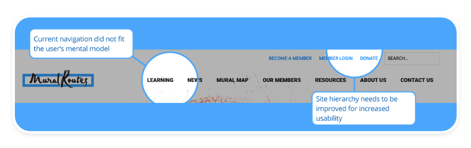
One of our findings highlighted the usability issues with the labels on the navigation bar experienced by all 10 of our participants. The current navigation did not match their mental model. Labels like ‘News’ and ‘Our Members’ presented moments of confusion for the users.
Recommendation:
To address these usability issues, we proposed the following recommendations:
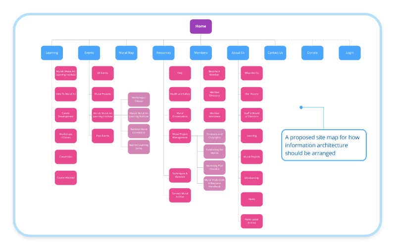
- A site map for how information architecture should be arranged
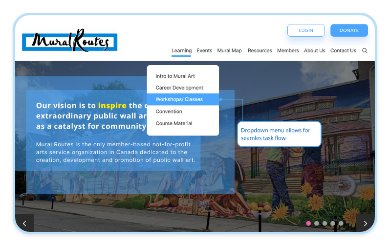
- Adding a drop-down menu which will allow a quicker access to specific pages that would otherwise be hidden on the main landing pages. This would help users understand the information provided on the website.
Recommendation 3: Encourage users to donate and/or join by giving them clearer information about Mural Routes’ offerings
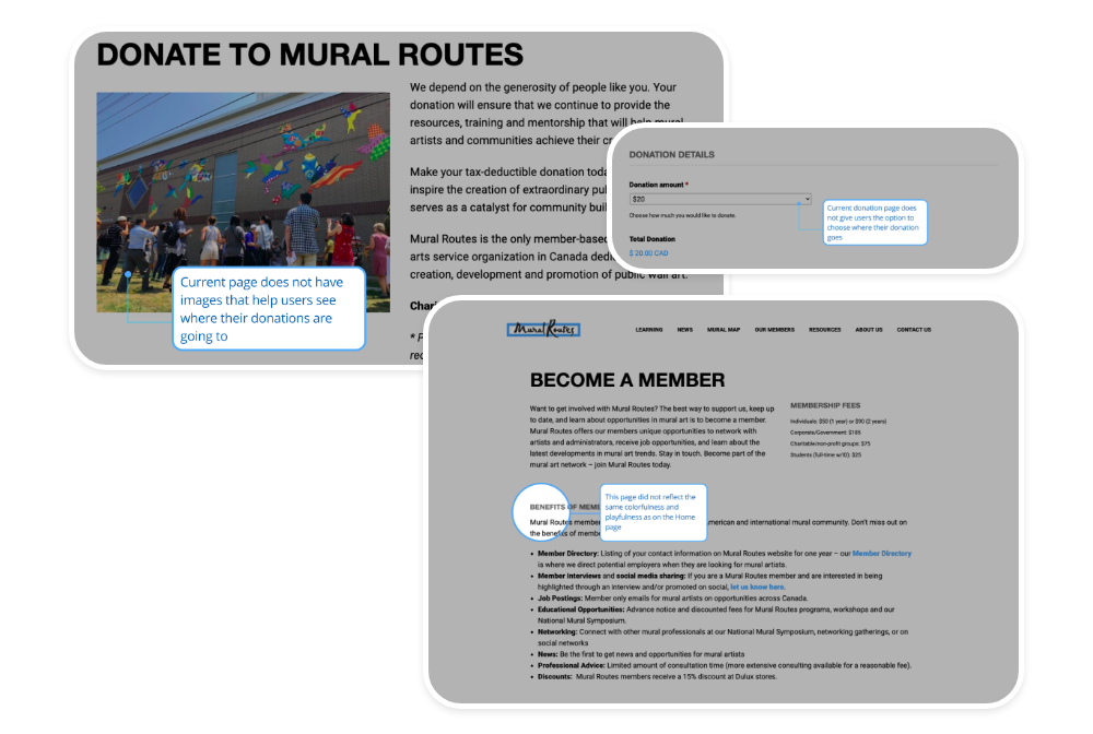
Finding:
After conducting the test, we found that users didn’t feel confident about becoming a member due to lack of information on the page. In addition to that, some users also felt that the page did not reflect the same colorfulness and playfulness as on the Home page. Users also felt dissatisfaction with the lack of information on the details of where the contribution is going on the Donation Page.
“It seems very easy to give donations but very vague in terms of where the donation is going towards”
Recommendation:
Descriptions of recommendations to address these findings are listed below:
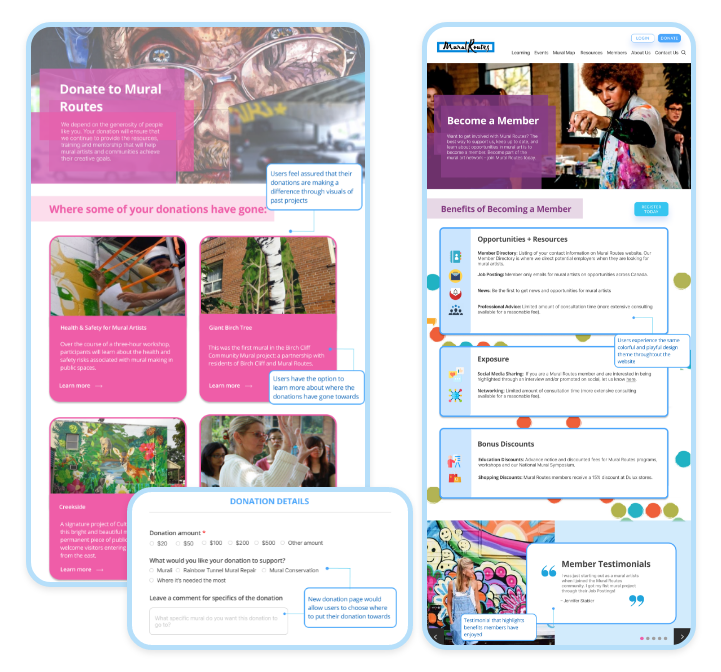
- Add testimonials on the Become a Member page of how artists have benefitted from their memberships.
- Provide a colorful and playful layout to display the benefits of becoming a member to keep theme consistency
- Add an option for users to express where they would like their donation to go towards
- Add images of the artists, murals, or events that have been funded by donations and spark a sense of urgency and call to action from users to donate.
Conclusion
Final Report
We provided the clients with a report that provides an in-depth analysis of the usability study of the website along with the proposed recommendations. The full report can be found on this link: https://documentcloud.adobe.com/link/track?uri=urn:aaid:scds:US:cdc6e5e9-e2e5-40ae-a95e-f9612a3fc552
Presentation
The study was also presented in a 10 minutes presentation with the clients over zoom.
“We really appreciate how you have given these actionable recommendations. We look forward to updating our website with the help of the analysis that you have provided us with.”
– Mural Routes Representatives
The presentation can be found on this link: https://docs.google.com/presentation/d/1BtuIEjP09-Bq12D4BsX72xuMQIGvmr0oogD9mQo8W9E/edit?usp=sharing
Reflection
If we had more time to work on this project, our next steps would have been to explore our findings and implement our recommendations to see the results.
Becoming a moderator really helped me in understanding the user experience journey. It also gave an understanding of the value testing brings to creating a user-centered and user-friendly product. This study definitely prepared us more for the future testings and gave insights on what should and shouldn’t be done while moderating a study. Working together as a group helped in bringing new ideas and different perspectives. It also pushed us to bring high quality work with more efficiency. Lastly, working with a real client on this project and getting their feedback was an amazing experience and opportunity.