Evaluation Report
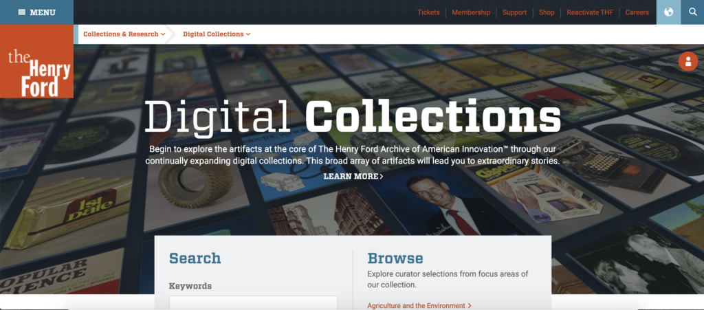
On March 17th 2021, my team met within Dr. Elena Villaespesa’s Usability Theory and Practice course Met with Ellice Engdahl and Filomena Napolitano, the digital collections and content manager and the digital marketing manager at The Henry Ford Museum. My team was composed of three Pratt Institute, School of Information Students: Yifan Wang, Haimeng Gong, and Ali Sasanian. The Henry Ford client explained to our team that the main focus was the digital collections portion of the existing website, and the goal was to make it more accessible for members of the general public. The client wanted to know if the website was friendly to those with visual impairments and who spoke different languages, and if it was easy to navigate.
The Pratt team decided to work aloud meetings where team members could vocalize ideas and talk through them with their other team members. We met weekly, often more than once, and over google docs. We completed moderated remote usability tests with two subjects each with a script and three tasks. The participants were chosen because they were part of the general public (not researchers), between the ages of 20 and 35, spoke english and lived in the US, and had an interest in history. These parameters were chosen to fit the profile of visitors of a history museum, we were able to communicate with them, and were not tech averse.
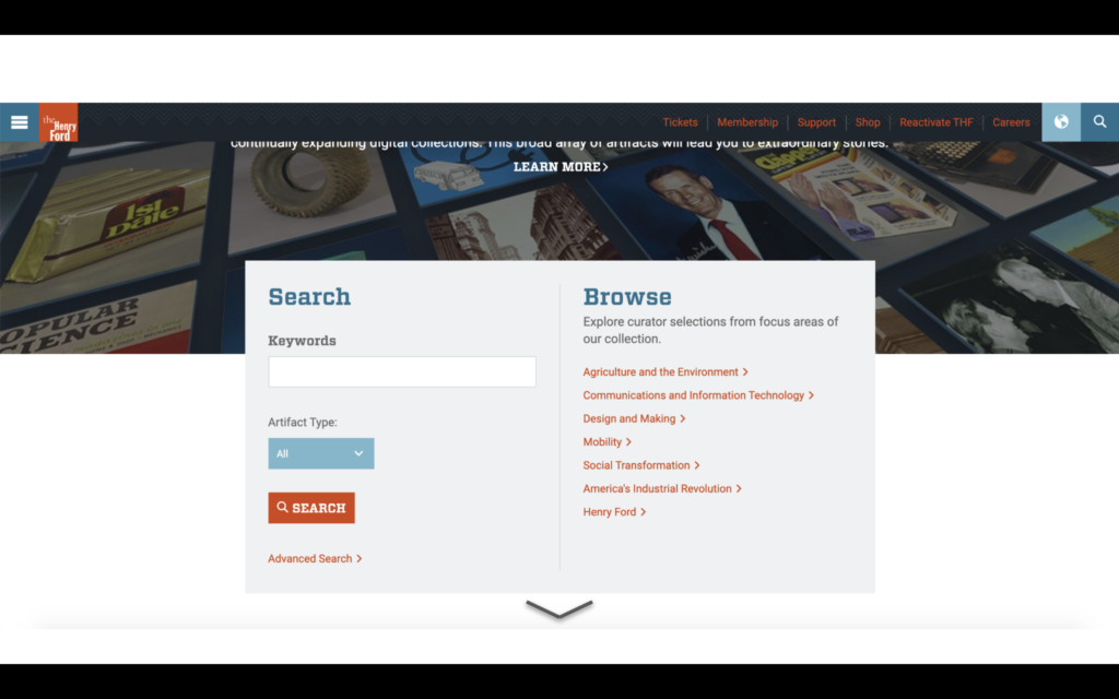
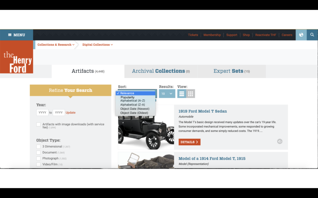
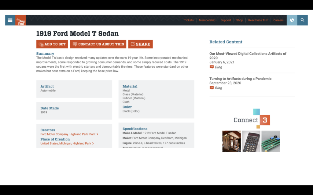
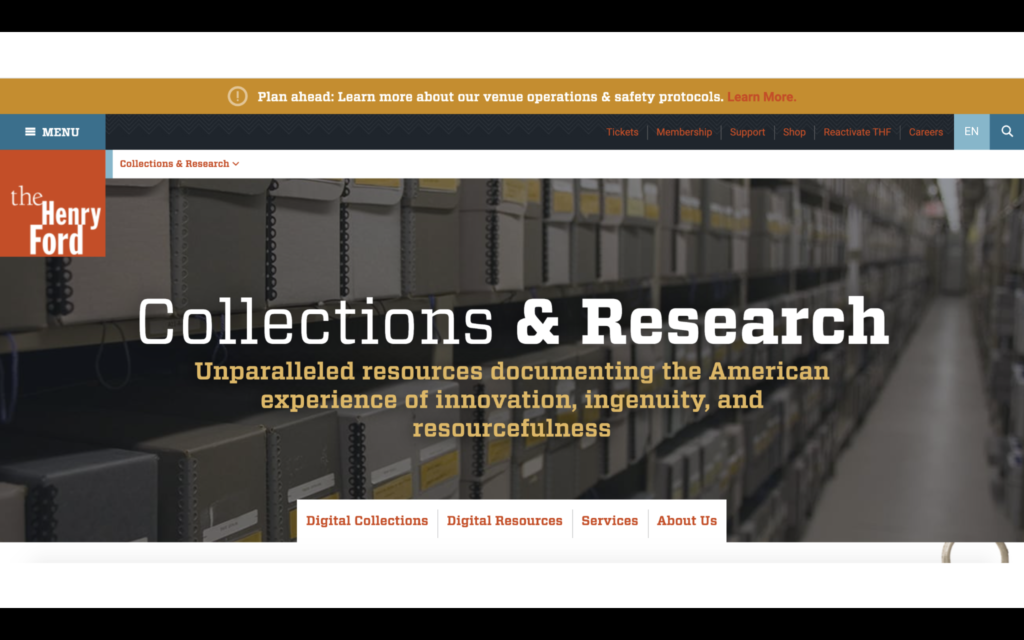
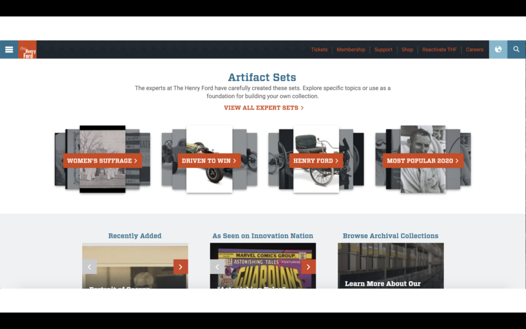
The test was curated to take the participant from the landing page of the website, through language translation, finding the digital collection, and searching for a specific object using a function of the website called “Expert Sets,” and then finding their own object of interest. These tasks were carefully planned to use the search function, browsing function, share option, and encourage the participant to find the “Expert Sets.” The participants were asked at the beginning of the test if they spoke other languages, if they had any visual impairments, if they used the internet before visiting a museum, if they had ever visited an online collection or participated in a virtual museum tour, and what their favorite museum was. These questions were formatted to categorize the participants within areas of the website the client wanted to make more accessible, i.e. the visual and language accessibility, and break the ice. After the test, the participants rated their ease of navigation on a scale of one to five, one being hard and five being easy. Of my two participants, one spoke Spanish, English, and French and thought the language translation functioned perfectly, and the other spoke only english. Both participants had trouble finding the language translation button, but navigated the digital collections website well and found the specific object. When asked about the “Expert Sets” in the post questionnaire, both participants said they were uncomfortable with the term “Expert” and thought that section was not for them as the general public. The ratings for ease of navigation was high for both participants.
Once the tests were conducted, the results from each team member was consolidated in a google sheets form to be compared. From there, the team met and decided on a list of recommendations for the website. The biggest problems the participants agreed on were the find-ability of the translation and share buttons, and the language of the “Expert Sets.” Other problems noticed by evaluators during these tests was that the participants didn’t always know they could scroll pages and they wondered what were the most popular objects in the collection. Our team came up with five solutions to these problems: Changing the icon for the language translation function from a globe to an abbreviation of the language, changing the language of “Expert Sets” to “Curated” or “Artifact” sets, add an arrow to indicate more scrolling, add a popular filter to the search function, and move the “share” artifact button closer to the title of the artifact and the “save this artifact” buttons.
The final document of this project was broken up into sections: Executive Summary, Introduction, Methodology, Key Findings, Recommendations, Conclusion, and Appendix. The team distributed the written sections on a volunteer basis, I wrote the Executive Summary, Conclusion and formatted the powerpoint for the client presentation, Yifan Wang wrote the Introduction and formatted the final document in adobe, Haimeng wrote the Methodology and formatted the appendix, and Ali was supposed to write the Recommendations. In the end stages of this project, both Haimeng and myself edited the Recommendations and wrote the Key Findings.
Our recommendations were intended to make the least fundamental changes to the existing website while also enhancing the reach and accessibility of it. The team believed these solutions were the most nominal modifications to streamline and enhance the user experience of an already phenomenal site.