Overview
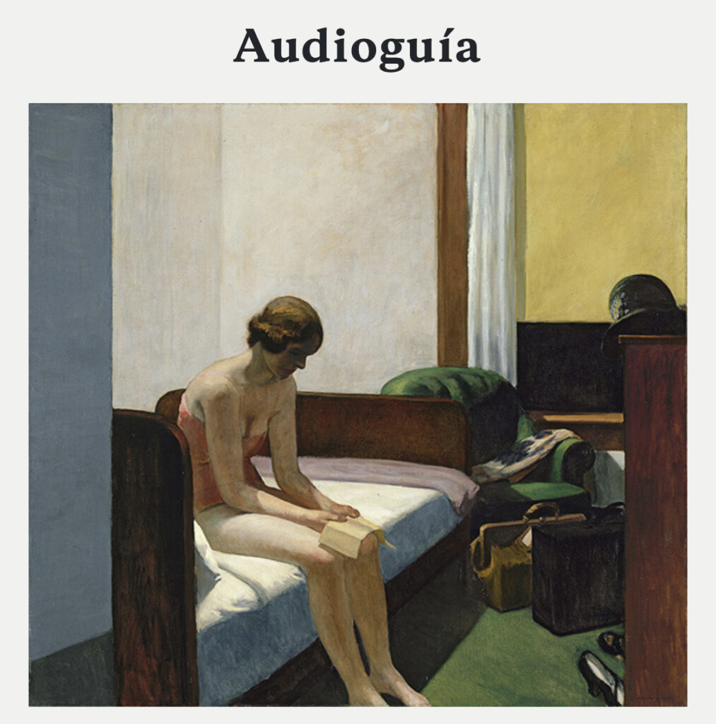
This report details the results of a usability study on a progressive web app designed by Audioguiarte, a company based in Spain offering customized audio and multimedia solutions to museums. Due to the Covid-19 pandemic, The Thyssen Bornemisza National Museum asked Audioguiarte for a digital solution to guarantee “zero contact,” as conventional audio guides apparatus is prohibited. Audioguirate then contacted the Center for Digital Experiences to evaluate the app in terms of usability, design, and technological innovation. Through remote moderated usability testing, participants attempted to complete three tasks given within a controlled setting. The test provides both qualitative and quantitative data which can be used effectively to find solutions for usability issues and uncover possible design opportunities.
Goal & Scope
To improve the usability and enhance overall user’s experience while using the audio guide app, we conducted a remote user test which focused on the navigation, information architecture, and content. We presented our findings and a usability report of the PWA audio guide , including the data assessments, results and recommendations for issues that found through the test.
Client: Audioguiarte
My Role: UX researcher, UX designer
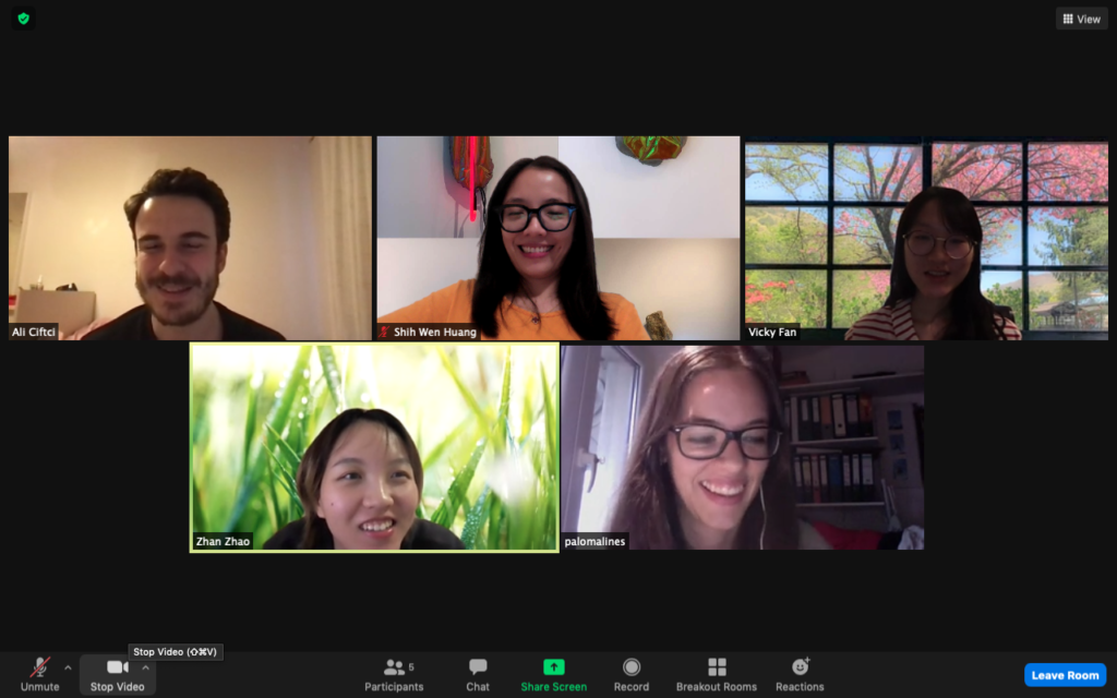
Team: Ali Cfitici, IXD-1st year Vicky Fan, IXD-1st year Zhan Zhao, Communication Design
Duration: March 17th ~ May 5th, 2021
Contribution: Usability Testing, User Interview & Survey, Data Assessment, Usability Report, Presentation.
Tools: User Zoom Go, Miro, Zoom, Google doc, Google form, Google slides, Adobe XD
Process
DEFINE AND PREPARE
After understanding the Audioguiarte’s goal and mission , we used the following metrics to screen participants who meet research criteria:
- Age group between 18~60+
- Adept with mobile application and online activities
- Interested in visiting museums and have used audio guide service
- Be willing to spend 40 minutes to take an online user testing
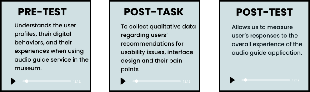
THREE QUESTIONNAIRES
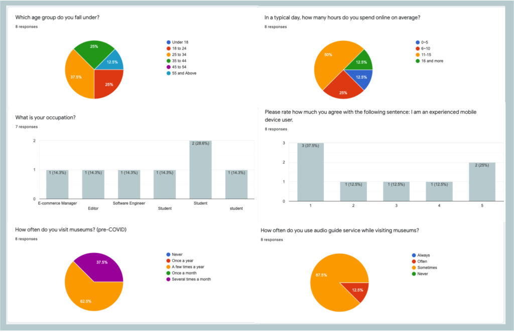
PARTICIPANT PROFILES
USABILITY TESTING
To assess the usability of the Audioguiarte PWA, we conducted the user tests with 8 participants. We chose a remote moderated usability testing via User Zoom Go. The participants were encouraged to use a “Think Out Aloud” method to speak out their thoughts as they interacted with the interface for each task. This allows researchers to obtain qualitative insights on the user’s thought pattern and their pain points are observed while performing the assigned tasks
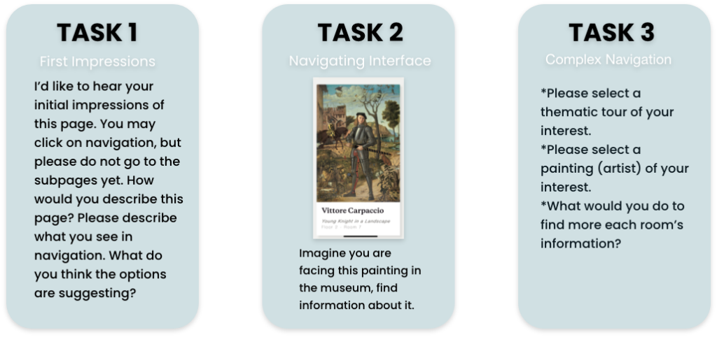
THREE TASKS
RESULTS AND ANALYSIS
Researchers documented their observations and findings on miro consolidation table to collect the qualitative data and insights, and the data were evaluated based on three metrics, the task-completion (Yes/No), the task-difficulty ( Rating: 1 – Completed with difficulty or help; 2 – Easily completed), and the problem experienced frequency.
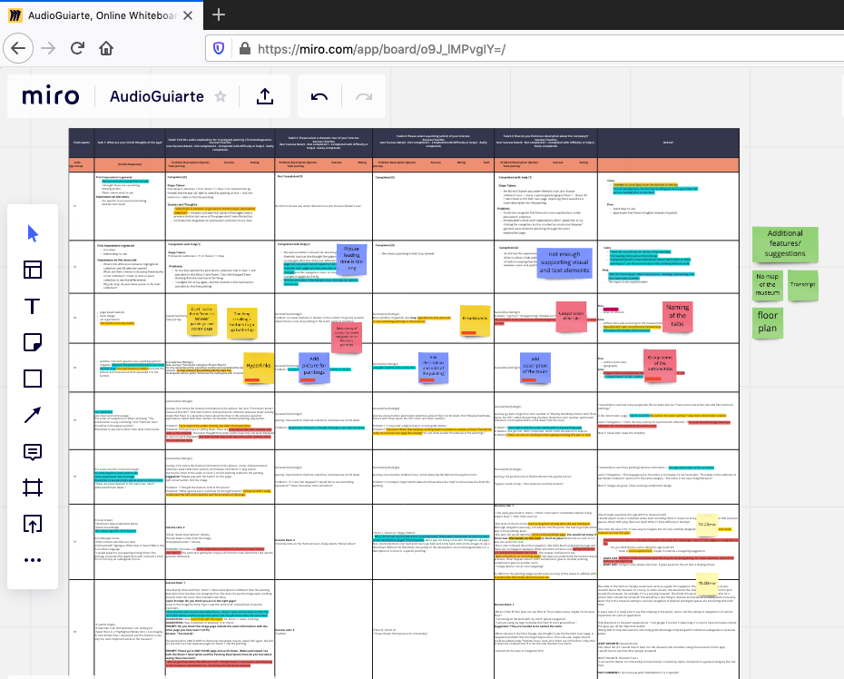
figure.4 Qualitative Date(Note-taking) 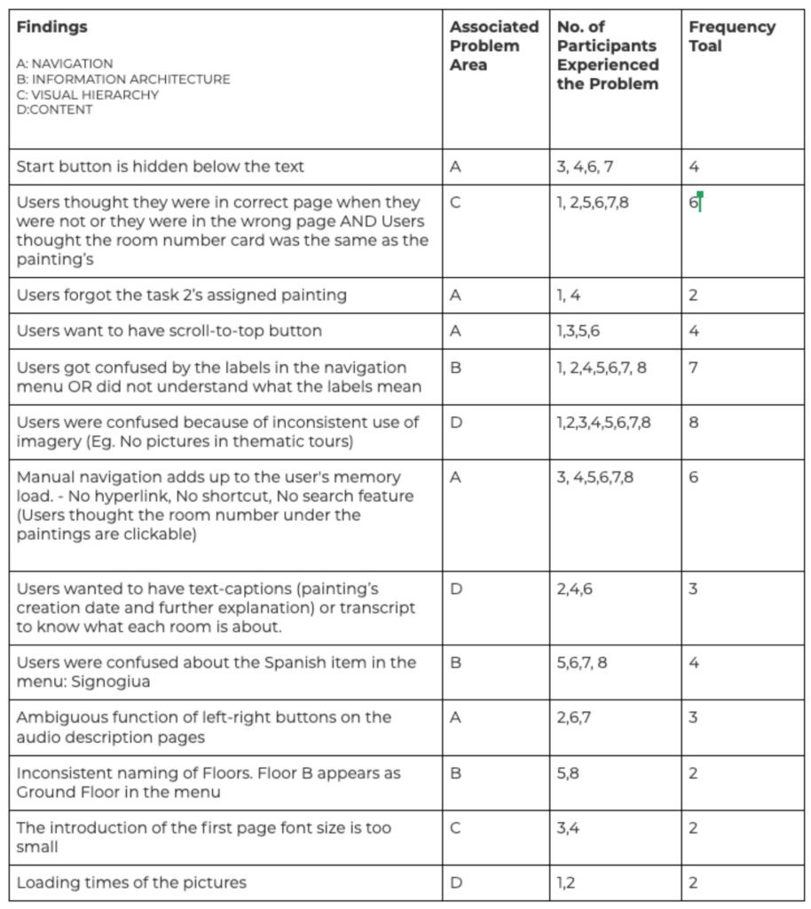
figure.5 Consolidated Problem Table
OVERALL FINDINGS
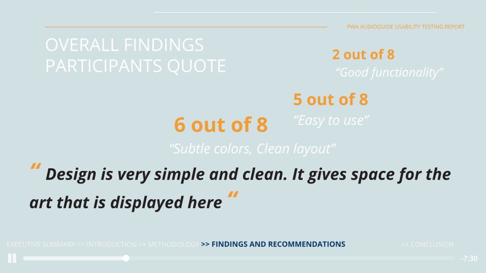
The post-test questionnaire showed aesthetic visual design among participants’ favorite aspects of the app, the clean layout and subtle colors making it easy to navigate the app. The functionality of the app was also greatly appreciated. Majority of participants have qualified the application as “easy to use”. More than half of the participants have reported that they would recommend this app to their friends. However, despite all these positive feedbacks, our research team still identified 13 unique usability problems. Most of these challenges are classified into 4 main areas.
4 MAJOR PROBLEMS AND RECOMMENDATIONS
- PROBLEM A- NAVIGATION
Confusing navigation system – Most participants experienced some challenges while navigating the audio guide app, they found it required good amount of time to access the information, because of the limited navigation pathways in the app.
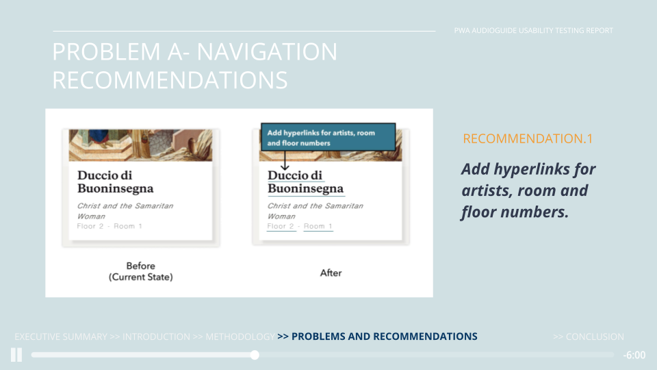
As the author, floor and room numbers are not clickable.
“On the information page, I wish I could click the author, the room number,” view more information related.”
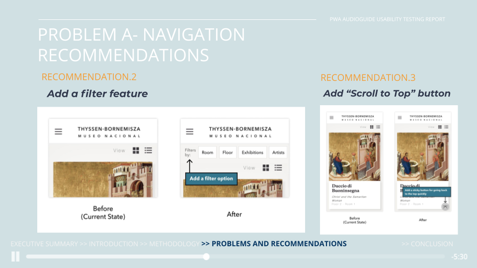
They tried to search the artist directly but didn’t find any search bar. Other than that, long scrolling motion was tiring for the users too.
“I needed to scroll back from the bottom to the top, I wish there is a button to go back to the first layer”
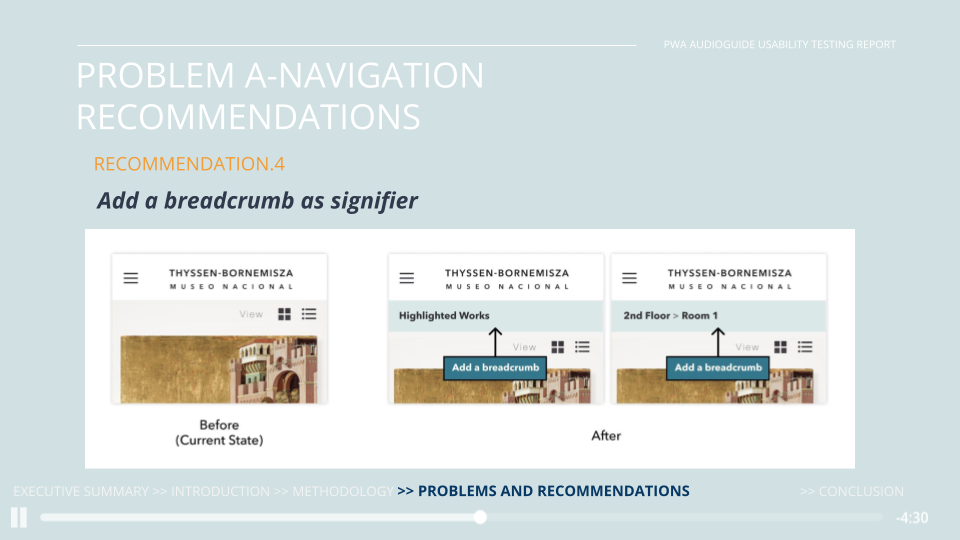
Most of the participants forgot which page they were browsing because there were no signifiers to correlate their action. The structure design of each page is very similar, the lack of signifiers play an important role in this problem.
“I forget where I am as I am navigating!”
- PROBLEM B- INFORMATION ARCHITECTURE
Unorganized and ambiguous information architecture – The unclear classification and inconsistency of labeling language on the menu page confused participants, they questioned the labels’ intended specificity.
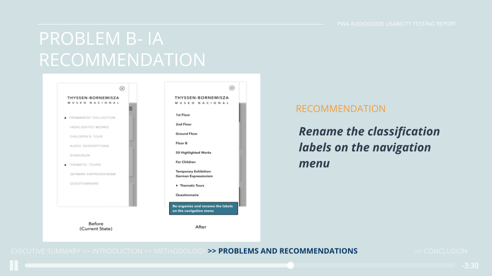
Participants were confused over the classification structure and labeling language on the menu page.
“What’s the difference between Highlighted Works and 50 Selected Works inside the Permanent Collection tab? and “Why is Children’s Tour outside of the Thematic Tours?”
- PROBLEM C- VISUAL HIERARCHY
Lack of visual cues to contrast content – Participants failed to understand that the audio they were listening to was about the room that the painting because the structure of the layout misleading the participants.
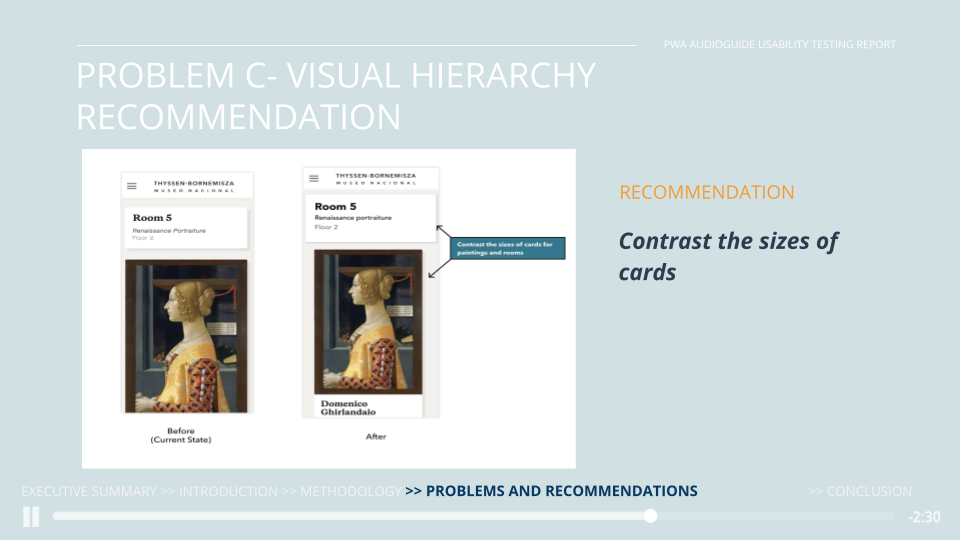
On the description page Lack of visual cues between different items
- PROBLEM D- CONTENT
Insufficient and inconsistent content – The use of images on the interface is found to be inconsistent. The lack of thumbnails on the thematic tour pages have made it hard for the participants to relate with the paintings. In addition to that, seeing thumbnails on other pages, participants were confused, thinking that these pages may serve different purposes having no thumbnails.
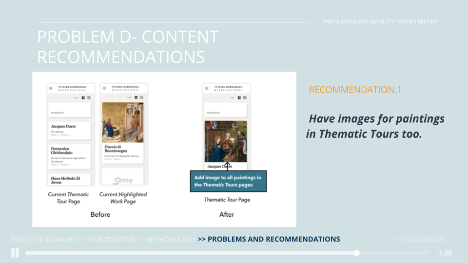
Inconsistent use of imagery
“Why do I not see any thumbnails for paintings here? There were thumbnails for them in other pages.”
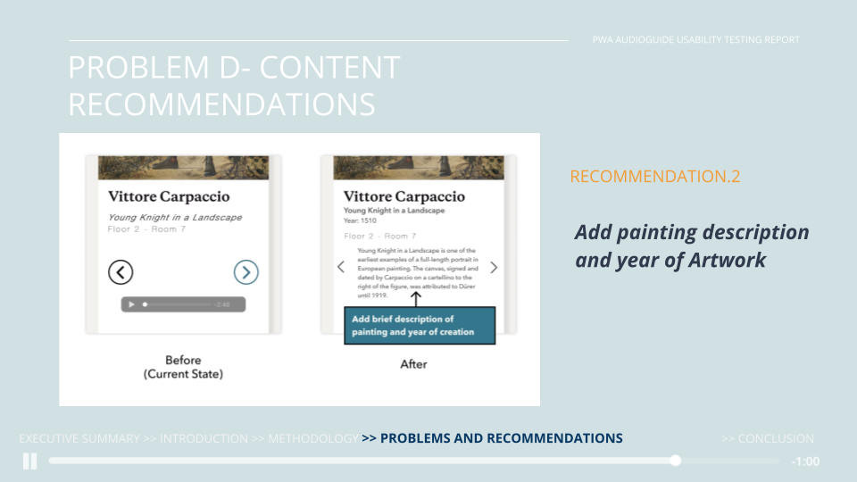
Lack of supporting captions
“A short caption, transcript or some sort of textual information would alleviate the problem.”
Takeaway
We received positive feedback from our client Audioguiarte. The representative acknowledged our team’s efforts and planed to implement our recommendations for future design reference. She mentioned many insights that we’ve addressed all aligned with their further improvement aspects. Personally I learned a lot throughout the process, not only the technical and research skills but also interpersonal and communication skills. It’s very challenging for a team to collaborate in the remote setting, our team ranged from New York, Taiwan, Turkey, Beijing and client resided in Spain. We need to tackle the time difference and accommodate individual’s difficulties. This makes me realized the importance of a product manager role, who needs to posses multi-dimensional capabilities, such as attention to the detail, time management, goal-driven, great communication and problem-solving skills. Overall, I’m so glad that our efforts and time have turned into a productive and actionable implementation.