Project Brief
Hoptale is an app that serves as an all-in-one content platform for travelers to explore, document, share and plan their trip stories. They have recently designed a travel panning feature, ‘Plan A Trip,” which allows travelers to make customized trip plans and edit detailed itineraries. I collaborated with four other 4 other UX Consultants at Pratt’s Center for Digital Experiences to redesign the trip panning feature and enhance the user experience.
- Team: Center for Digital Experiences at Pratt Institute
- My Role: UX Researcher & Content Designer
- Scope: Redesign the trip planning feature.
- Duration: 16 weeks (January – May 2021)
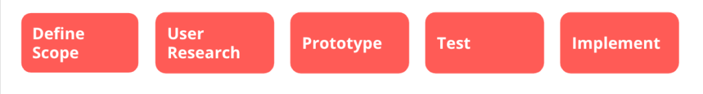
Our Process
Project Goals
Building a user-friendly experience of bookmarking trips, activities, and attractions.
Creating a connecting flow from browsing to trip planning.
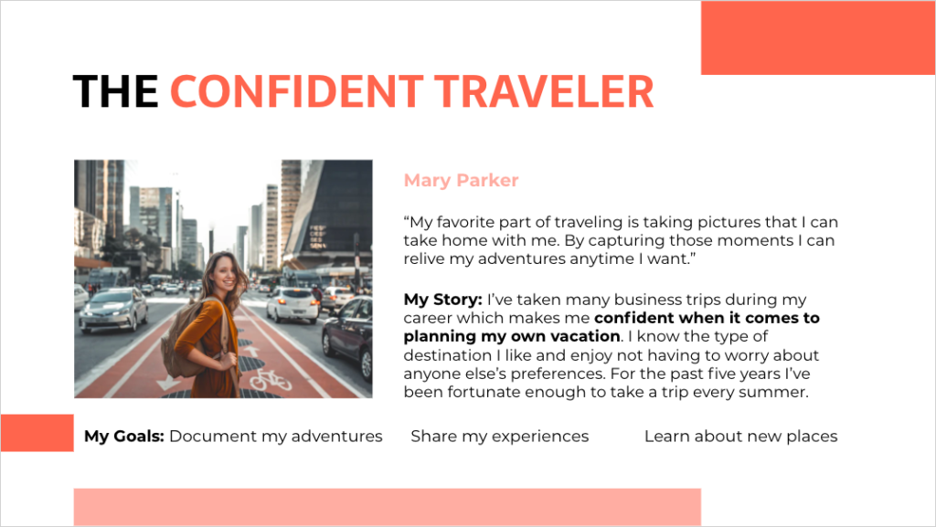
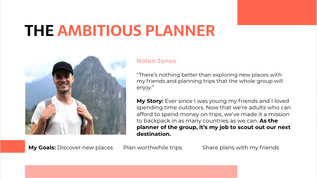
Introducing Our Users
Before beginning our design process, we had an initial client meeting that provided insights into the target audience of Hoptale. We developed user personas to represent our target audience to ensure we were creating design solutions for our user needs.
User Interviews
A series of semi-structured user interviews and direct observations were conducted to evaluate the current browsing and planning experience of Hoptale. For observations, participants were asked to employ the Think-Aloud technique while performing specific tasks to understand how they navigate the app. Both remote and in-person interviews took place with a total of 17 users that matched the profile of our target audience.
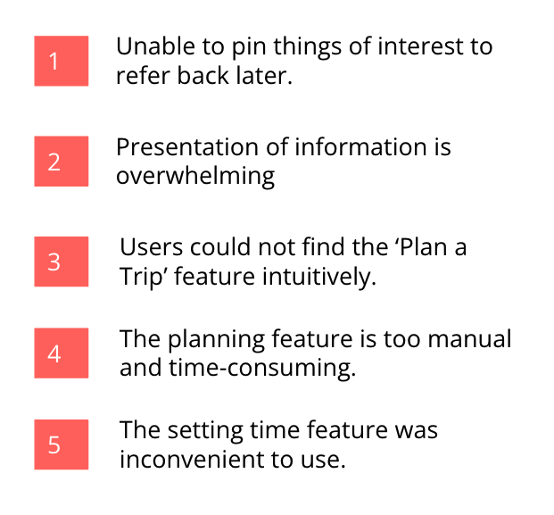
Key Insights
The interview and observation process revealed valuable findings on how users interacted with the browsing and planning features of Hoptale.
Design
Once we analyzed all the data provided, my team created paper sketches and low-fidelity wireframes to compile different possible solutions before jumping into high-fidelity design.
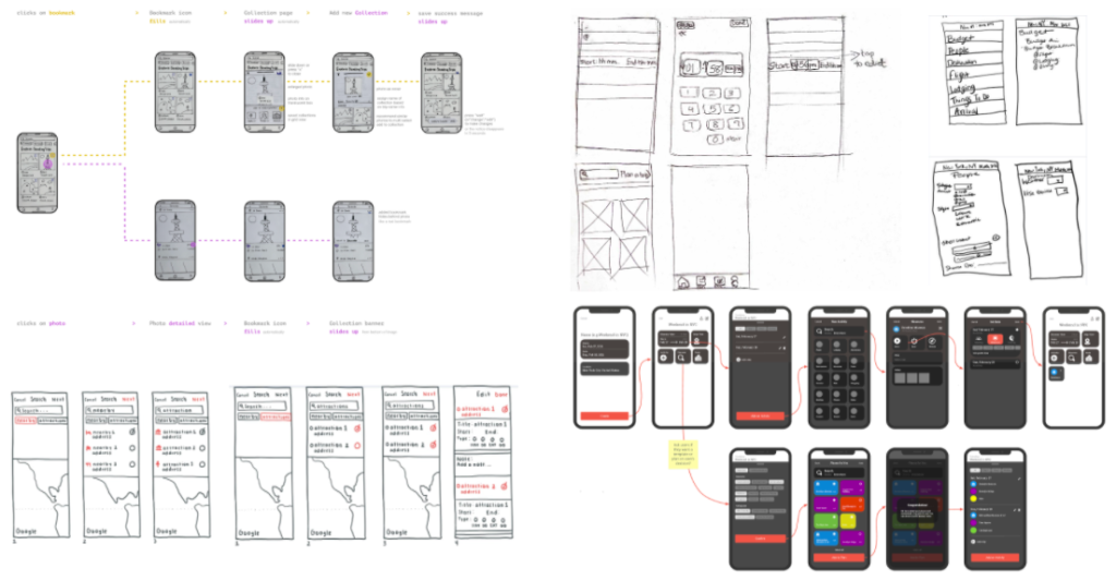
I contributed to the customized trip planning template that provided the user to either plan a trip manually or edit a template.
Initial Recommendations
Recommendation 1
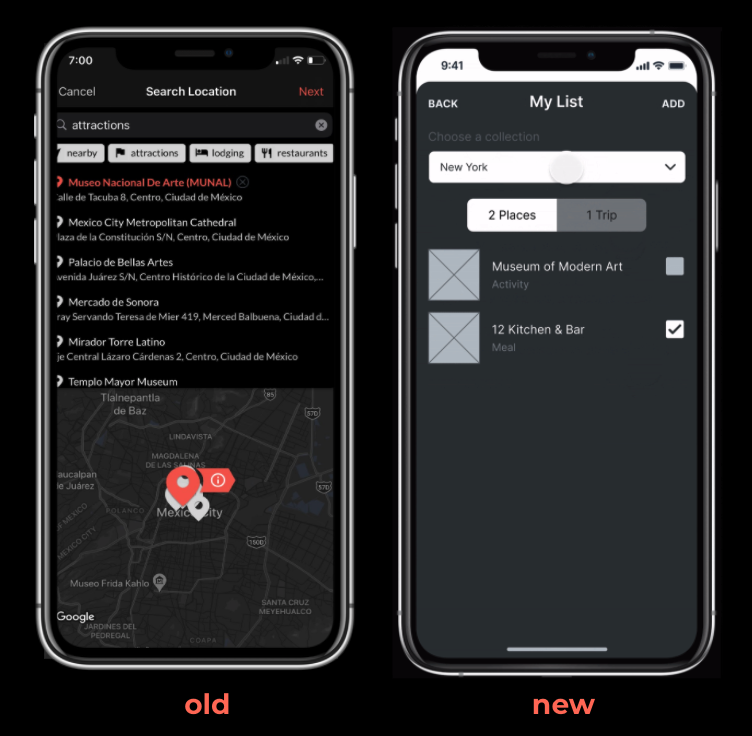
Make the save to list more apparent and allow someone to pull the list when planning a trip.
RECOMMENDATION 2
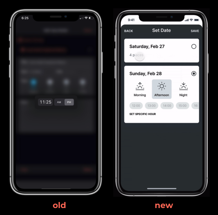
Indicate obviously that users can leave specific time blank and allow to select vague time period.
RECOMMENDATION 3
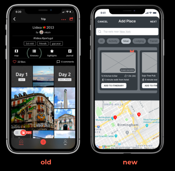
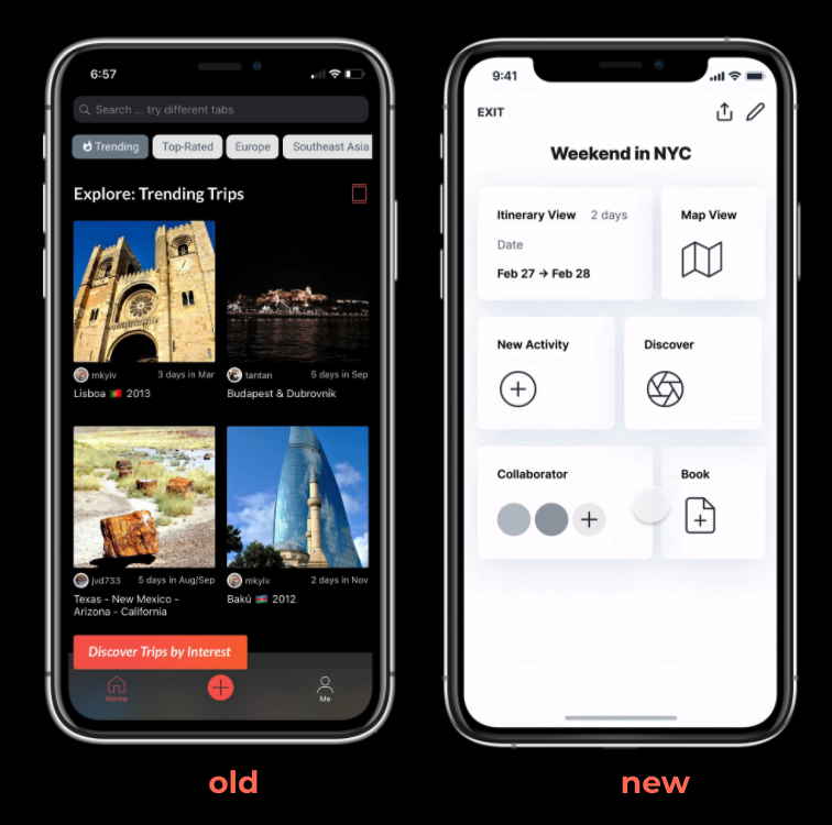
Make the ‘Plan a Trip’ feature more visible to the first hierarchy on the homepage.
RECOMMENDATION 4
Include a trip planning template and give the user the option to either plan a trip manually or edit a template.
RECOMMENDATION 5
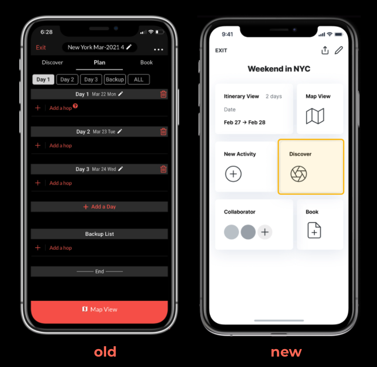
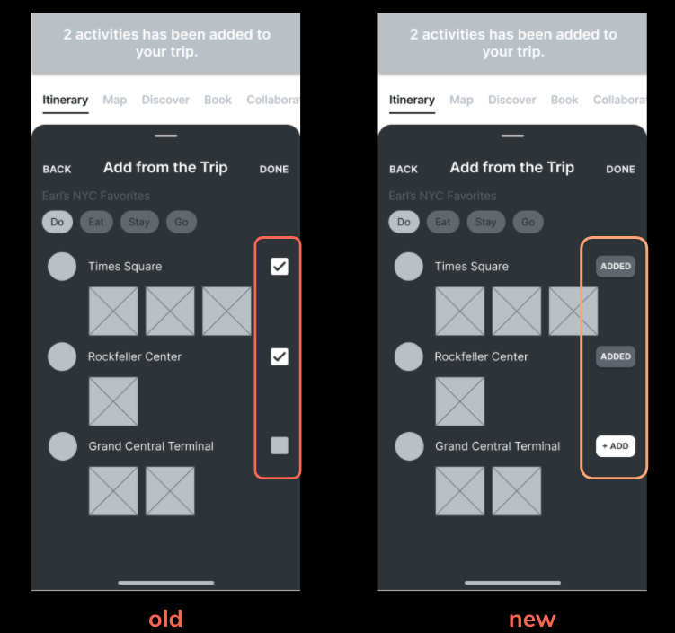
Having checkmarks next to ‘attraction’ so they could see what had already been added and what was still available.
Usability Testing with Hoptale Uses
Our client provided us with a list of active Hoptale users. We conducted a total of 8 usability testing sessions to gain insight on what aspects worked and what could be revamped from our initial design solutions. For each user test session, a testing script that consisted of a pre-test questionnaire, tasks, and post-test questionnaire was implemented to ensure consistency and accuracy across sessions.
Final Design Iteration
RECOMMENDATION 1
Change checkbox to button and provide obvious feedback on what activities have been added.
RECOMMENDATION 2
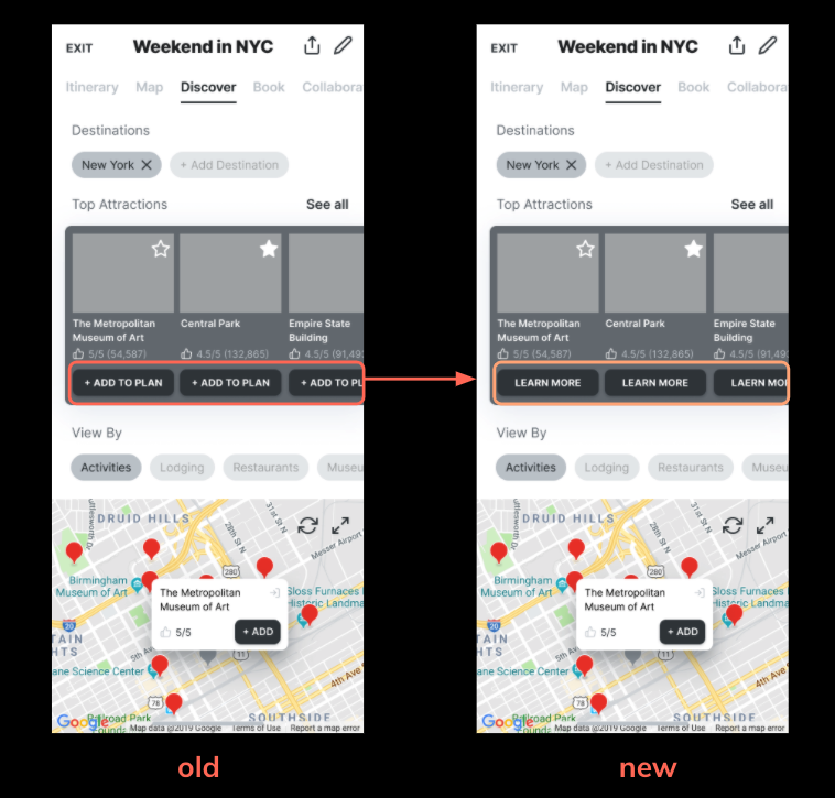
Change from “Add to Plan” to “Learn More,” giving the user more details of activities before they make decisions.
Conclusion and Next Step Recommendations
We presented our design to the client and our recommendations were received with positive feedback. They are currently implementing our designs! For next steps I suggest
- conducting more usability tests with existing Hoptale users.
- craft more features for the map view page.
I am looking forward to seeing the changes in the near future and I am glad that I was able to to be apart.