
On March 17th, our team had the first meeting with our clients on Dr. Elena Villaespesa’s usability evaluation class : Ellice Engdahl and Filomena Napolitano, the digital collections and content manager and the digital marketing manager at the Henry Ford Museum website. Our team is made by a group of graduate students from Pratt Institute, the School of Information, including Haimeng Gong, Katie Drake, Ali Sasanian and I. During the meeting, we learned from the clients that they wanted us to evaluate the “Collection and Research” page from the existing website, especially how the website accords with the universal design principles, for the sake of targeting to the general public. The clients wanted to know how the current website functions with people who have visual impairments, use another language, or have little experience with researching.
In order to learn the insights from different users, our team met weekly and planned a google form for recruitment. Our target participants are general people who are familiar with using museum websites but have never browsed the Henry Ford website before. The selected participants are from 20 to 35, including people who spoke another language, have some visual impairment (color blindness), and also a researcher who had museum artifacts related research experience.
Then we created the script for moderated testing and each of our group members conducted the test with two recruited participants. The test was curated to take the participants from the homepage of the website, change the website to their preferred language, and navigate to the collections and research page to do some tasks including finding specific “expert sets” or an object and sharing it. The participants I recruited include one researcher and one general browser. During the testing, I used UserZoomGo to conduct the remote moderated tests, and the participants were asked to think aloud and express their feelings about using the website. By observing the users and how they responded to the given tasks, I took notes and specifically asked them about why they are hesitating. I also asked them to rate 1-5 from difficult to easy after finishing each task. After all the tasks were completed, the participants were welcome to express anything they felt about the website and to give their advice.
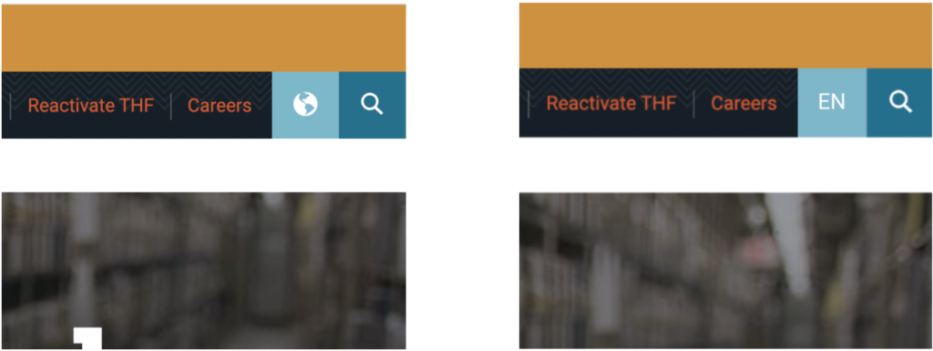
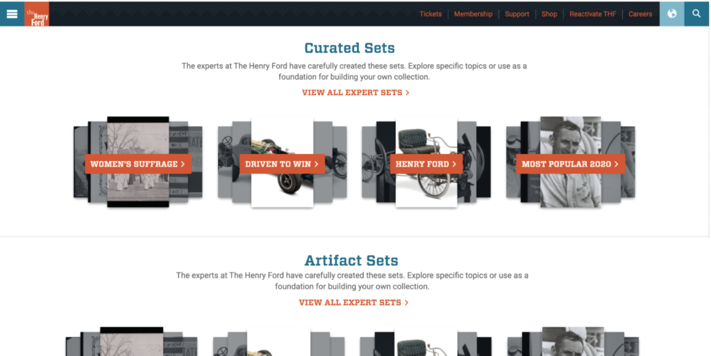
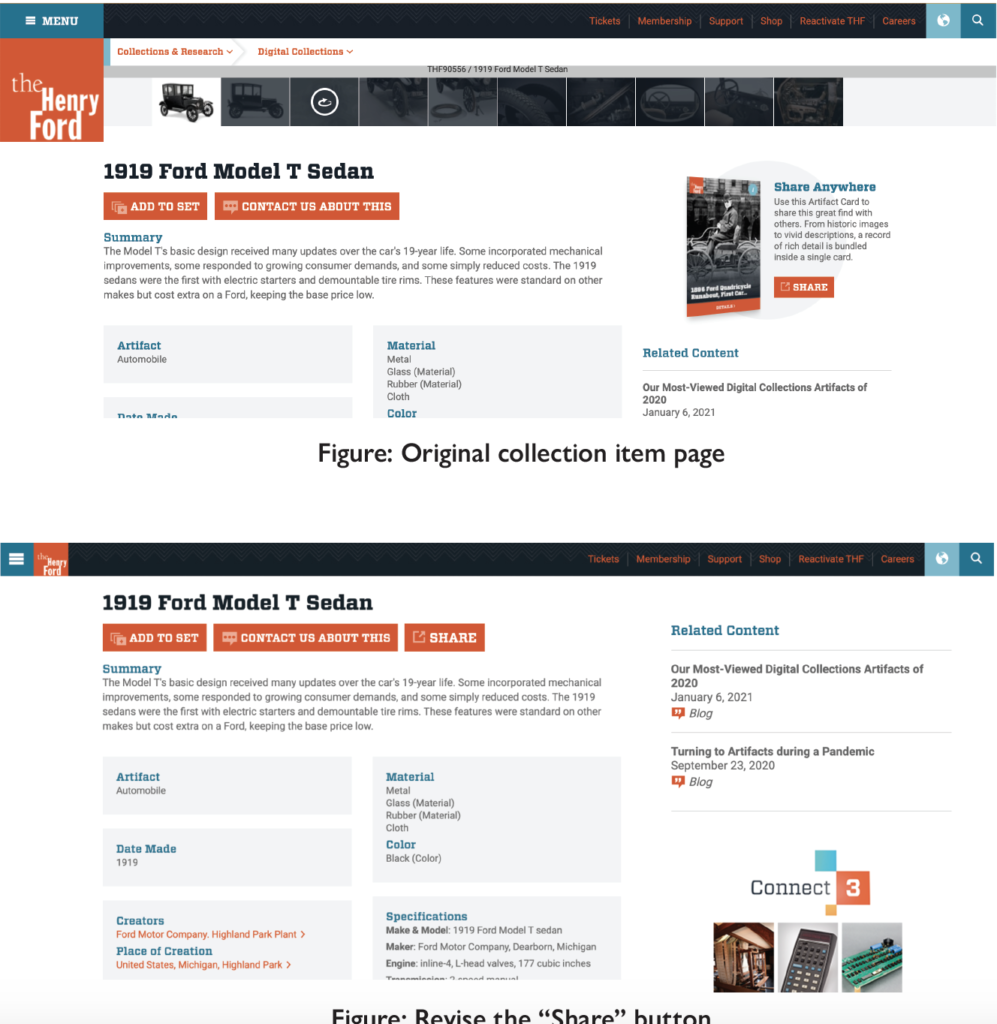
From my testing results, the two participants both speak English and Chinese. They both agree that the current button for changing language is not very intuitive and the expression of “Expert Sets” feels confusing, but they have very different opinions about the collections and research page. One participant who usually browses museum websites for exhibition information was upset with the visual aesthetics of the website, including the typeface, color palette and the text-heavy contents. Because the website has a search icon (for website researching) stick on the right-top corner, the search bar on the digital collection page seemed reductant for him that he always wanted to use the one on the top. He also had problems with finding the share button because he thought the current one was an advertisement. Meanwhile, the other participant who had research experience felt the website served its function for researching. But the participant also said that she would not use this page unless she is doing research. She did not notice there was more content below the search bar at first.
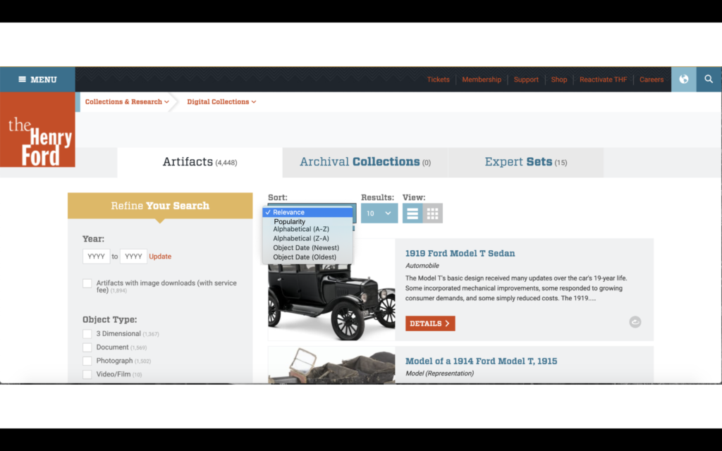
After finishing all the tests, we gathered our data in a google sheet form. Then we had a meeting discussing our common findings and possible recommendations to the findings. Because we have learned from the clients that their digital collection team is a separate department and does not have the authority to change the framework related to the whole website, we decided to make recommendations on those findings that are relatively easy to revise for them. We found common issues on the language button, the expression of the “Expert Sets”, and the share button. Thus, we concluded with five solutions to the findings: Changing the icon for the language button from a globe to an abbreviation of the language, changing the expression of “Expert Sets” to “ Curated Sets” or “Artifact Sets”, adding an arrow under the search section on the digital collections page to indicate more content, adding a “popularity” sorting filter to the advanced search page, and revising the “share” block to a button placed besides the other buttons.
We broke the report into several parts, and I wrote the introduction and formatted the report after reviewing the contents. On May 5th, our team presented to the clients about our findings, and the clients showed satisfaction on our findings. They were especially surprised by the finding that the current sharing block looks like an advertisement to the users. They also told us that some recommendations like adding a sorting filter may require a huge change on the back end. In general, they liked our presentation and thought the insights we presented really helpful.