Project Summary
Our team, 5 graduate students at Pratt, conducted 10 remote moderated user tests to help improve Urban Outreach Center (UOC) website experience and usability.
Duration
March-May
Team:
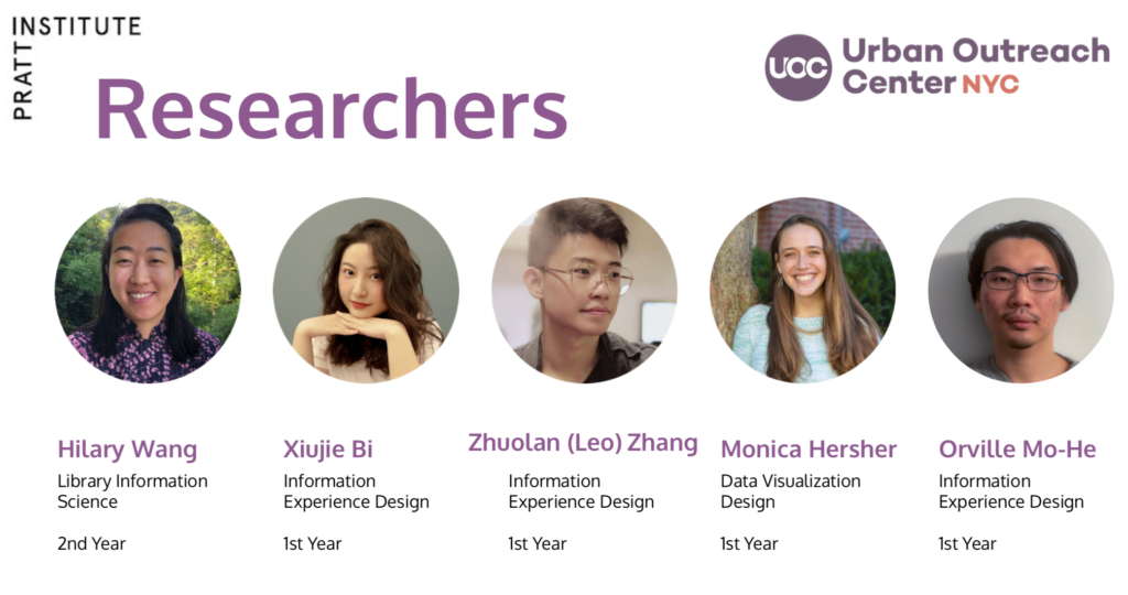
Zhuolan Zhang – MS Information Experience Design, Pratt Institute
Orville Mo-He – MS Information Experience Design, Pratt Institute
Monica Hersher – MS Data Visualization Design, Pratt Institute
Xiujie Bi – MS Information Experience Design, Pratt Institute
Hilary Wang – Library Information Science
Tools:
UserZoom Go, Miro, Slack, Zoom, Google Docs, Google Slides
Step taken:
Identifying goals and target users
Recruiting participants
Designing user test script
Conducting moderated user test
Studying the result and gaining insights
Creating a detailed report
Presenting the recommendations to UOC
Client Background
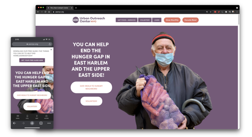
The Urban Outreach Center (UOC) is a non-profit community organization focused on connecting homeless and low-income New Yorkers in East Harlem and the Upper West Side with food and other critical supplies. The UOC helps “nearly 50,000 vulnerable New Yorkers each year to move with dignity out of homelessness and food insecurity toward self-sufficiency.”
Client Goals
We meet the representative of UOC Jordan and define our project scope. After the meeting, we drew wrote down some key concerns:
- How the younger age group user interacts with the website on mobile?
- Can the user relate the information on the website and donate?
- What are some usability issues?
Recruitment
After we defined our study goal, we set up a meeting to discuss our target demographic for recurring. We formed a questionnaire and wrote down an email letter and asked the UOC representative to help us reach out to people who might match the demographic. After we had a list of participants. Each of us was responsible to contact at least 2 participants on the list and set up a remote moderated user testing.
During our internal meeting, we wrote down the pre-test question, tasks, and post-test questions as following for the participants to complete.
Pre-test questionnaire
- Have you ever or do you currently volunteer for any organizations?
- Have you ever or do you currently donate money to any organizations?
- Would you currently be more likely to donate or volunteer if you were looking to get engaged with non-profit organizations in your community?
- Are you comfortable with making payments through mobile browsers?
Tasks
- Take a couple of minutes to look at the homepage and learn about this organization without clicking on anything. What is your first impression of the website?
- Can you tell me a few ways you can get involved with this organization? You can click on anything you’d like now. Which of these do you think would have the biggest impact? Why?
- Now you want to make a recurring donation each month. Can you show me how you would do that? You won’t have to make any payments. How would you use the information on this page to make a decision on how much to donate?
- Can you show me some other ways to donate?
Post-test questionnaire
- How would you compare the Urban Outreach website to other donation websites you have used in the past?
- What do you think worked well on this website?
- Overall what do you think of this website?
Analysis
Upon completing our interview, we draw down notes and creates a table to sort out finding in a group. We organized our sticky notes on the Miro board and created appendixes for all the discovered usability problems. We rated the severity of the problems and decided which of those are the main usability issues to suggest some recommendations. We synthesized those issues into three sections.
We split up roles so that everyone had at least a section to work on. My role is to write down usability issues, purpose a recommendation, and create a mock-up for the endless scrolling issues with my teammate Orville. Moreover, I created appendixes for “Big Problem Small Fix” “ Consolidated list of all usability issues” “Questions & Tasks” “Selected Quotes” for the client to refer.
The main usability issues we found are:
- Ambiguous redundancy
- Endless scrolling
- Confusing Navigation
Finding 1:
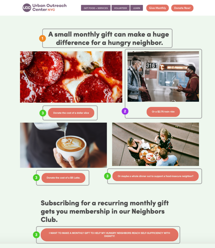
- Images and dollar amounts on the “Give Monthly” were not consistent with the amounts on the donation form.
- Participants were also confused if the items in the images represented what was being donated to those in need
- the five different buttons “redundant” since they took them to the same donation form.
Recommendations:
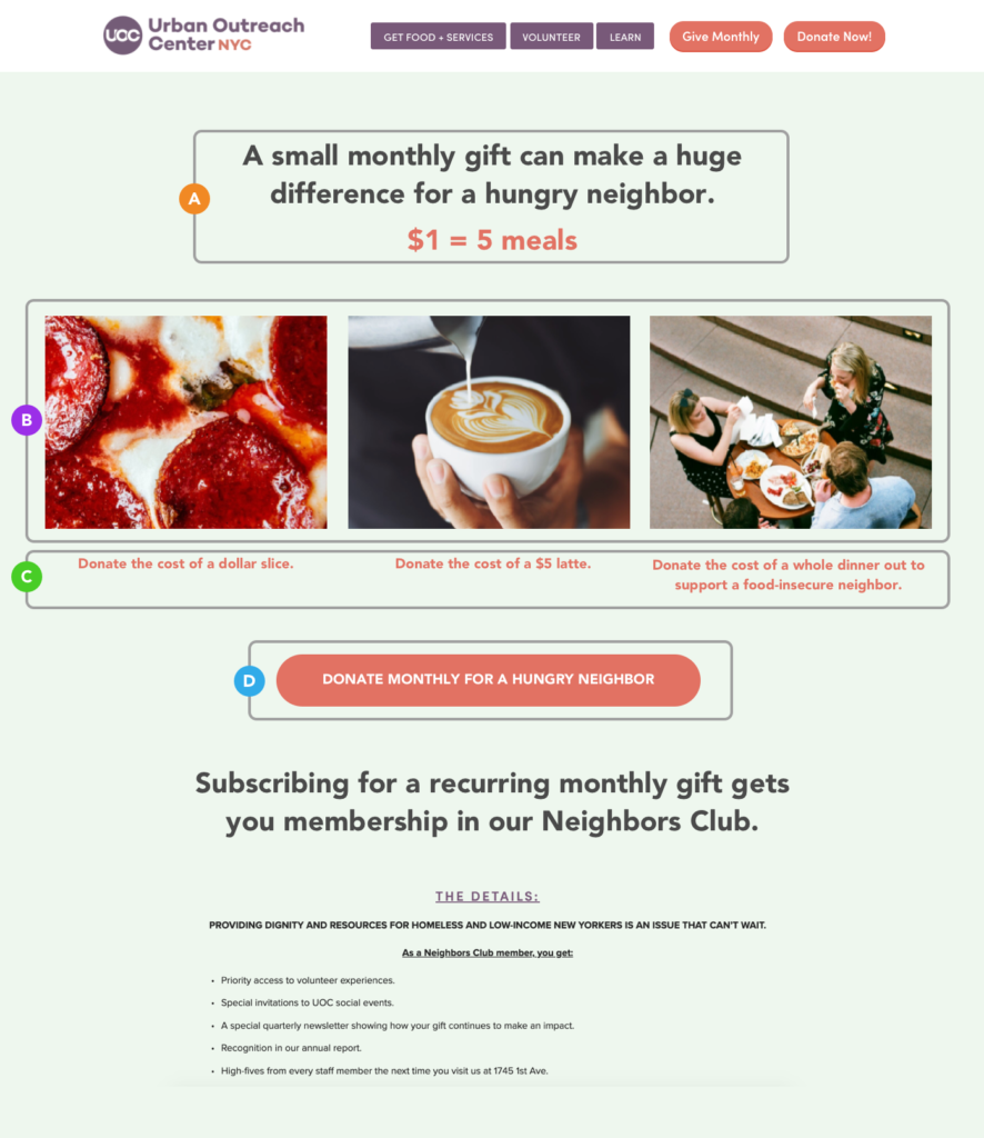
Reformat “Give Monthly” page components.
- To highlight the impact of monthly donations, the researchers suggest adding language from the donation form page “$1=5 meals” to the “Give Monthly” page above the images.
- Remove the image of the subway ride and align the images of the pizza, the latte, and the meal.
- Turn the buttons into updated captions: “Donate the cost of a dollar slice”, “Donate the cost of a $5 latte”, “Donate the cost of a whole dinner out to support a food-insecure neighbor”
- One large button below the captions. “DONATE MONTHLY FOR A HUNGRY NEIGHBOR”
Finding 2:
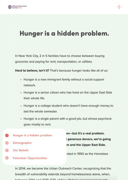
- Users did not consistently scroll down on the homepage and found that the amount of information on the homepage.
- Users also found that the amount of information per page was difficult to navigate.
- the important information was often buried.
Recommendations:
Implement an additional navigation menu to the left side of the page, that links to the different groups of content within each page.
This will serve two functions:
- Give an overview of the amount of content on a page
- Quickly navigate the user to the information
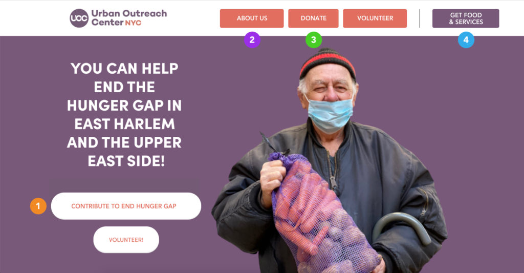
Finding 3:
- The labeling and information architecture of homepage navigational buttons confused participants when trying to access specific information.
- Several participants did not consistently think to associate the “Learn” button with the mission and vision information provided.

Recommendations:
Relabel the “Give Meals to Hungry Neighbors” button to “Contribute to End Hunger Gaps” or any wording that is easily understandable as a button that leads to the donation page
Relabel the “Learn” button to “About Us” to ensure clear communication of the content that it is leading to.
Combine the two donation buttons: “Give Monthly” and “Donate Now” into one single button “Donate” as a way to group similar information.
Clearly distinguish the content for different audiences (people looking to learn and engage and people looking for services) by grouping and styling the buttons “Learn”, “Donate”, “Volunteer” differently from “Get Food + Services”.
Presentation and Report
The user test results were presented and shared with the Representative of Urban Outreach Center in the form of Google slides.
We discussed the findings and recommendations in depth during the meeting and shared the document with our clients through a report.
The client was very satisfied with our findings and believed that our recommendations can hugely improve the usability of the website. The key point we discovered can help the potential users donate more easily through the website. I am very excited to hear our client’s feedback and see the update in the future.
Personal Reflection
During a month of team cooperation, I learned so much from other people by seeing how they use their skills to achieve the research and design goal. This year, during the pandemic, we conducted all the research and team meetings remotely. This experience is unique and opens up a great opportunity for us to practice our research skills in the future. I also learned how to create a diagram to visualize the data as well as understanding the structure of writing a professional usability report. Working with a real client throughout the project was an excellent experience. Our clients were very collaborative and able to answer all the questions.
What could we have done differently?
- Writing a script is extremely helpful for the success of usability testing. I hope our script can be more professional and have a less leading question.
- I wish I can work even closer with the teammate for the design of the report. And reduce the number of texts in the report for ease of reading.