Duolingo is an app that assists people to learn different languages in an interesting way. First, it makes users gain achievements, in a game way, when learning. Second, it is free for users to learn languages without a financial burden. Now, being a user since 2017, I am going to apply the concept of Don Norman’s “The Design of Everyday Things” to critique this app (Web version). There are 2 tasks that I’d like to take you go through.
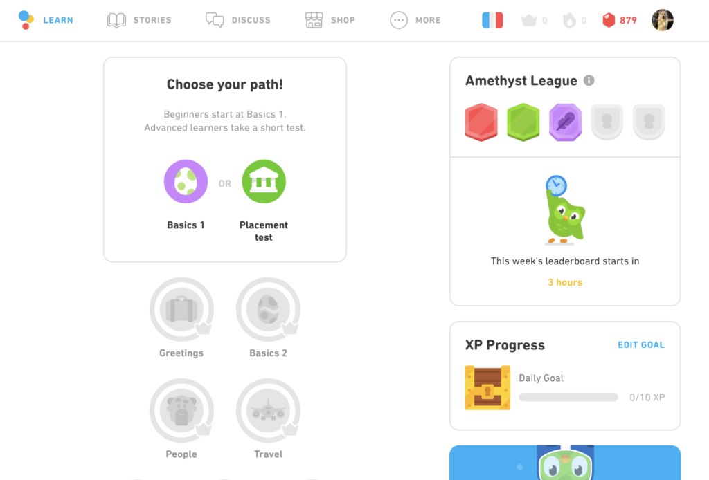
TASK 1: Our goal is to learn French. How should we do?
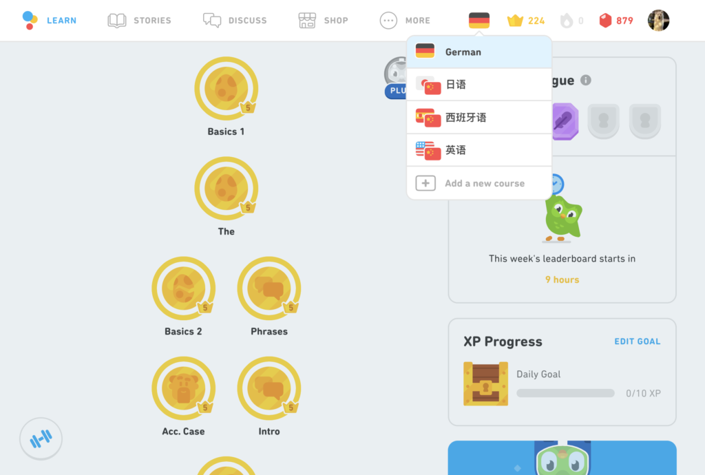
When entering the site as an existing user, we can see a clear navigation bar on the top, which shows: we are on a German course page currently. That is a knowledge in the head for us since most websites are used to be designed like this. Also, icons in the navigation bar are good signifiers that lead us to understand where we are and provide good discoverability. As seeing the flag icon, we do not know it is clickable, which seems not a good signifier. However, when we hover over the buttons, the pointer icon and the colors of icons are changed and show a dropdown menu. Now, we get a conceptual model to bridge the gulf of execution.
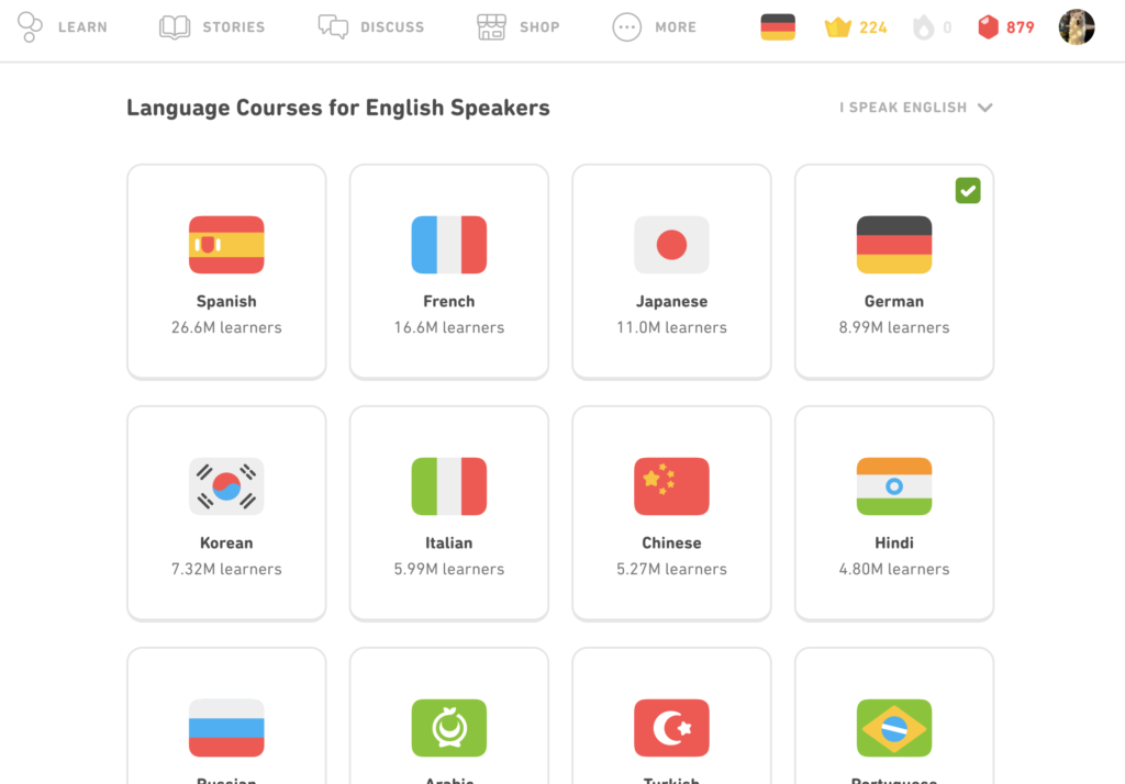
When clicking the flag icon, we can see other languages that you can choose. “+” icon is a signifier that allows users to click if we want to add a new course. After clicking the “+” icon, as good feedback, the new page shows up. And with mapping of flags, we know how many learners are in different languages and which one is the most popular (sorted by learner numbers). It’s beneficial for us to select a language to learn.
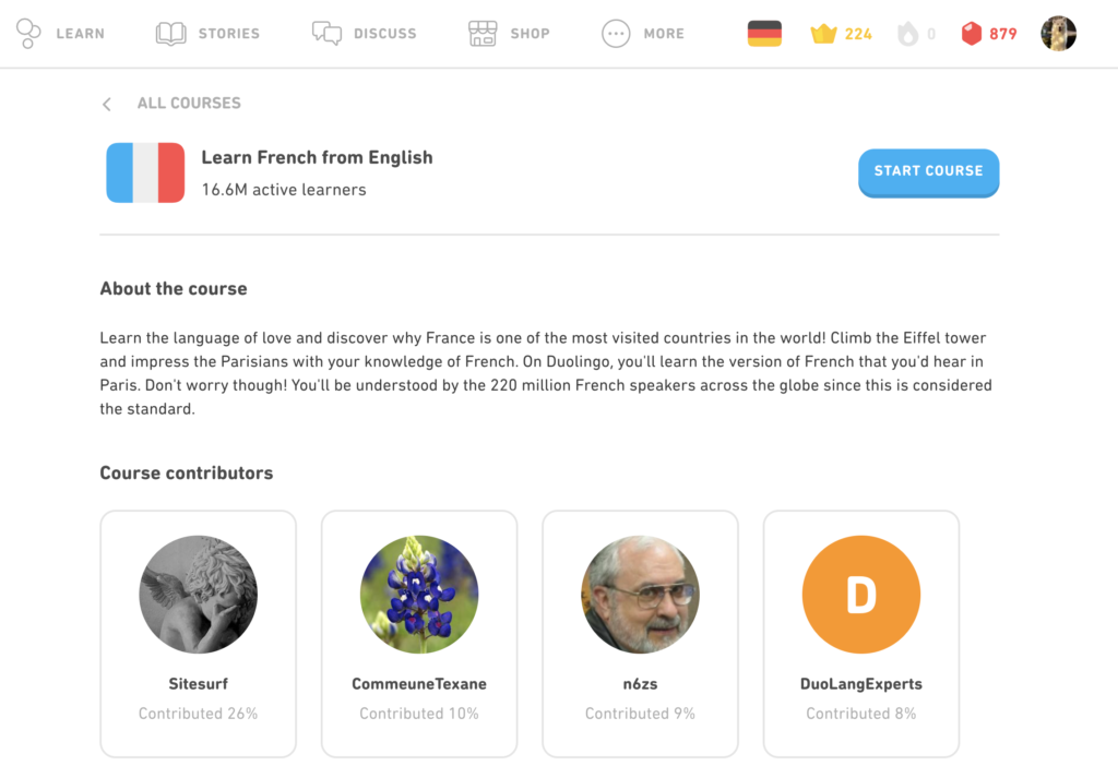
After choosing the French flag, the button with shadow and an outstanding color from the background is a great signifier that calls to action. Leading us to click it. There is just one action to do on this page. Very clear and clean!
After clicking the “start course” button, the page changed again. Therefore, we know something happened by this feedback: the page becomes totally different than the one we just entered. Such as, the flag and the crown in the navigation bar are changed. We bridge the gulf of evaluation through it.
TASK 2: Next step, how to learn?
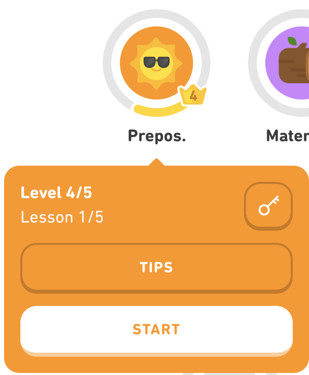
Now, we continue to learn some new lessons from German. There are lots of circles that show they are clickable buttons because there is amazing animation in each circle when hovering over. Great signifiers!
Plus, the number in the crown shows which level and lesson you are in, which is nice discoverability. However, using this app a thousand times, I still have no idea what the key button without words stands for. I cannot get an additional explanation from the knowledge of the world. This signifier is bad.
Furthermore, the “start” button catches our eyes when showing up. It provides us a primary action to follow, good error prevention.
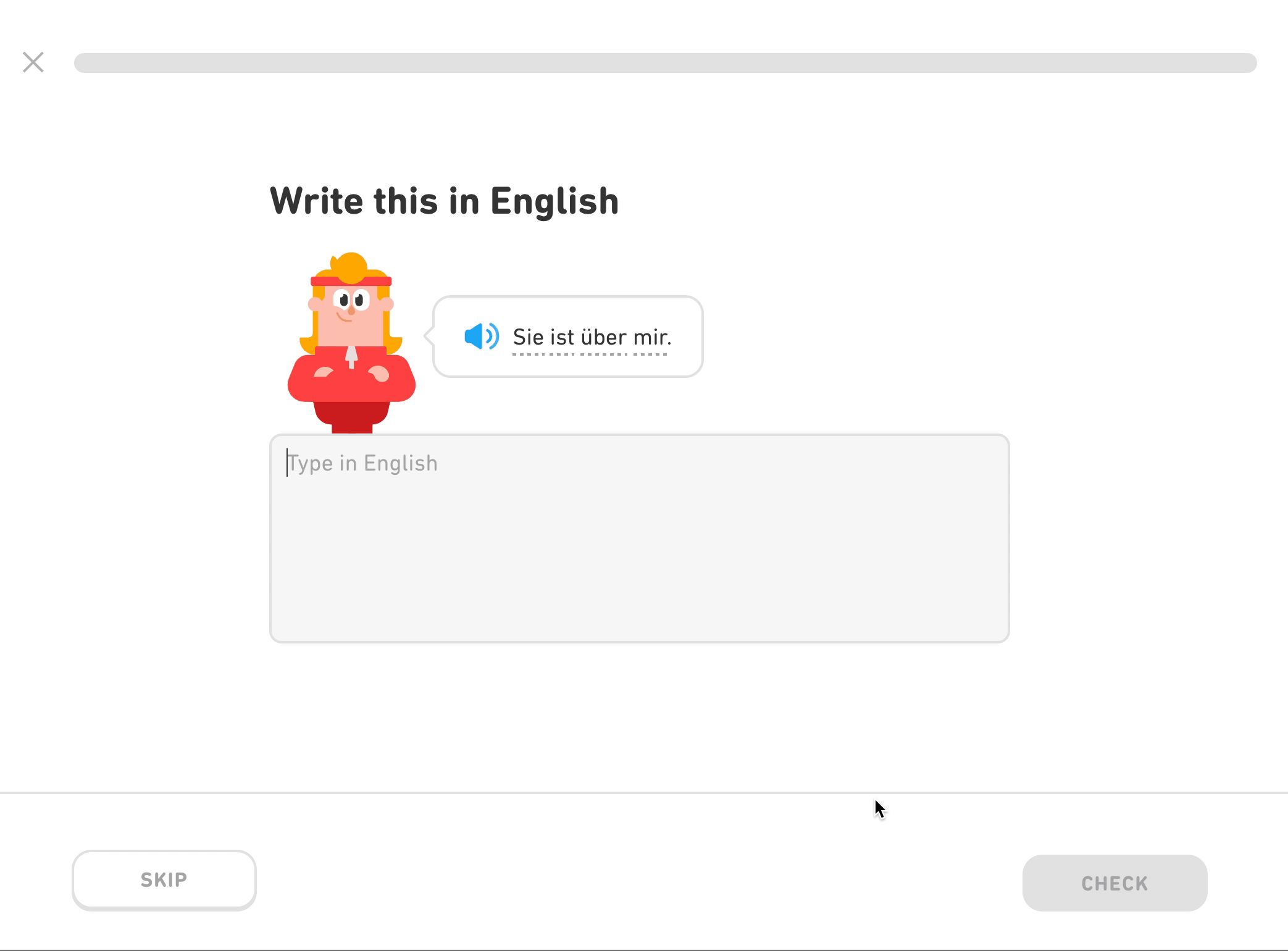
When starting a lesson, there is a text box with the cursor. It affords typable.
As finishing typing, we have cultural constraints that knowing the right button is “next” or “move forward” rather than the left button. In this app, the “Check” and “Continue” buttons both are placed on the right side. We can easily understand and move our mouse pointer to the right button, then click it.
Also, the progress bar on the top of the page shows our status currently. Don Norman says:” Great precision is not required.” Although without a precise percentage, it is good enough for understanding the progress. Good discoverability.
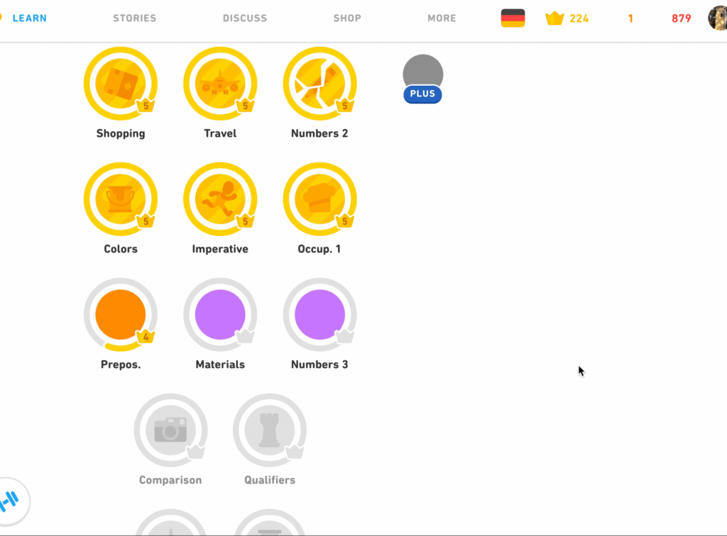
As we can see, when finishing a lesson, the yellow bar moves up. This discoverability allows us to pursue complete status which is filled with a yellow ring.
Conclusion
Duolingo with animation and icons do make me easy to learn and understand how to use it for 4 years. Especially when I am in a lesson, I discover that there would be only one action to do on that page. And almost every motion I do, there is feedback from animation, incoming page, and sound effects. I won’t get confused or get lost. To be honest, I do recommend this app to many friends because of its fantastic design. Understandability is one of the important parts in design. And I think Duolingo nailed it!