
Hulu is a video streaming platform that has existed for more than a decade, allowing subscribers to stream an array of different on-demand movies and shows on their TVs, phones, and laptops. It’s rated one of the best and largest streaming platforms currently in the United States, with more than 40 million subscribers.
Logging into the App
When a user first launches the Hulu app on an iPhone, they are presented with two main options of starting a free trial, or if the user is already a subscriber, logging in to their existing account (Figure 1). This is an excellent example of proper discoverability of the available options to users. The start a new trial option is encased in a white block, and the logging in option is not. This design can trigger a visceral response to click on the highlighted option in users because of the knowledge of the world/head in which mobile interaction practices can be homogenous depending on the operating system being used.
*The user knows that using a color block on a mobile app or site can correlate with a clickable tab (head) that they learn from continuous use of mobile devices (world).
Recommendation: I suggest consistency throughout the interface, such as using the same highlighting of existing options, adding a signifier like an arrow (>), border, or underline (_) that can let the user know they can afford to click it. (Figure 1B)
Signing Up For A Subscription
As a new user, choosing a subscription plan is required before streaming is available (Figure 2). This inspires goal-driven behaviors in a user, starting from the top by subscribing and working their way down to being able to stream.
Once the new user opens the app and clicks on the start a free trial option on the screen, immediate feedback takes the user to a new screen where they can choose which membership they want to start with, bridging the gap of evaluation.
Recommendation: adding a signifier like an arrow(v) or a vertical scrolling navigation bar that alerts users that they can afford to scroll down. For instance, individuals who may not have knowledge of how iOS apps work may not know that with experience, there is a visceral reaction where experienced users with declarative knowledge unconsciously start scrolling. Adding another signifier like an underline so that users can know that the link is clickable. (Figure 2B)
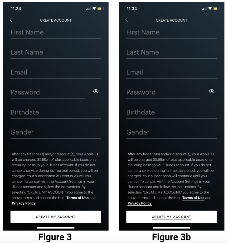
After selecting a subscription plan, users land on a page where they are presented with different placeholder attributes in the input fields. These attributes act as an affordance and a constraint as to how much and what type of content is expected from the user in the input fields, bridging the gap of execution. The text remains while the input has specific values, even when the form control undergoes focus. When entering a password, the “eye” icon acts as a signifier that can allow users to see their input and make any necessary corrections since there is no secondary password verification. (Figure 3)
Below the input fields, there is a blurb that provides the user with more information, and within that blurb, there are links to the Terms of Use and Privacy Policies bolded in the white text indicating that these are links.
Recommendation: The bolded white text should be underlined, designating the text as a clickable link that allows users to know that they can afford to click on the highlighted links, thus bridging the gap of execution. (Figure 3B)
Navigating The Home Page
Once a user creates an account or logs in with their credentials, a simplified tutorial alert explaining the interface. Hulu does an excellent job providing an uncomplicated explanation of how the app works, allowing users to create a conceptual/mental model that leads them to understand the properties and functions of the application. (Figure 4)
As soon as the user is finished with the tutorial, they land on the home page, where there are clear signifiers that indicate what the user can afford to do within the app. Using intuitive iconography like the looking glass for “search” and a home icon for “home” creates visibility within the app; the user knows where all the options are and how to access them.
Recommendations: Unfortunately, Hulu does not exhibit proper mapping methods throughout the app. A simple way to solve this would be to add a vertical scroll bar that can pop up when the user is actively scrolling and disappear when not engaging with the screen. It tells the user where they are on the page and when dragging it down, the page moves down at the same rate; control and effect would be closely mapped. (Figure 4B)
Searching & Streaming a Show
Searching
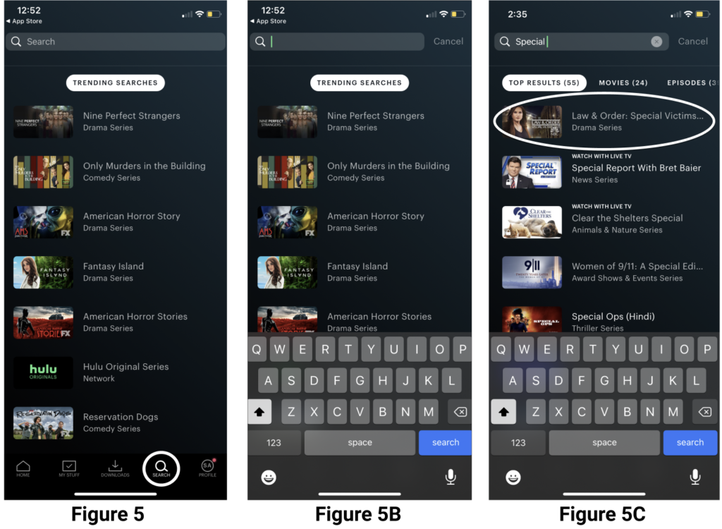
Clicking on the “search” tab at the bottom of the screen directly takes the user directly to the search page. The highlighted icon signifies that the page the user is currently on, which is a good use of mapping. The user knows where they are, and the icons and headings are highlighted as they navigate pages. (Figure 5)
Touching the search bar will trigger the iOS keyboard (Figure 5B), allowing users to start typing in their search terms with ease (feedback).
Once the user starts typing in a title, such as “Special” for Special Victims Unit, the feedback the user receives is all of the shows/movies that have that exact term in the titles until it shows the correct one. (Figure 5C)
Recommendation: Creating a drop-down menu (feedback) where the user can input a title and the listed titles in the drop-down menu change according to that would be an efficient way to avoid the app slowing down or freezing. This avoids the unnecessary roadblock of closing or restarting the app, thus bridging both the gulf of evolution and gulf of execution.
Streaming A Show
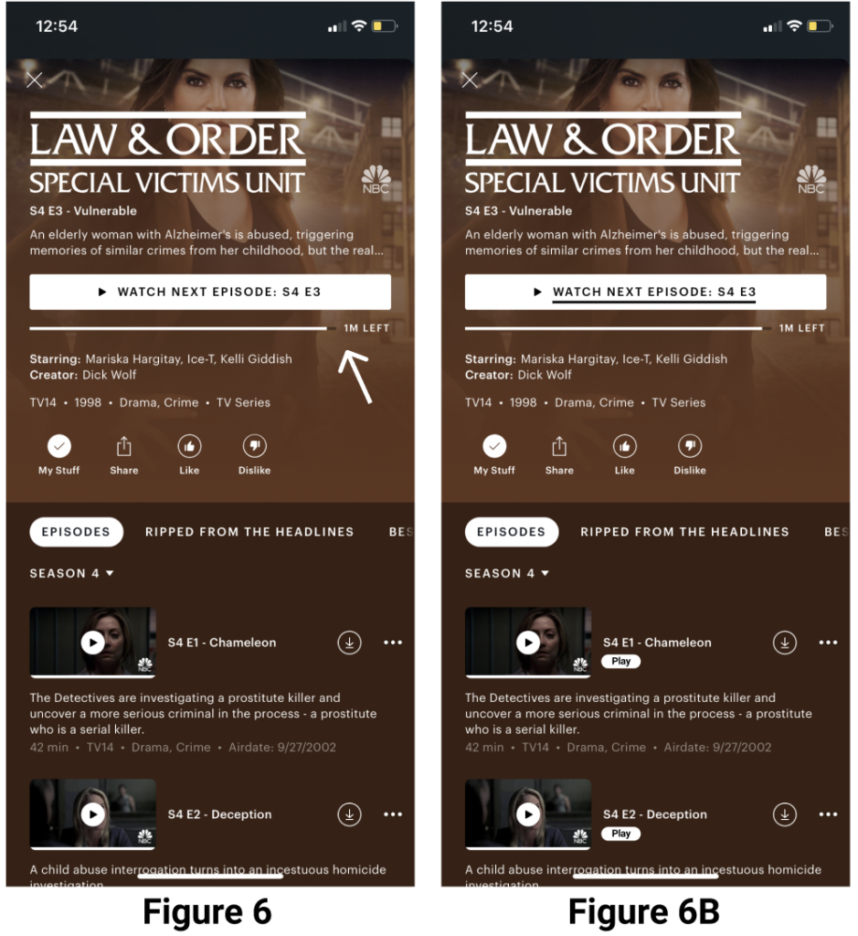
Choosing Special Victims Unit brings you to the show’s profile that exhibits visibility; you can like the show, add it to your list, share it with your network, download episodes and browse through seasons. Using a kebab menu gives the user an indication that there are more options hidden from the page.
On top of the page, you find another mapping method (Figure 6) of where a user left off on the episode previously watched both visually and analog. This is an example of good design because the user is not left confused.
There is a “play” icon located on top of the thumbnail for each episode which could inform users that they can afford to click it in order to play the episode.
Recommendation: Although there is a clear “play” signifier, there can be an additional button that says “play” in case there are cultural constraints with certain icons. (Figure 6B)
Conclusion
Hulu is a popular streaming platform that provides access to shows and movies to its millions of subscribers via Tv, phones, and laptops. Overall, the app has a good design, with its ease of use, simplified conceptual model, signifiers, feedback, discoverability, and affordances. The mobile application should implement a major mapping method; a vertical navigation bar that interacts with the user when they engage with the screen. Once this is implemented, the user’s experience should improve, especially for users who may not be familiar with the iOS operating system. As Norman said, “Affordances, signifiers, mappings, and constraints can simplify our encounters with everyday objects. Failure to properly deploy these cues leads to problems.”