
Sephora is a French retailer specializing in personal hygiene and beauty products. With over 3,000 brands and its own exclusive label – the Sephora Collection – Sephora offers a wide range of products including beauty tools, cosmetics, skincare, and more. Sephora operates over 2,700 stores in 35 countries worldwide. Additionally, Sephora was an early e-commerce player when it launched its first website in 1998, and the brand later created an app in the early 2010s that would eventually become the most popular beauty e-commerce app available on both Android and iPhone.
Creating an Account
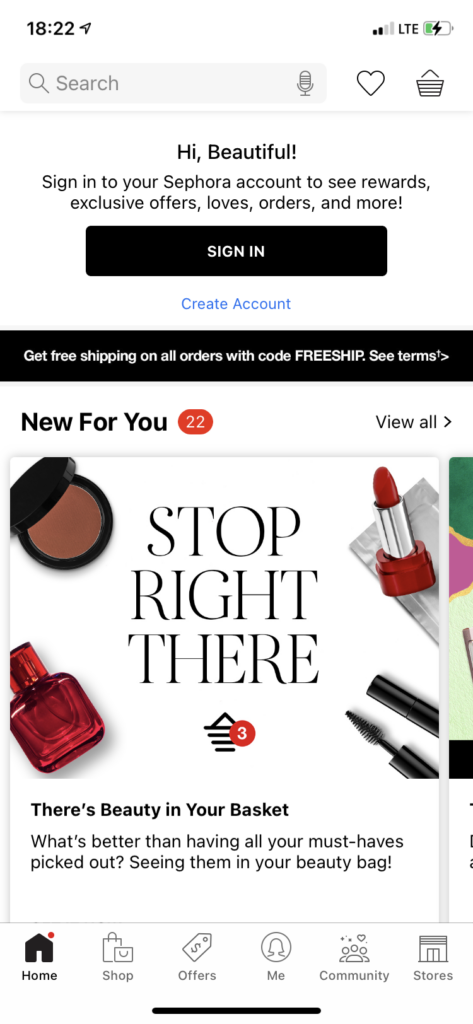
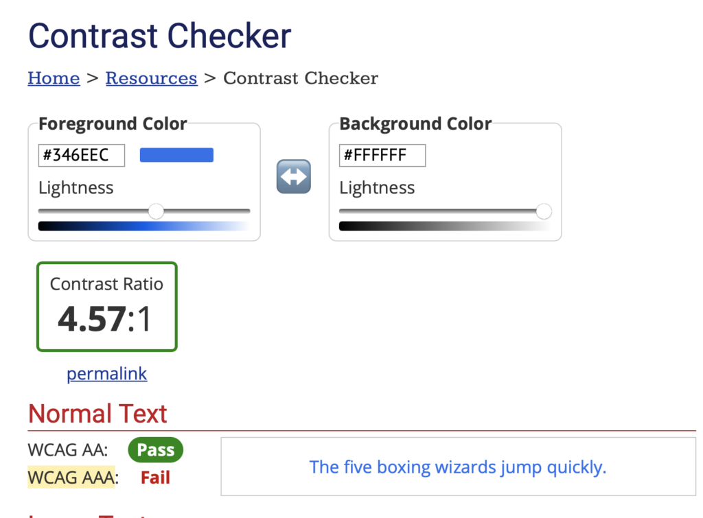
The Sephora app uses a fairly busy format for the user to create an account. This is the opposite of most apps that use the concept of simple discoverability – narrowing down the process to be uncomplicated and straightforward. This gives the user the option to log in to an existing account or create a new account. In contrast, the Sephora app gives similar options at the top of the screen, while the app bombards new users with advertisements and an overwhelming amount of confusing options. The sign-in option is apparent and easy to spot, nestled on a smooth black button, compared to the app’s “Create Account” option, which is simply plain text in a small light blue typeface on a white background (Figure 1). There is no button, no underlined text, and nothing to signify that it is a clickable link, further illustrating my point of low discoverability — the blue text failed the contrast tracker to be WCAG triple-A compliant (Figure 2).
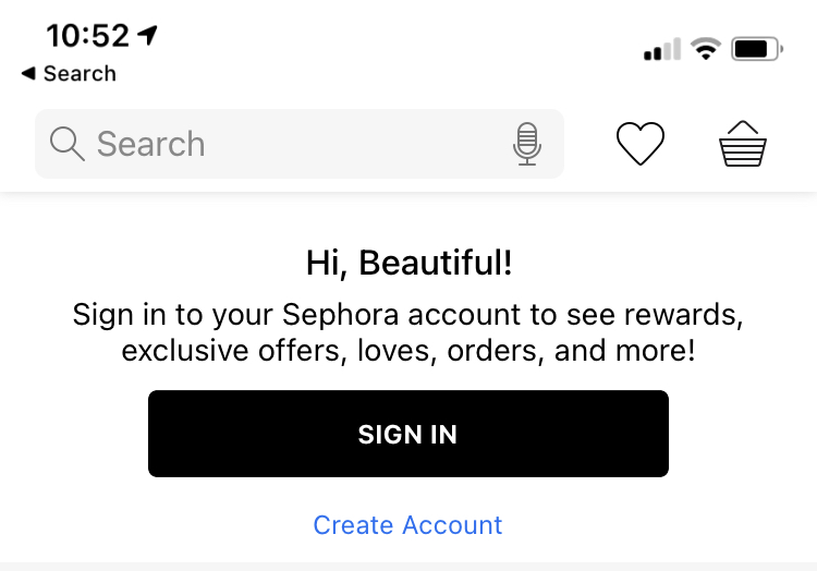
However, the process becomes more straightforward once the user locates and taps the “Create Account” button. This command gives the user visual feedback by bringing the user to a new page. This method notifies the user that this link affords the ability to create a new account (Figure 3). Once the user has entered their email, the app asks for basic information such as name and date of birth, and to create a password.
Solution: Once the user has downloaded the app and opens it for the first time, it should be a enjoyable experience. The discoverability could be enhanced with a simple prompt to either log in to an existing account or create a new account without the user being overwhelmed with advertisements and promotions. This method would utilize clear signifiers for a smoother operation. Additionally, the “Create Account” option should be similar to the log-in button in weight and color. If the “Create Account” process were made where discoverability was at the forefront, such as with the mock-up image above (Figure 4 Mock-Up), first-time users would be able to download the app and immediately understand how to interact with it effortlessly.
Interacting with the Interface
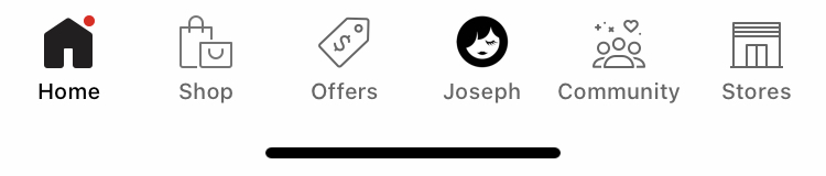
Once active, the app allows the user to continue purchasing products, leave reviews, and collect “Beauty Insider Points.” The app does this using six key icons as signifiers in a navigation bar located at the bottom of the screen, giving the user easy to follow prompts on how to proceed with their desired outcome (Figure 5).
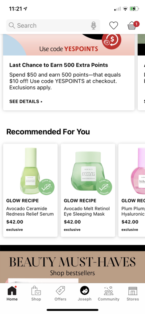
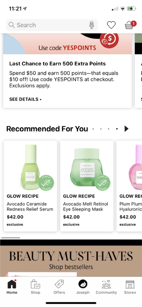
Within the home button, the user is afforded the option to scroll sideways to view their recommended products provided from the Sephora algorithm. However, it lacks a signifier that would tell the user how to operate such a command and relies on knowledge in the head (Figure 6). Once the user starts side-scrolling, the app does provide feedback by showing new products, and feedback is given by the appearance of the bottom]scroll bar, letting users know where their place is in the list of recommended products as they move back and forth through the page.
Solution: Have an arrow indicating a signifier of the possibility of movement. The bottom scroll bar should be a permanent fixture inside of the app instead of using it as a form of feedback of the action. Additionally, if the bottom scroll bar were a permanent feature, it would employ natural mapping and would make use of the concept of knowledge in the world. In turn, this would provide a clear idea of where they are and where they can go within the sideway scroll feature (Figure 7 Mock-up).
Making a Purchase
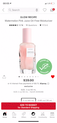
Purchasing within the app is one of the main reasons why the user would download the Sephora app. Once the user finds a product they would like to purchase, the user can follow the natural mapping of the page layout and click on the product’s image. When the product is selected, the user can click on the “ADD TO BASKET” button which signifies adding the item to the basket. Additionally, the Sephora app has implemented visual feedback of a miniature icon of the product swooping around the screen and flying into the basket. This action lets the user know that the product has successfully been added to their cart in a rather fun and creative way. This feature also removes doubt for the user and gives a clear indication of success (Figure 8).
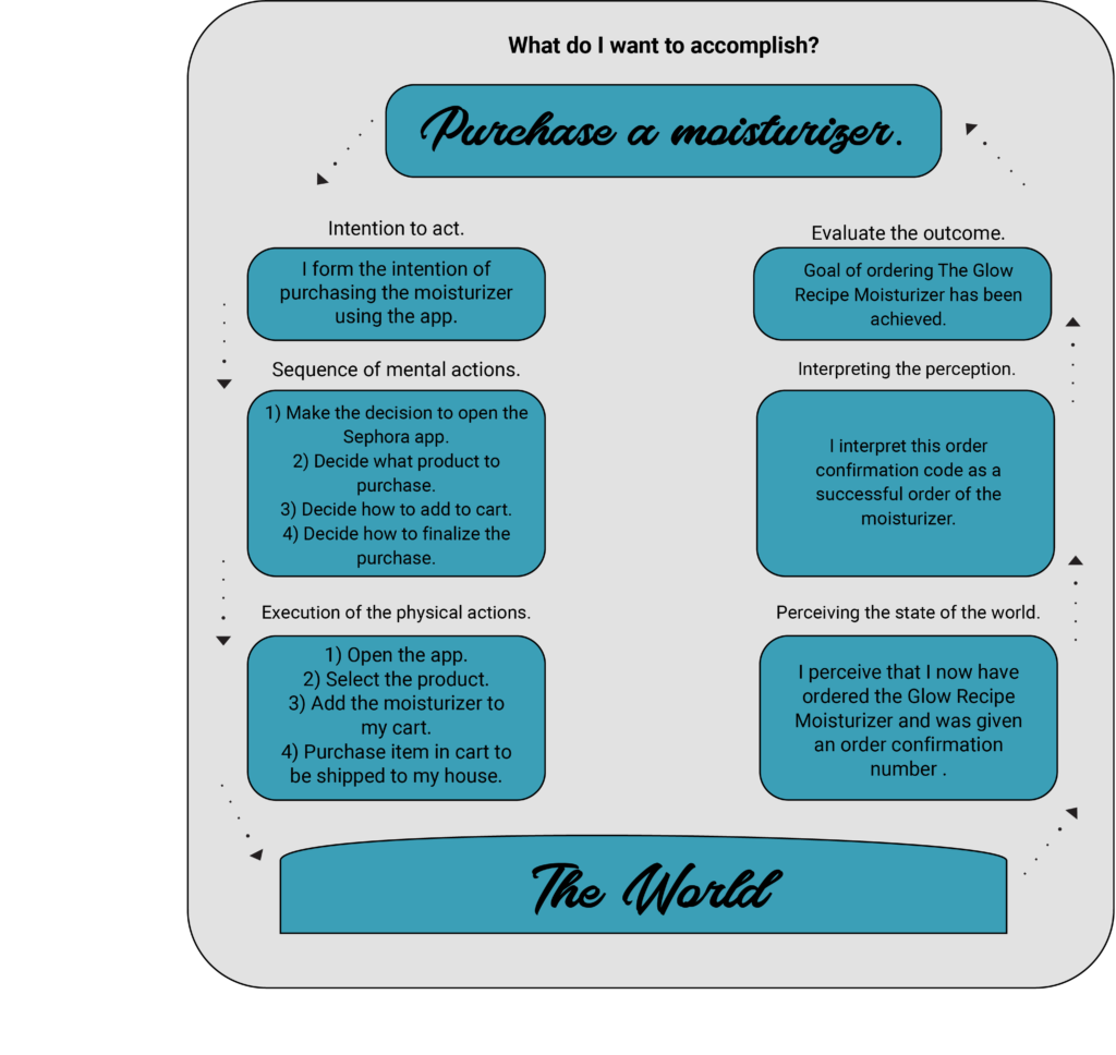
I have no critiques on the purchasing feature of the app. However, I wanted to highlight this feature because it successfully acts in accordance with Don Norman’s 7 Stages of Action (Figure 9).
Conclusion
The Sephora app is excellent for purchasing products, reading reviews, and interacting with the beauty community. However, applying a few design principles could improve the interface and create a more efficient and direct app for the user. Despite that improvements could be made to the app, I do believe it is highly effective at capturing the user’s attention and converting that to a sale — speaking from experience.