StockX is an online marketplace and clothing reseller, primarily of sneakers. Since November 2020, it has also opened up to electronic products such as game consoles, smartphones and computer hardware. StockX has had what seems like a meteoric rise to success over the past several years, as it has combined two unique concepts that haven’t really been seen together before: consignment shop & stock market. In this design critique, I’ll be evaluating the StockX App against Don Norman’s book- The Design of Everyday Things.
Navigation Bar
The navigation bar at the bottom of the screen includes three icons representing the Home(trending discover), search, and me(personal account). The icons are good signifiers of the page that each icon leads to, which enables good discoverability for the user. When the user taps on an icon on the navigation bar, the icon will be highlighted green, which tells the user which page they are currently on. This instant feedback allows users to quickly and clearly know that their actions are complete. The navigation bar also uses natural mapping. It is in connection with the interface controls and gives a clear idea of what happens when the tabs are used.
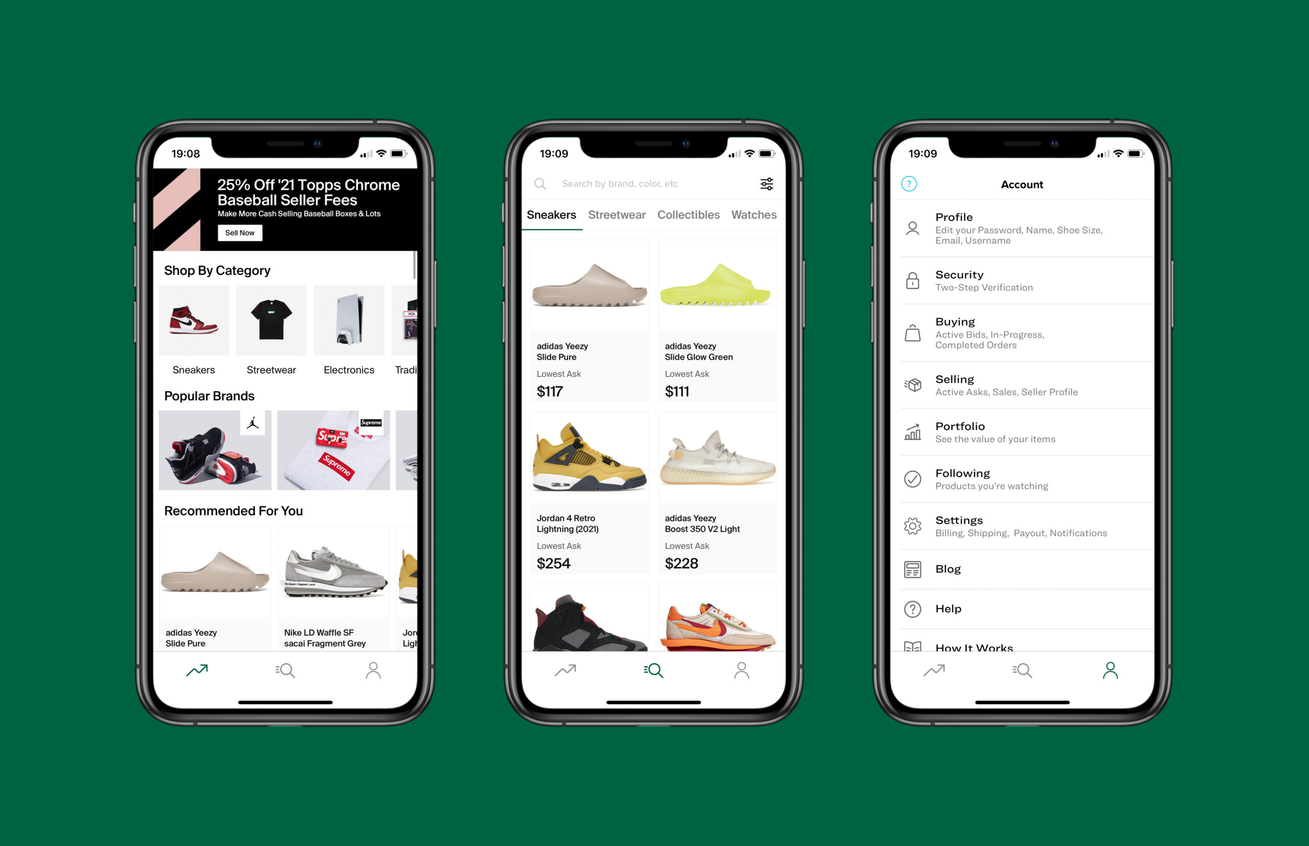
HomePage
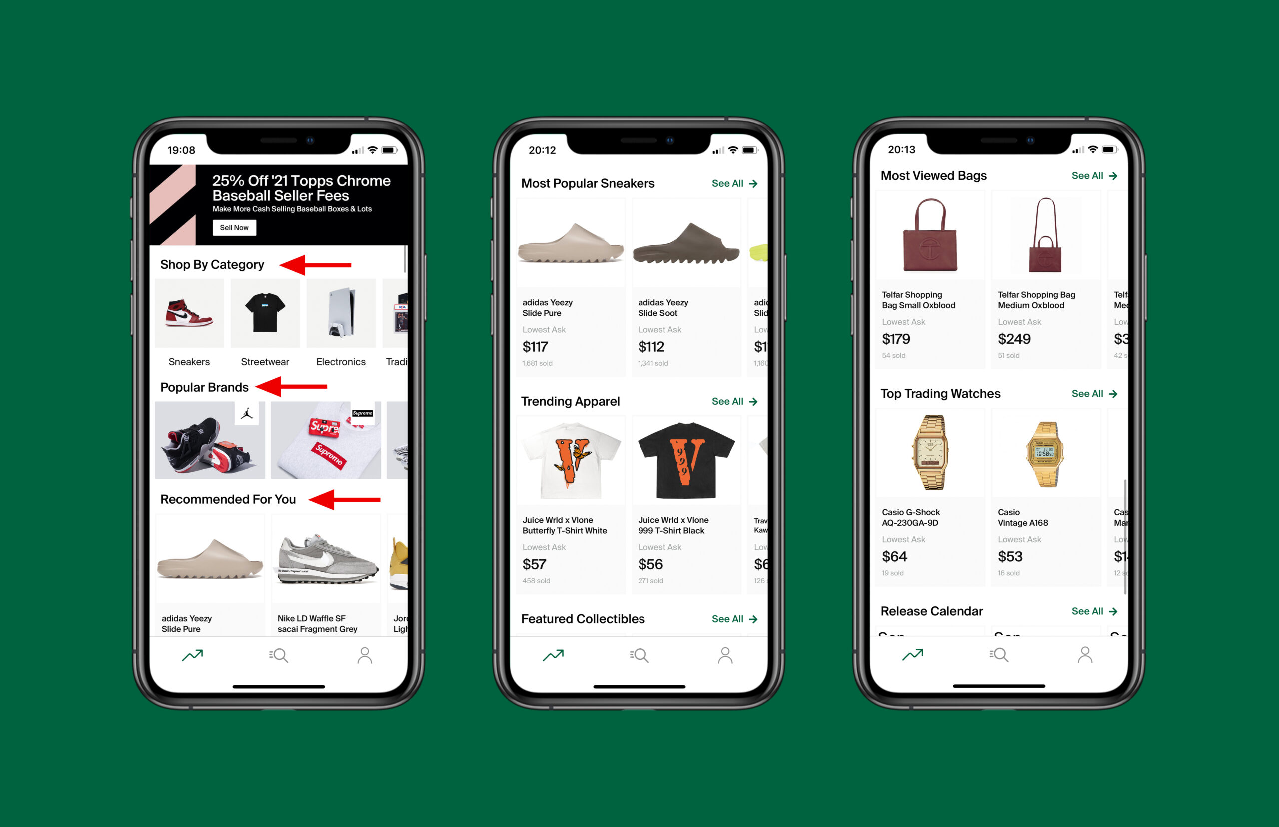
The homepage contains very good conceptual model. The content displayed on the homepage is very clear, each section is organized, showing the various product trends. Users know what they should be looking for in order to move on. The homepage also has very good discoverability, If users know what they’re looking for, they are able to find it easily and the action clearly discoverable. Users only need to select what they want to find according to the content under the title. For example, in the section Shop By Category, users only need to select the category of the products they want to buy and then tap it to go to the product display page.
Searching page
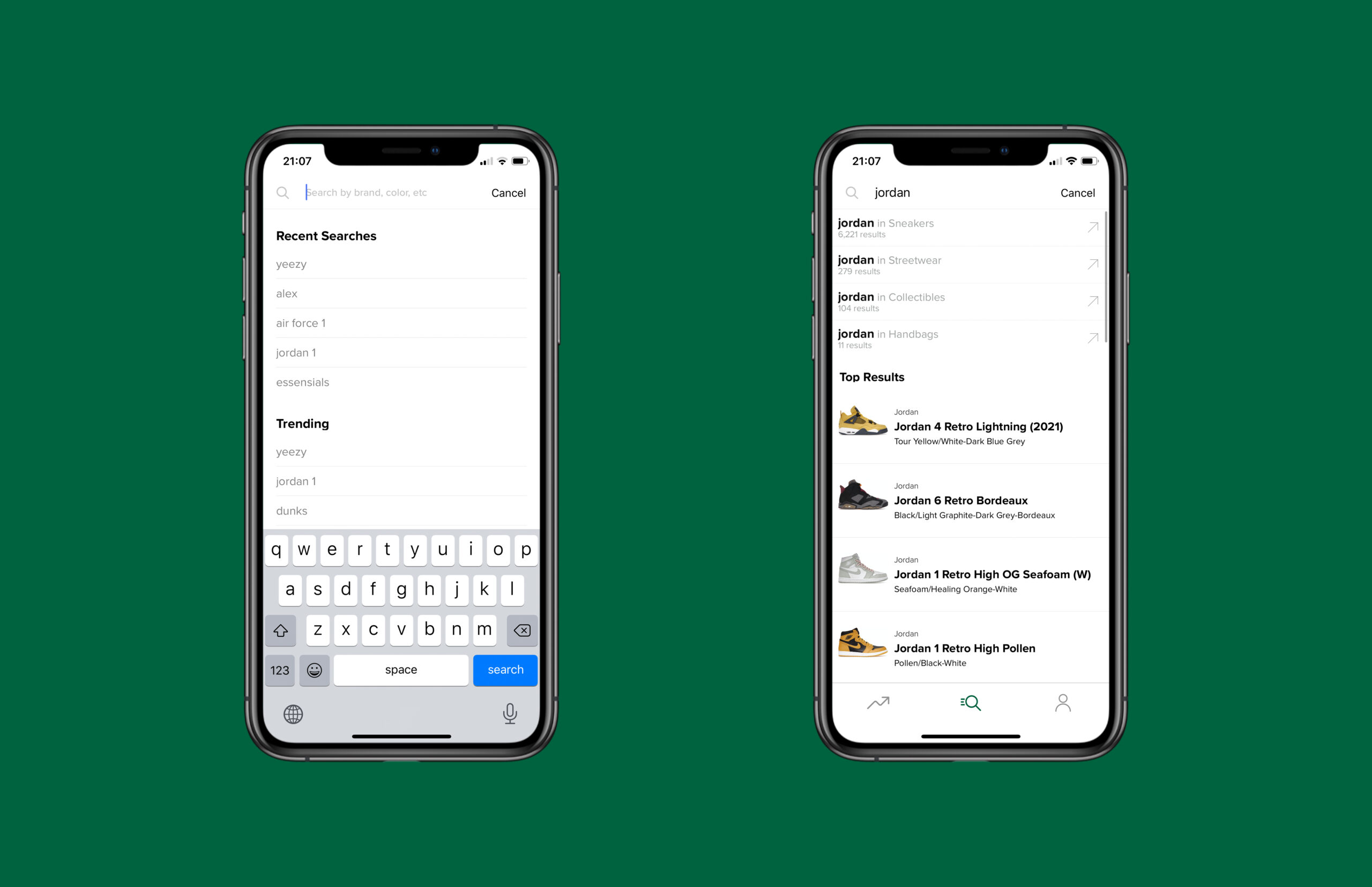
The searching icon at the top of the searching page and the contents in the search box can make it very easy for users to find the search function, which is a very good discoverability. When the user enters the search content, the page displays the possibilities in each product category. The arrow icon on the right represents the signifier, which leads the user to click on the page of the product they want. Top Results at the bottom also provides some basic information about related products to help users find products faster and more accurately.
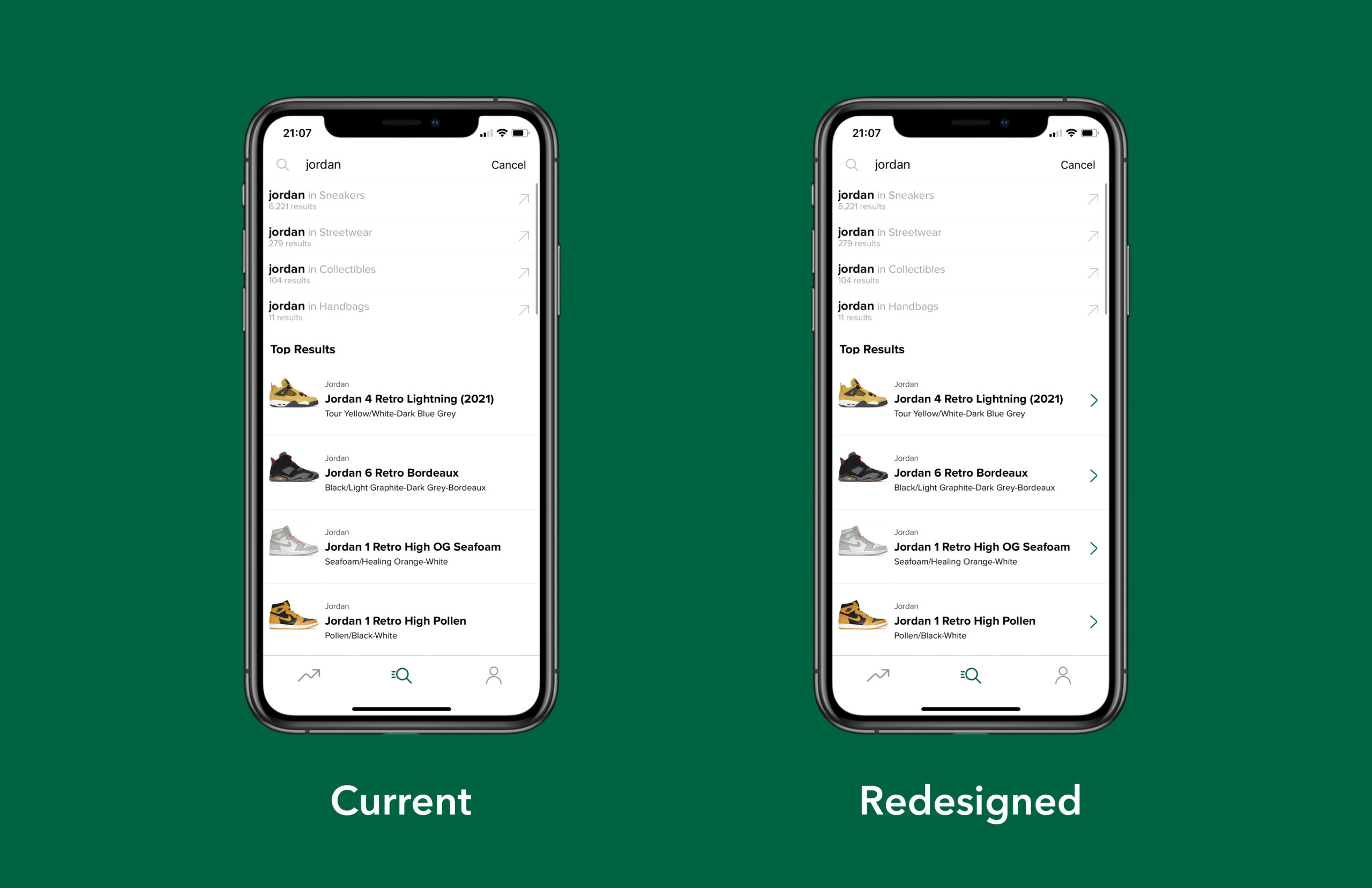
However, each search result displayed under Top Results does not look like a clickable link, and there are no buttons to prompt users to tap. This is without signifiers, which is very unfriendly to new users, because they have no idea that these search results are tappable. In this case, I added an icon with an arrow next to each search result, giving users a clear signifier to guide them to the next step.
product details page
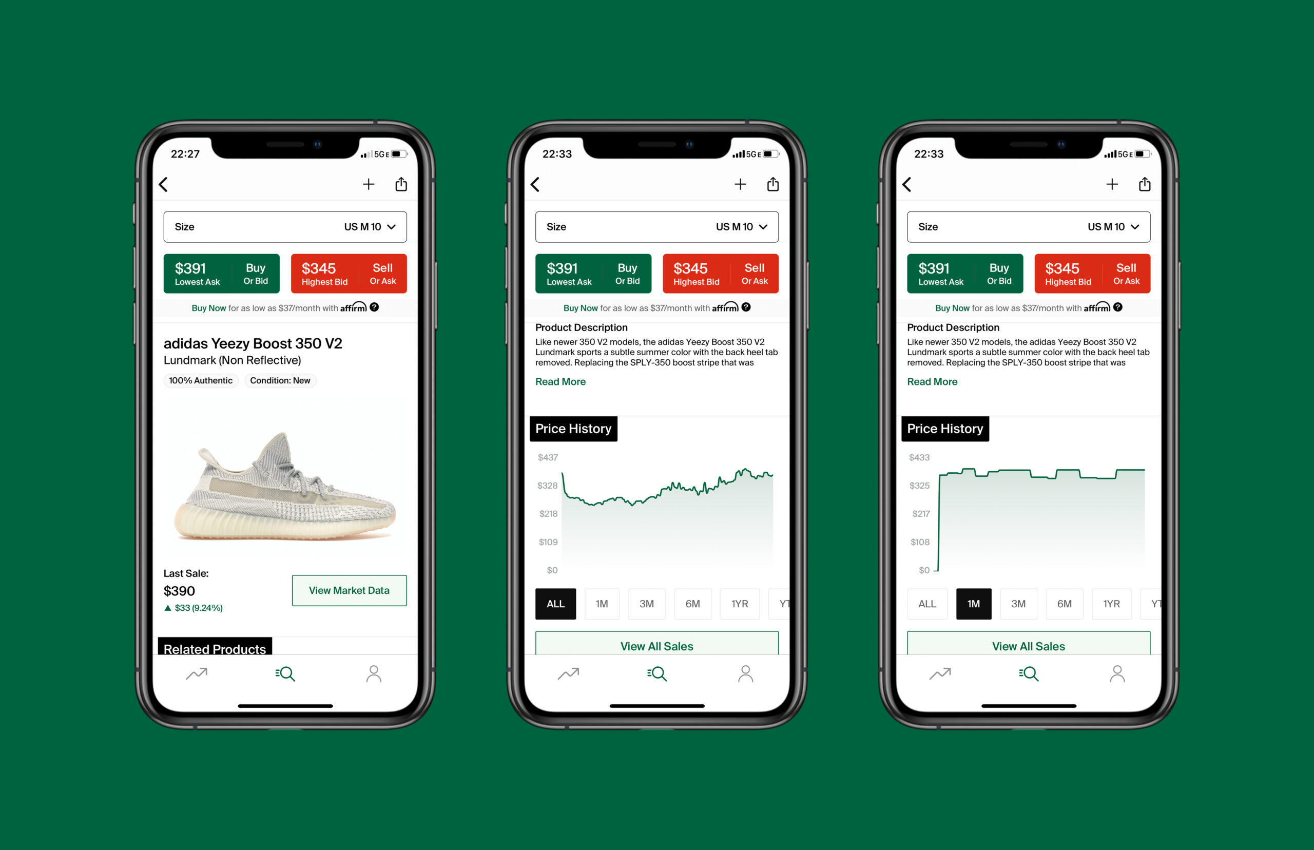
In the Product Details Page, on the whole, every part is clear and has a good signifier. Almost every button is in the right place, and users can easily do things (like buy, sell and choose a size etc.) if they know what they want to do next. Detailed product information is also clearly displayed on the page, especially in the Price History section, where the user can clearly see the trend of product price fluctuations. In the bottom row of tabs, each square represents a different time point. When users tap on the time period they want to know, the square will be highlighted in black to indicate that the they have made the selection. At the same time, the top chart changes immediately. This reflects a very good and timely feedback.
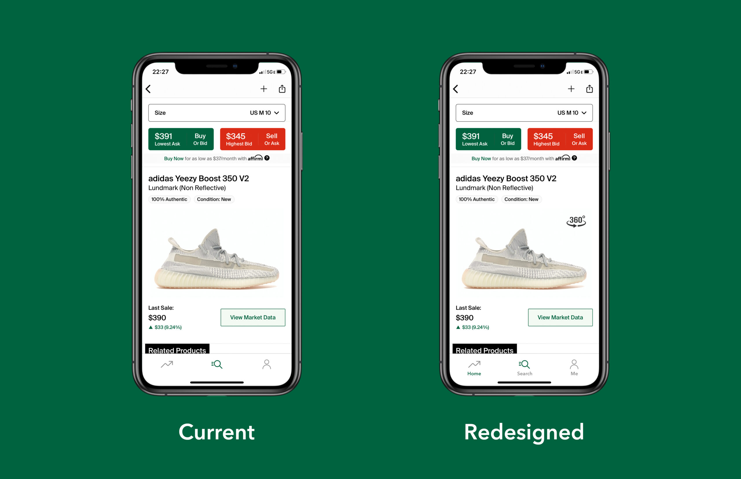
However, discoverability and signifier are missing in the product pictures display part. All the products in the App are displayed in 360 degrees VR viewing mode, but there is no sign or text on the image to inform the user. Therefore, I added a 360-degree viewing icon to the edge of the product picture, so that users can clearly and quickly understand that the picture is not static.
Conclusion
Overall, I think the App has a good conceptual model, it does a good job of communicating its purpose and meeting user needs. Its navigation is not complicated, and the visual focus is on highlighting pictures and products prices, and putting what users want when browsing this App in the front and center. Although there are still some areas for improvement, I think this App has a good balance between appearance and operation, just like an e-commerce App, but also like a stock market showing price trends. I highly recommend it to fashion lovers.