The Infatuation is a New York-based restaurant recommendation application that was founded in 2009, its mission is to simply bring the most honest and trustworthy opinions on where to eat for its users. Urban professionals find it very helpful to discover elegant local restaurants and authentic cuisines from around the world.
Homepage
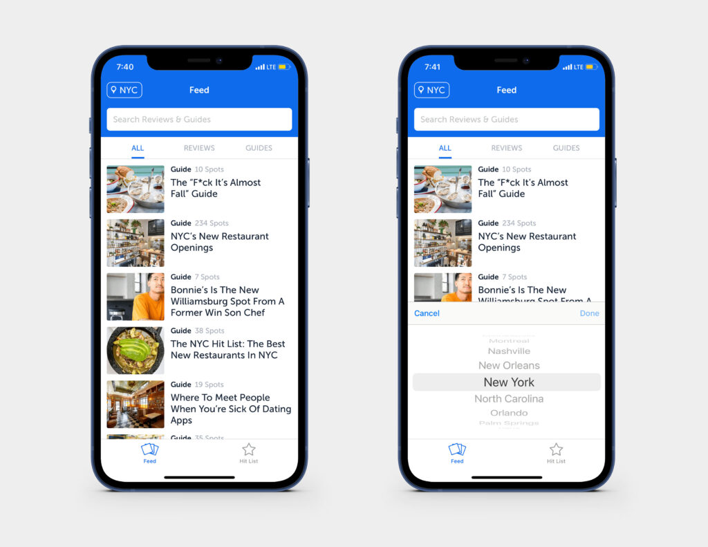
The Infatuation homepage has a minimal and explicit design layout, the use of this blue color in their UI elements makes the mobile interface consistent with their overall brand image. The location button on the top left corner has good discoverability, it has both a pinpoint icon and the city name to emphasize its function. It acts as a signifier to inform users that the application affords them to set their desired location and browse the content accordingly. The search field presents spaces and affords users to type text inside, and the placeholder text is a signifier to advise the users on what information to put in the field. The content section is below the search field, which has images and headlines of the recommended guides and restaurants. The main navigation bar locates at the bottom of the page, which only has two features: Feed and Hit List. There is no profile or messaging systems built in this section, which constrains the users to communicate within the application.
Content Section
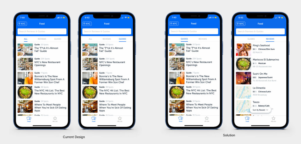
Underneath the search field is the content section, which is categorized into three different tabs: All/ Reviews/ Guides. By clicking each tab, the text is highlighted and underlined in blue, which provides proper feedback to users, therefore they know which category they are currently viewing. However, as I clicked through all three tabs, I noticed the contents under ‘All’ and ‘Guides’ are exactly the same, which might add confusion to users. To solve this problem, I eliminated the ‘All’ tab, and just displayed ‘Guides’ and ‘Reviews’ instead. With the combined knowledge in the head and knowledge in the world, users can quickly figure out that ‘Guides’ will provide them with a collection of recommended places based on specific themes, and ‘Reviews’ is the editors’ comments on the chosen spots.
Restaurant Guides
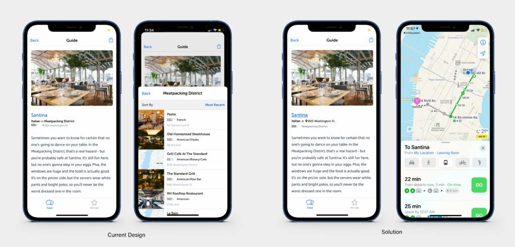
Once the user clicks on one of the guides, it will present a list of places. Each place will have a featured image, the name and some basic information, including the type of cuisine, the address, price level, and a brief paragraph to give users a preview of the place. Although the overall visual displays elegantly on the page, I think the mapping and discoverability have room for improvements. For instance, I did not realize the restaurant name is a clickable link that can take users to a more detailed page, thus adding an underline would enhance the discoverability. Also, when I tried to click on the restaurant’s actual location and see how far it is from me, I accidentally clicked on the neighborhood instead, which is an action-based slip. And then a new page popped up with restaurants within that neighborhood, which was the information I didn’t need. Then I hit back and tried to click on the location again and nothing happened, I then realized it was not a clickable link. People who are new to a city might not know which neighborhood locates in which area yet, but they just want to know where exactly the restaurant is so they can figure out ways to get there. Therefore, in my opinion, the address should be a clickable link that locates above the neighborhood and have a stronger presence. By doing so, the discoverability is increased, and the gulfs of execution and evaluation are bridged.
Restaurant Reviews
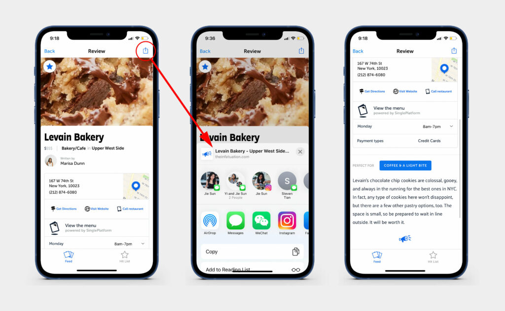
The review page has detailed information on the recommended spot. The banner image features an iconic dish, my visceral reaction was quite positive as the image effectively informed me what the restaurant offered. Then I noticed the small star icon on the top left corner which resembled the Hit List icon from the navbar, this knowledge in the world made me assume if I clicked the icon, this place would be added to the Hit List. After clicking it, the star went from grey to blue, which was the needed feedback that confirms my assumption. The ‘share’ icon on the top right corner affords users to share the spot with friends through text or other messaging systems. This feature makes visual-related communication much more effective. The location and contact information for the restaurant are easily discoverable. The ‘Call restaurant’ link affords users to call the restaurant and possibly make reservations. They also provided information about restaurant open hours and payment options, thus the users will have acquired the most necessary information when they make plans.
Conclusion
The Infatuation app has become a tremendous help for city residents to explore local restaurants and connect with each other through food and culture. Although the usability has room for improvement, the application has a clear conceptual model and packs with valuable content and a well-designed interface which has certainly benefited its users.