The Client

My research group was approached by Andrew Clarke of Braata Productions to help improve the user experience of his organization’s website. Braata Productions is a Caribbean arts and culture organization that hosts events and fundraisers to help promote everything the Caribbean has to offer here in NYC.
Our Team
For this usability study, a team of five usability experts collaborated to conduct interviews with participants. The team consists of graduate researchers at the Pratt Institute in Manhattan, NY. The team implemented a moderated user testing approach for our research breaking up each session of interviews into pairs, with one researcher moderating the session and the other taking notes.
Meeting Objectives
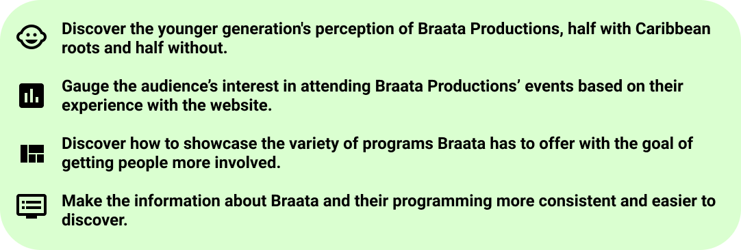
To begin our research, we first met with Andrew to go over what he was hoping to achieve through this user study. The key objectives Andrew approached us with were targeting a younger and more diverse demographic and organizing the website in an appealing way that makes sense for users to browse. We landed on a hierarchy for prioritizing which areas of the website to focus on, as seen in the figure below:
Process
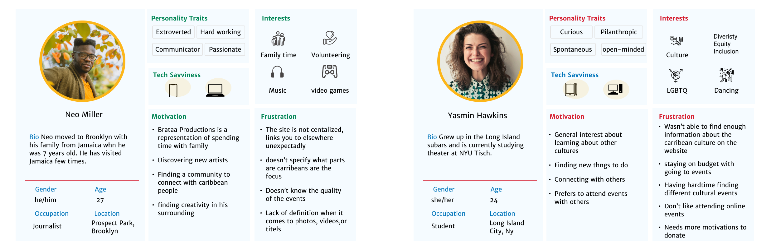
Our research gathering process consisted of a few different parts. The first step was to establish an audience to recruit for our study. Because Braata Productions was looking to target a younger demographic, we decided to limit the age of our participants from 18-39. We then created personas for two different demographic we were looking to recruit.
Once we had our ideal participants in mind, we recruited users through a number of channels including LinkedIn, Craigslist, and the Pratt’s Graduate student listserv. Users who applied to participate were screened using Google Sheets questionnaire, and were then asked to sign up for a session in which we would then conduct an unmoderated user test. During these sessions, our team would ask a series of questions in reference to the website while the participants described their thought process out loud.
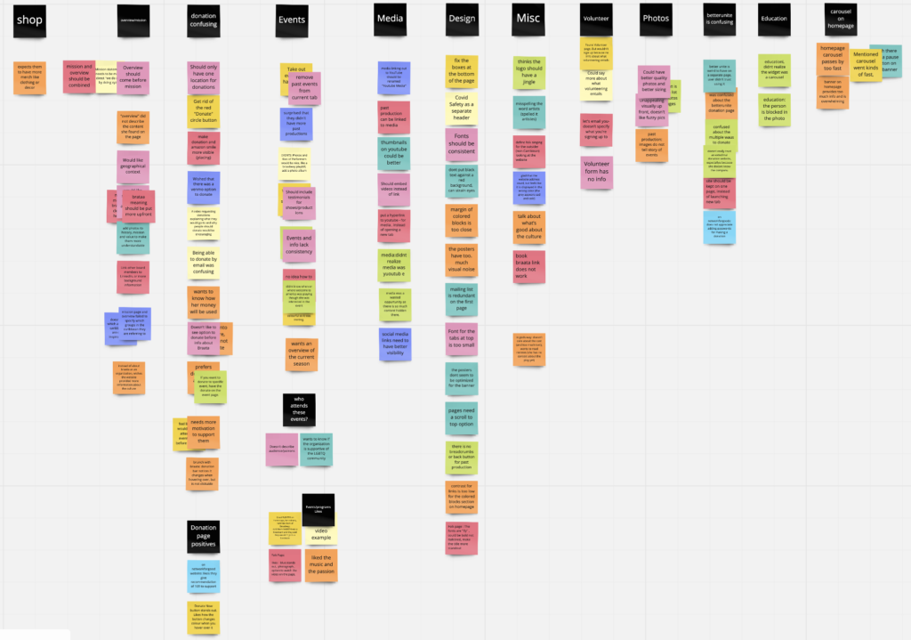
Card Sorting
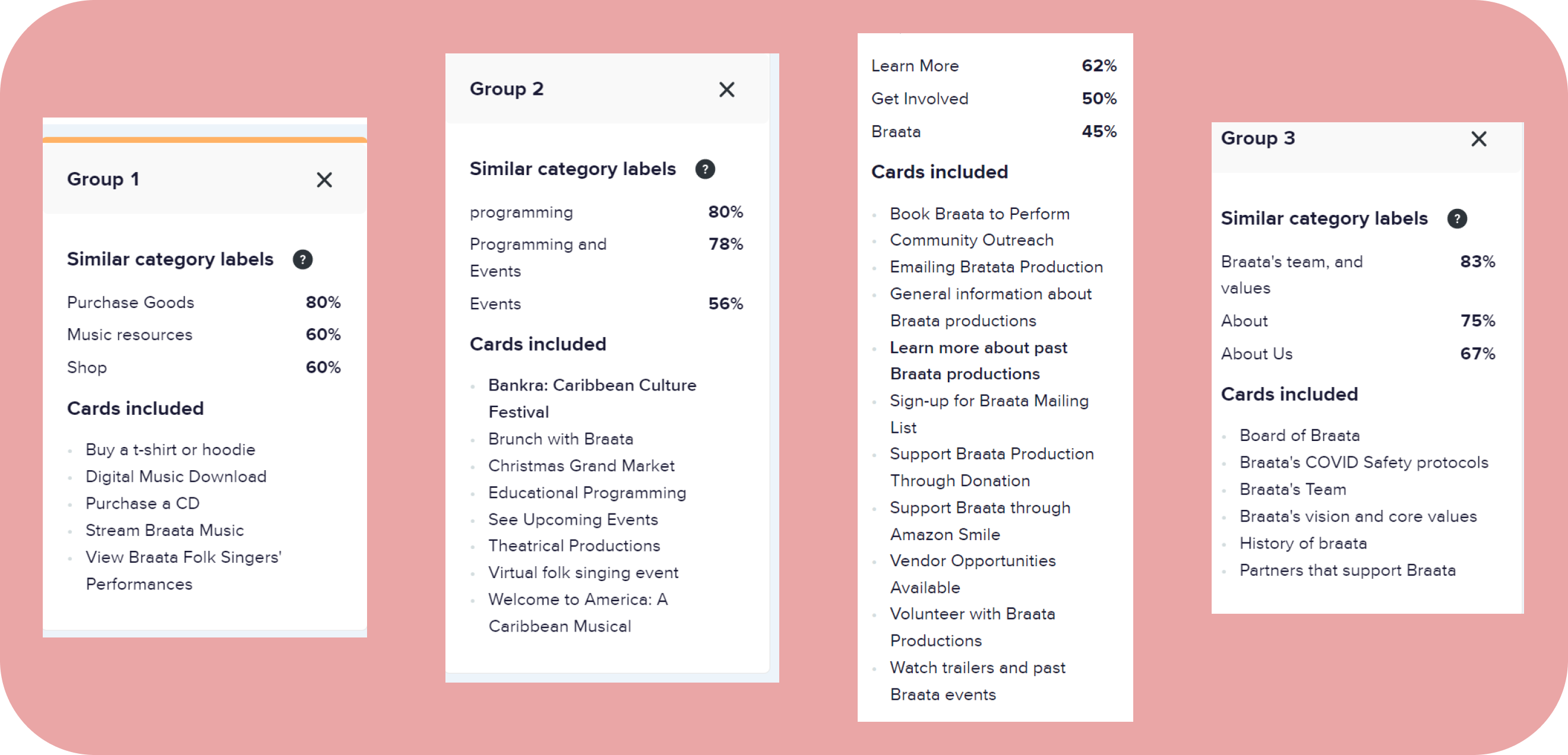
Before launching into our interview sessions with participants, we also had users complete a card sort on Optimal Workshop, which consists of arranging different sections of the website under different categories. While this is not always necessary for user studies, we figured this might give us some insight into how to best arrange the information on Braata’s website. The card sort yielded the following results:
Testing the Participants
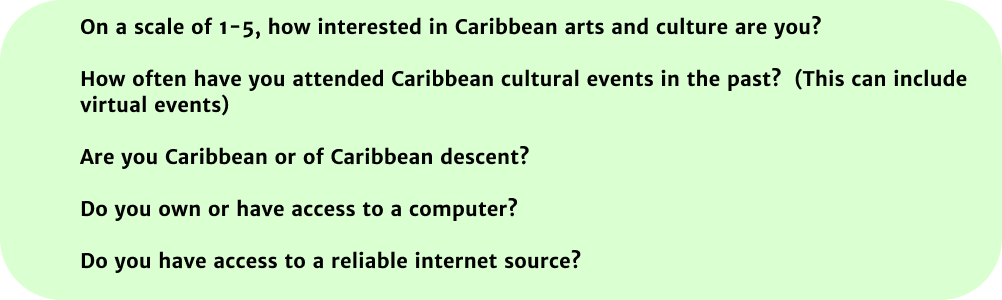
As mentioned before, our methodology for gathering research data consisted of using the moderated user testing strategy. Unlike unmoderated user testing, where a set of tasks is predetermined and users simply follow the tasks to the best of their ability without the researchers present, moderated user tests benefit from the usability experts’ ability to observe the participants and help clarify things when needed. The set of tasks and post-task questions we established for the sessions are as follows:

Once our test plan was in place, we were able to conduct our sessions virtually with our ten participants. We recorded these sessions and referred back to the notes we took during the session to analyze our results with the help of Miro, we were able to begin affinity mapping the different feedback and sentiments our participants shared in order to organize our findings and brainstorm recommendations.
Results and Findings
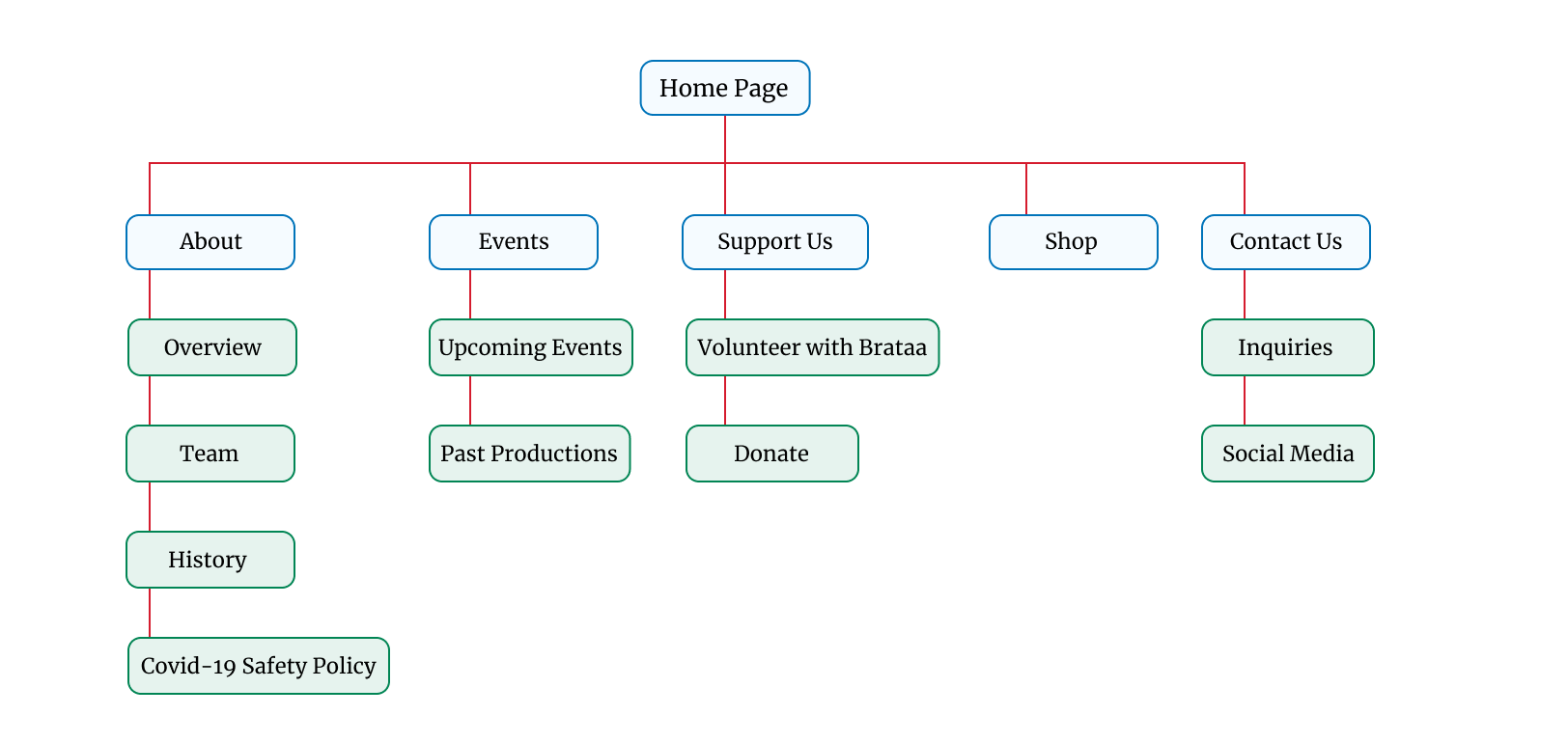
Through this user study, we discovered that our participants were generally receptive toward Braata’s mission as an organization looking to promote Caribbean culture. The majority of participants also voiced their critiques around the consistency and finding information on the website, however, so these were areas we focused on for improvement. The first recommendation was to reorganize the site content based on suggestions from the sessions and the card sorts that preceded them, as shown below. This rest of this section details each of our recommendations and findings from the study.
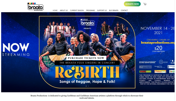
Recommendation 1: Home Page Redesign
Our study participants noted that the information displayed on the front page could be organized in a way that doesn’t overload the user with too much information that cycles out too quickly. As is, the homepage has several elements, including an image carousel that displays upcoming Braata events. One of the main critique from users was that the carousel moved too quickly, and that the information provided on these images wasn’t as relevant as expected. To remedy this, we suggested a redesign of this section of the home page.
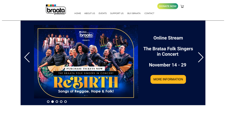
The Proposed Redesign
Another area of confusion on the home page came from the information displayed toward the bottom of the page. Participants noted a lack of clarity surrounding this section, and wished the elements shown were more descriptive. Our recommendation shown below adds more context, which would theoretically make users more interested on first impression.
Original Layout 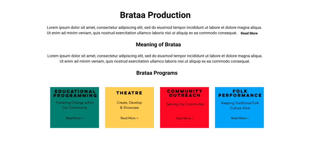
Proposed Redesign


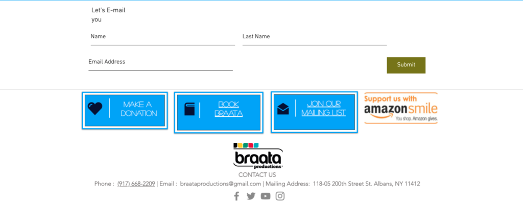
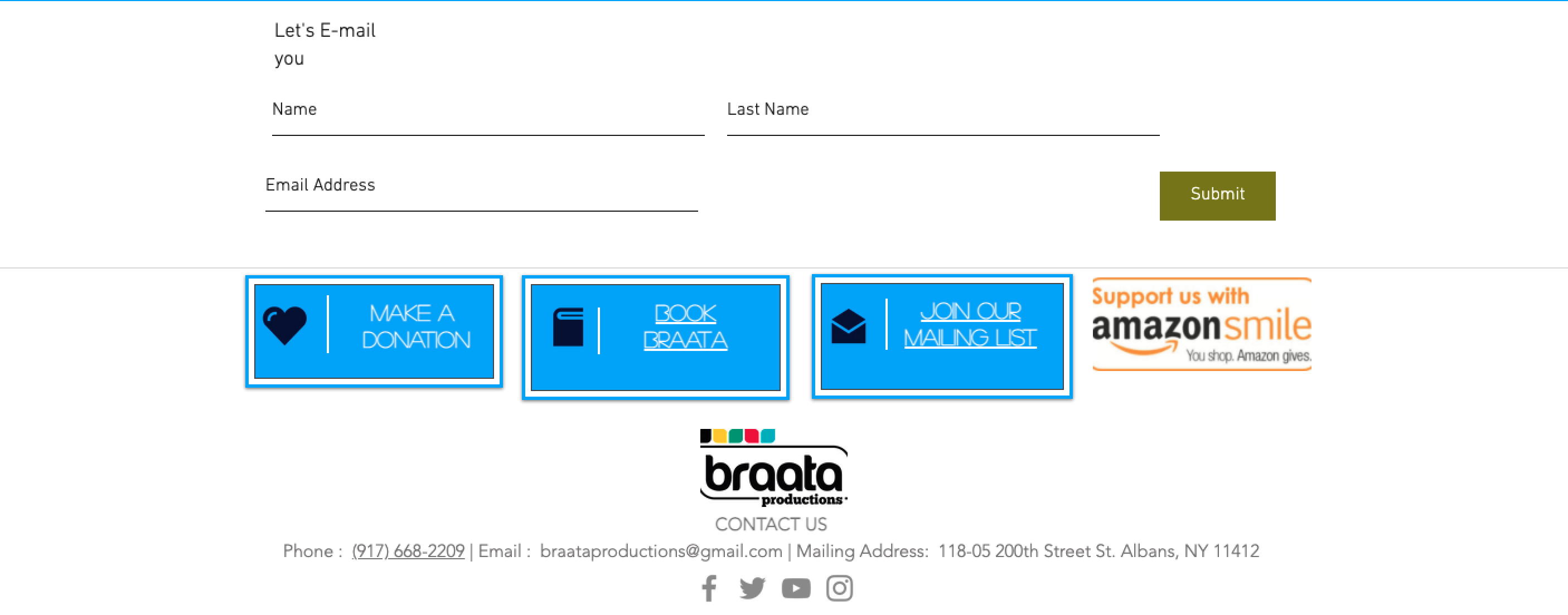
Lastly, we found users were generally confused by the layout and wording for the newsletter signup at the very bottom of the home page. A simple redesign shows a simplified version that shouldn’t cause any additional confusion.
Original Layout 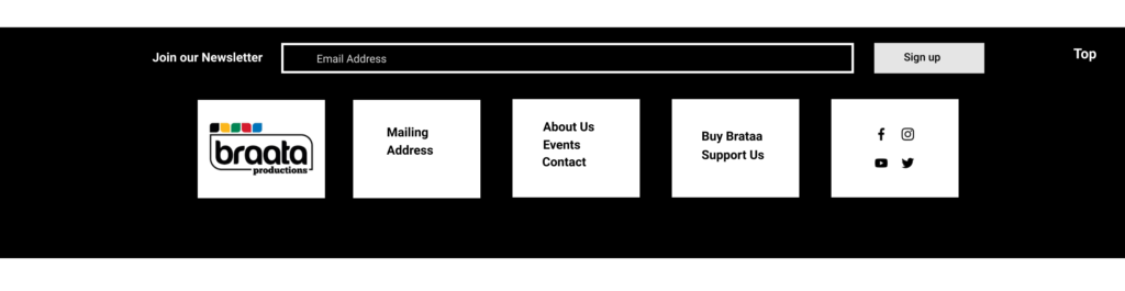
Proposed Redesign

Recommendation 2: Past and Future Events
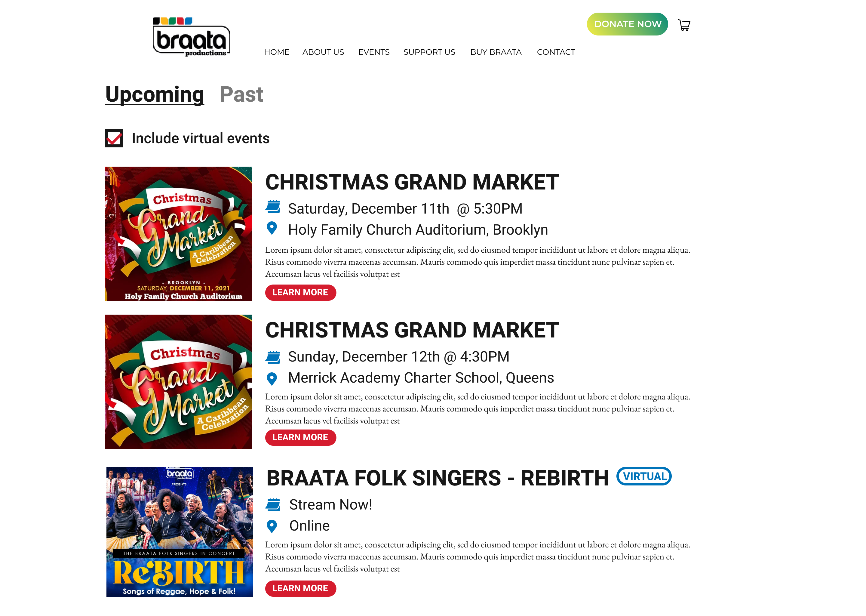
Our findings from the study also revealed that while users enjoyed seeing the events with context, the information provided was often ambiguous. Furthermore, participants pointed out that several events listed were for a previous date and therefore no longer relevant. To fix this issue, we suggested a redesign of the Current Season tab, which includes a distinction between past and future events under a new tab titled “Events.”

Recommended Redesign for Events Page 
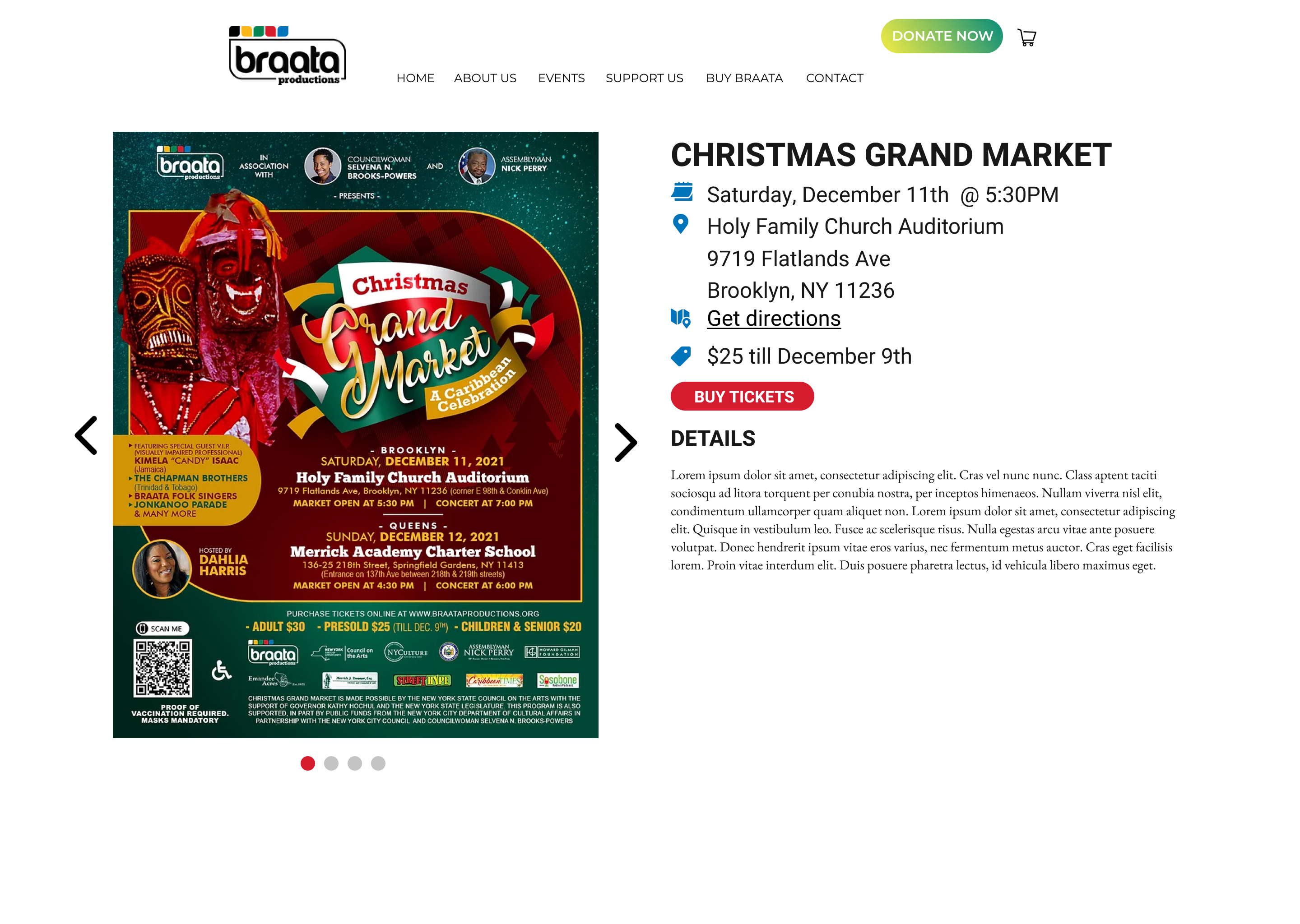
Example of clicking an event for more info
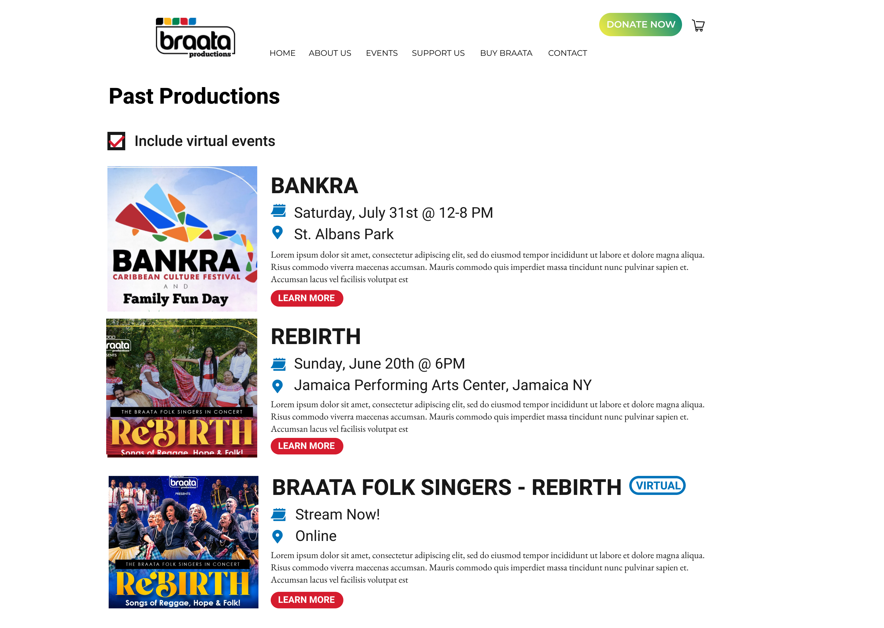
In order to keep with the consistency, the past productions tab was also moved to this section, with our recommendations shown below.

Overview of Past Events 
More information on past event

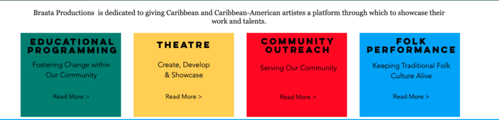
Recommendation 3: About Us/Programs
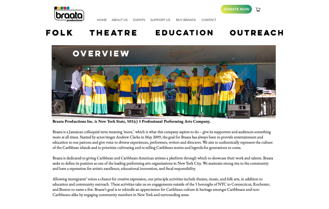
The third recommendation our team made addresses the issue of users being unable to find relevant information about Braata as an organization. While most participants were able to get a sense for what Braata’s mission was, they were also interested in discovering how Braata was providing a space for Caribbean culture. Several users mistook the Programs tab for a part of the website listing upcoming events, but when guided to explore that section, users were the testers were more receptive to the information and had more context for Braata’s operations. Our solution is to combine the Programs tab with the Overview section in order to make this information more discoverable, without the need to explore the website at length. The use of videos in these sections also helps provide more context and engagement.

Redesign of Overview 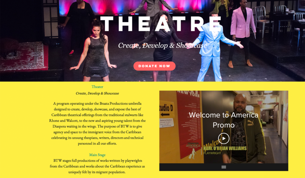
Example of Program Redesign

Recommendation 4: Supporting Braata
Our final recommendation is in regards to the ways visitors can learn about supporting Braata. Another of our client’s priorities was to redesign the donations page to gauge users’ interests un supporting the organization. We decided to extend this priority to volunteering opportunities in our study, as this would be another way to support Braata without money. We found that participants were generally confused about both the volunteering and donation sections, citing that they wished there was more transparency for both. Our suggestion here is to add different types of volunteering options, as well as offering transparency around where supporters’ donations would be going.
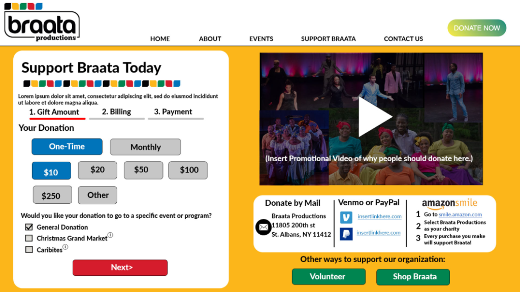
Donation Page 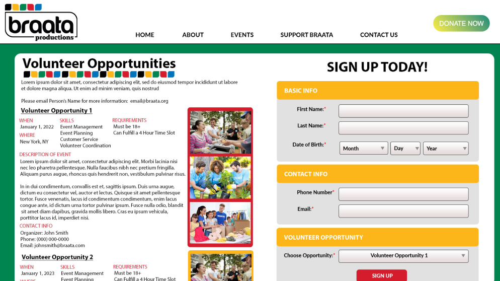
Volunteer Info

Wrap-up
Once we had all of our suggestions, we finally met with our client to present our findings in a presentation. Andrew took notes during the presentation and was appreciative of the work we put into our research, excited to implement the suggestions we offered. Overall, we found our study to be a success, as we were able to address Braata Production’s objectives of appealing to a younger audience and discovering what drives engagement and learning on their website.