Introduction
Whether a neighborhood, a college campus, a civil service program, or a well-attended Twitch channel, it’s hard enough already to move away from a community without fearing that you might lose touch with those you love once you leave. For many of us, beginning in March 2020, this worry came unexpectedly true as we found everything and everyone in our lives going remote, and after two years of social distancing, it’s becoming clear that creating long-term solutions to easily connect our communities is more important than ever.
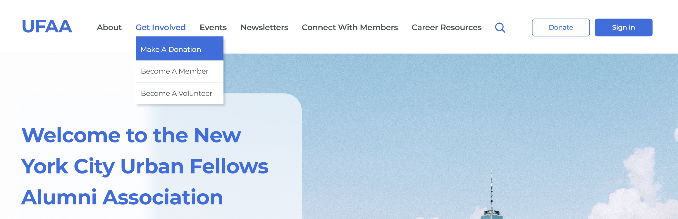
As such, when the NYC Urban Fellows Alumni Association (UFAA) reached out to my team in September 2021 to __, my team centered our creation of an intuitive, attractive, and impactful online events and donation flow around the core value of connecting community. Our final design prototype strives to enable Urban Fellows alumni to better connect with their peers in remote and in-person spaces by providing an interactive events calendar, user-friendly donation interface, and streamlined RSVP portal.
Process
My team prioritized user research at each step in our design process. We began this process by conducting qualitative and quantitative research to best understand our users’ needs, and presented our insights first in a project brief before collaboratively creating a Miro dashboard to better organize our findings. We sorted our data into things that users (1) said (2) think (3) do (4) feel and (5) strive for as goals. This research informed website functionality and content requirements, and we emerged from this task with a deeper understanding of why users needed community centered in our design prototype.
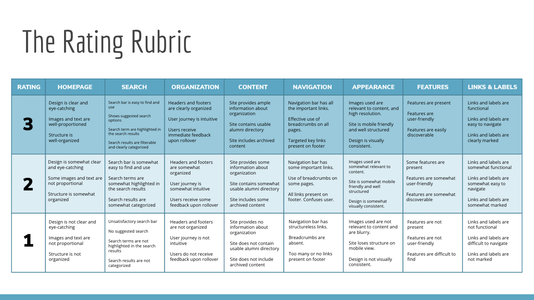
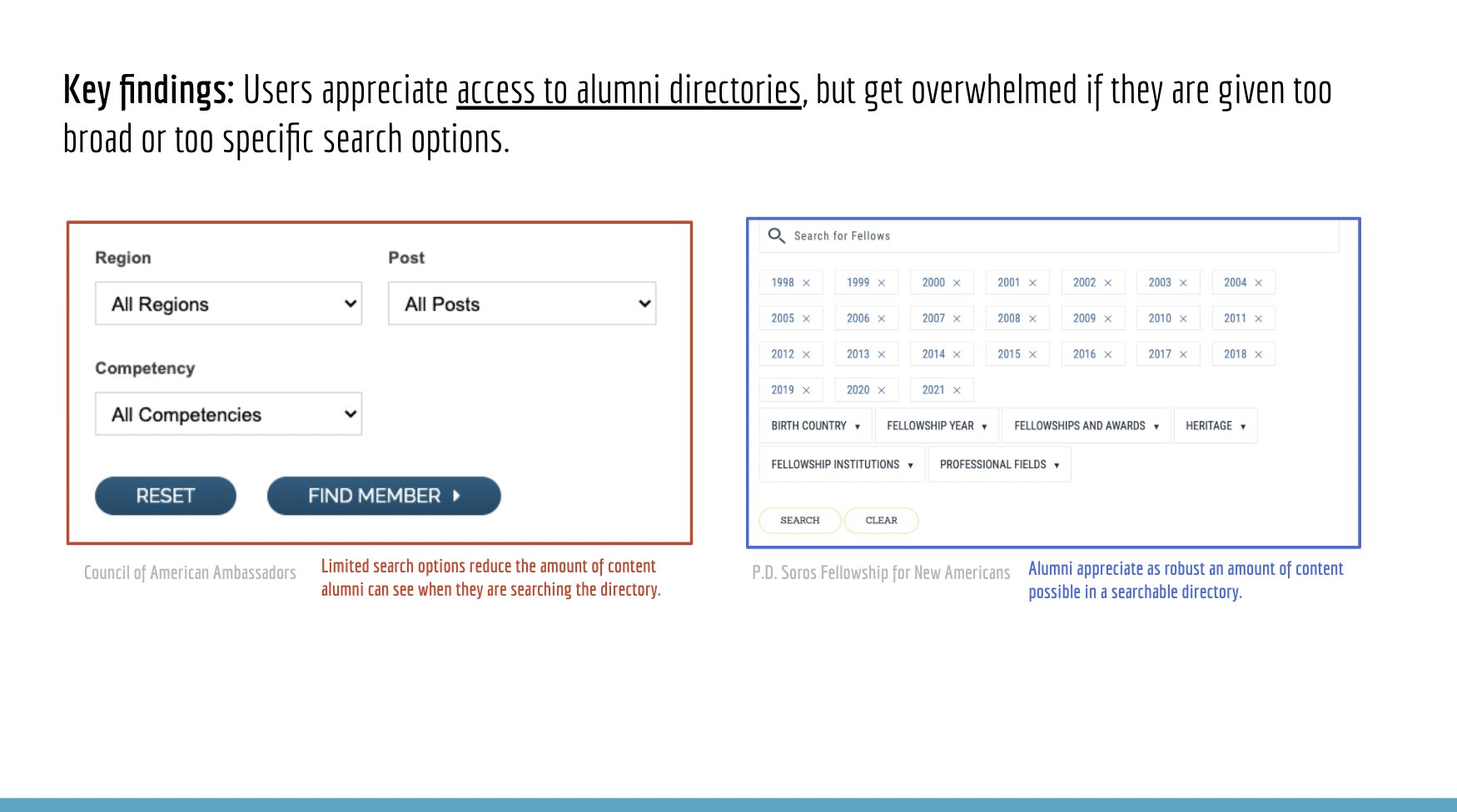
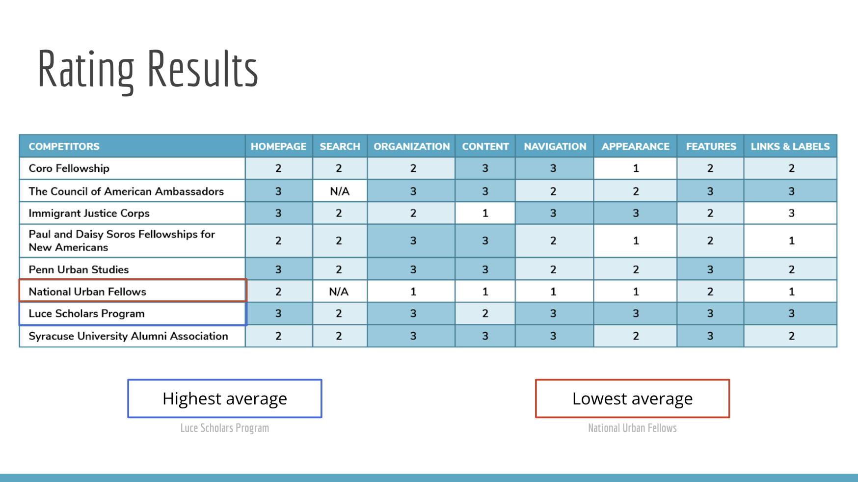
We organized our data in Miro and shared our key findings in a slide deck that identified both strengths and opportunities for growth in UFAA’s competitors’ websites, using quantitative and qualitative evaluation.
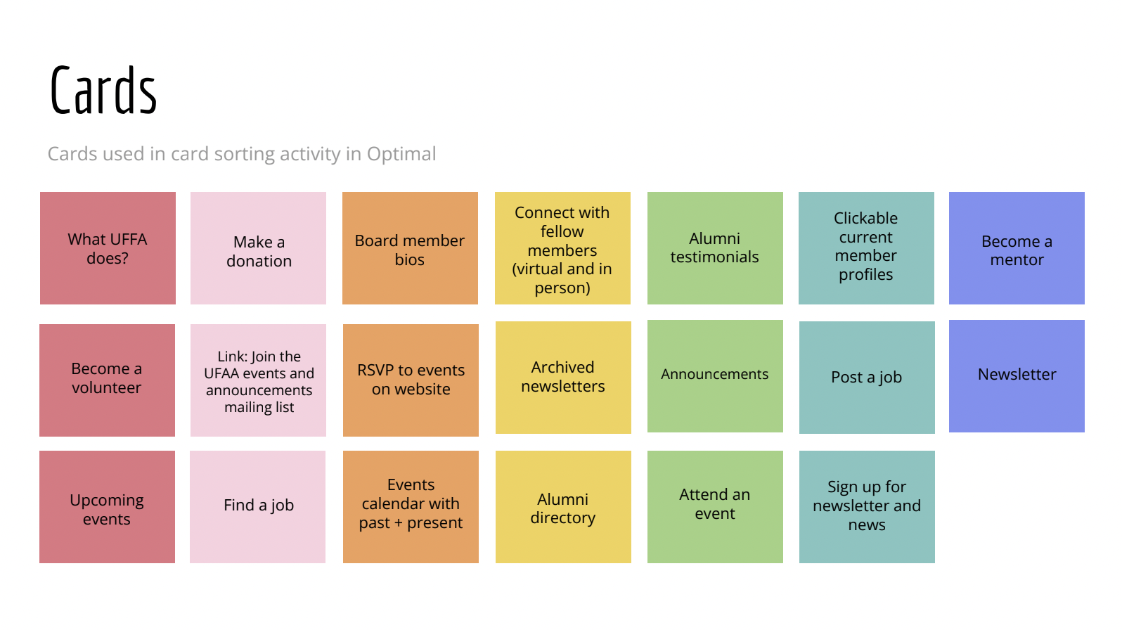
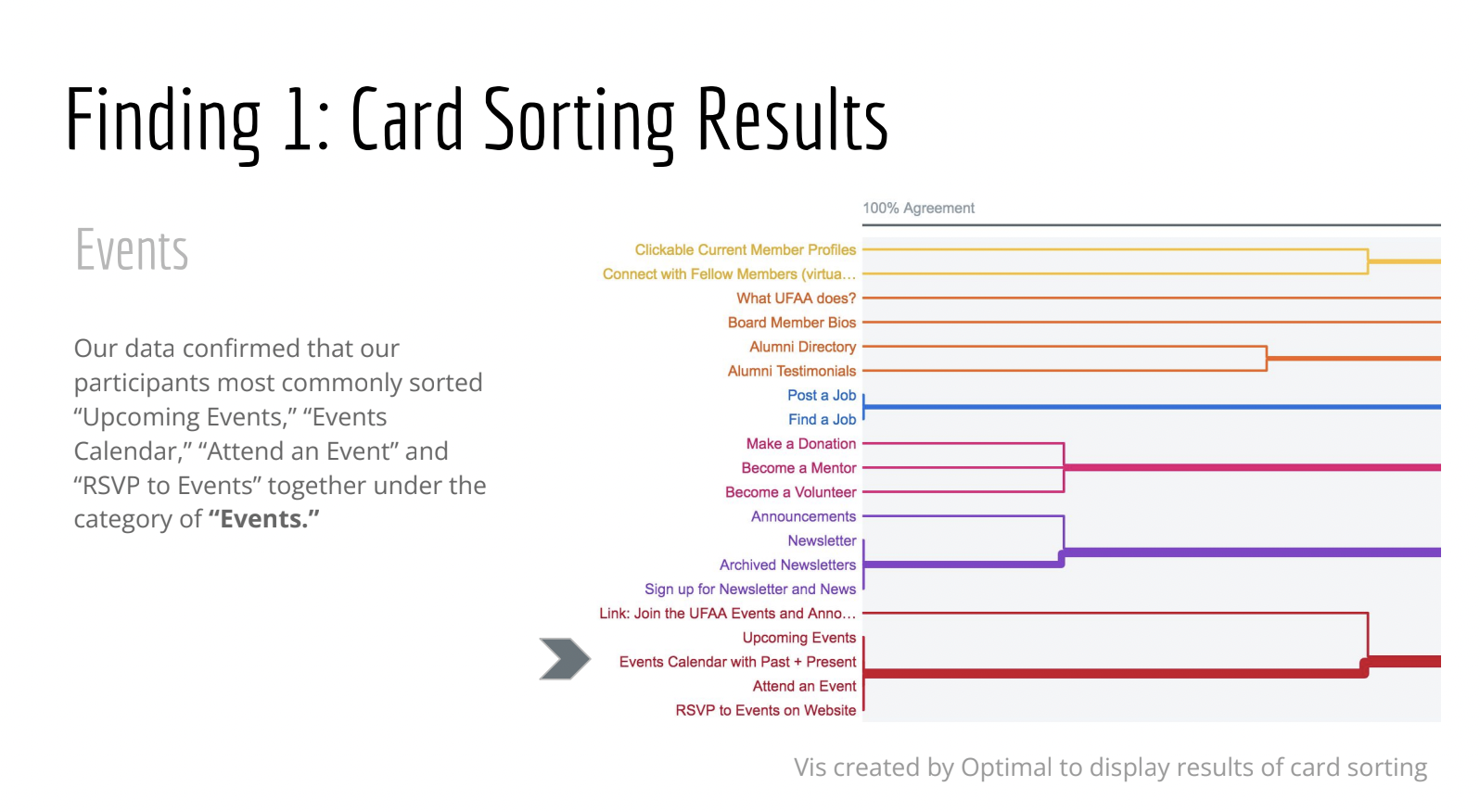
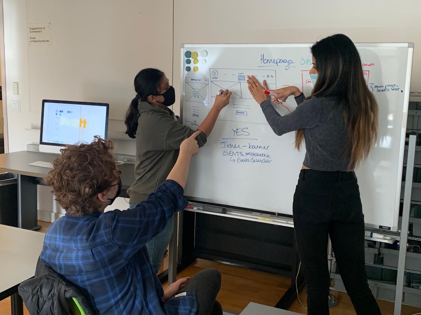
We moved forward with developing and testing an infant site architecture, supported by our users’ input about what they needed to see in the design process. We reached back out to our user testers at this point for tree testing and card sorting. Tree testing and card sorting our initial vision revealed to us that our users felt lost in the submenus, and as such we decided to consolidate the next iteration of a sitemap into fewer pages with more content.
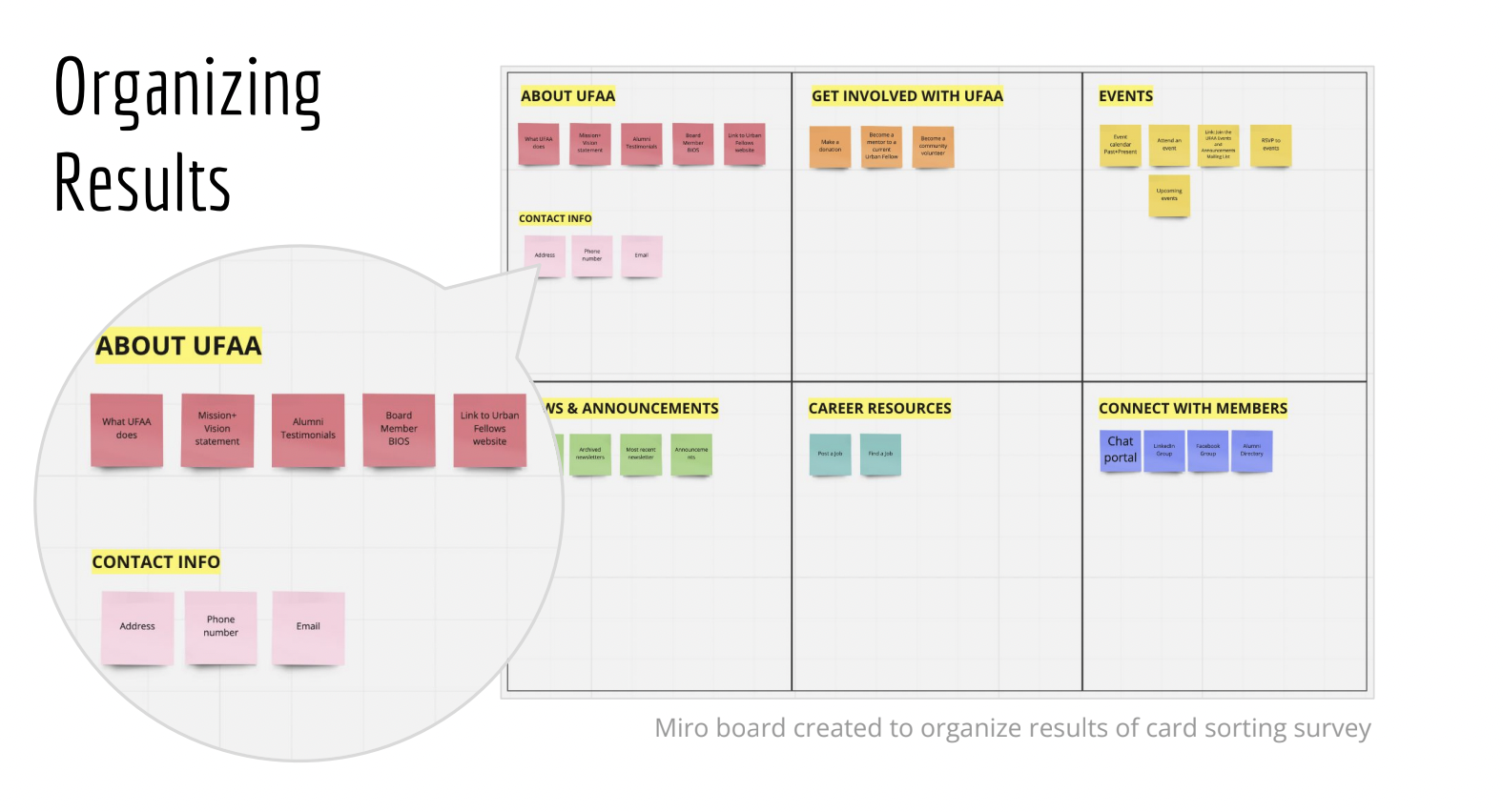
We concluded our tree testing and card sorting by generating a medium-fidelity sitemap with which we felt we could work in building our first mid-fi prototype. In the sitemap, we made sure to emphasize how UFAA offers benefits like attending events, becoming a mentor, joining a chat portal, and signing up for the newsletter— opportunities that bring communities together.
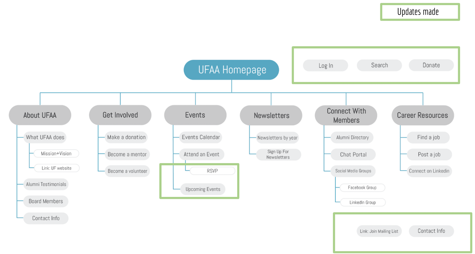
[changes after tree testing and card sorting marked in green]
Solution
Thus equipped with a sitemap which our user testers felt met their wants and needs, my team moved forward building the first iteration of a usable medium-fidelity prototype in Figma. I was impressed by the tool’s collaborative nature and capacity for complex visual storytelling. Figma allowed my team members and I to perform to our strengths. My expertise in museum project management and exhibition design and my team members’ UXD expertise and professional design background came together in Figma to create a strong user narrative seamlessly integrating visual and text elements. My team and I continued to work collaboratively in Figma, sharing knowledge and leadership on visual and text elements. As someone new to Figma, I had a lot to learn about the tool and greatly valued my team members’ input and guidance while sketching out my vision for the homepage and footer for mobile and desktop.
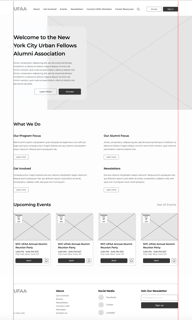
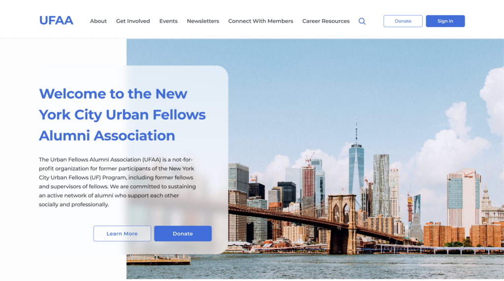
Homepage, prototype for desktop in Figma 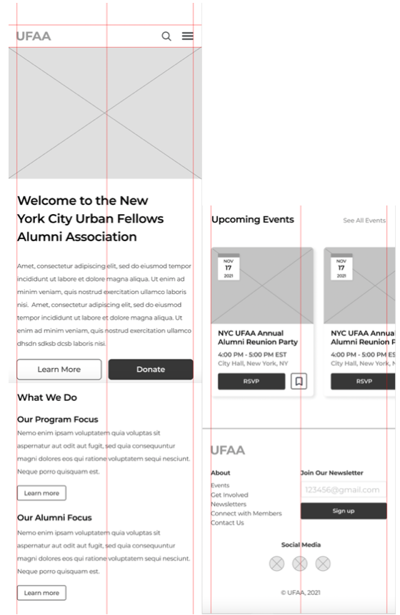
Homepage, prototype for mobile in Figma [split into two screens for the purpose of this case study]
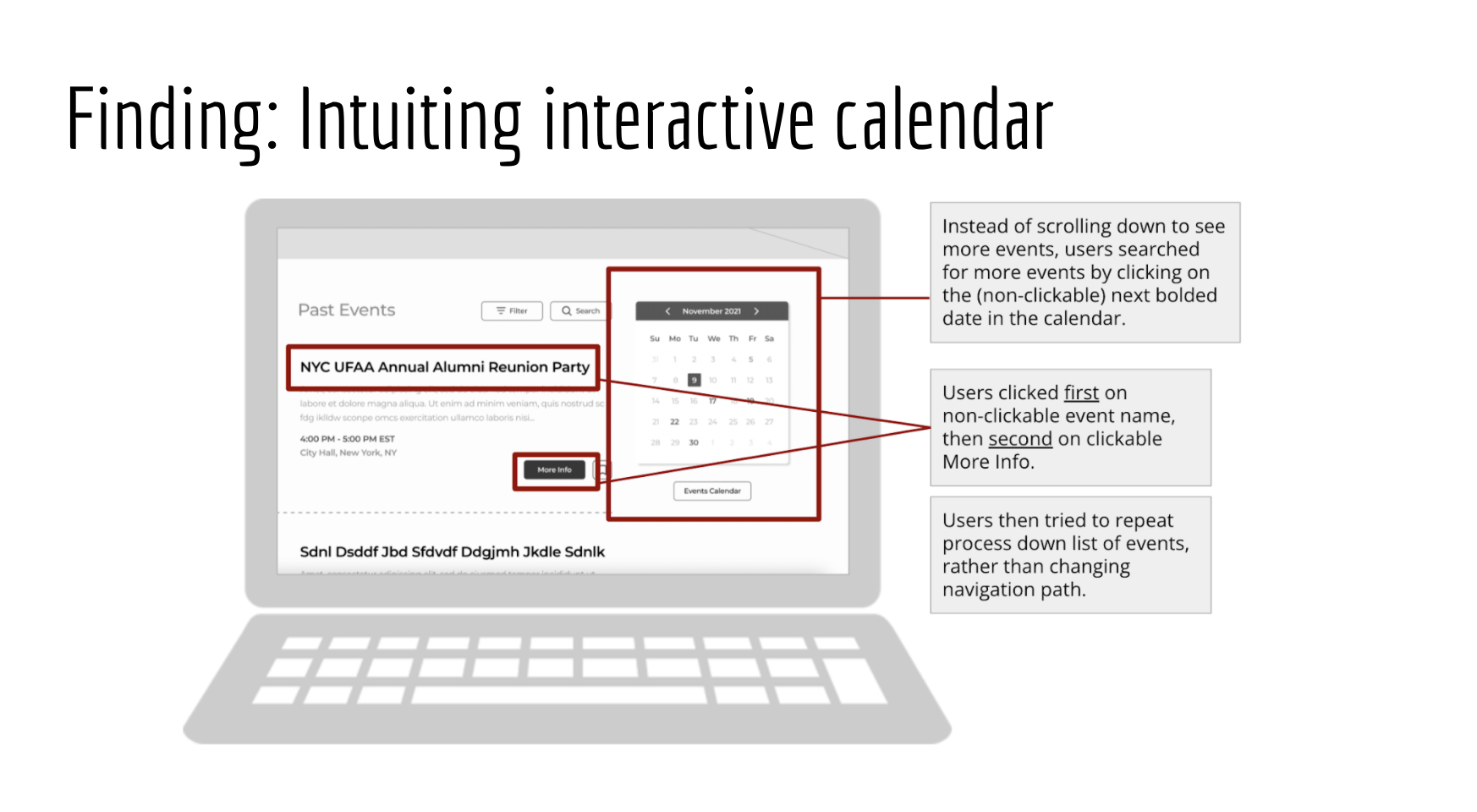
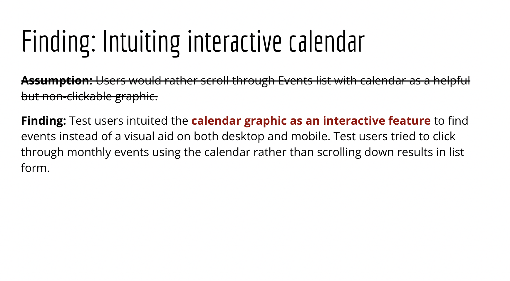
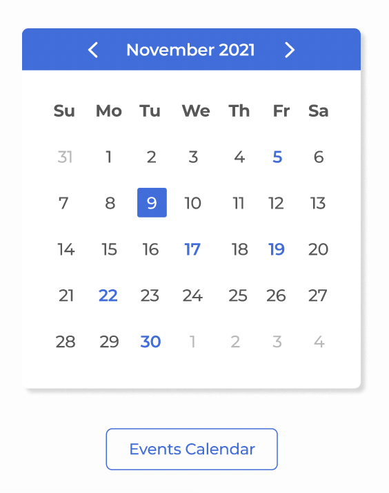
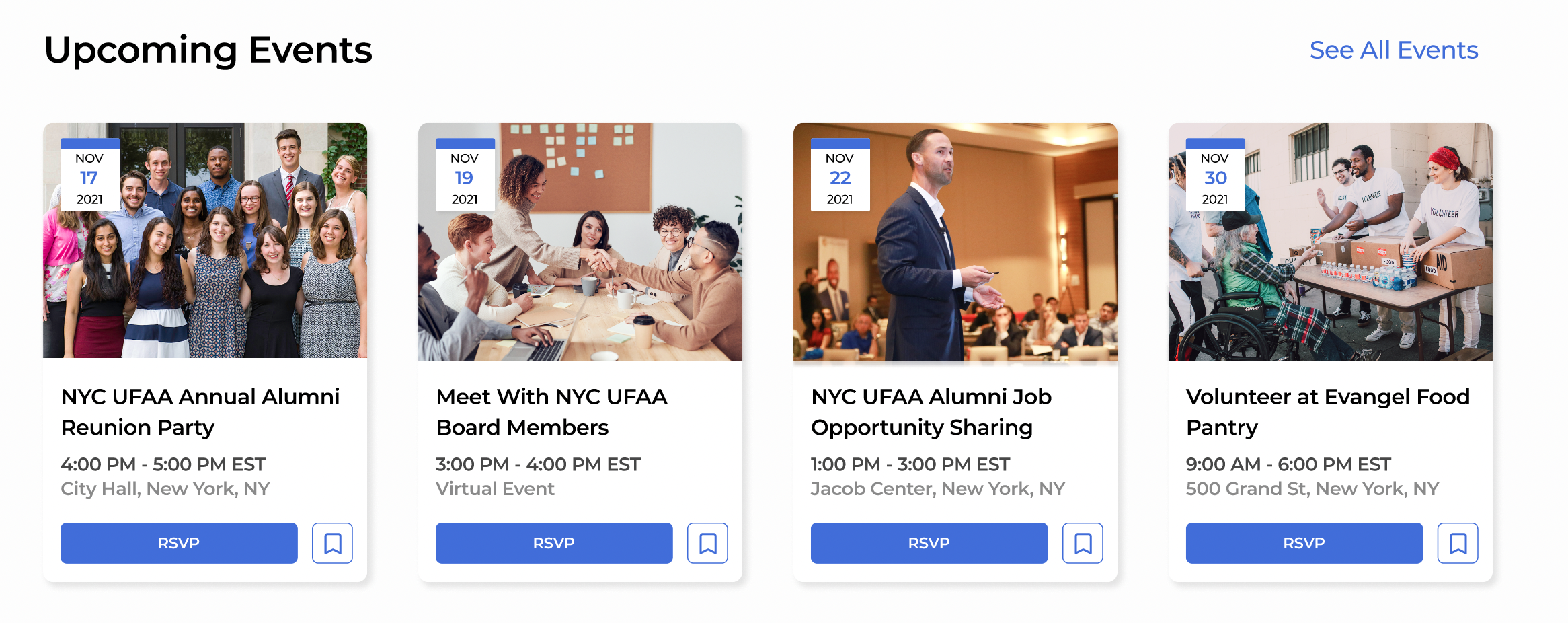
Like any prototype, however, our first product was far from seamless. My team members and I conducted user research of mobile and desktop prototypes remotely and in-person through interviews to critically evaluate our deliverable so far, then came back together in a team setting to collaboratively address the best opportunities for growth. I presented my findings to my team as a slidedeck that focused on areas of potentially weak intuitiveness in the Events flow, as expressed by my user testers. I specifically noted that users focused on the events calendar as an interactive, even though we hadn’t intended to design it as such. This new information about our users’ wants and needs made our prototype both more streamlined and more usable.
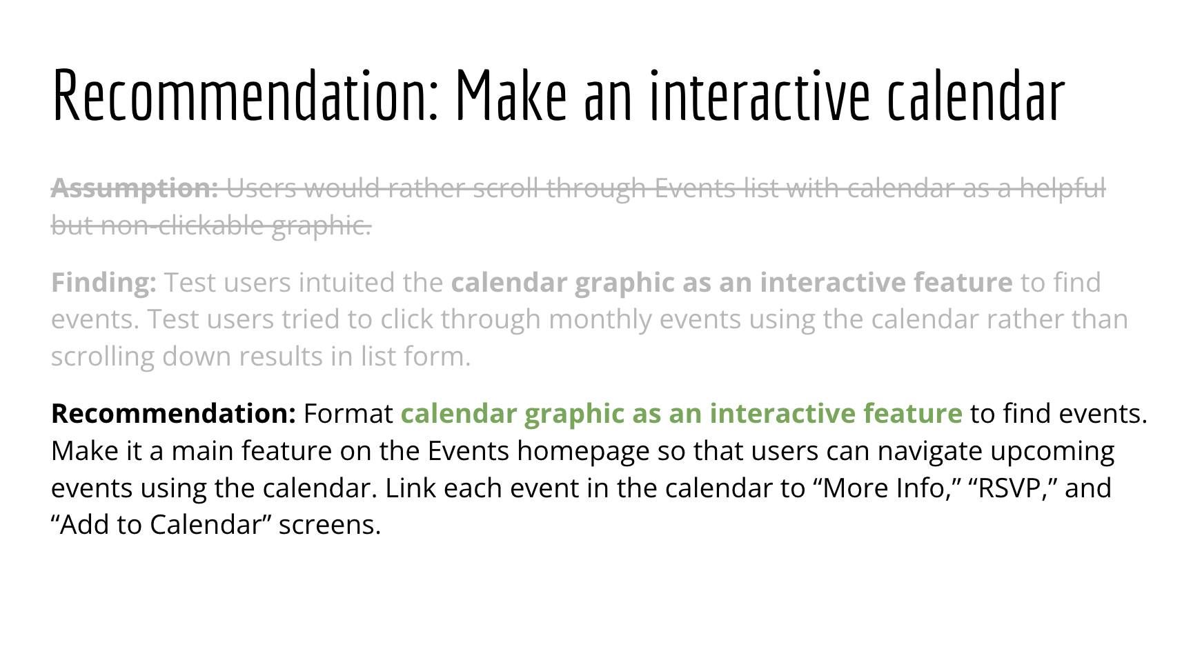
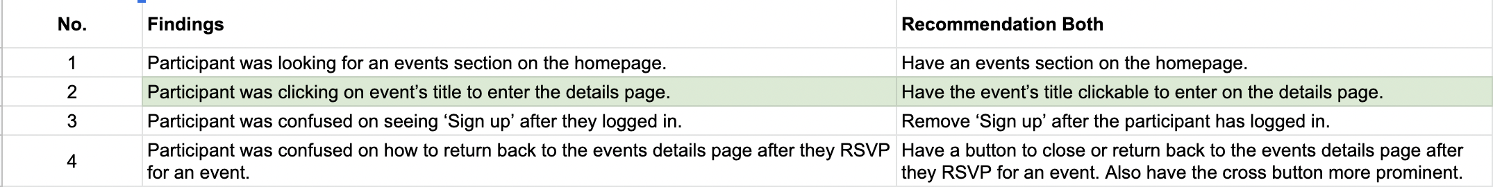
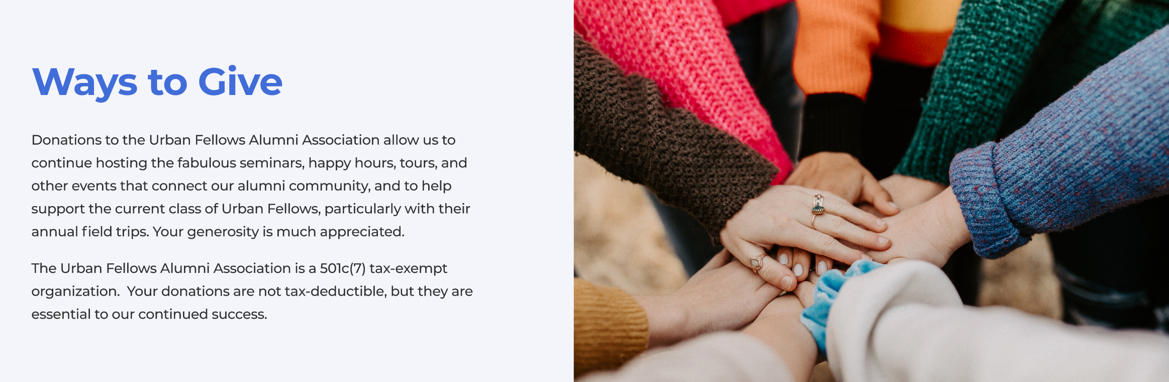
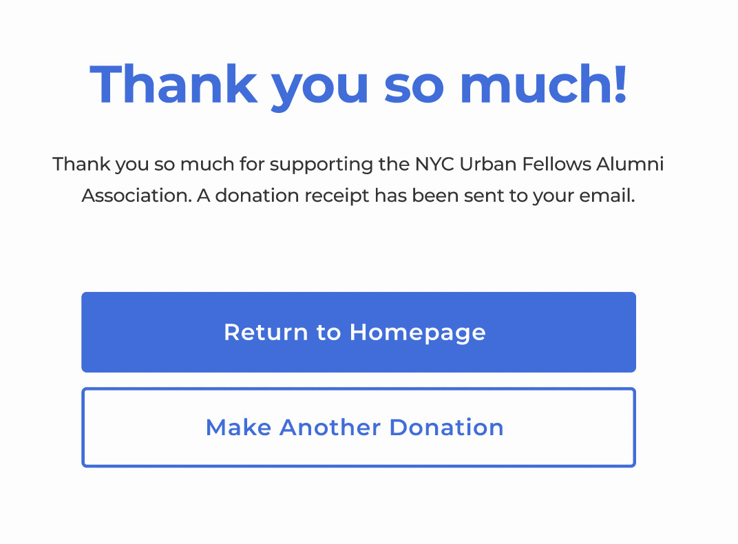
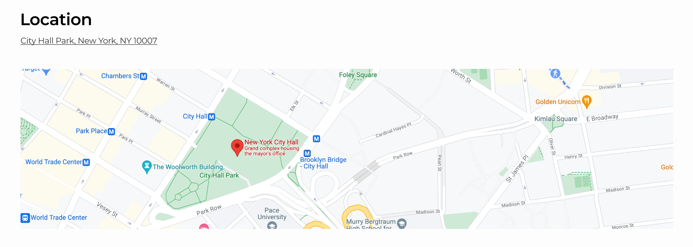
Once we had our med-fi prototype fully fleshed out and critiqued, our workflow moved forward very quickly as we systematically addressed these findings while adapting our product to high-fidelity. We had already decided to maintain UFAA’s original color scheme to maintain familiarity, for users who were regular visitors to the site. With greyscale changed to color, placeholder text and images replaced with text from the current UFAA website and images from UFAA social media, icons appropriately credited, interactions enabled, and relationships between pages properly linked, our final design prototype provides an intuitive, attractive, and engaging user experience for Events and Donation flows.
Highlights
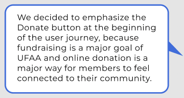
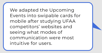
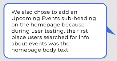
For each significant design decision, we made sure to add annotations in the margins to document how our user research informed our design process. I wrote about the design decisions for the homepage and footer on both mobile and desktop.
In Conclusion
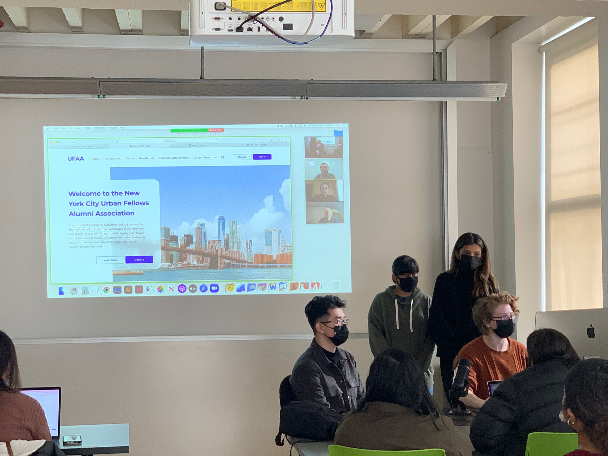
We welcomed UFAA’s board members back to our workspace at the end of the contract period to walk through our final design prototype. They were thrilled with our attention to user needs and provided positive feedback about how we communicated with them throughout the process, and how our centering connecting community resonated especially as New York City heads into a winter surge of social distancing. My team worked hard to provide a high-quality deliverable and were happy to hear we had achieved our goal.
Personally, I had set out as a team member to pull my weight in Figma, as I was new to the tool and had a background in narrative rather than visual design. With my team members’ collaboration, I felt confident that I had met my own expectations.
Next up, I hope to hear back from UFAA board members about how they plan to implement our design prototype. It will be rewarding to both see our design in action and recognize that we’ve helped a community grow closer together in a time when it’s harder than ever. I’m proud of my team and myself for our hard work, and can’t wait to see what we achieve together in the future.