Cameron Dudzisz: Case Study, Task Co-Writer, Testing Co-Moderator
Usability Study by Cameron Dudzisz, Cathy Hu, Eesha Parasnis, & Sharon (Yuxin) Tao, prepared for Nicholas Dease & Pratt Institute Library
For full report, please click HERE.
Abstract
The Pratt Institute Library is a vital resource for students, and the database search tool its supportive spine. Supplied by support company EBSCO, the tool is used to query databases for publications, ebooks, and so on. However, the existing tool is quite intimidating to use for student researchers, and a replacement is in development. Our job then was to design a usability test, recruit testers from the student body, and discover flaws in the new tool’s usability before it is implemented for wider use.
Project Summary
What is the problem?
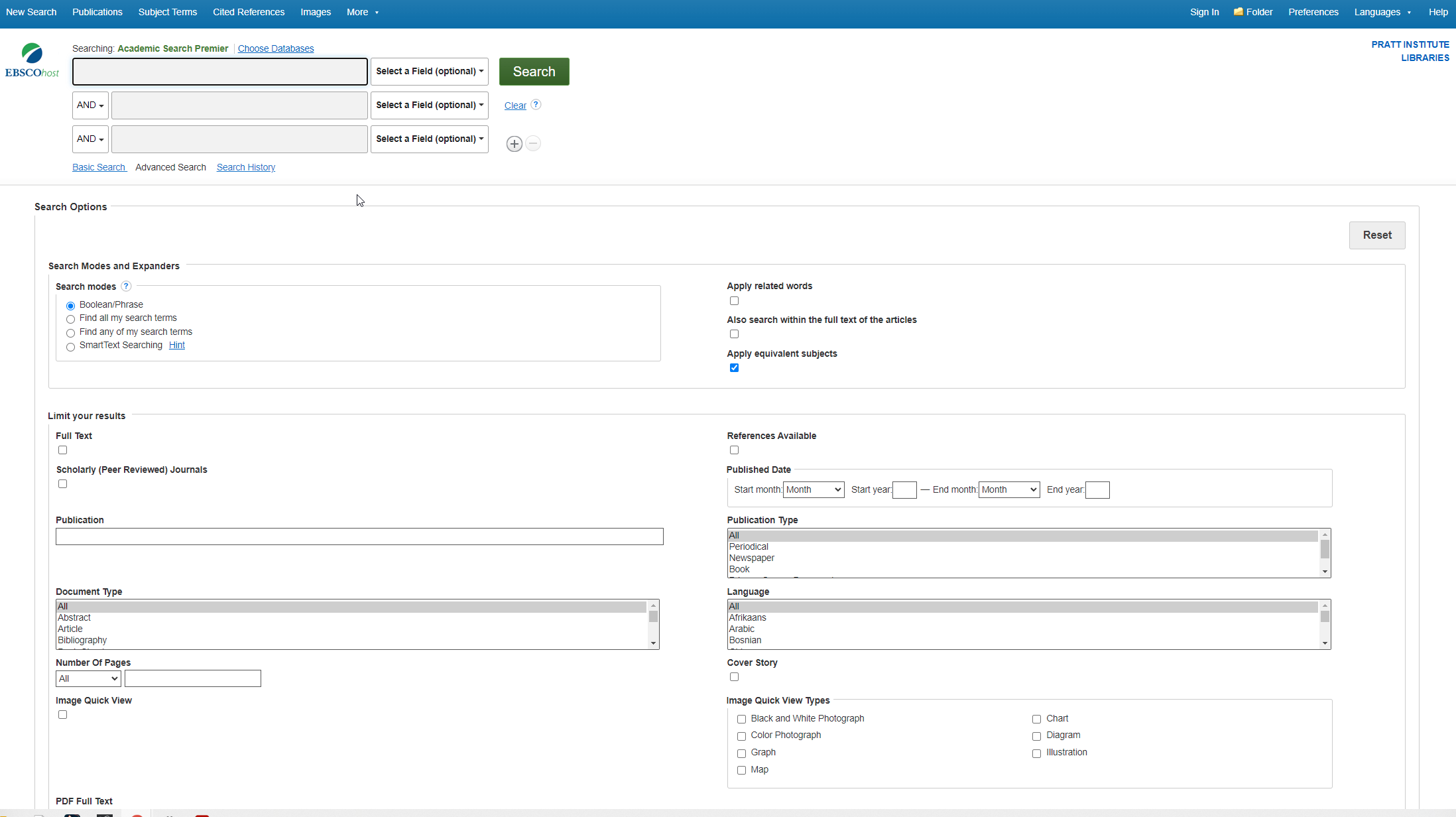
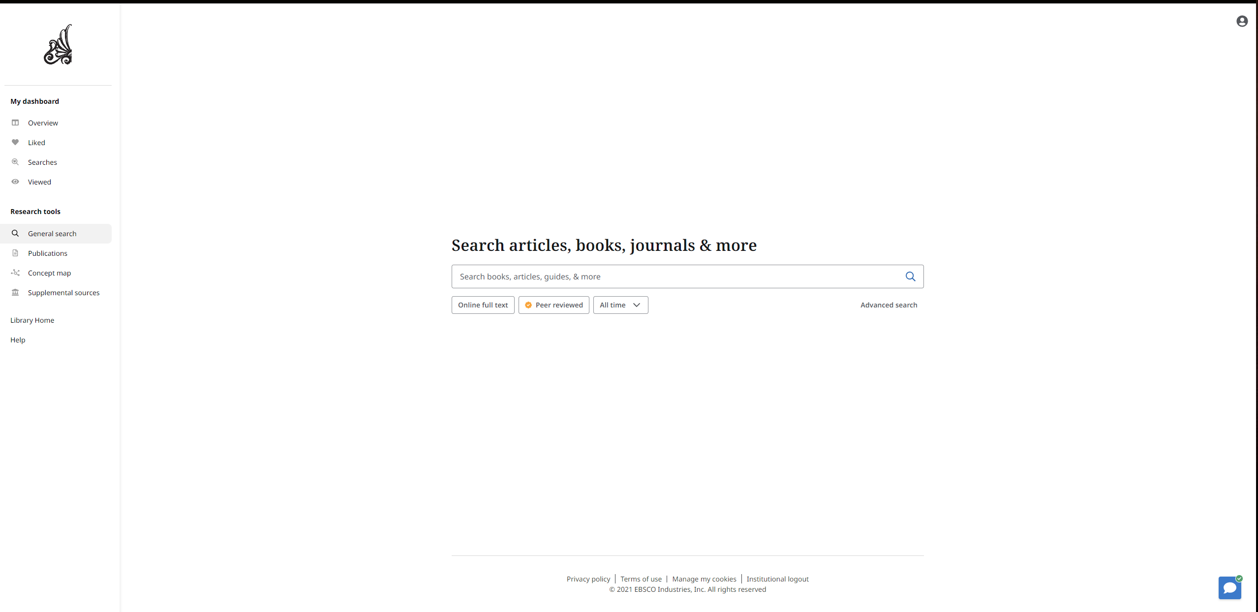
Pratt Libraries’ online database uses a search platform provided by EBSCO Information Services to help students find materials for their research. Currently, this discovery tool opens to an overwhelming splash of fields, criteria, and search features. While this is very useful to someone experienced with this system, it is very overwhelming to new students. Pratt Institute wants to streamline this interface to make it easier to use without compromising its search power.
Designing a Remote Test
Methodology
Due to the ongoing COVID-19 pandemic and for the convenience of all participants, we quickly settled on a guided remote approach, with testers monitored over ZOOM and pre-written tasks and questions. Live moderation allowed us to monitor our testers in real-time and provide guidance when needed while assuring the safety and comfort of all participants. We then settled on four tasks to test features and use-cases suggested to us by Nicholas:
- Task 1:
You are having trouble getting started with your research. Which tool would you
use to connect with someone to find help?
- Task 2:
You remember your professor gave you some articles to read about art during
the Renaissance period and you want to look up related books. Find a book that fits
these criteria which you can read on your computer, and skim through the chapter titles
(the table of contents) of the book.
- Task 3:
You want to start reading on your subway commute. Save Chapter 1 on your
computer.
- Task 4:
You want to include this book in your report as an APA reference. How would
you find the information you need?
Who Do We Pick? Selecting the Participants
We wanted a cross-section of undergraduate students across a variety of majors, as we were more concerned with students who may have less experience using database search tools. Graduate students who are more used to doing intensive research were thus excluded. Unfortunately, we were unable to test with any Sophomore students as by happenstance we did not get any after screening for availability and willingness to be recorded.

Running the Tests
With the tasks and questions finalized and the participants determined, we proceeded to run our remote user testing via ZOOM from November 12, 2021 to Nov. 22., 2021. We then collated and organized our quantitative results from the survey questions and task timings and qualitative results from participant free-responses and quotes in order to determine our final results and make our recommendations.
Findings… Assemble
““It’s a lot clearer and easy to use.” — [P1]

Overall, testing participants found the new tool to be easier to use than the current tool. Using the System Usability Scale (SUS) standardized survey, the participants evaluated the new website, with results below.

The mean of these scores was 82.2. By SUS methodology, a score above 68 indicates “better than average” usability, and so this indicates that the new Discovery tool clears that benchmark by 14 points. However, despite the overall good reception, the evaluators did identify some flaws in the current iteration of the new tool. To correct these issues, we made 4 easily-implementable recommendations.
1. Need a Little Help From My Librarian
“Some of the elements, like the chat, wasn’t[sic] very welcoming in the sense that it seems it’s hiding from the user and not presenting itself as something the user can use” –[P7]

While the LibraryChat icon to ask a librarian for help is in the lower-right corner of the page, which is a web usage standard, it is so small and difficult to see that some participants still missed it. Our suggested improvements were to make the existing icon larger, and add a redundant chat option to the left-hand menu to make sure that a student looking for help can find it, no matter which side of the screen they first look to.
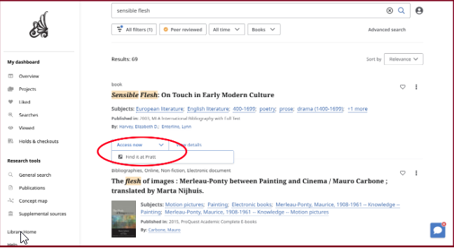
2. Demystifying “Access Now”
“Personally, [I would prefer]the PDF preview(if it’s available) on the bottom of the page, not a new popup view. It might be faster for people who are skimming through multiple resources.” — [P5]
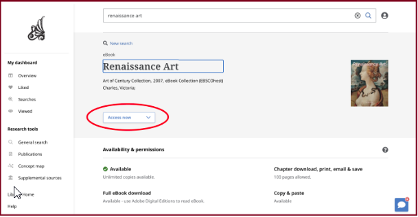

The “Access Now” dropdown is the primary method to access PDF versions of the full text, and was by far the largest difficulty our testers faced. With an average completion time of 4 minutes and 56 seconds, most testers struggled to find the PDF within this dropdown. Our suggestion is to split the PDF Reader to its own button, with the other access options as a separate, more clearly labeled menu.
3. You Are Now Leaving Pratt Airspace
“I didn’t know what I was looking for, like I didn’t know which sources would keep me on the website. I didn’t know what would indicate whether a source was on an external site”. — [P9]

Some participants’ chosen sample articles and books aren’t hosted in EBSCO databases, and so trying to access the full text would take them to a third-party site, which they found to be annoying and disruptive. Instead of disallowing this and denying access to those resources, we suggest a warning so that users can make an informed decision if they wish to pursue materials not hosted within the database.
4. Give Them a Hint
“Tags/categorization, hard to differentiate digital sources (ebooks/epubs vs.articles). Visual info (source, publisher) not super visible.” –[P6, summarizing flaws with the tool].


Our final recommendation is to add hover-over tooltips to the search filters. Some of the participants wanted additional information on what the filters meant and did, and adding tooltips that appear on hover can provide assistance without adding clutter to the page.
Results: Simple Improvements to an Already Improved System
“These resources will be essential as the libraries move their way toward new interfaces.” — Nicholas Dease, Digital Learning Librarian, Pratt Institute
Nicholas was very impressed with our testing, findings, and presentation. In addition to confirming that Pratt Libraries’ initial goal of the Discovery tool being easier to use was met, minor issues were discovered that will be able to be rectified before final release.
Full Report Available HERE.