TikTok is a short-form video sharing app that has become a popular form of entertainment in the last couple years. Users scroll through their “For You” page that contains videos generated from content they have interacted with before. Videos range from 15 seconds to 3 minutes and can be any genre of entertainment.
Normans’ Principles can be used to analyze the good and bad design of TikTok. The app is available on iOS, Android, and Web. For this critique, I will be focused on TikTok for iOS.
“For You” Page
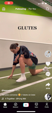
The “Home” page is the feature a user interacts with when first opening TikTok. Because the videos are the primary focus, all buttons and features that a user can interact with are pushed to the edge of the screen.
Center: The main focus of TikTok is the content that the platform is used for, videos. Just like a film or TV show, a user can play and pause the video by clicking the center (Figure 1). Apart from the video freezing, this signifier prevents any confusion in a case such as a still photo being displayed. There would be no method to understand whether or not the video was playing so a signifier is needed in this case. The feedback given to the user is a play symbol that is overlayed on the paused video.

Top: At the top of the screen, the words “Following” and “For You” are in white. The “For You” page is one of the most interacted with features since most users are watching content. Both pages work similarly, the only difference is the content generated for each. A user can tap between the pages by tapping either word (Figure 2). The word that is bolded in white is a digital signifier to which page the user is on. The other title is not bolded. This is a clever design since there is no need to add both pages on the navigation bar at the bottom. This features combines two pages into one.
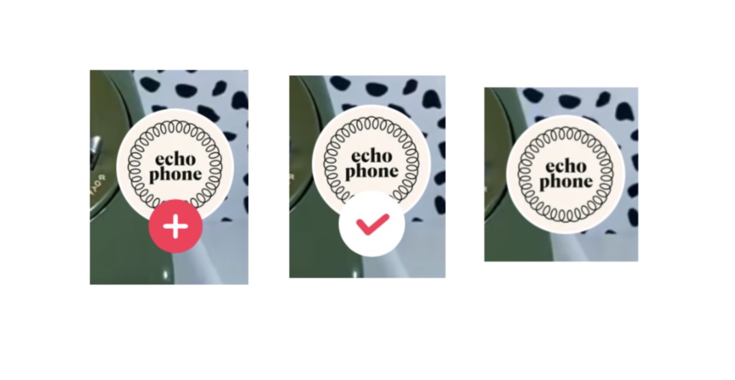
Right: On the right hand of the screen is where a user can interact with the video. Beginning from top to bottom, the top circle with an image embedded has a small plus sign at the bottom of the circle. Clicking the plus sign allows the user to follow the content creator without having to click away from the “For You” page. The plus sign will then disappear turning into a checkmark (Figure 3). The circle alone shows the user they are now following that content creator.
The heart is what Norman refers to as “knowledge in the world.” The heart feature is equivalent to a “like” in the digital world. The heart animates to red when a video has been liked providing the user with good visual feedback (Figure 4). A liked video is distinguishable from one that hasn’t been liked. Users can build a mental model with this icon because these are similar to ones used on other social media platforms.
The comment section follows the heart with a talking bubble icon. This is a good signifier that has been used universally across various platforms. The user will know how to interact with this quickly when the button is clicked. Comments from other users are shown at the top, towards the bottom is a bar that says ‘Add comment…’ to interact with (Figure 5). Once clicked, the keyboard shows up with a flashing cursor. The signifiers that result from the actions keeps the gulf of execution small because a user knows how to operate a comment section when they are familiar with social media.

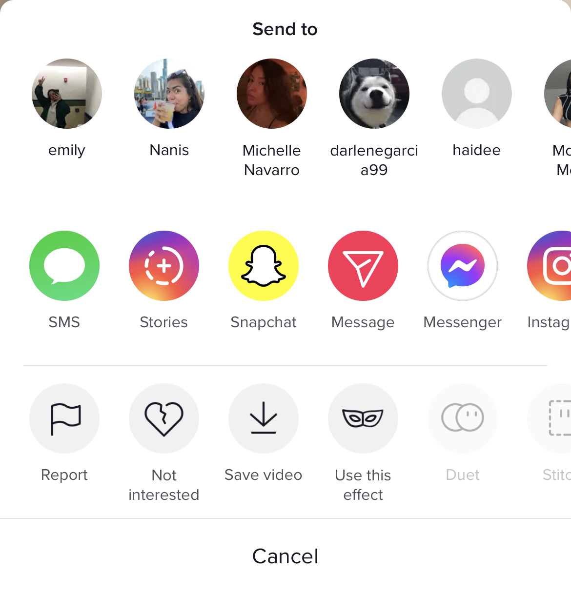
The share button is an arrow. When clicked, an assortment of options result providing feedback to the user. This is a good example of the gulf of evaluation. The user is provided with clear information of what to do once the button is pressed. The user is provided with different options that are labeled with icons or an icon and word paired (Figure 6). This affordance is designed based on user’s past experiences.
All of these buttons give feedback to the user by adding an animation to the buttons or prompting the user with a new display. The feedback here is a good design because the user is given a result to their action. The buttons being placed on the right side is a physical constraint to those that choose to hold their phones with their left-hand. TikTok could add a feature in the settings that allows the buttons to flip to the left-side of the screen to give users an easier way to reach and interact with the buttons.
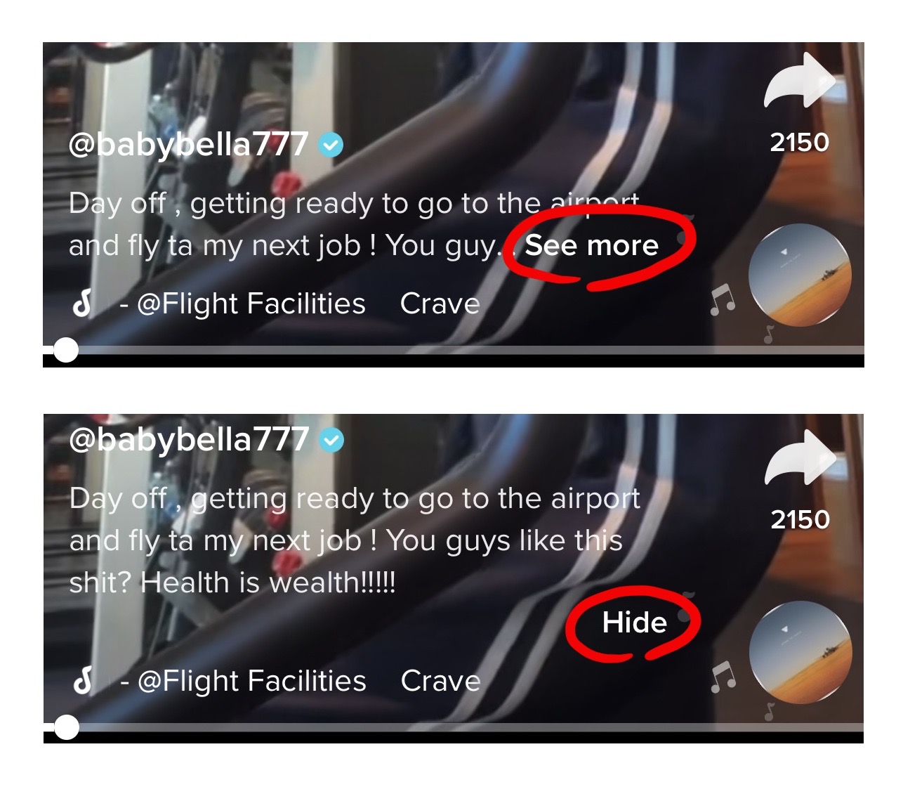
Bottom: At the bottom of the screen, is where the information of the video is contained. Beginning at the top, the content creator’s username is displayed with the ‘@’ symbol following with the name. A user can click the name and also reach the content creator’s profile this alternate way. Below that is the video caption. This is a constraint that has been attempted to be fixed by adding ‘…See more’ that is bolded in white to tuck away more lines from the caption that hinders the user from viewing the video (Figure 7). When the user no longer wants to read the caption, it can be tucked away by pressing ‘Hide.’
Navigation Bar
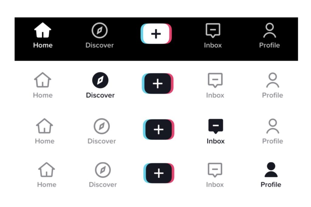
At the bottom of the TikTok app a navigation bar displays what other pages a user can enter as shown on the left (Figure 8). An icon with a single-word summarize the page to the user. For example, the compass icon has the word “Discover” under it. The discoverability is clear for this navigation bar because it uses natural mapping since the design resembles that of other social media applications. The icons paired with words removes any possible constraints of understanding what the icon resembles.
Although the navigation bar is a good design, there are some good and bad points made with the mapping on the app. After the first login, it is assumed that the user no longer needs an indicator to scroll down the “For You” page for more content. TikTok relies on the knowledge of the world Norman discusses. It has now become common knowledge on various apps to scroll for more content resulting in removing a signifier completely. Although this is a flaw in the app there are other signifiers like ‘<‘ and ‘x’ icons as shown on the right (Figure 9). The arrows point the user to go back to the previous page. The ‘x’ icon tells the user how to exit a page. These icons only appear when necessary which helps the user know when they have reached a stopping point when navigating through the app.
Summary of Norman’s Principles on TikTok
Norman has a few principles when considering design: discoverability, mappings, signifiers, constraints, and feedback. Each of these principles can be applied to TikTok.
Discoverability applies to how seamless something can be figured out without clear instructions. After becoming comfortable with social media rules, a user has the ability to navigate TikTok with clear labels and icons that help guide the user through the application.
Mapping on TikTok is something that is possibly a poor design if you are a first-time user. A good design will allow the user’s action to be connected to an effect. There is no indication telling the user to scroll down for more content which is bad design, but here are other indicators like ‘<‘ and ‘x’ icons to go back or exit a page.
Signifiers give the user an indication as to what to do. These are clearly shown on the app with labels and icons.
Constraints exist digitally on TikTok. Constraints limit the user’s interaction with the app. This is shown with the location of buttons, readability, and icons.
Feedback gives the user a reaction to their action on the app. These indicators on TikTok are helpful with small animations that show a user they selected a specific button.