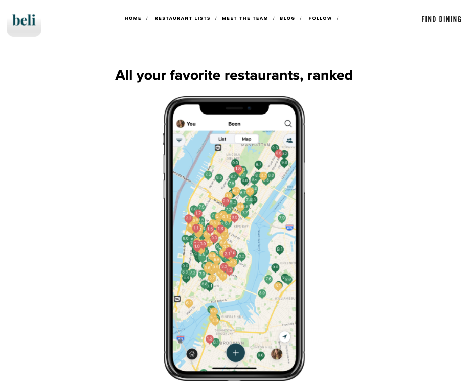
Beli is a curated restaurant discovery application to help users find places to eat based on their personal network. Users are able to rank and curate lists of their favorite restaurants as well as share helpful notes and pictures with their followers. The more ratings you give the more tailored your restaurant recommendations will be.
Homepage Overview
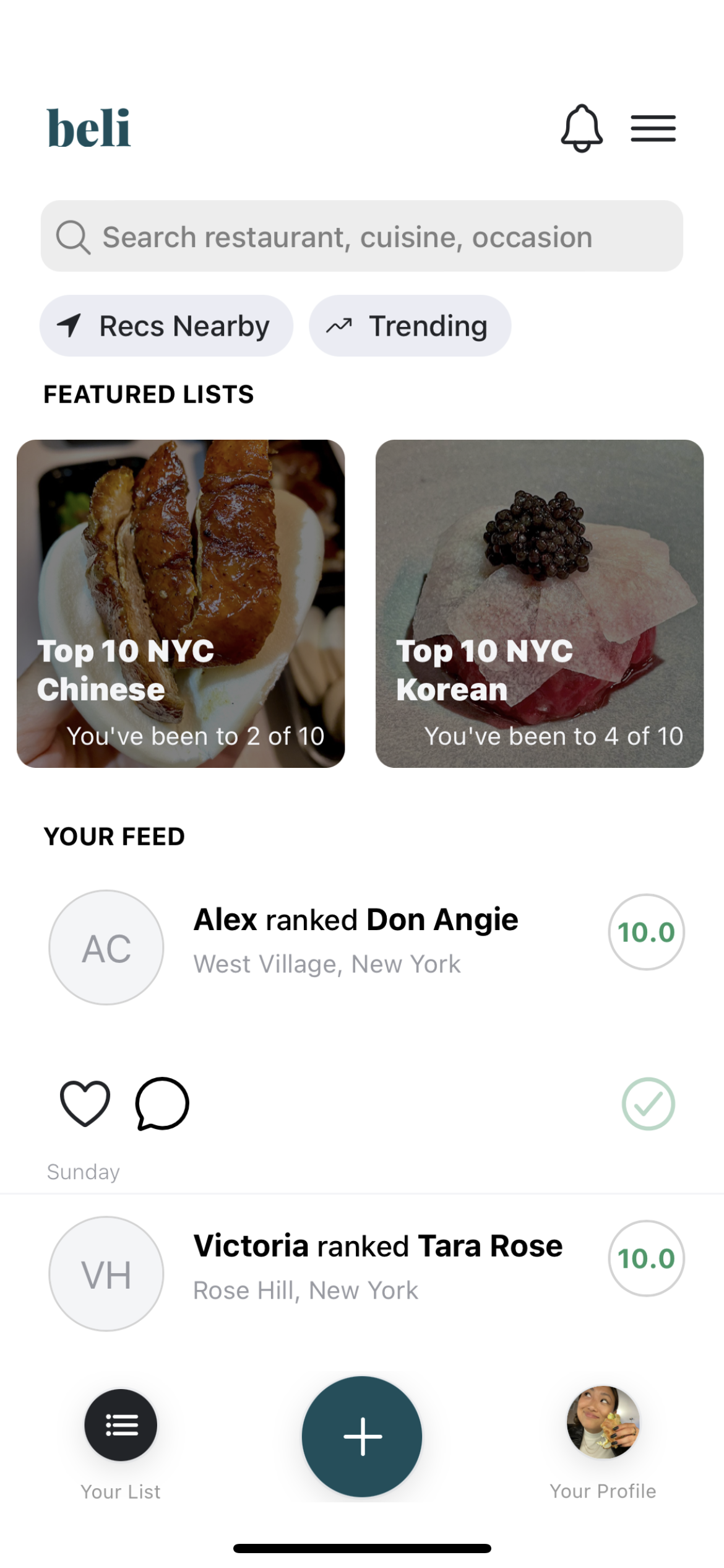
The homepage is very simplistic with very limited options in the navigation bar: “Your List”, “+” and “Your Profile”. The “+” icon is a visual affordance that you can add to a restaurant review once selected. This is because interface icons such as “+” are taken knowledge in the world so users can understand the function quickly.
The carousel for the “Featured Lists” and scrolling of the “Your Feed” section is fairly intuitive and utilizes mapping to engage users as they scroll through to discover restaurant categories or recent scores from friends. Users utilize the knowledge in their head from using such a carousel and scroll elements in similar apps with newsfeeds and discovery pages. There is also the search bar at the top that affords users to type in a “restaurant, cuisine or occasion” which is signified by the light grey placeholder text.
Ranking Restaurants
When ranking restaurants you are forced to decide between the restaurant you are scoring with one other restaurant you have evaluated in the past. This constrains the user from only comparing restaurants determined by the algorithm instead of you manually giving it a score. It forces you to make a decision, skip, or it’s “Too Tough” to decide which contributes to the restaurant’s score when ranking.
To improve the experience, there should be a way to further categorize the ranking system. For example, the current application may have you decide between an expensive sit-down or a fast-casual—but depending on one’s mood and preference at the time can have a vast difference of opinion of what is a “better” restaurant. To better improve the user experience with rankings, Beli can expand the constraints by comparing restaurants within the same category (such as by cuisine or $$$ amount).
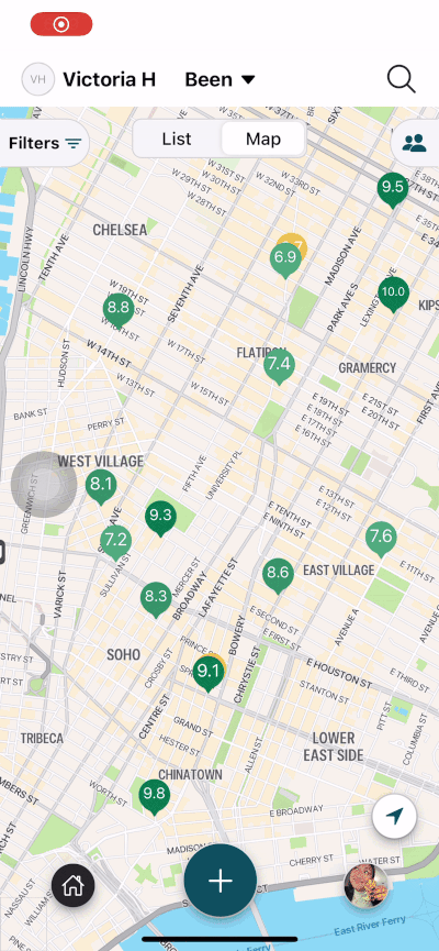
“Your List” Page
Map prior to selecting a restaurant.
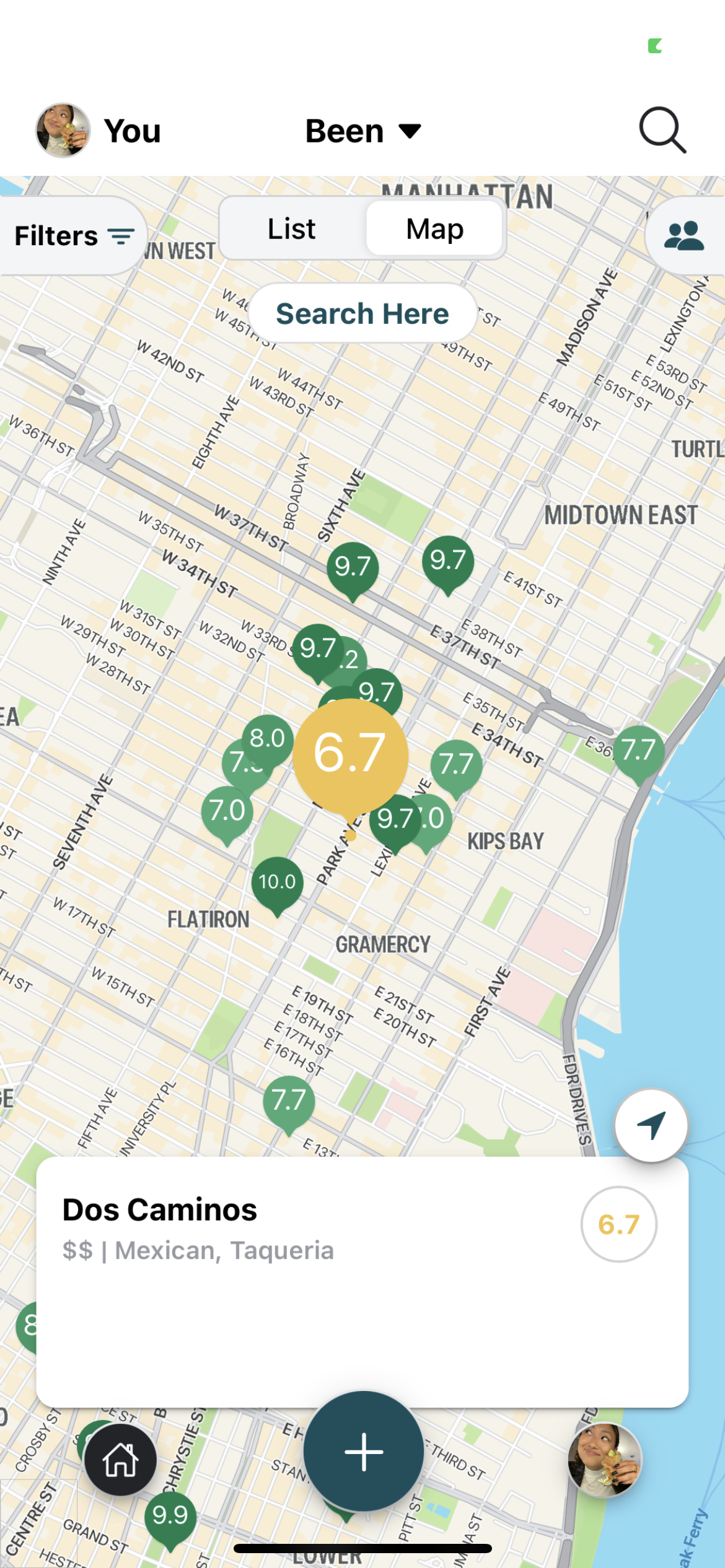
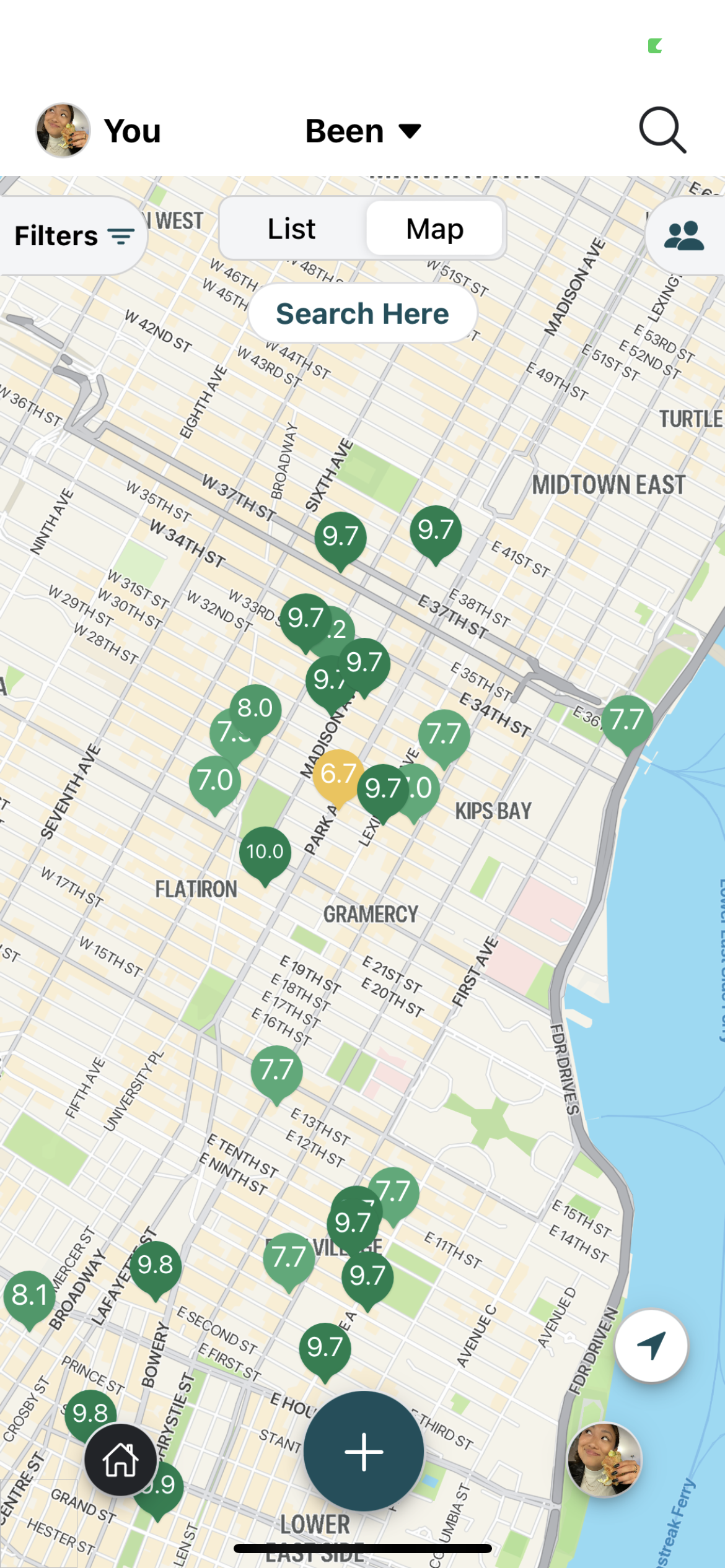
Feedback after the user selects restaurant.
When the “Your List” page is clicked, the user is taken to a map with color-coded flags to distinguish different rankings (green flags meaning higher scores than red). When selecting specific restaurants, feedback is given to the user when the flag enlarges and the restaurant banner pops up at the bottom of the screen.
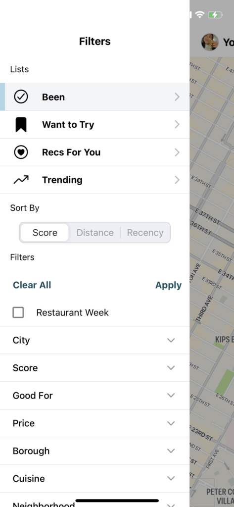
The map and list results can be narrowed down to show specific categories selected from the “filters” tab. The user can pick a specific list of filters such as “Score”, “Price”, “Cuisine”, and so on. This follows natural mapping due to narrowing the scope through the selection of these filters.
Restaurant Page
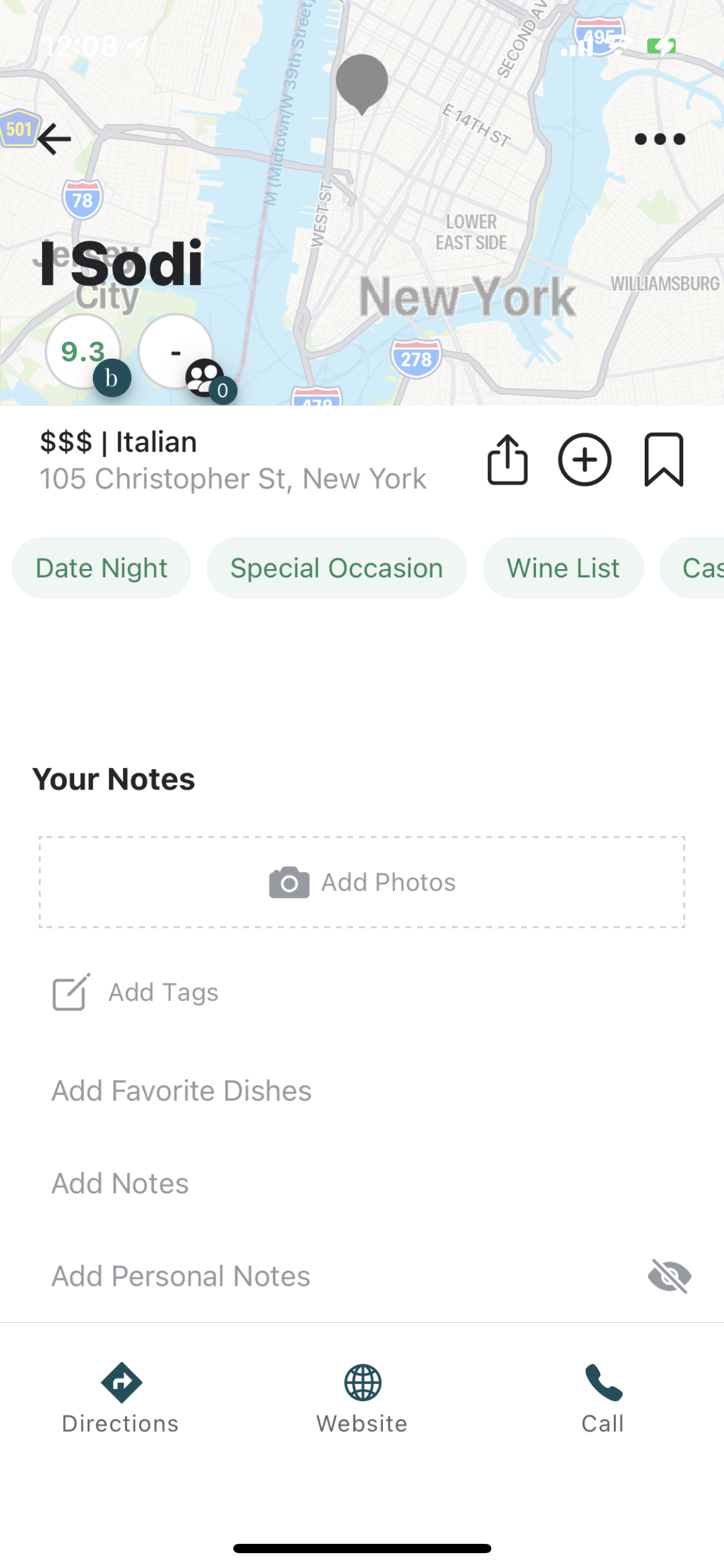
The restaurant page has decent discoverability with obvious signifiers of icons combined with labels to find “directions”, go to the “website” or call the restaurant. This low gulf of execution allows for users to quickly achieve their desired goal. However, some of the affordances on the page were not obvious enough for me. I wasn’t aware you could interact with the map in the header of the page until I accidentally tapped that area of the screen. For added clarity, the map should not be hiding behind the restaurant title and the marker can potentially be animated to hop up and down to signify you can interact with it.
Besides ranking restaurants, there are two other actions a user can take on a restaurant page: sharing or saving. Both the share and save icons on the top right affords users the to bookmark the place or send the spot to their friends. Beli users have the ability to save a place by clicking the bookmark icon underneath the title. Users will receive feedback they have saved the restaurant with the bookmark icon filling in teal. Users can access this list on their profile where the same bookmark icon is labeled with the list “Want to Try”.